Chart Vizzard
Vizzlo's AI-based chart generatorNovember 8, 2019 • 4 min read
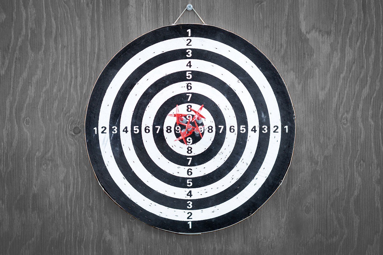
Hit your targets: Can dataviz really increase productivity?
Spot trends, communicate fast, exceed your goals
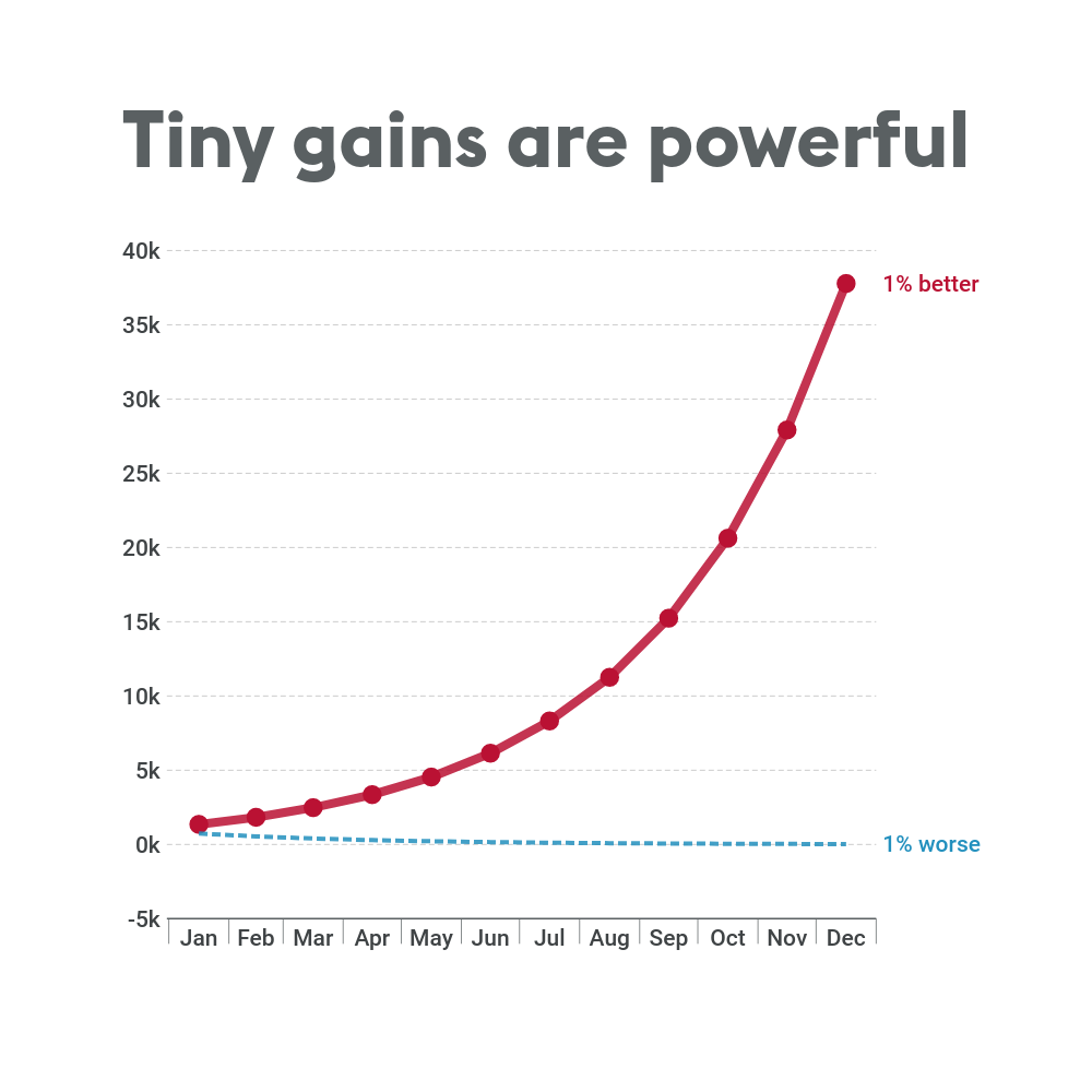
Whether you’ve had a bad month and need a new game plan to turn things around, or you’re just looking for ways to keep your winning streak going, visualizing those key numbers can make a solid, tangible difference in your team’s performance.
“There’s still the impression that creating graphics or visualizations is really just making pretty pictures and the real stuff you need to do can be done through analysis,” says Autodesk researcher Justin Matejka, who wrote the paper with fellow researcher George Fitzmaurice. “Even if you’re very good at statistics, you might miss something.”
Seeing your progress move up or down has a considerable psychological effect on personal and team motivation; adding a projected target to this visual can make the difference between closing that one last task each week. But why do we respond to visuals with more motivation and efficiency? We explore five of the reasons below:
1. Visualization exposes new trends
No matter how high your expertise in your work processes, you can always find something new–whether that’s a problem area needing attention, or a potential forecast for future sales–once you look at the figures from a different angle. Perspective is everything, and visualization is just as crucial for exploring the data as it is for presenting it.
2. It’s the cleanest form of communication
If KPI data analysis is all about searching, finding more and more links and trends and including every single number you can find–visualization is the opposite. You’ve found the big story you need to tell, the make-or-break evidence that could drastically affect your company’s bottom line, and now everything else needs to be pared down to let this take centre stage. Visualization when it’s at its best is clean, legible and clear; stripping away everything unnecessary and leaving bold, unambiguous facts.
3. It gives decision makers more control
Having been on both sides of the performance report, I know there’s nothing more frustrating than having a recommendation that needs implementing but the implementer being unable to grasp exactly why. One way to solve that is an extreme level of trust that amounts to team leaders basically replying “because I said so” when asked why they need to allocate big budgets in different areas; another, slightly more realistic ask is to help your decision maker truly, visually see what the data story is, and why they need to act. They get more control over the process than simply trusting a recommendation, and the team leader gets a mutual recognition of the validity behind their idea.
4. It’s the quickest way to understanding
Perhaps not a revolutionary idea in communications, but visuals convey more information more quickly than anything else. If this wasn’t the case, video would never have killed the radio star and emojis would not be racing to become the most globally spoken language.
Visualizing your data will help you (and the people you’re working with) to spot even small changes at first glance and stay ahead of the competition. Time is money, my chart-wielding associate. Save yourself and your team both by showing your data rather than talking about it.
5. Data visualization is easy, fast and beautiful
If you’ve ever tried to make a chart in Excel you’ll know this isn’t always the case… but it can be with Vizzlo. While other dataviz tools might require several hours spent on intensive training just to figure out how to open a new doc, and other software made for designers can be intuitive to use but not entirely accurate when it comes to presenting data, Vizzlo finds the happy medium. Increasing productivity shouldn’t require extra planning that overwhelms your actual tasks! Vizzlo wasn’t built for mathematicians, and neither was it created to make business cards, wedding invitations or put together your entire Powerpoint presentation for you — we help you to make better charts faster, so you can focus on smashing those 2019 targets.
For your free pro trial (and then only $11/month), visit vizzlo.com today.