Chart Vizzard
Vizzlo's AI-based chart generatorApril 9, 2018 • 5 min read
Pie Charts, tasteful dataviz tool or evil wasted calories?

Born in 1801, Pie Charts have been highly criticized, compared to, improved, praised and sought after for over 200 years. Many arguments have been shot in both directions, but the fact is that they continue to be around and it doesn’t look like they are going anywhere. So we might as well take a closer look at them and learn how to use them correctly.
So what makes them such a spicy topic of conversation?
Well, research has shown that the human brain can compare length easier than angle, and therefore some people argue that we should Save the Pies for Dessert. When reading a pie chart, we notice the inner angles each slice forms, the area they occupy and the length of its outer-arcs, to judge proportions. Depending on these factors and on how the pie chart is positioned, we try to decide which slice is bigger and well; there is simply too much room for error.
The truth is they are not your default go-to-chart, what they are is colorful simplicity. Pie charts exemplify the part-to-whole relationship in a friendly form, and we need to respect their function.
They are not comparison charts, and you should not base your research findings or important business strategies on comparing proportions. Proportions might be a good starting argument to make a point, but do you really want to make them the center of attention? This will only make sense in rare cases. That is why before deciding to use a pie chart, you have to make sure your data requires one.
Golden rule here: The data is key
Like with every visualization really, you must first understand the information you possess and the message you are trying to convey, so if your data fulfills the following criteria, a pie chart might just be the right choice for you:
-
Your data makes up meaningful categories
-
You have different non-overlapping categories
-
You have no negative values
-
Your categories will add up to a 100% sample
-
You will show less than five to seven categories
If your data meets these characteristics, my friend you’ve earned yourself a pie!
Now take these pro tips home and start charting pies
-
Organize your data from biggest to smallest and don’t use too many categories
-
Make sure your data is grouped meaningfully or can’t be compressed further
-
Label your slices
-
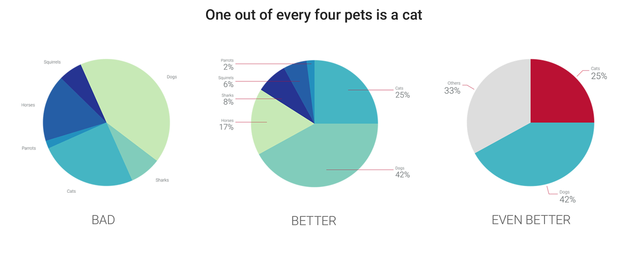
Gray-out slices adding up to 2%-1% or less, and/or group into “Others.”
-
The ideal number of slices in a pie chart is two: The whole and the part-to-whole slice that should stand out
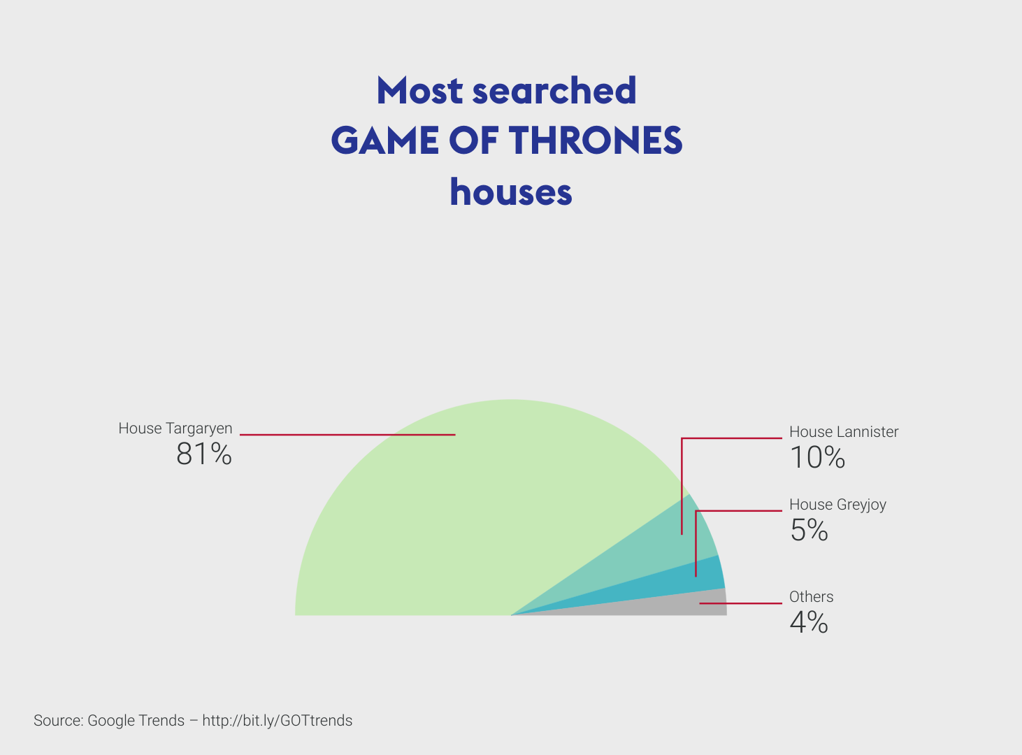
Also, here are some variations to pie charts that you can use. See how easy they can be to graph and read when your focus is on ONE of your slices?

Big Pros to pie charts are their familiar shape and colorful appeal. Plus their part-to-whole portray when used correctly.
You can hate them or love them, but you can’t ignore them. Google gets over 100 thousand “Pie chart” inquires a month, can we agree they are here to stay?
Yet, there is much more to Dataviz beyond pie charts
Before you use a pie chart, think about the alternatives.
Let’s take the following real data as an example:
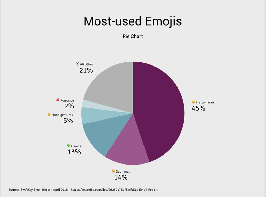
Most-used Emojis
😃 Happy faces with 44.8%
😢 Sad faces with 14.33%
💋 Romance with 2.40%
💚 Hearts with 12.50%
✊ Hand gestures with 5.30%
⚽️ 📷 Other with 20.67%
If you want to stress the usage of “Happy faces” a pie chart will do, but depending on what you are trying to explain, you will find that sometimes you are better off using alternative charts.
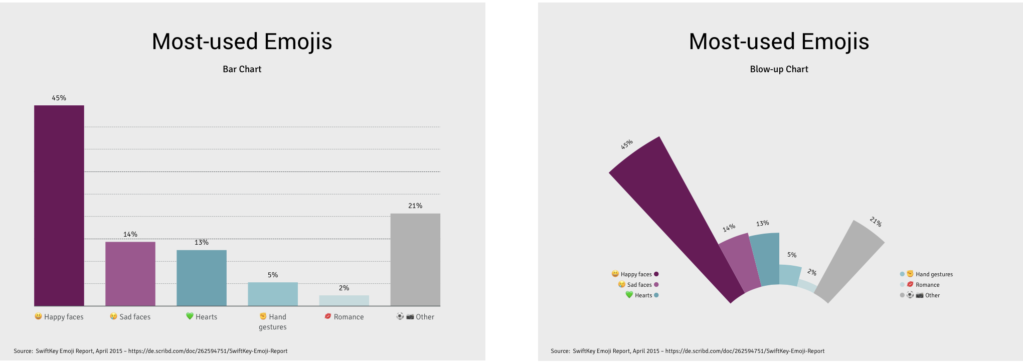
A bar chart makes the difference between “Hearts” and “Sad faces” easily appreciated, while a blow-up chart is a creative variation to the bar chart.
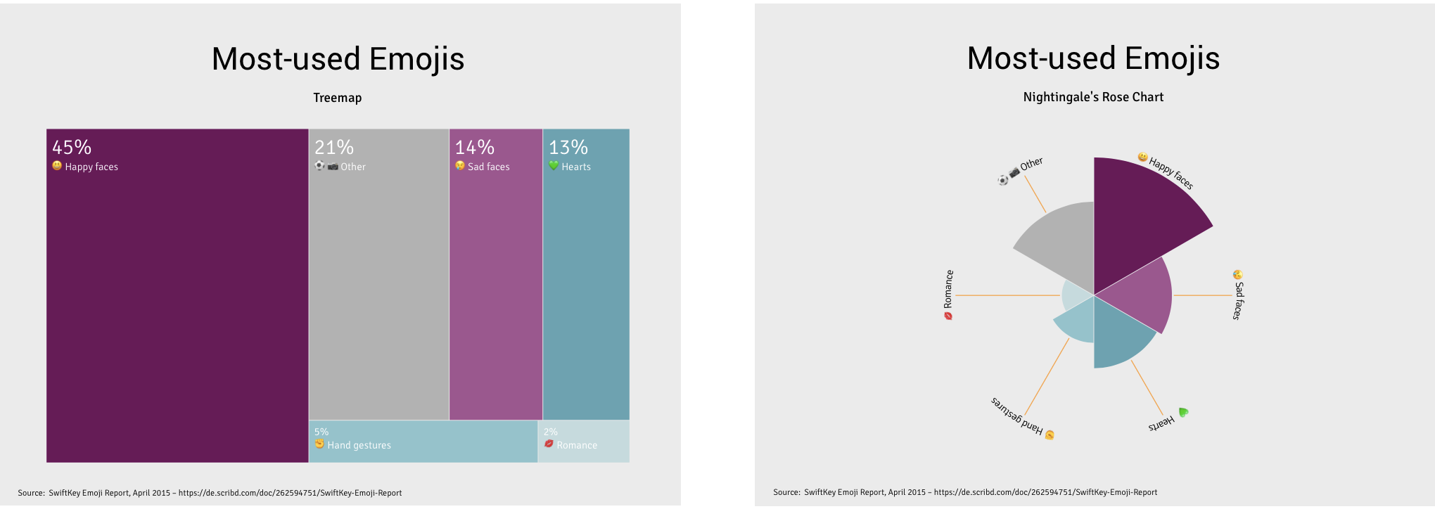
A treemap makes hierarchical data evident. A Nightingale’s rose chart, also known as “polar area chart” or “coxcomb chart,” is ideal to visualize periodic seasonal data.
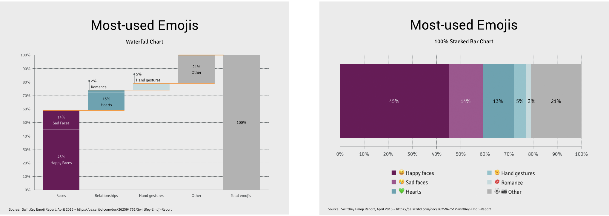
And well, there are also charts that help portray richer or multi-dimensional data like the waterfall chart, which allows for, and even welcomes, negative values and is often used to make financial forecasts. We then have the 100% stacked bar chart, that not only shows the part-to-whole relationship, but supports comparisons between groups as well.
You must understand your data before you make a pie chart
Take advantage of visualizations to highlight your findings and don’t manipulate data to fit your visualizations. It is all about the information you have and the message you are trying to convey, that is why choosing the “right” chart is essential.
A pie chart won’t explain the correlation of two or three categories to each other, but it will clearly show how one category stands out among the total. So don’t be afraid to opt for a different chart if it comes to it.
Pies are simple, and not everything can be simplified enough to fit into one. So much like counting calories when eating healthy, choose your pie intake wisely!
Show us your best Pie charts by using #vizzlove and help us prove that less truly is more! Also, don’t be afraid to send your feedback, we want to hear from you.