Chart Vizzard
Vizzlo's AI-based chart generator100% Stacked Area Chart
Create a 100% stacked area chart to compare the relative weight of different data series.
What is a 100% stacked area chart?
100% stacked area charts are great to depict part-to-whole relationships of multiple series and to display their cumulative values. As its name suggests, the total area of the 100% stacked area chart corresponds to 100%, and the areas of the data series are proportionate parts of the total that add on top of each other up to 100%.
100% stacked area charts are very popular: they are colorful and dynamic. However, likewise the conventionally stacked area charts, they communicate better overall trends and composition than individual values (for the latter, prefer the line graph). If you want to visualize trends over time, try Vizzlo’s super versatile time series graph.
How to make a 100% stacked area chart with Vizzlo?
Make a great-looking 100% stacked area chart online. Follow these easy steps:
- On the tab “DATA” of the sidebar, click on the button “SERIES” to name your time series.
- Use the spreadsheet to import or paste your data quickly. Click on the “wheel” icons of the columns to set the number formatting before entering your data into Vizzlo’s spreadsheet.
- Test the customization and layout settings options of the tab “APPEARANCE” to define the look of your chart.
100% stacked area chart maker: key features
- Multiple series
- Straight line segments, smoothly interpolated curves or steps
- Custom x-axis: values (number) or categories (text)
- Adjustable axes and ranges
- Custom number formats
- Optional labeling of individual values
- Optional labeling of closing/end values
- Adjustable transparency
- Custom colors and fonts
- Custom gridlines
Resources
100% Stacked Area Chart: What's new?
Axis titles can now be hidden.
You can now show legends, even if they only contain one entry.
Slight improvement to the user interface to make number formatting easier and consistent.
We added an option to hide axis labels.
You can now hide vertical and horizontal axis lines.
100% Stacked Area Chart Alternatives
Enhance your productivity
Create a 100% Stacked Area Chart directly in the tools you love

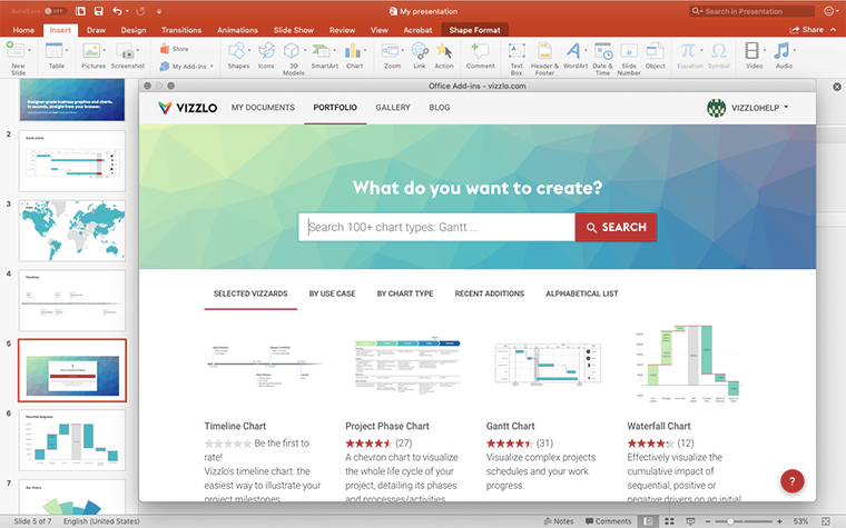
Create a 100% Stacked Area Chart in PowerPoint with
Vizzlo's add-in
Loved by professionals around the world


Visualizations your audience won’t forget
Convey abstract concepts and data with professionally designed
charts and graphics you can easily edit and customize.


