Chart Vizzard
Vizzlo's AI-based chart generatorButterfly Chart
Create a butterfly chart to compare two data sets side by side.
What is a butterfly chart?
A butterfly chart is a type of a bar chart used to compare two data sets with the same parameters and scale. The bars of the data sets are plotted opposite each other, resembling the butterfly wings.
This chart is extremely versatile and can be used for different DataViz purposes. A butterfly chart is among others especially useful to compare the outcomes of opinion polls between two socio-demographic groups, or yes and no positions for multiple categories. You can also use it to create a population pyramid.
What is the difference between a butterfly chart and a tornado chart?
If vertically ordered from the largest bar on top to the smallest one, this chart is also called “tornado chart” and helps to identify priorities and most relevant issues quickly.
The tornado chart is often applied in the deterministic sensitivity analysis, to identify how the variation of one parameter impacts on the output values, i.e., how results are sensitive to parameters change. Hence, allowing to compare the relative importance of the variables, their uncertainty, and access risk.
How to make a butterfly chart or a tornado chart with Vizzlo?
This vizzard is the easiest and most beautiful alternative to the Excel butterfly chart or any ready template. Create your own in seconds! Follow these easy steps:
- Click on any bar to start editing it: you can drag and drop it, and pull its sides to adjust its length.
- Alternatively, you can use the active cards on the sidebar to enter your data or paste it directly into Vizzlo’s spreadsheet.
- Try the layout setting options (tab “APPEARANCE”) to adjust the look of your chart.
- In order to apply the tornado chart format, apply the “Sort by value (tornado chart)” option under the layout settings.
- Explore the Vizzlo themes or customize your own to change colors and fonts.
Butterfly chart maker: key features
- Custom number formats
- Custom lines, grid and colors
- Optional labeling of individual values
- Left-aligned or centered layout
- Optional sorting by value (tornado chart)
Butterfly Chart: What's new?
These chart types now all support adding custom formatting to individual value labels.
Axis titles can now be disabled.
Easier number formatting through some changes in the user interface. Showing and hiding values is possible in the same place as you format them.
Butterfly Chart Alternatives
Enhance your productivity
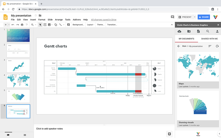
Create a Butterfly Chart directly in the tools you love

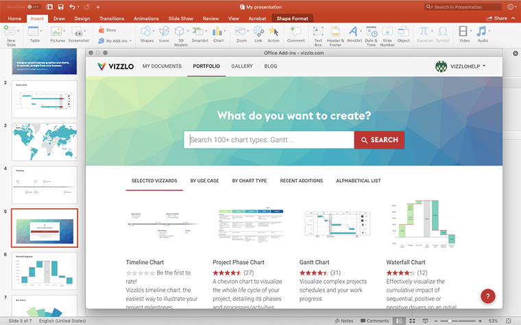
Create a Butterfly Chart in PowerPoint with
Vizzlo's add-in
Loved by professionals around the world


Visualizations your audience won’t forget
Convey abstract concepts and data with professionally designed
charts and graphics you can easily edit and customize.


