Chart Vizzard
Vizzlo's AI-based chart generatorData Visualizations That Will Make your Presentations Look Better
This guide will tell you everything about data visualization for presentations you need to know. First, I’ll explain to you what data visualization is and why it is more important than ever.
Then, I’ll show you how to get the most out of your presentations with the most common types of charts in data visualization. These charts will help you effectively communicate with your audience. Are you ready to get started? Let’s dive right into it.
What is Data visualization?
Data visualization is a form of communication that portrays dense and complex information in graphical form. What The resulting visuals are designed to make it easy to compare data and use it to tell a story – both of which can help users in decision-making.
Data visualization can express data of varying types and sizes: from a few data points to large multivariate datasets. Good visual presentations tend to enhance the message of the visualization. You always need to pick the visualization that best fits your specific dataset and that highlights the key data features you want to show.
Directory of data visualizations
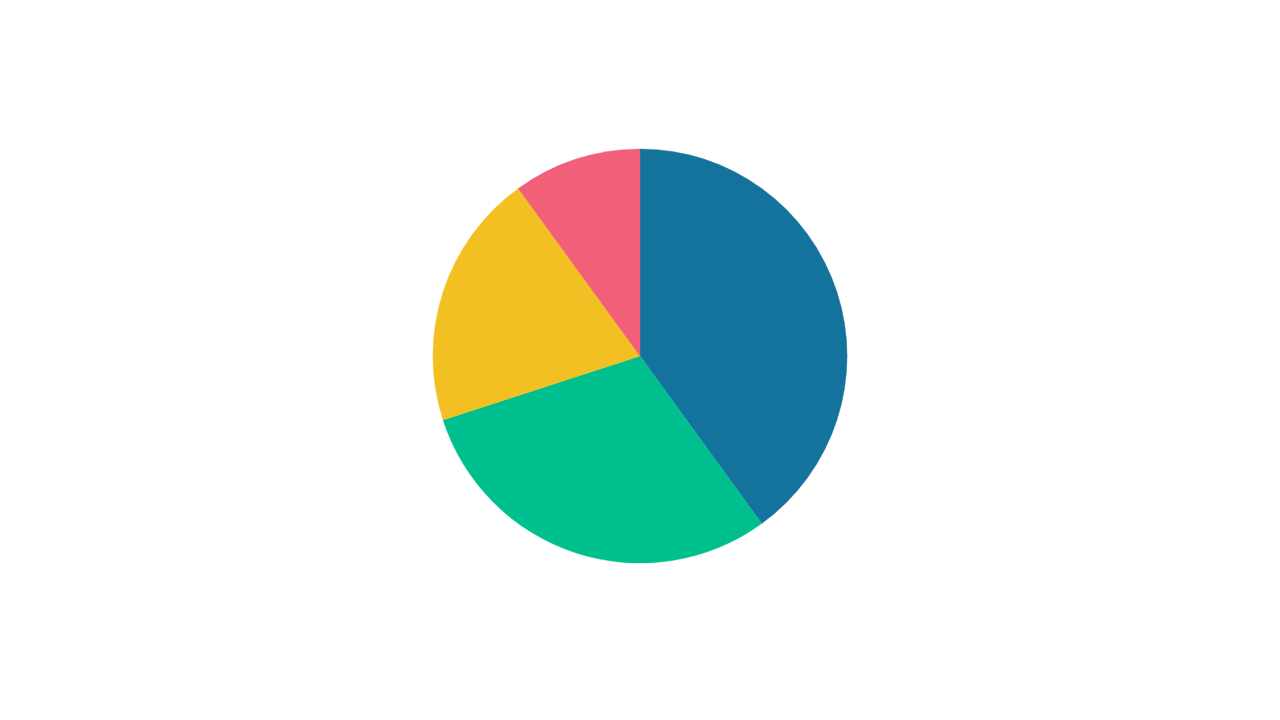
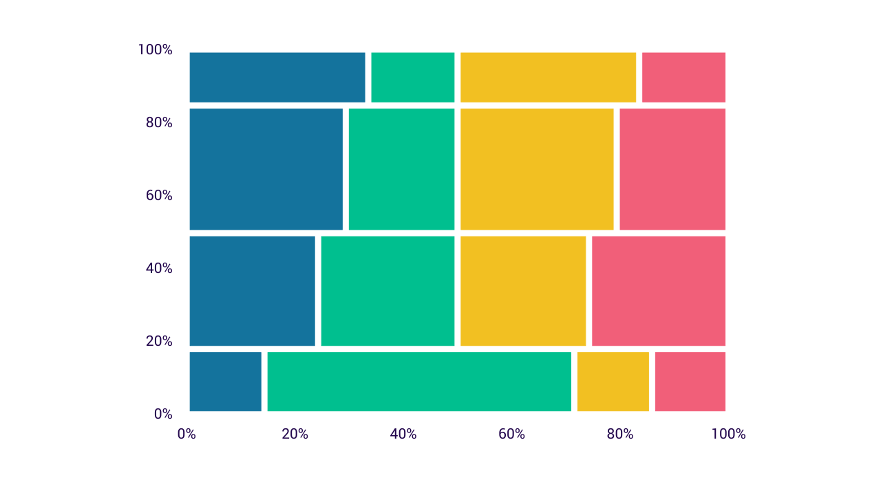
Part-to-whole
Part-to-whole charts show how partial elements add up to a total. The archetypal visualization in many business presentations is the pie chart. A pie chart is an important visualization because it is used by many people.
When proportions are specified according to multiple grouping variables, then marimekko charts, and treemaps are a good choice.
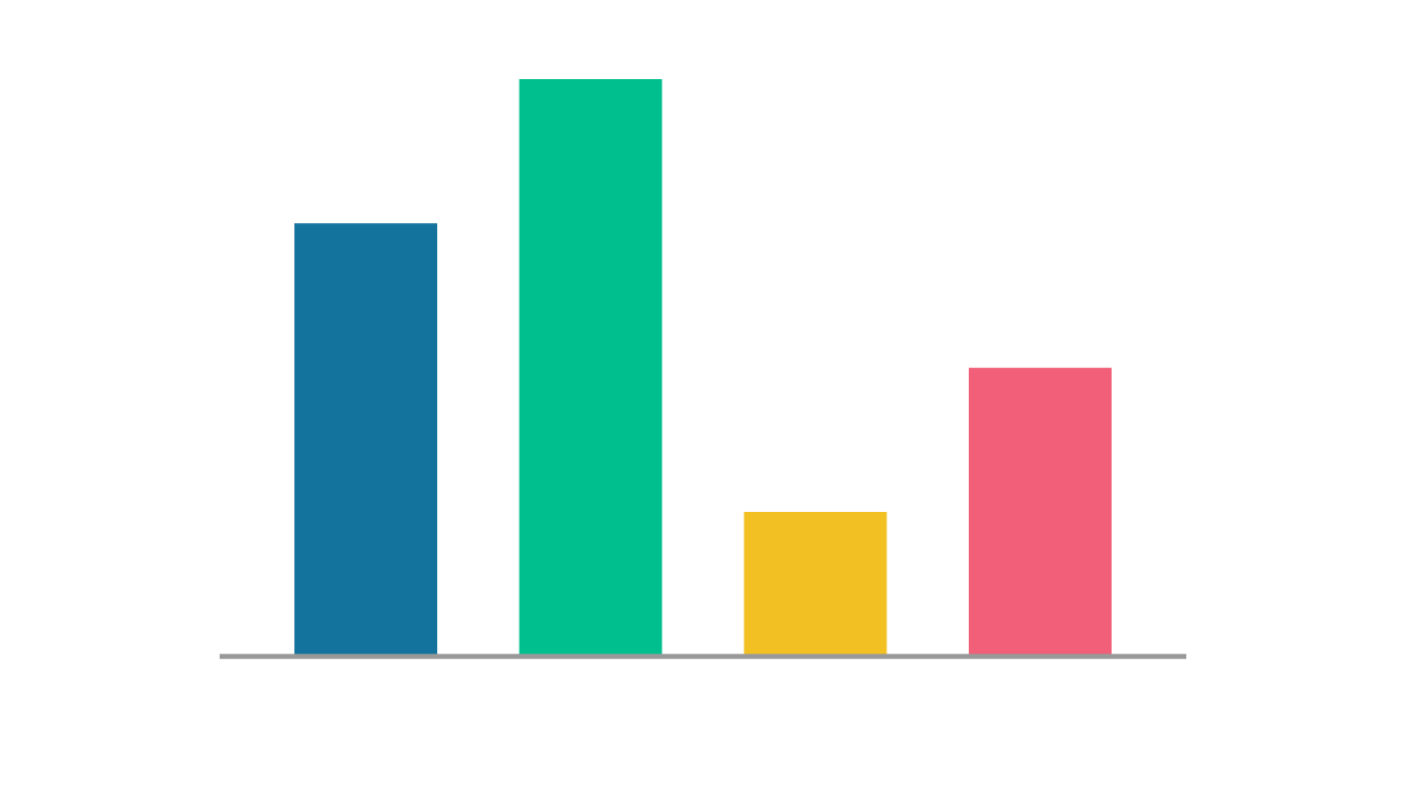
Visualize Amounts
The most common approach to visualizing amounts is using bars. Bars can be arranged either vertically or horizontally.
A radial bar chart is displayed in polar coordinates instead of Cartesian coordinates.
However, instead of using bars, we can also place dots at the location where the corresponding bar would end.
Group comparison
Category comparison charts compare data between multiple distinct categories.
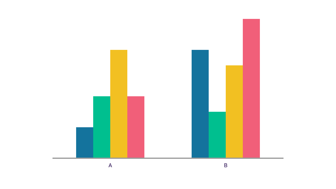
When you are interested in two or more categorical variables at the same time you can visualize this dataset with a grouped bar chart.
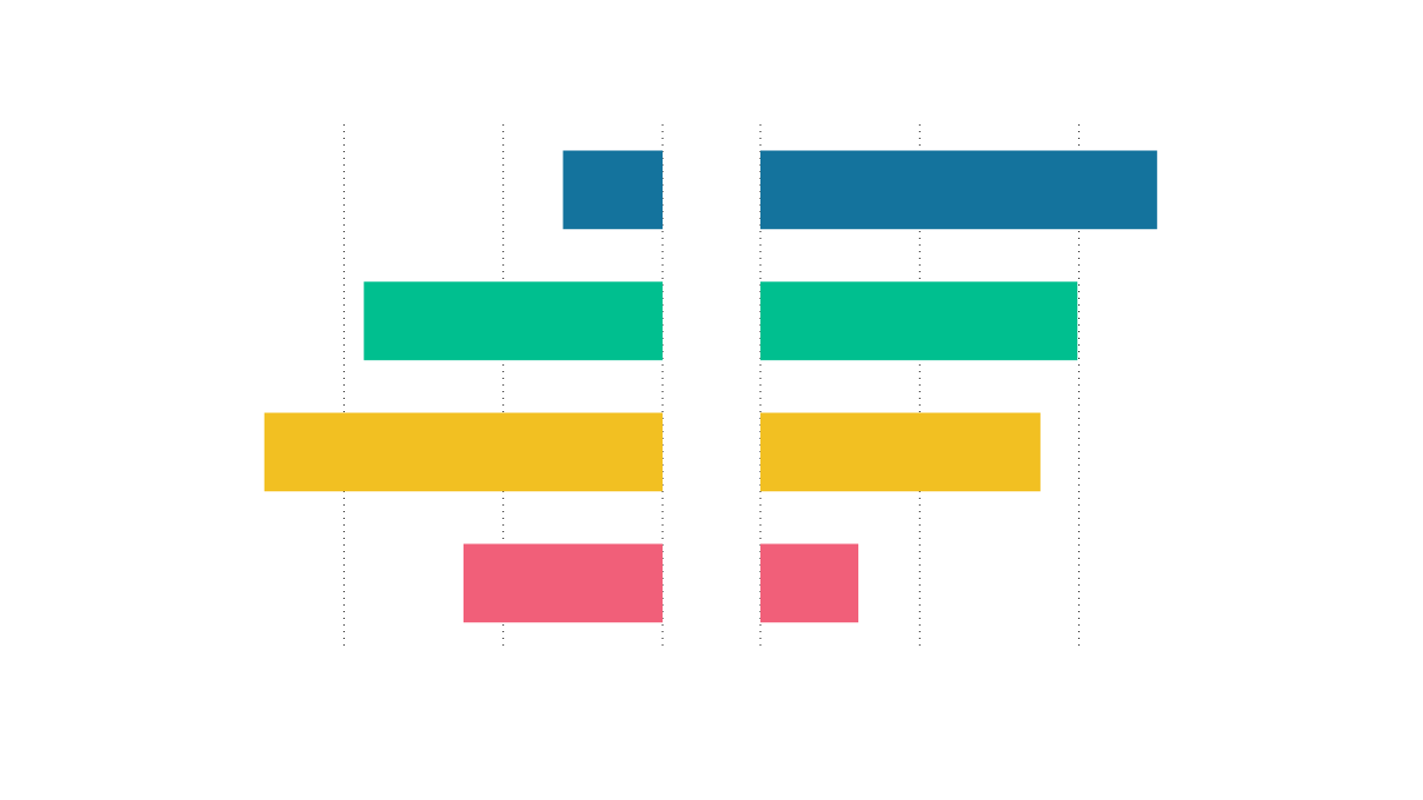
A butterfly chart is a type of bar chart used to compare two data sets with the same parameters and scale. The bars of the data sets are plotted opposite each other, resembling the butterfly wings.
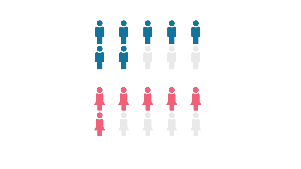
A more engaging overall view of small sets of discrete data can be visualized with a pictogram charts. They allow you to visualize and compare percentages, fractions or absolute numbers with using icons.
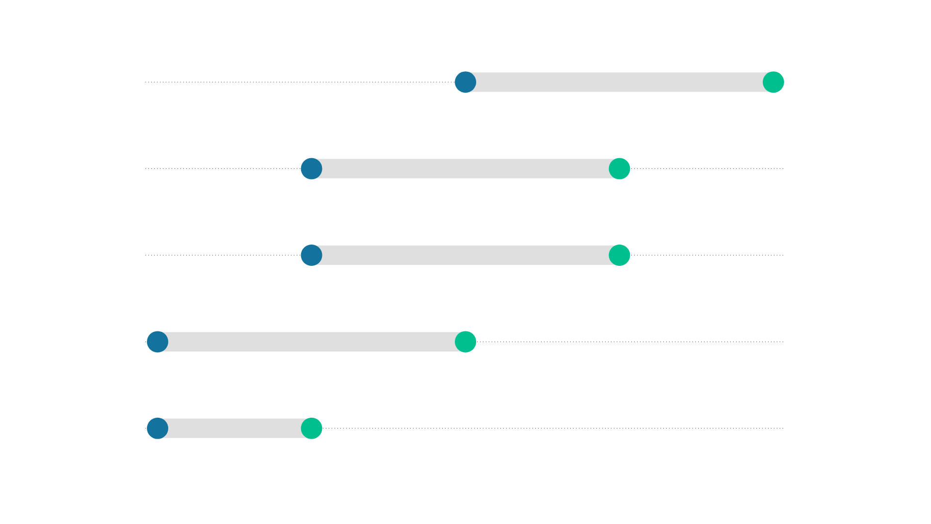
A range plot is a great visualization if you want to highlight the difference between two values rather than the values themselves. Typically, two dots are connected by a line to illustrate that difference.
x–y relationships
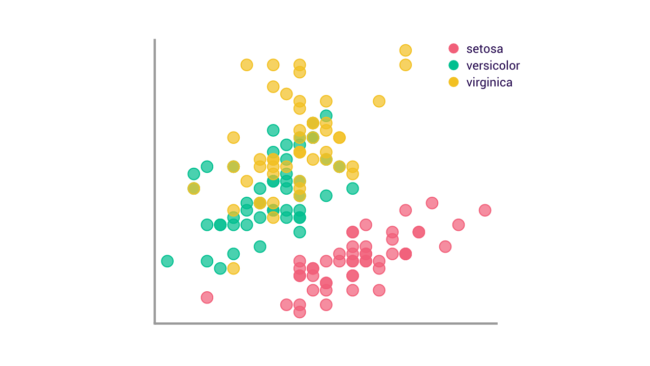
A scatter plot is the most common type of visualization when you want to show the relationship between two quantitative measurements. They show correlation between two variables.
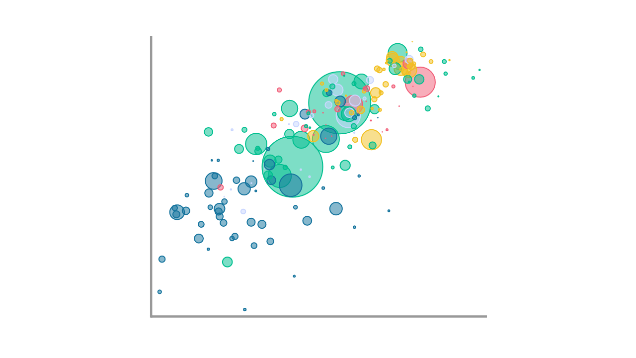
When you want to show more than two variables, you can further map these to the color or the size of the dots, in which case you speak of a bubble chart:
There are other types of visualizations to show the relationship between multiple quantitative variables. One that is not yet so often seen but very effective is the slopegraph:
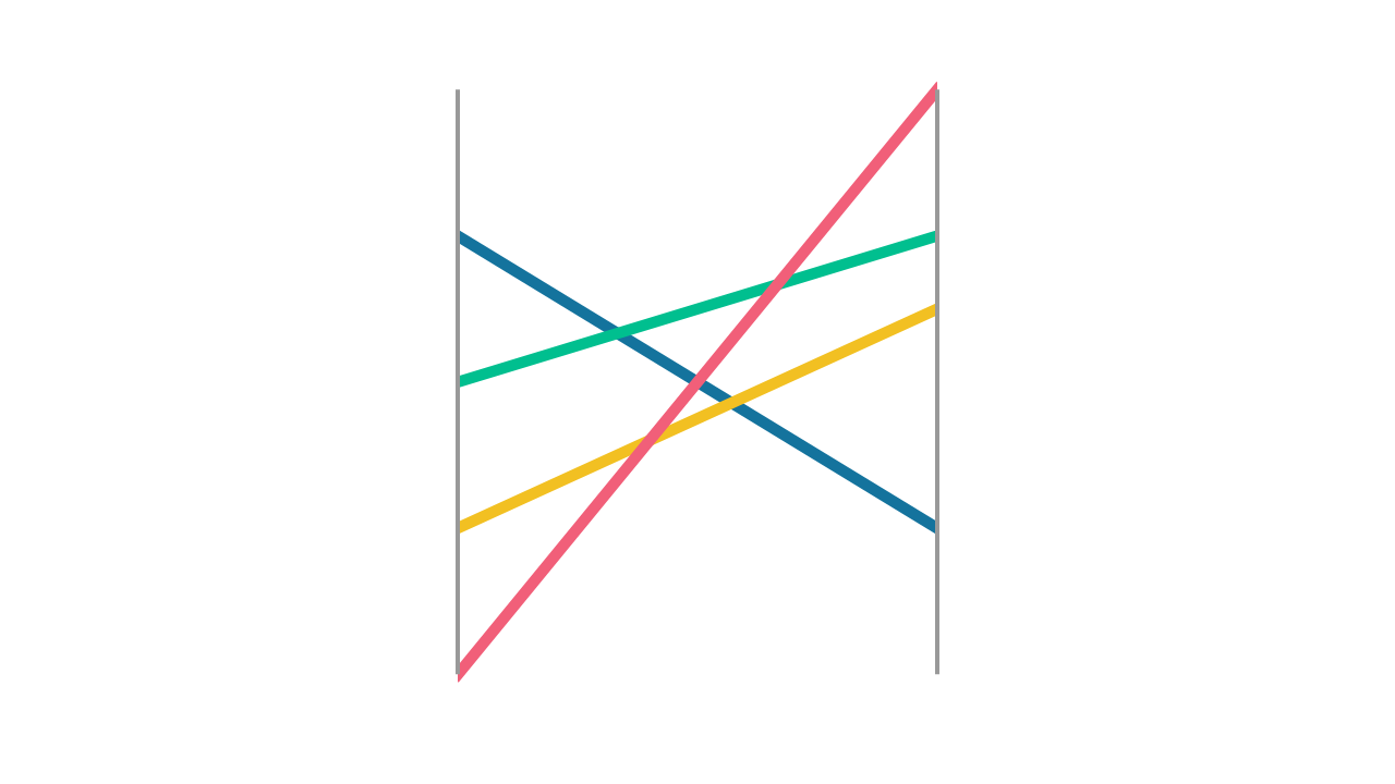
A slopegraph will help you to tell a story about change. It is an elegant visualization; highly regarded by data visualization experts because of its simplicity.