Chart Vizzard
Vizzlo's AI-based chart generatorHow to Make a Timeline in Excel for Office 365
This step-by-step Excel for Office 365 timeline tutorial explains how to create professional timelines using Microsoft’s popular spreadsheet tool. Excel does not offer a native way to create a timeline, but we can tweak a XY-plot to create a professional looking timeline.
Timelines list events in a chronological order on a horizontal timescale. Business professional use timelines to present project schedules to their clients as part of reports or presentation decks.
How to Make a Timeline
Besides the many build-in functions, you probably have used Microsoft Excel for Office 365 to create charts before. The one we are looking at in this tutorial is the scatter plot, or XY-chart. We will use the following data to first tweak of the scatter plot to imitate a lollipop chart. This requires a few steps of styling and adjustment but will get the job done for you.
However, setting up a project timeline does not have to be difficult. If you need to create and update a timeline for recurring communications to clients, it will be simpler and faster to use a free timeline generator that automates the entire process for you right inside a PowerPoint presentation. In this step-by-step tutorial we will teach you both approaches.
How to manually make a Timeline in Microsoft Excel
Set up your data in an Excel worksheet
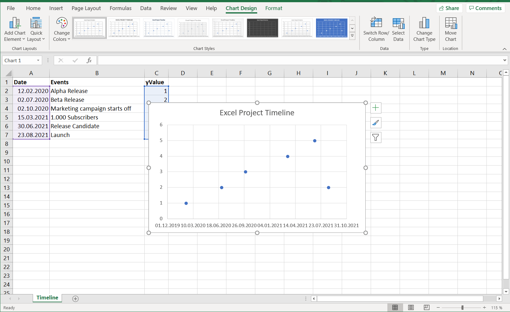
Like with any visualization before we can start thinking about the graphic representation we need some data. For this tutorial we will focus on this dummy data:
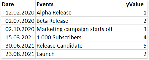
The data contains due dates, key events, and numbers in a third column. We will map column Dates to the horizontal axis and the key events of your project will be called Milestones, and they will be used to annotate the timeline. We will use the values in column yValue to arrange the milestones vertically so that they do not overlap when plotting them on your timeline template. These numbers are somewhat arbitrary. Try out different numbers to make the timeline look as you expect.
In this tutorial we will first create scatter plot, then turn it into a Lollipop chart and finally annotate it so it will turn into an Excel timeline.
Set up a Lollipop chart from Excel’s built-in Scatterplot
The message of a lollipop chart is basically the same as that of a bar chart. From the outside, they differ in that the end of a lollipop chart is represented by a point that is connected to the baseline by a segment. Think of it as a dot plot with only one point for each category, where the lines all reach to the x-axis.
The next four steps will create an empty canvas that we fill with dots, lines and text in later steps.
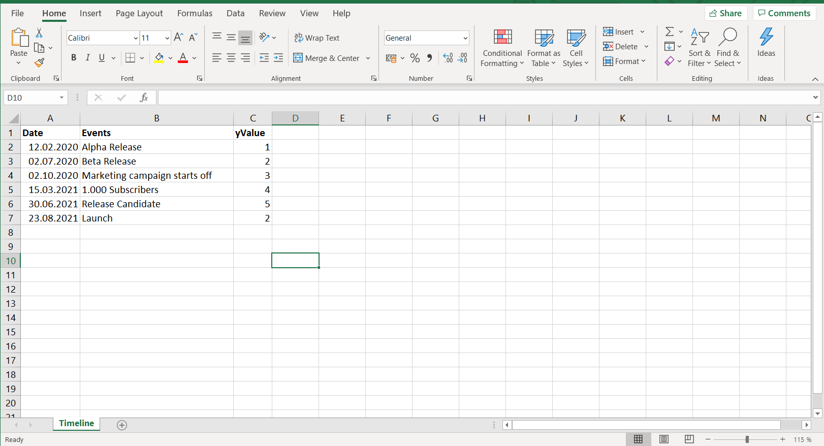
- From the Timeline worksheet in Excel click in any blank cell.
- From the Excel ribbon, click the Insert tab and navigate to the Charts section.
- In the Charts section open the Scatter/Bubble Chart menu.
- Select Scatter which will insert a blank white canvas onto your Excel worksheet.
Add Milestone data to your timeline
Now that we have created the basis for the Excel timeline, the next step is to add the data points that will make up your milestones.
-
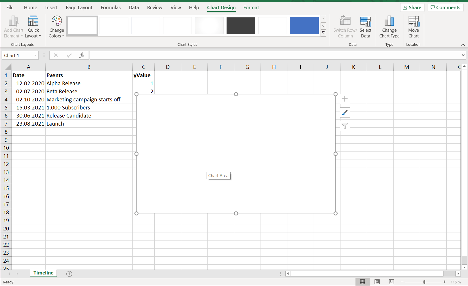
Right-click the blank canvas and click Select Data to bring up Excel’s Select Data Source window.
-
Now click on Add Data and select the columns
DatesandyValue. and On the left side of the Data Source window you will see a table named Legend Entries (Series). Click on the Add button to bring up the Edit Series dialog. Click in the input element Series X Values and then select columnDateswith your mouse. Do the same for Series Y Values but this time select columnyValue. Click OK and your graph will show a set of dots.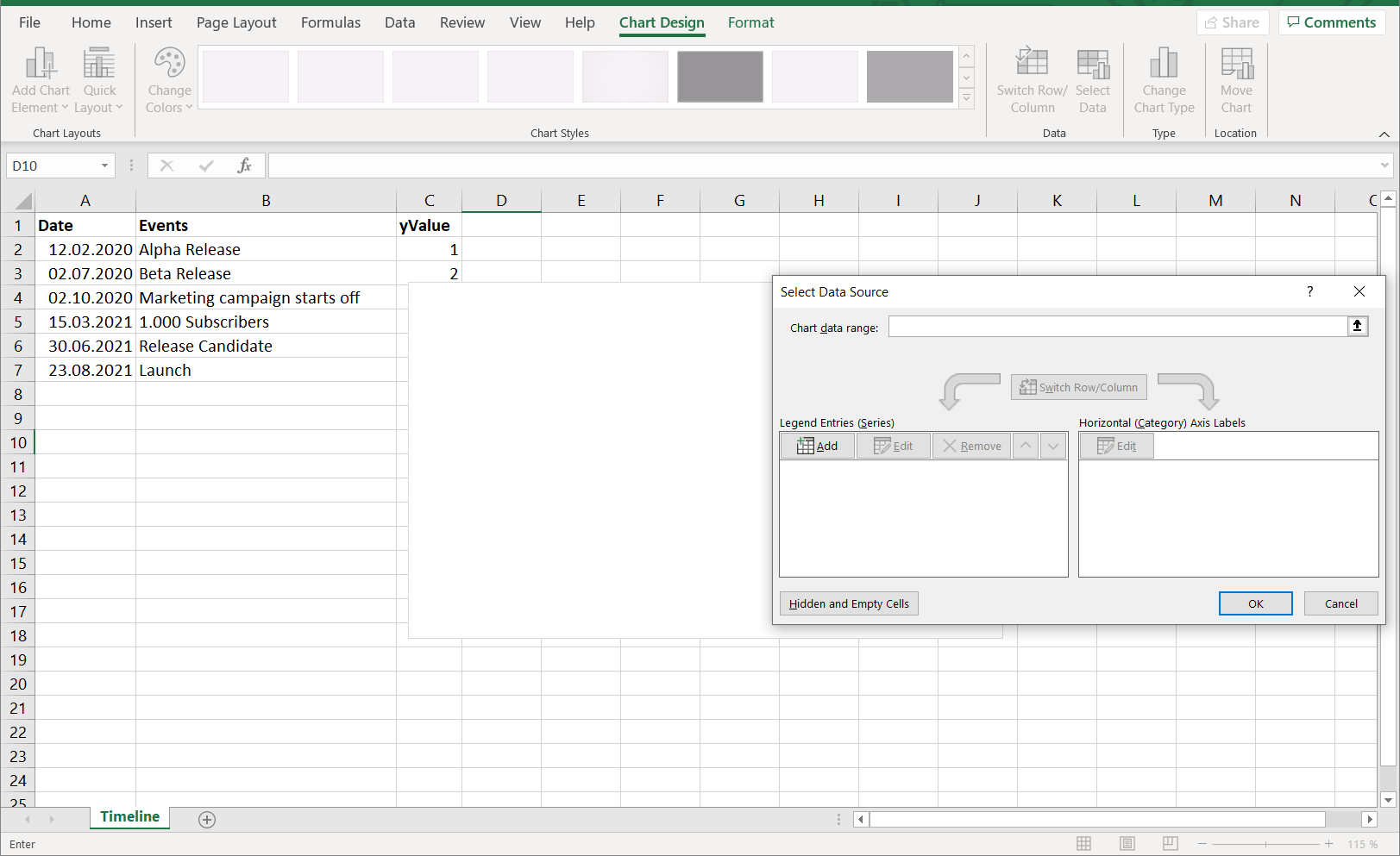
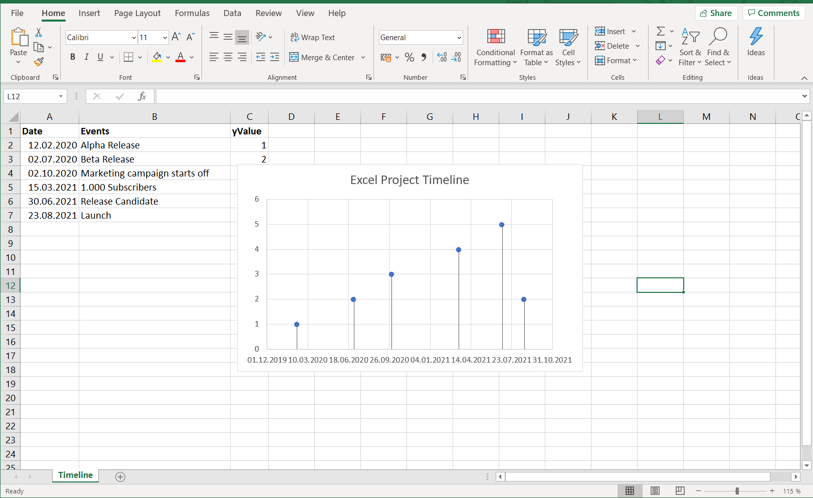
Turn your scatter plot into a lollipop chart
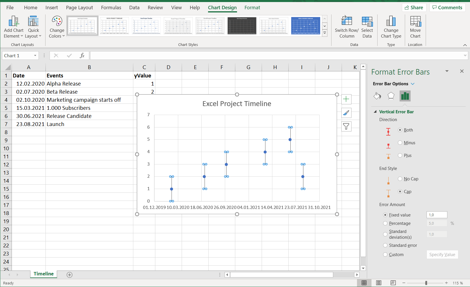
The next steps involve adding a line that connects each dot with a line starting at the x-axis. We are going to create these lines using error bars.
- Navigate to the Chart Tools > Design tab and click the button that says Add Chart Element.
- Click the dropdown arrow there, hover down to Error Bars, hover on it’s arrow to open another menu.
- Finally, click on More Error Bars Options.
The next step is to draw the error bars only on one side, so they connect the dots with the x-axis.
In the sidebar menu Format Error Bars under Vertical Error Bars > Direction, select the option Minus. Under Error Amount choose the option Percentage and type 100 into the number input.
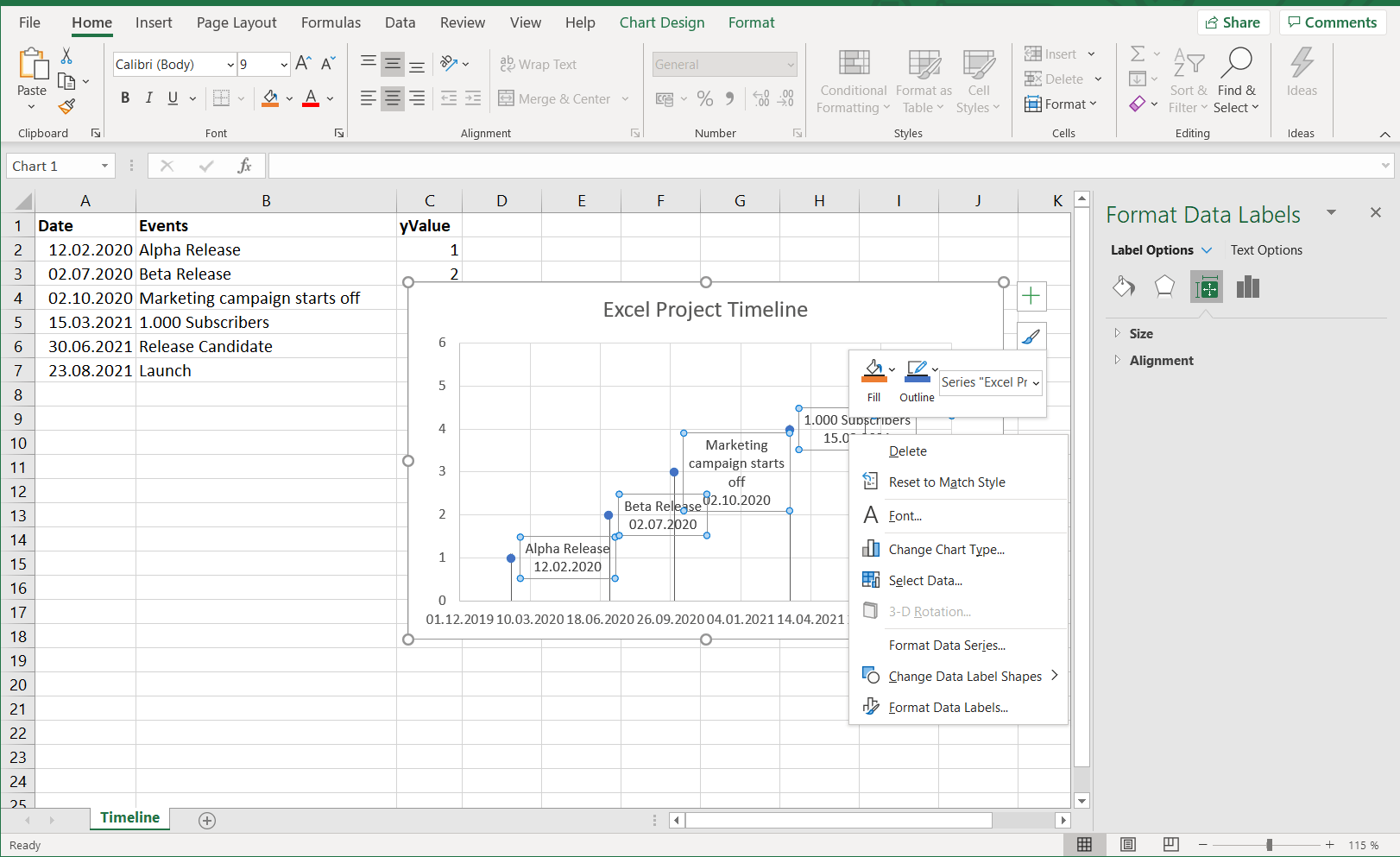
Add annotations to your timeline’s milestones
To add data labels next to the dots in your Excel timeline, you need to :
- Right-click on any data point.
- Select Format Data Labels (Note: you may have to add data labels first).
- Put a check mark in Values from Cells.
- Click on Select range and select your range of labels you want on the points.
There are many shapes available in which the text can be wrapped. To illustrate that feature, we choose to display the key events of your Excel project timeline in square speech bubbles:
How to make a timeline online automatically in Microsoft PowerPoint
Creating a timeline from scratch using Microsoft Excel for Office 365 is time-consuming. Nevertheless, depending on the time you spend on adjustment and styling, the final result will look professional. But the timeline you created using Microsoft Excel will still lack the flexibility to update easily to changes in your data. An online timeline generator like Vizzlo is well suited for the need for creating professional-looking timelines and graphics needed in business or project presentations.
We will show you how to automatically make a timeline using Vizzlo and customize or update it with a few clicks. To begin, open the timeline maker in your browser (https://vizzlo.com) and follow the steps below.