Chart Vizzard
Vizzlos KI-basierter Diagramm-GeneratorChanging Worlds: India's population in 1950 vs 2050
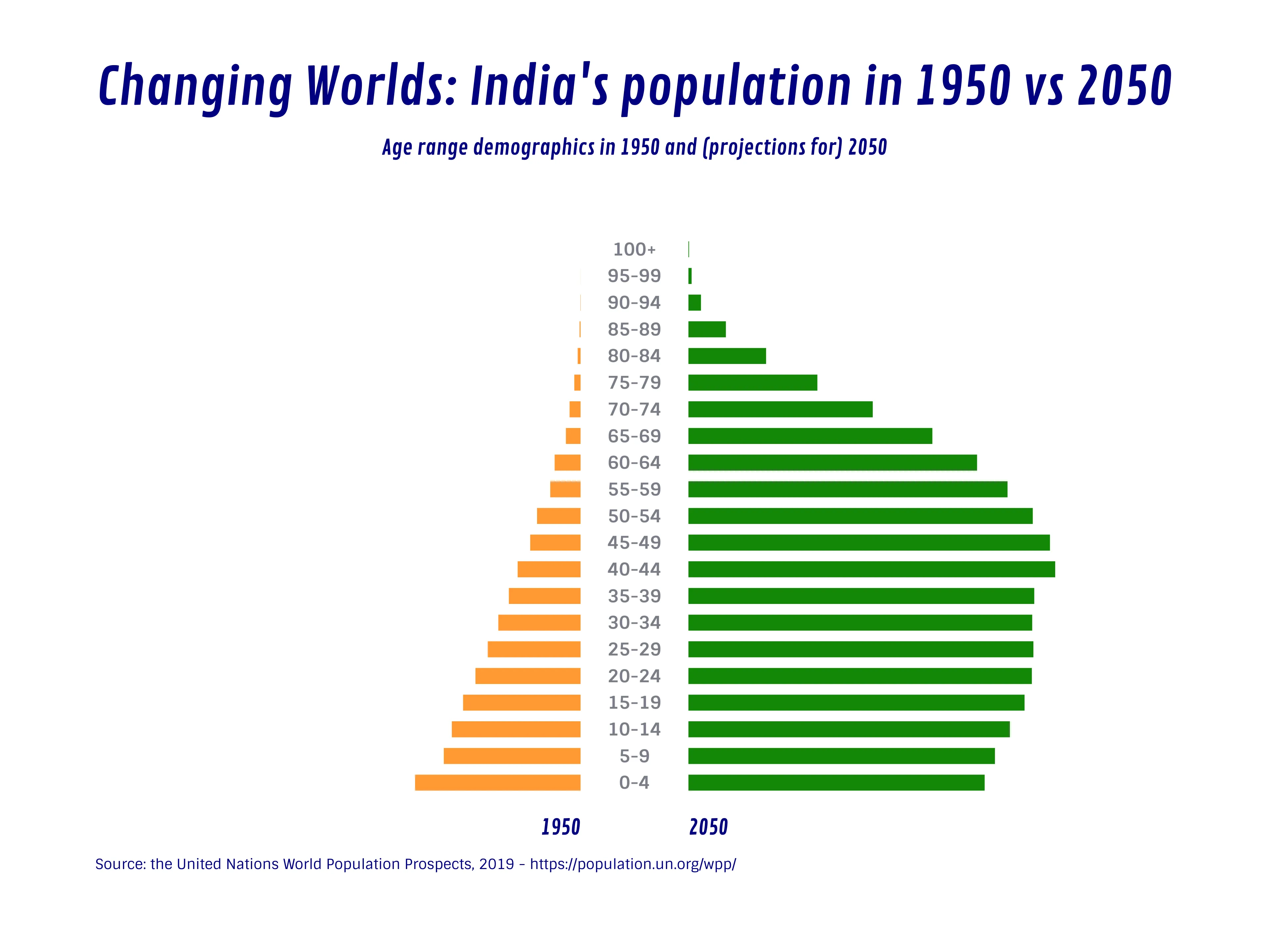
Part II of our Changing Worlds series.
With the global population forecast kicking off our series on population changes between 1950 and projections for 2050, today we start going through some of the worlds biggest economies and countries with drastic changes.
Speaking of drastic changes, today’s chart shows projections for India, one of (if not the top) country with the most drastic population increase in modern times.
While birth rates in India have lightly declined, death rates have reduced drastically since 1950, from over 27 per thousand populations in 1951-61 to 9.3 in 1993.
Other causes are early marriages, usually in teen years, female education and illiteracy which makes family planning a hard or often ignored task and general poverty leading to children being a big part of a family’s security net in case of sickness or old age.
Dies ist ein Beispiel für Vizzlos "Schmetterlingsdiagramm"
Erstellen Sie ein Schmetterlingsdiagramm, um zwei Datensätze nebeneinander zu vergleichen.