Chart Vizzard
Vizzlo's AI-based chart generatorChangelog
2026
Chart Editor
Data Viz
NEW
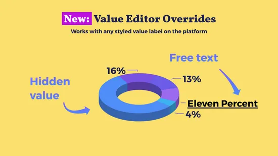
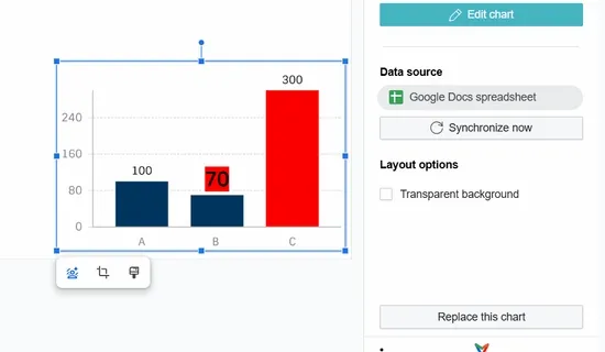
You can now hide individual value text elements or override their text directly in the editor, giving you finer control over what each value displays.
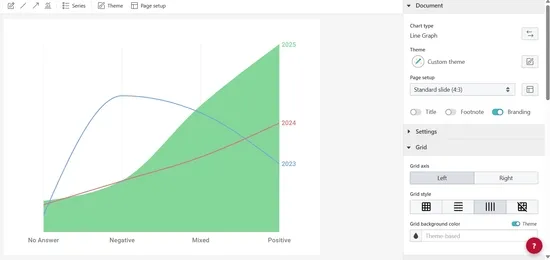
The line graph now supports the integrated legend, placing each series’ label directly next to its line instead of in a separate legend box.
Data-Sync
Bug Fixes
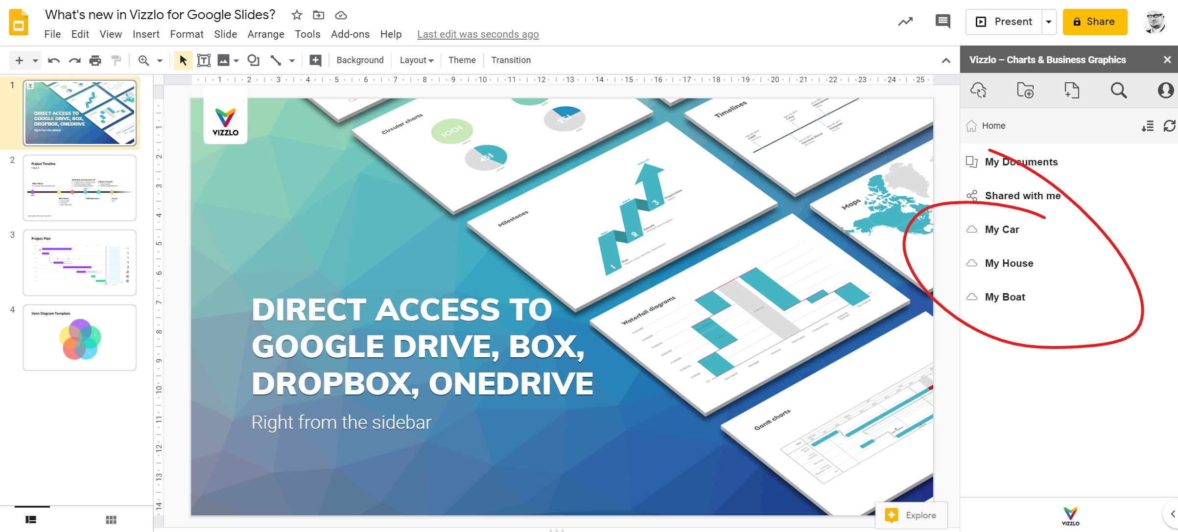
Fixed data sync for Excel and CSV files stored on Google Drive.
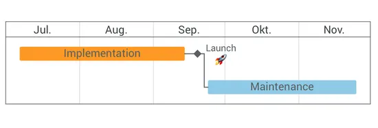
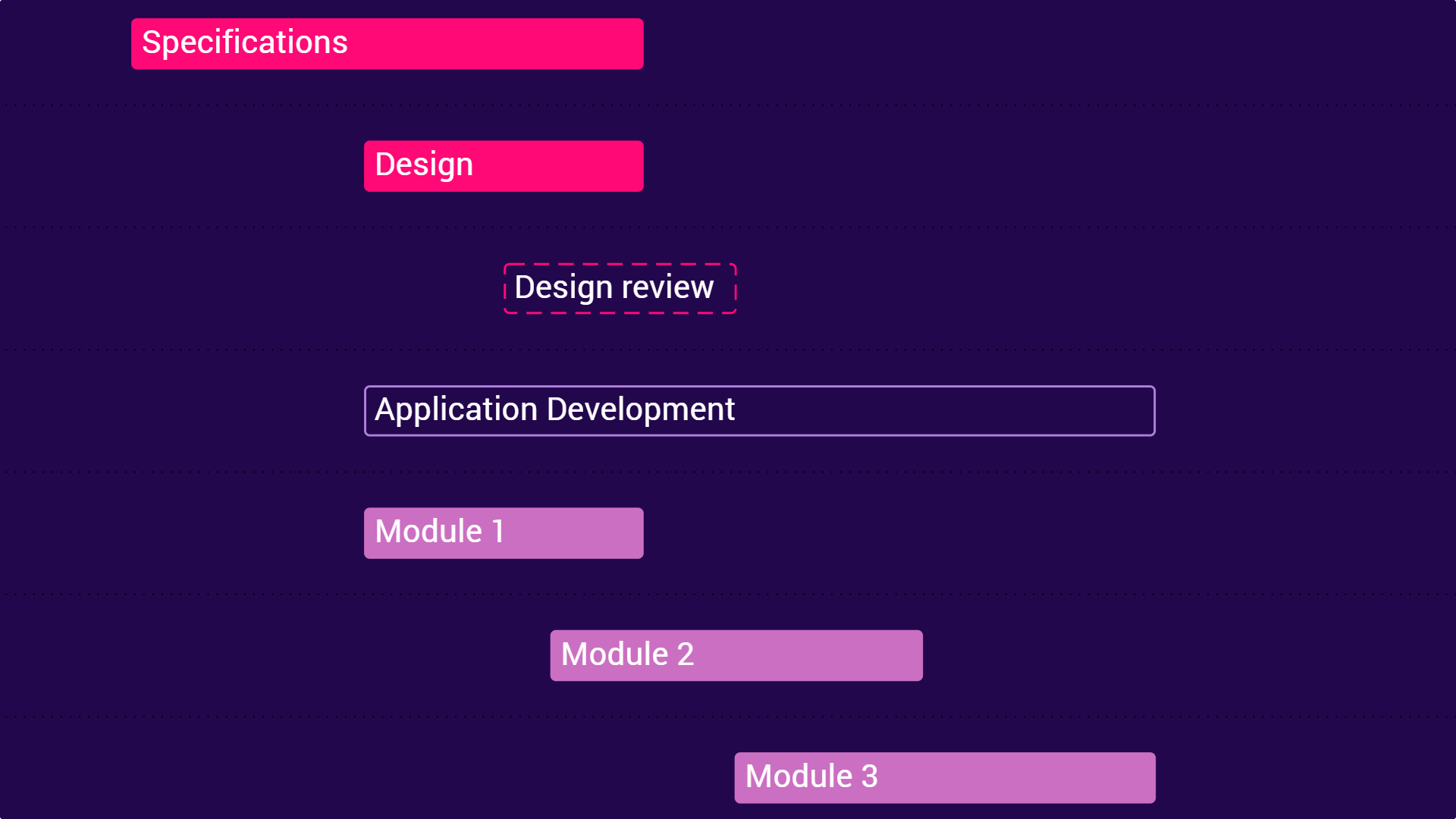
Gantt Chart
Data-Sync
Bug Fixes
Fixed a Gantt chart issue where syncing could wrongly link elements or create duplicate element IDs.
Data-Sync
Google Slides Add-on
Data sync now automatically retries after temporary server errors, making your syncs more reliable.
Data Viz
NEW
You can now style your charts with gradient fills and rounded corners for a more polished, modern look.
A new theme—“Aurora”—showcases these features with a vibrant color palette and smooth gradients.
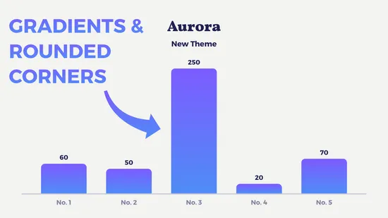
Chart Editor
Annotations
Bug Fixes
Improved image annotations: images now drop at the correct position, SVGs can be added more reliably, and a new size limit keeps your charts performant.
Chart Editor
Bug Fixes
Fixed a bug that prevented data input into new lines of the spreadsheet.
Gantt Chart
Bug Fixes
Fixed data sync updates not working properly for predecessor columns.
Chart Editor
NEW
Introducing image annotations! Add any image from your computer to your chart via a new button in the horizontal toolbar.
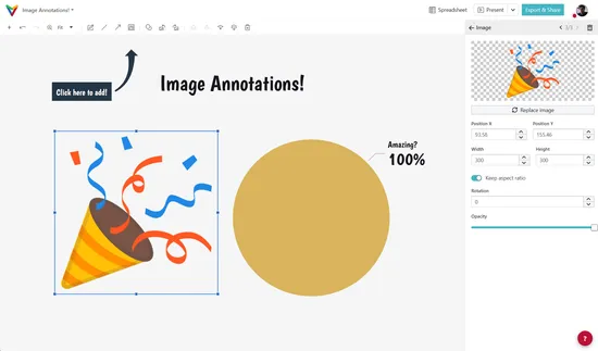
Chart Editor
Chart elements can now also be added via the right-click context-menu.
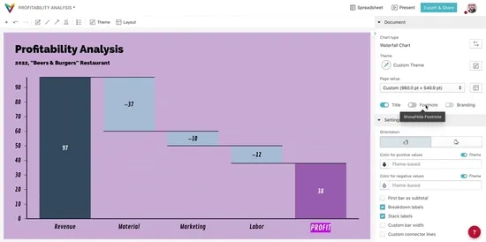
Platform
NEW
There are now two new color fields in the theme editor for positive and negative colors that are then used by default for chart types with a dual color mode (for example the Waterfall Chart).
NEW
The orientation of the line graph can now be switched.
Gantt Chart
Bug Fixes
When rescheduling, dependencies that are connecting segments to a milestone will place the milestone at the segment’s end date.
Fixed removing a dependency affecting the project date range in some cases.
Fixed dependency line style not being applied for connections in the same activity.
Added multiple quality of life changes.
- When changing zoom via the sidebar slider, the map now stays centered on the current viewport center
- Country selection now feels snappier
- The currently hovered country is now highlighted by a slight color offset
Gantt Chart
Bug Fixes
Spreadsheet editing is more stable now.
Fixed being unable to reposition activities in some cases.
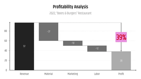
Waterfall Chart
Bug Fixes
Editing values on the canvas now works properly.
Pie Chart
Bug Fixes
Fixed selection frames for slices being displayed with an offset.
Data-Sync
NEW
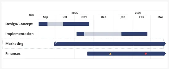
Added Smartsheet data-sync support. Links to Smartsheet projects can easily be dropped into the Connect dialog like any regular Google Drive spreadsheets. They will then automatically be prepared to be in a spreadsheet format which works with the Gantt chart.
NEW
Improved map resolution and added 65 more countries and territories including Singapore, Andorra & Liechtenstein.
Chart Editor
All axes are now clickable to show the settings in the sidebar.
Segment tooltip positioning improved for complex documents.
Gantt Chart
Bug Fixes
Fixed opening the spreadsheet causing the editor to freeze.
Chart Editor
Bug Fixes
Fixed the external screen cast disconnecting in some cases.
Chart Editor
Bug Fixes
Fixed the external screen cast sessions disconnecting after 24 hours.
Gantt Chart
Bug Fixes
Further performance improvements for complex documents.
Fixed dependency handles not showing post milestone repositioning.
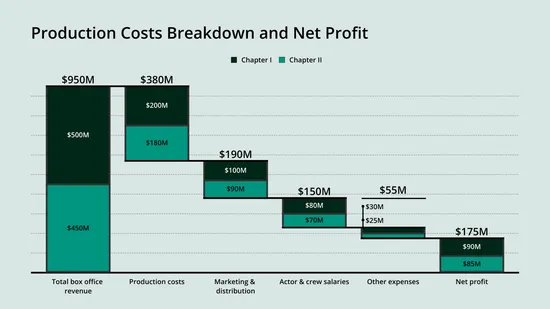
Added a stacked waterfall chart template chart type to the portfolio.
Series data points are now placed at interval center per default.
Segment and milestone style now persist per activity on spreadsheet updates.
Chart Editor
Bug Fixes
Fixed importing semicolon CSV and TSV files.
Improved performance for complex documents.
Gantt Chart
Bug Fixes
Fixed dates getting offset by one day for imported data in some regions.
Bubble Chart
Bug Fixes
Fixed spreadsheet editing.
Gantt Chart
User Experience
Improved the dependency creation handles that are shown when selecting a segment.
Gantt Chart
Bug Fixes
Fixed the spreadsheet freezing when a segment has no start date.
Fixed dragging multiple segments horizontally.
Chart Editor
NEW
Cast Vizzlo charts to Smart TVs and other external displays right from the editor and keep them updating live on their own!
Learn more in our latest blog post!
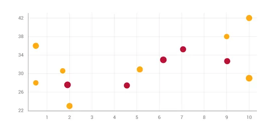
NEW
Visualize correlations, patterns and trends with the new scatter plot chart type!
Added a context menu option to select all milestones or segments.
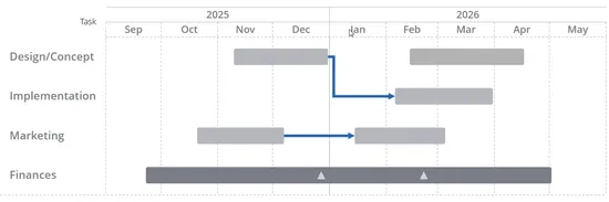
Added a predecessor column to the spreadsheet that describes the dependency relationship between tasks.
Added a duration input to the selected segment sidebar.
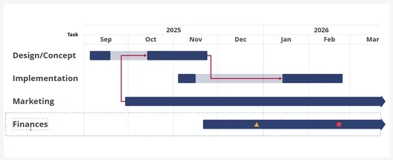
Dependency lines are now also displayed when connected to a segment that is part of a collapsed activity group.
Dependency references now still show while moving a segment across activities.
Bubble Chart
Bug Fixes
Drag and drop for bubbles now works properly again.
Google Slides Add-on
Bug Fixes
Fixed drag handles being displayed much larger than they should.
FS dependencies now appear in a cleaner L-shape when their lag is zero days.
Fixed inner value label display for pie charts in 3D mode.
Platform
Bug Fixes
Document search will now correctly search by file name instead of document title.
NEW
Create visualizations of timelines with the new icon timeline chart type!
Chart Editor
Bug Fixes
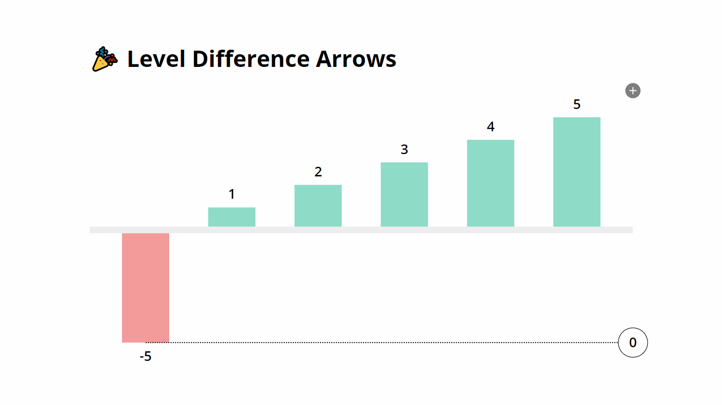
Editing the value format of multiple top arrows or level difference arrows is now working properly again.
Gantt Chart
Bug Fixes
Fixed a bug causing issues when deleting the relative axis anchor milestone.
NEW
Gantt chart projects can now be rescheduled via an added button in the toolbar. Clicking the button sets the lead/lag for all unlocked dependencies to 0.
Dependency lines are now properly drawn underneath group indicator brackets.
Fixed date label positioning for segments with empty label text box.
Fixed axis values sometimes drawn over axis borders.
Data-Sync
Bug Fixes
Fixed worksheet selection input not showing all available worksheets when re-opening the spreadsheet.
Fixed spreadsheet data-sync sidebar settings not working when re-opening the spreadsheet.
NEW
Gantt chart dependencies can now be locked. Locked dependencies preserve their delay when segments or milestones are moved or resized. Any change within a locked dependency chain propagates to all connected elements.
Segment labels can now also be positioned above or below the segment.
Data-Sync
Bug Fixes
Fixed updating chart data from a worksheet that has been renamed since the last update.
Platform
Bug Fixes
Fixed creating new charts from the editor of a document that is located in a teams folder.
Line Graph
Bug Fixes
Fixed the symbol size slider glitching.
Now supports custom document sizes and custom text style formatting.
2025
Values can now be displayed inside the bars of bar charts.
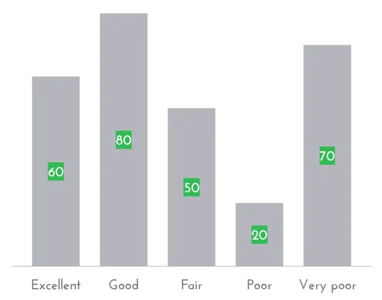
Chart Editor
Individual character styling is now also possible for document titles.
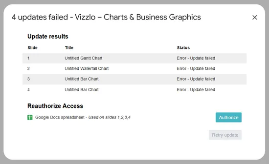
Added a button to reauthorize access to connected Google Sheets to the update report. This makes it easier to resolve issues when updating charts used in Google Slides.
Gantt Chart
Bug Fixes
Milestone label and date now appear in the correct order when displayed in top position.
All data point settings are now shown by default.
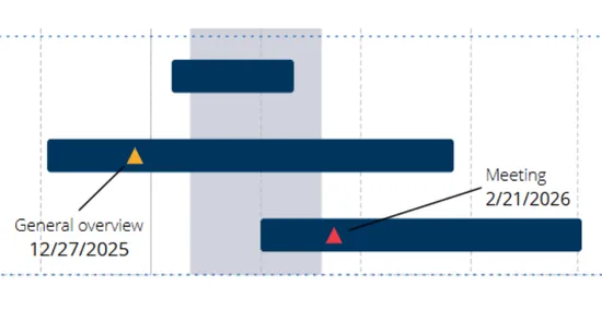
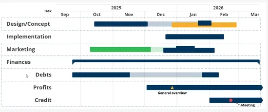
NEW
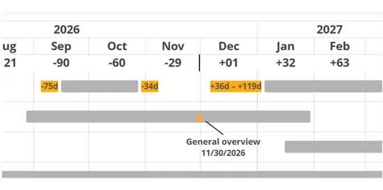
Projects can now be shown on a relative timeline that counts down to a chosen milestone. The milestone anchor is selectable via the new “Relative axis anchor” option in the sidebar or the right-click menu.
NEW
Segments are now displayed as overlayed when overlapping in time. Sorting can be done via the right click context menu.
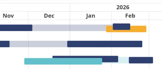
NEW
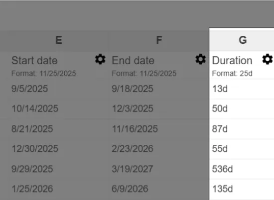
The Gantt Chart now has a new column in the spreadsheet that displays the duration for each task. Set a start date and a duration and the spreadsheet will set the end date automatically. The duration is also shown in the tooltip that gets displayed when a segment is selected.
The label of a milestone is now displaying a connector line when moved away a certain distance.
It’s now possible to select and move multiple activity rows at once.
Google Slides Add-on
Bug Fixes
Inserted existing charts will now be placed onto the correct slide again.
User Experience
Sidebar text input content now appears uniform in size and color.
Dependencies can now be linked to split segments independently.
It’s now also possible to display the date label of inline milestones in addition to the title.
Milestones of grouped activities are now shown in the line of a collapsed group.
The tooltip showing the dates of the time range of segments now also appear while resizing a segment.
Data-Sync
Automated updates are now disabled by default when establishing a new connection to an external data source.
Project Phase Chart
Bug Fixes
Fixed drag and drop for stages not working.
Bug Fixes
Switching chart type via the chart conversion dialog now works properly again.
Time Series Graph
Bug Fixes
Fixed date inputs for shades showing N/A.
Enterprise
Security
NEW
Enterprise admins can now strictly disable public sharing across their workspace. When enabled, this setting:
- Prevents making org-owned documents public
- Applies to managed user accounts as well (managed users cannot make their personal documents public)
- Disables creation of link-based sharing (inviting named users via email is still possible)
- Blocks embedding for documents covered by the policy
You can toggle this in Organization → Settings → Security under “Limiting public sharing”.
The date labels of global milestones and shades now support custom value formatting.
NEW
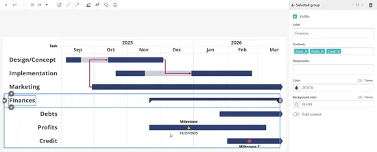
Groups can now be selectively hidden on the chart by using a new checkbox in the sidebar or the groups dialog.
NEW
Segment labels can now be placed outside of the group via a new button group in the sidebar.
Dependency lines now end with arrowheads by default.
Google Slides Add-on
Bug Fixes
Fixed charts resizing incorrectly after being updated.
Google Slides Add-on
Bug Fixes
Fixed “Update all” getting stuck in an endless loop.
Chart Editor
Data Input
NEW
Added a lot of new keyboard shortcuts:
Basics
Ctrl/Cmd+J: Save & close spreadsheet
Movement
Ctrl/Cmd-Arrow Keys: Move to the beginning/end of the current block of data or the whole sheetCtrl-Home: Move to the A1 cellCtrl-End: Move to the last used row in the last used column (even if the cell itself is empty)
Selection
Ctrl+Space: Select entire column(s) based on currently selected cellsShift+Space: Select entire row(s) based on currently selected cellsCtrl+Shift+8(Windows) orCmd+Shift+*(Mac): Select entire current block of data or the whole sheetCtrl/Cmd-Shift-Arrow Keys: Extend/shrink selection to the beginning/end of the current block of data or the whole sheetShift-Hometo extend the selection to the first columnCtrl-Shift-Home: Extend selection to the A1 cellCtrl-Shift-End: Extend selection to the last used row in the last used column (even if the cell itself is empty)
Adding & removing entire rows or columns
Ctrl+Shift++(Windows)/Cmd+Shift+=(Mac): Insert one or multiple columns/rows before the current one (based on number of cols/rows selected; only if entire cols/rows selected)Ctrl+-: Delete selected columns/rows (only if entire cols/rows selected)
Filling the selection
Ctrl/Cmd+D: Fill down with the content of the first cellCtrl/Cmd+R: Fill right with the content of the first cellCtrl/Cmd+Return: Fill the whole selected range with the content of the first cell
Google Slides Add-on
Bug Fixes
Updating linked charts now works properly again.
Gantt Chart
Bug Fixes
Moving activities from one group to another via the context menu now works correctly.
The milestone limit has been removed, allowing you to add as many milestones as needed.
Chart Editor
Bug Fixes
Fixed color picker glitching issue that occurred when the title was too long.
Google Slides Add-on
Bug Fixes
Fixed images getting cropped when resizing charts multiple times in Google Slides.
Platform
Fixed user experience when setting up cloud storage providers for improved integration reliability.
In case of an error when updating a chart that is connected to a spreadsheet from Google Drive, the sidebar will trigger the Google file picker to request access again.
Bar Chart
Bug Fixes
Top arrows now respect sum value positioning again.
Data-Sync
If there’s an issue accessing a connected Google Drive spreadsheet when updating a chart, the spreadsheet now prompts the Google file picker to request access to the file.
Line Graph
Bug Fixes
Fixed an issue where top arrows would clash with value labels in some cases.
Reworked as more interactive and to support custom page setups seamlessly.
Google Slides Add-on
Bug Fixes
Resolved a problem with the sidebar not clearing the panel properly.
Data-Sync
We made it easier to grant access to individual files even if your IT team did not configure full read-only access to Google Drive. No need to search manually in Google Picker. Just paste the URL and we’ll automatically pre-filter to the correct file.
It is now possible to seamlessly switch between grouped and stacked series—no need to convert into a different chart type anymore.
Google Slides Add-on
User Experience
Newly created charts in Google Slides are now directly added to the current slide, without the need to initially save them using the Vizzlo editor. This change streamlines the chart creation process, allowing users to quickly add and position charts within their presentations.
NEW
Introducing the Photobooth plugin! 📸
Capture photos of yourself or your team directly within Vizzlo and seamlessly add them to your presentations.
Data-Sync
Enterprise
Enterprise users can now grant Vizzlo broader, read-only access to their Google Sheets data sources, allowing easier collaboration across teams. This feature is particularly useful for organizations that need to share data sources which are already stored in shared folders or with specific users.
Google Slides Add-on
Security
At Vizzlo, we believe exceptional chart creation shouldn’t come at the expense of your privacy, which is why we continuously work to minimize the permissions our tools require.
Through collaboration with Google, we were able to redesign the way our extension operates, moving from broader set of permissions to a more precise, presentation-specific approach:
Starting today, Vizzlo for Google Slides only requests access to presentations where you actively choose to open our sidebar.
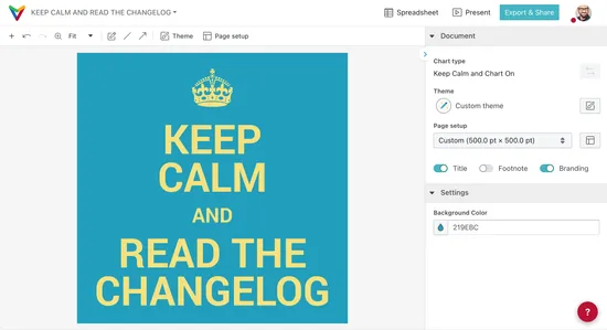
The “Keep Calm and Chart On” plugin got a bit of a refresh! 🎉
It now supports custom document sizes and a bit more interactivity.
Platform
Security
NEW
Free accounts now support creating private documents, too. Learn more about this change in our latest blog post:
Privacy by default: Why we’re making every chart private (yes, even free ones)
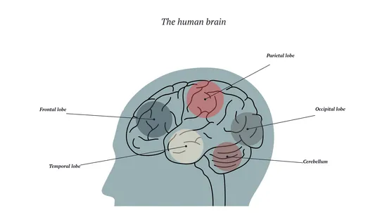
The brain chart got a full rework. The visualization now shows the position in the human head and allows changing through different page setups.
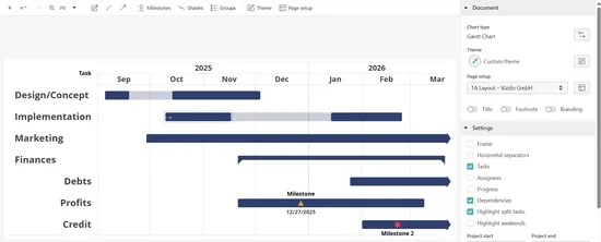
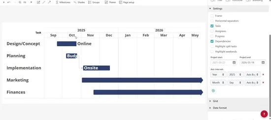
We added several new ways to format axes in the Gantt chart. These format options can be accessed via a new dropdown input in the settings.
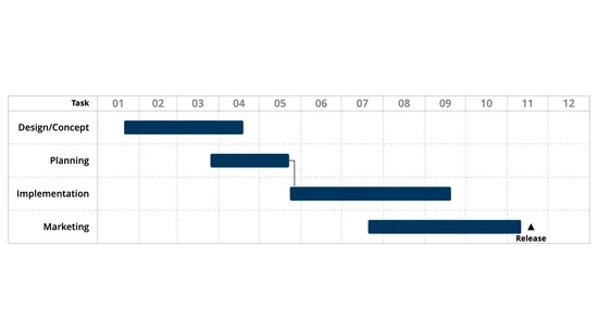
Chart Editor
Duplicating elements now also works via keyboard shortcuts. Simply select an element and use CTRL-D on Windows or ⌘D on a Mac to duplicate.
Grouped Bar Chart
Bug Fixes
Showing or hiding values for individual series now works properly again.
Chart Editor
Hover indicators for line series now scale together with the chart size.
Google Slides Add-on
Bug Fixes
Updating charts connected to external data sources with multiple worksheets now works properly again.
Data-Sync
Opening the spreadsheet no longer downloads external data source updates automatically.
Platform
The watermark for free accounts is now using a lighter visual.
Google Slides Add-on
Bug Fixes
Fixed a bug which caused some embedded charts to break when updating them from the Google Slides sidebar.
You can now configure the handling of gaps in the data. The default is to show a break in the line, but you can also choose to fill the gap with a solid color or a shaded color.
Now supports individual value styling.
Chart Editor
When using custom font sizes in text boxes, like chart element labels, the line height is now automatically adjusted to match the font sizes---even when multiple different font sizes are used on the same line.
Data Viz
Bullet size and paddings around the legend now scale with the legend font size.
Chart Editor
When exporting a PNG file, the downloaded file’s name will now match the filename set in the editor.
Value labels in the line graph can now be repositioned via drag & drop. They can be brought back to their original position via the right-click context menu.
User Experience
The theme editor preview now shows the legend at the position specified in the theme regardless of overrides in the current document.
Bug Fixes
The font size of text entered in text inputs in the sidebar or the spreadsheet no longer adjusts together with the font size on the chart.
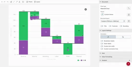
The waterfall chart has a new build direction setting that enables the creation of build-down waterfall charts. This variant of the regular waterfall chart adds up items from right to left to a total on the left side of the chart. The build-down waterfall chart can also be created right from the create new chart dialog.
The warning sign chart type can now be displayed with various page setups which makes it suitable to use in Google Slides at any size.
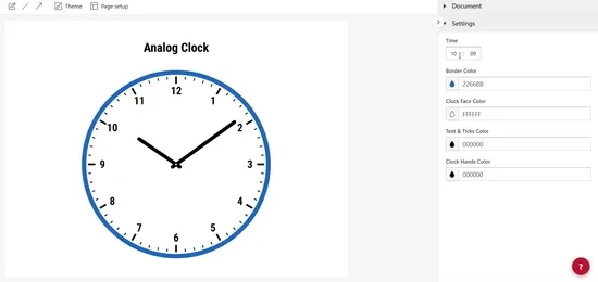
The analog clock chart type can now be displayed with various page setups which makes it suitable to use in Google Slides at any size. In addition to that there is now an animation playing in the chart editor everytime the clock’s time get set.
NEW
Create QR codes for any link and add them to your presentations.
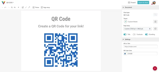
Chart Editor
Overlay arrows can now be positioned from any record to another via drag and drop.
It is now possible to easily mix and match between line, area, stacked area and 100% stacked area series.
Platform
It is now possible to set an upper limit to automatic seat count updates for organization admins.
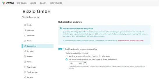
Chart Editor
It is now possible to zoom in and out using Ctrl + Scroll Wheel, pinch gestures on trackpads, or Ctrl + Plus/Minus keys for improved navigation and precision. On a Mac zooming is accessible via Cmd + Scroll Wheel, pinch gestures on trackpads, or Cmd + Plus/Minus keys. The view can be moved via Scroll Wheel click and drag, trackpad gestures, or the scroll bars.
Platform
Organizations can now enable automatic seat count updates to have the seat count adjust automatically when adding new users. This setting can be found in the organization subscription settings.
Platform
Google Slides Add-on
Data-sync updates now preserve per record customizations. This means that it is now possible to highlight key values in charts on Google Slides and have that highlighting persist data-sync updates.
A single click on a bar now selects the series and shows the series settings in the sidebar. Individual bar colors can be set by using a right-click on a bar and choosing the option “Change individual bar color” in the context menu.
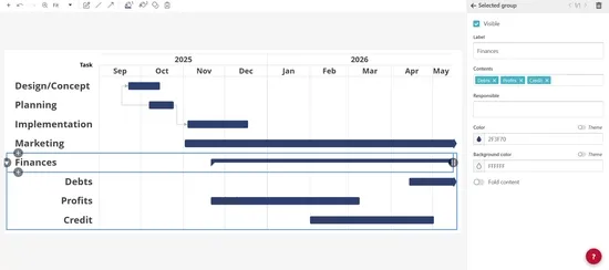
Activities and groups now have a new setting for customizing the background color.
The labels for inline milestones can now be moved to preset positions via a new button group in the sidebar.
2024
The clamp or segment length of a group now also accounts for the milestones of activities within the group.
Groups now also include a text field for assigning a responsible person.
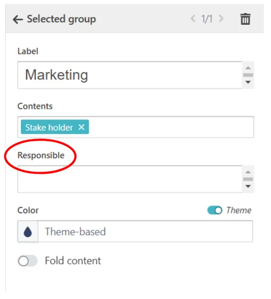
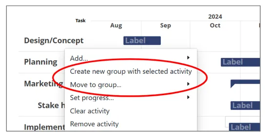
The context menu now features actions to create new groups and move activities to existing groups.
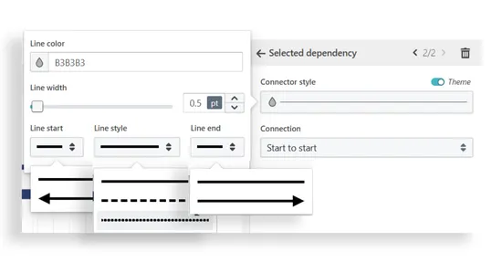
Dependency lines can now be customized individually with a larger range of options. In addition to settings for line color and width, there are now also optional arrow heads and dashing styles to choose from.
Platform
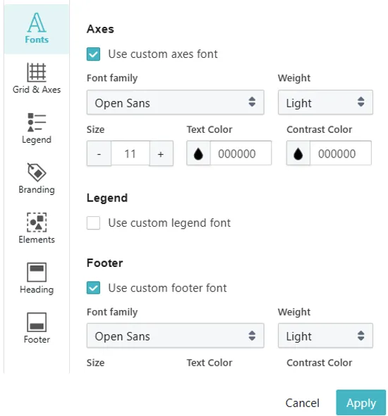
All themes are now equipped with a new optional font setting that enables customization of legend text. The checkbox to enable or disable the custom legend font style can be found in the theme editor near the bottom of the font section, between the checkboxes for toggling custom axes and footer font styles.
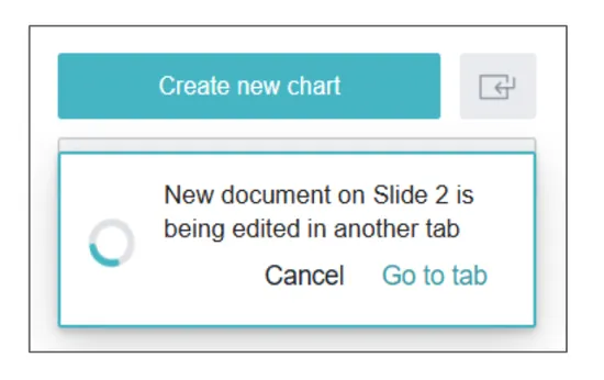
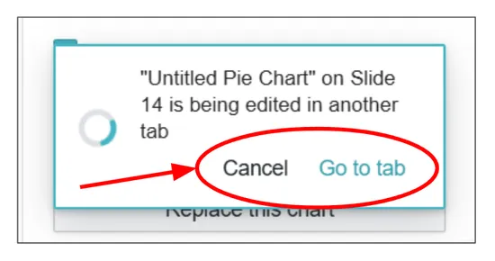
Resize actions performed on Vizzlo charts in a presentation are now picked up and mirrored by corresponding editor sessions in another tab. This enables fitting a chart onto the slide and quickly making size adjustments while keeping the editor tab open. Once the editor has updated the chart it is displaying the correct layout for that new size.
The dialog for chart type selection now closes right after a chart type was selected. This enables reading or editing the presentation at the same time while a new chart is being created in the editor tab. The sidebar now displays a floating card element as an indicator for open editor sessions in other tabs.
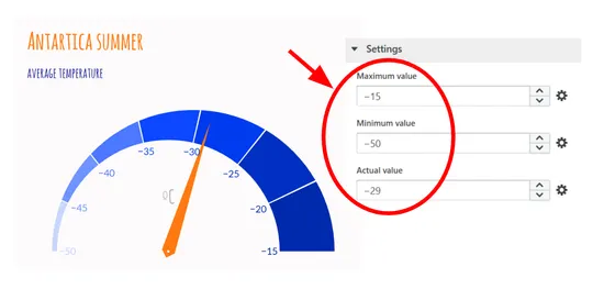
The number inputs in the sidebar for setting up the maximum, minimum or actual values now each also accept negative numbers to visualize a circular gauge with values below 0.
Series that are part of a bar or area stack on one y-axis can now be moved swiftly and freely to the other y-axis. This means that the chart now adjusts to the new conditions while preserving all existing settings.
It is now also possible to move to or close a running editor tab by clicking the new the buttons on the floating indicator cards.
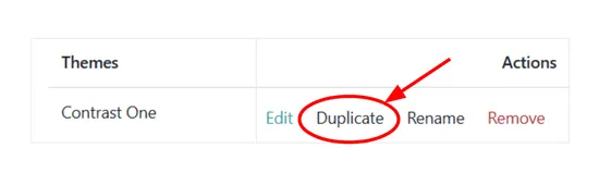
Brand managers and admins can now easily create variations of existing themes via the new duplicate button in the themes section of the org settings.
Projections are now available.
All series style settings are now available per selected series.
The chart space will now adjust when the axis labels are removed.
Large numbers are no longer cut off if they don’t fit into a bar.
Bug Fixes
Selecting fonts and personal themes in the theme editor now works properly again.
Segments can now only be resized after initial selection.
The sidebar color input now shows the correct color at all times.
The maximum number of series now is 25.
You can now easily switch between regular stacked and 100% stacked mode.
Platform
Security
Selecting files from Google Drive for data sync is now done by using Google’s file picker making the connection more secure.
Platform
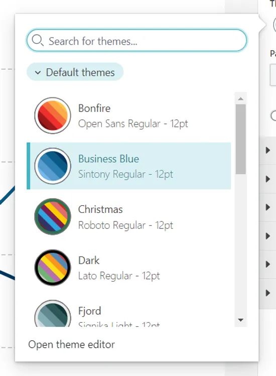
The theme picker now appears more tidy and features a search bar.
Bug Fixes
Opening the export dialog from the file menu now works properly again.
Platform
We adjusted the system to improve loading speed in North America.
Team names are now editable after creation.
Theme titles are now editable after creation.
The dialog for moving items now also allows creating folders in team spaces.
Platform
Made it easier to share documents & folders with other Vizzlo users via email. Shared items do not need to by accepted anymore. They will automatically show up in the “Shared with me” folder.
We now show a small progress bar when updating multiple charts in a your presentations.
Google Slides Add-on
Bug Fixes
Fixed an issue with adding linked charts.
Google Slides Add-on
Data-Sync
NEW
Embedded charts can now be connected to external data sources, too.
Google Slides Add-on
Bug Fixes
We worked around an issue, where Chrome’s pop-up protection was triggered when trying to use the “replace shape” feature in the Google Slides add-in. Also, embedded charts may now be larger than 1920x1080 points.
PowerPoint Add-in
Data-Sync
NEW
Charts created with the PowerPoint add-in can now be connected to external data sources.
Venn Diagram
Bug Fixes
Selecting newly created intersections now works properly again.
Platform
Chart Editor
Google Slides Add-on
The displayed chart type will now dynamically reflect the actual data in your document. This means that you can create a new “Bar chart”, add another data series, and the chart type will automatically update to “Grouped bar chart.” This feature works in the Google Slides sidebar, the chart editor, as well as the document list in the Vizzlo dashboard.
Waterfall Chart
Bug Fixes
Annotations are correctly drawn on top of other labels, now.
Stacked Bar Chart
Bug Fixes
Position rendering for top arrows now works properly again.
Chart Editor
Bug Fixes
Adjusting digits before a zero now work properly again.
Chart Editor
Bug Fixes
Setting up custom colors in the theme editor now works properly again.
Stacked Bar Chart
Bug Fixes
Sum value label positioning is now responsive to individual value labels.
Toggling off the legend now works properly again.
Chart Editor
Bug Fixes
The spreadsheet now again detects the dd.mm.yy date format as expected.
Using slant labels for the X-axis now shows more detailed labels.
Butterfly Chart
Bug Fixes
Value formatting the now works properly again.
Chart Editor
You can now use the theme editor to set up number or date axis lines to end in an arrow head.
Platform
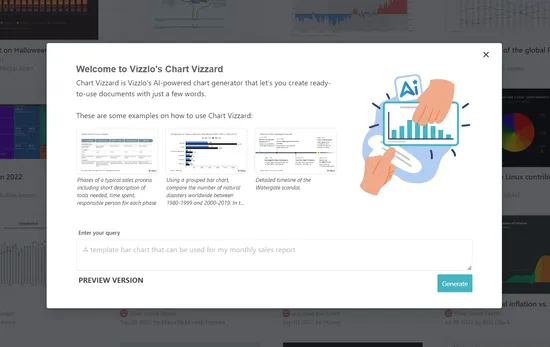
NEW
Introducing Chart Vizzard: Generate fully editable Vizzlo charts by using the power of AI! Click the “Chart Vizzard” button in the dashboard to try for yourself.
Time Series Graph
Bug Fixes
Data import, axis settings & moving series to the right y-axis from the spreadsheet now work properly again.
Gantt Chart
Bug Fixes
Editing task & responsible column now works properly again.
Stacked Bar Chart
Bug Fixes
Editing values & the sidebar inputs for side labels now work properly again.
Grouped Bar Chart
Bug Fixes
Connecting a chart with top arrows to an external spreadsheet now works properly again.
Data-Sync
Bug Fixes
Data Input
Browsing cloud storage documents for data sync now work properly again.
Series color inputs now work properly again.
Scrolling the spreadsheet on touch devices now works properly again.
Chart Editor
Bug Fixes
Moving text annotations now works properly again.
Placing arrow annotations now works properly again.
Selecting chart types for chart conversion now works properly again.
Color picker windows now always appear inside of the frame.
You can now display non-fitting individual values outside of the bar.
Chart Editor
Tooltips now all appear in a unified style.
Custom colors can now be edited and are now saved beyond editing sessions.
Color pickers in the sidebar now update the selected element’s color during selection.
Chart Editor
NEW
Holding shift while moving annotations with the arrow keys now lets you fine adjust the positioning. In addition to that, annotations will now move on a shared grid when moved via the arrow keys.
Input labels now appear more bold, increasing overall readability of the sidebar.
You can now edit text of a selected text box by pressing enter.
You can now choose to set up your arrow chart elements without a shape for the values.
Grouped Bar Chart
Bug Fixes
Value labels are now drawn above other elements.
Chart Editor
You can now apply style changes to text by using keyboard shortcuts.
You can now move arrow labels outside the grid area.
Venn Diagram
Bug Fixes
Dragging the labels now works properly again.
Moving circles outside of a set intersection now works as expected.
Chart Editor
Bug Fixes
Selecting and moving spreadsheet columns now works properly again
Platform
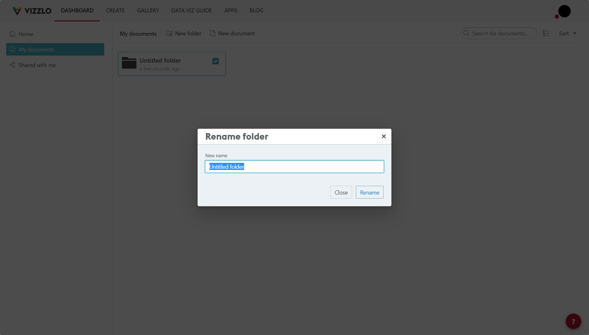
Handling of duplicate names is improved when renaming, moving, or copying documents and folders. There will be less error messages and more informative feedback in the rename dialogs.
Bar Chart
Bug Fixes
Adding individual growth rates now works properly again.
Value labels now appear with the correct font size.
Line Graph
Bug Fixes
Symbols in stepped mode now appear where expected.
You can now edit the colors of bars individually.
Sum values will now show the absolute value in percentage mode.
Theme stroke color is now applied to series in bar mode.
Platform
Bug Fixes
Exported images will now appear without chart element UI elements again.
Platform
You now have the option to move to the folder a document in the search results is located at via the context menu.
Platform
Bug Fixes
Private themes now appear with the correct name instead of “Custom theme” again.
You can now seamlessly switch to a grouped bar chart by adding another series.
2023
You now have the option to display both absolute and percentage values together.
Platform
Bug Fixes
Sorting documents by filename now works as expected.
Documents now will keep their set filename after moving to a folder from the editor.
Chart Editor
The theme editor now appears with the color panel as default.
You can now display non-fitting individual values outside of the bar.
You can now edit the line style of individual connections.
You can now show the min, max & mean values for boxes.
Platform
Bug Fixes
Long email addresses now appear shortened with an ellipsis.
The portfolio now appears in the correct size again.
Organizational Chart
Bug Fixes
Editing the spreadsheet now keeps the set structure intact.
Platform
Shared documents now appear with the correct theme regardless of access to that theme.
Organizational Chart
Bug Fixes
Removing entries with intermediate siblings now works properly again.
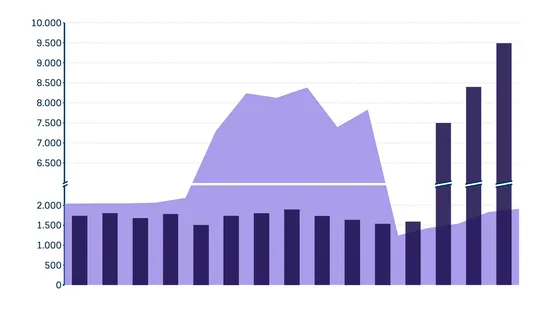
You can now set up scale breaks in the Line Graph.
The date range tooltip is now also displayed while adding new segments.
Added support for scale breaks.
Custom colors can now be configureds for individual records.
You can now set up scale breaks also in the Time Series Graph—including series visualized as lines or areas.
User Experience
All added chart elements now appear in a revamped list in the sidebar.
These chart types now all support adding custom formatting to individual value labels.
The maximum amount of records is increased to 100.
Platform
NEW
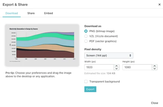
The export dialog now features options for pixel density as well as dimensions & gives an estimate for the resulting file size.
Platform
New folders can now be created from the dashboard’s context menu.
Platform
Bug Fixes
Dates in the team activity sidebar now are correctly formatted regardless of the configured browser language.
These chart types now all support adding custom formatting to individual value labels.
Data Viz
NEW
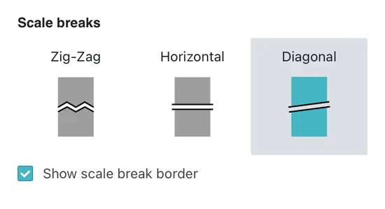
We now offer three different styles for scale breaks: diagonal, straight, and zig-zag. Additionally, an optional border can be added to the scale break, too.
Custom formatting is now also available for individual value labels.
Platform
The default page setup can now be freely selected by clicking the star icon in the page setup dialog.
The “Who” column label now responds to column width changes.
Platform
Security
NEW
Enterprise organizations can now disable document storage on Vizzlo servers by turning on lockdown mode. Also, single sign-on for authentication can be enforced for non-admin members.
Platform
We added a new document layout to better reflect Google Slides widescreen presentations.
These chart types now all support adding custom formatting to individual value labels.
Data Viz
NEW
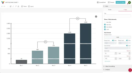
The editor now allows setting up multiple scale breaks rather than only one.
Custom formatting is now also enabled for values.
The Time Series Graph now supports adding top arrows to highlight growth rates and more.
You can now also display values as percentages or as absolute & percentage.
Data Viz
Arrow heads now won’t appear on ordinal axes.
Data Viz
Bug Fixes
Setting the bottom margin to 0 now works as expected.
Platform
The theme editor now allows font sizes to be set as low as 4pt.
Organizational Chart
Bug Fixes
Drag & drop now works properly again.
Bubble Chart
Bug Fixes
Drag & drop for bubbles now works properly again.
NEW
Sum value and subtotal labels now support custom formatting.
Platform
The axis precision now automatically updates once the scale interval is set to a higher precision.
Project Phase Chart
Bug Fixes
A bug that caused phases to lose content after drag & drop was fixed.
Pie Chart
Bug Fixes
Drag & drop for pie segments now works properly again.
Data Viz
Bug Fixes
Chart feature anchors no longer appear behind chart elements.
NEW
Individual labels can now be shown in percentage mode, too.
Label lines in outside position now use the custom connector lines theme setting.
Data Viz
Top arrow labels can be moved horizontally with drag’n’drop now.
You can now set the color for each single part of a stack.
Platform
Bug Fixes
Using the dashboard breadcrumbs now works properly again.
Google Slides Add-on
Security
Major update to the Google Slides integration!
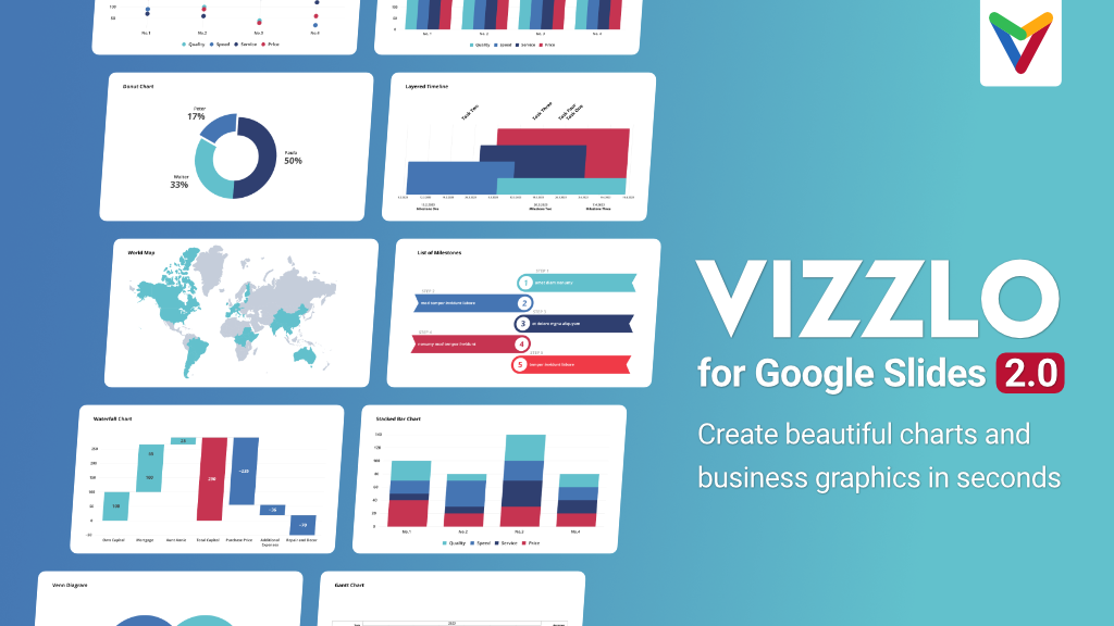
This new version of our add-on for Google Workspace’s presentation brings you embedded charts and lots of improvements to the user interface. Read more about it in the accompanying blog post announcing Vizzlo for Google Slides 2.0.
Data Viz
Footnotes are “responsive” now and the rest of the chart will adjust to the available space. No need to manually adjust the margin of the chart anymore!
Data Viz
Extra chart features, like top arrows, level difference arrows, etc. can now be formatted with custom colors and shape settings.
Data Viz
Bug Fixes
The scale interval settings for axis ticks now supports decimal numbers again.
Gantt Chart
Bug Fixes
Fixed a small bug with old documents not opening correctly.
Gantt Chart
Bug Fixes
Resizing or moving segments now updates associated dependencies as expected.
Platform
Bug Fixes
Imported spreadsheet data via data sync now detects the correct value formats again.
Using the spreadsheet now works properly again.
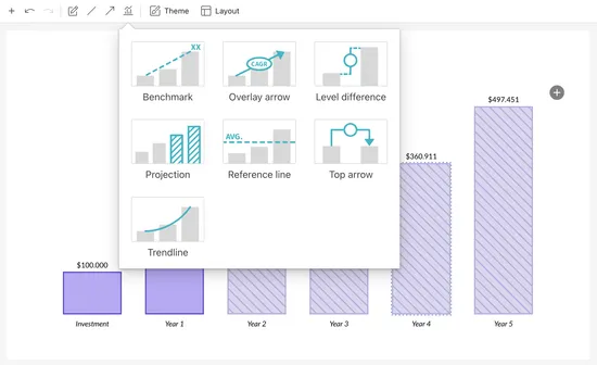
You can now add benchmarks, projections, overlay arrows and top arrows.
2022
Platform
User Experience
You can now search for documents and folders from the home section of the dashboard.
Clicking the folder information under a document in the home section will now open the directory.
The dialog for seat management for organizations displays information now in an improved way.
It is now possible to show both absolute and percentage values together for bar segments.
NEW
The line graph now supports level difference arrows, top arrows & shades chart features
Pie Chart
User Experience
Toggling the legend on or off is now interconnected with the label placement input.
Gantt Chart
Bug Fixes
Deleting activities now works as expected again.
Platform
NEW
You can now set up two-factor authentication to improve your account’s security. Check out the settings page to get started.
Platform
NEW
We have added a search results page in the dashboard. Simply hit the ‘Enter’ key after putting in your search term and get access to all results matching the term.
Data Viz
NEW
All additional chart features will now be presented in a nice popup window accessible from the toolbar.
Stacked Bar Chart
Bug Fixes
Fixes a bug where the chart would sometimes not update correctly when modifying number formatting settings.
Bug Fixes
Fixes a frightening but false error message about the document being removed which popped up when pressing Enter in the visualization editor.
Data Viz
NEW
You can now set up custom value formats for each chart feature individually.
Platform
User Experience
You can now search the portfolio by pressing / (Slash) and put items into the trash bin via drag and drop.
Value labels now act responsively again, even when resizing the chart dimensions.
Platform
User Experience
The dashboard will now show the last person editing a chart for team folder.
Gantt Chart
Bug Fixes
Fixes “dangling dependencies” showing up sometimes.
NEW
You can now add dependencies to activity milestones.
As with other visualizations on the platform, the Marimekko Chart now support slanted axis labels, too.
Data Viz
NEW
You can now specify a stroke width and color to use for all shapes in any chart you create. Finally, we all can re-create that classic black & white diagram look in Vizzlo!
NEW
The Google Slides add-on now a features a context-specific sidebar and automatic re-layouting upon resize. No need to edit charts anymore only to slightly adjust the sizing.
Data Viz
Marimekko Chart
Add custom style support for value labels.
Platform
Bug Fixes
Ensure that team folders and shared folders are presented using a permalink.
Data Viz
Stacked Bar Chart
Sum/difference arrows are now positioned correctly for negative segment values.
Platform
User Experience
We change the navigation bar in the dashboard and updated the main menu to be more in line with the design of the visualization editor.
Annotations
There are now more styling options available for line annotations.
Data Viz
Bar Chart
Waterfall Chart
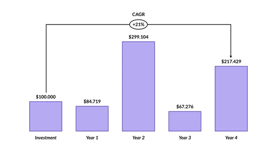
Sum/difference arrows now allow calculating CAGR and AAGR values for the whole graph or individual column ranges.
Time Series Graph
User Experience
The series options in the editor sidebar now appears more structured.
Platform
Bug Fixes
Sum and level difference arrows are now working properly again.
Pictoral chart types are now interactive again.
Platform
User Experience
NEW
You can now set up a file name for a document that may differ from the document title.
You can now duplicate folders right from the dashboard.
There is now an option to set the background color for grid-based chart types in the theme editor.
Gantt Chart
Bug Fixes
The Gantt Chart now also works for small sized documents.
Platform
User Experience
NEW
You can now add chart types to your personal favorites.
The search function for the chart picker is now improved to make chart type selection faster and easier.
All legend related settings now appear in the legend section of the sidebar.
Bar Chart
User Experience
You can now set up charts with up to 100 bars.
The Gantt Chart will now run much smoother even with larger amounts of activities.
Time Series Graph
Bug Fixes
Freshly created series are selectable again.
Platform
User Experience
NEW
We proudly present the redesign of our chart selector! The new dialog makes it far easier to choose the best chart for your data.
Custom fonts are now supported on embedded documents.
Platform
Bug Fixes
The version conflict detection now does not trigger upon using the undo button.
Platform
User Experience
The dashboard will now be faster when walking through different folders and teams.
Data-Sync
User Experience
The communication about data-sync update failures has changed: you will only receive an email you after two retries and the link to the data source will be included.
Platform
Bug Fixes
Fixed a bug that could take you to the old path if you used the link to a document’s folder on the Editor.
Google Slides Add-on
Bug Fixes
A bug that would show the “Multiple active accounts detected” error on the Google Slides add-in, even if only one account was being used, was fixed.
Platform
Bug Fixes
A bug that would show some selection trails on the editor.
An issue with deleting multiple selected elements using the toolbar was fixed.
Bar Chart
Bug Fixes
Fixes bug that could break charts if a Sum/Difference arrow was added.
Gantt Chart
Bug Fixes
A bug that was would not allow the selection of dependencies was fixed.
Bar Chart
Bug Fixes
A bug that could break old charts was fixed.
NEW
The Sum/Difference arrow is now available for both the Bar Chart and the Stacked Bar Chart.
Empty values are now supported. You can normally input empty values on the Spreadsheet and the sidebar - the values won’t be converted to zero and no warning message will be exhibited.
You can now easily move the activity groups using the drag handle.
Activities can be included in and removed from a group using drag and drop.
Hovering the bottom of the chart to position a milestone won’t affect the visualization anymore.
Waterfall Chart
Bug Fixes
Fixed a bug that could result in a wrong color on a column if both a scale break and custom minimum value were used.
Data Input
Bug Fixes
Fixed an issue that could incorrectly detect decimals separators and dates prior to the year 2000 when importing a document to the Spreadsheet.
Teams
Platform
User Experience
A version detection was introduced to avoid conflicts if more than one person is working on the same document simultaneously.
Time Series Graph
Bug Fixes
A bug that could crash documents using connected data sources was fixes.
An issue with the opacity settings was solved.
Horizontal Bar Chart
Bug Fixes
Fixed a bug that could cause the sidebar to malfunction when an analysis feature was selected.
NEW
The new Color Coded Bar Chart is available!
 .
.
You can now easily reset milestones’ icon sizes to the default setting.
Waterfall Chart
Bug Fixes
Fixed a bug that could cause one record settings to interfere with other records.
We improved the way documents are handled inside Google Slides.
A bug that could prevent charts to update properly was fixed.
We removed the Area Plus Line chart from the portfolio page. You can still open your old documents normally. The same functionalities can be achieved using the Time Series Graph.
Platform
User Experience
We strealined our sidebars’ (on the dashboard, settings, editor) designs, for a more consistent experience across our platform.
Platform
Bug Fixes
A bug that could cause malfunctions to the editor main menu was fixed.
Platform
User Experience
You can now open the Spreadsheet by pressing ⌘ J / Ctrl-J on the Editor.
Platform
Bug Fixes
The range input for connected sheets now ignores spaces
An issue with difference computations with multiply/divide by settings was fixed.
A problem that caused malfunctions to spreadsheets connected to external sources was solved.
Fixed a bug with subtotal bars when Start from baseline was used.
An issue with axis range auto scaling for vertical charts was fixed.
Platform
User Experience
NEW
You can now you use the new Presentation mode, available on the Editor.
Normal document links are used now, instead of share links.
Platform
Bug Fixes
An error on the desktop app sidebar was fixed.
Marimekko Chart
Bug Fixes
An issue causing the spreadsheet to malfunction was solved.
Platform
User Experience
NEW
Presenting the brand new Trash Bin! You can now easily restore your deleted documents and folders.
The document search function now also works for documents inside team’s folders.
NEW
It is now possible to use custom settings for opacity and for the Category Styles with Line, Area or Line and Area
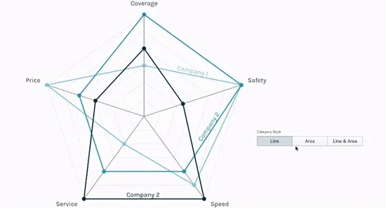 .
.
Grouped Bar Chart
Bug Fixes
A bug that could crash the chart if an analysis feature was added is fixed.
Platform
Bug Fixes
A bug that caused malfunctions when a header border was used is fixed.
Platform
NEW
It is now possible to invert the legend listing.
The visual distance between legend items in top or bottom position is improved.
Opening or creating new documents won’t open the editor in a new tab anymore.
The error 404 (not found) pages are improved.
The chart now supports sum difference arrows.
You can now freely set up start-to-start and end-to-end dependencies.
Data-Sync
Connected documents now have a limit in the number of imported columns (64) to avoid longer loading times and malfunction.
Platform
Bug Fixes
A bug that prevented the sidebar to update on selecting elements is fixed
Platform
The visual distance between legend items in top or bottom position is improved.
Annotations
Your cursor now switches on hovering line annotations to indicate the moving interaction upon click.
Platform
Bug Fixes
The fallback options if a theme cannot be resolved are now improved.
The messages shown to you if an error occurred are now showing the actual error message.
The home screen is now showing thumbnails if the dashboard is in list mode.
Converting your document to a different chart type now ensures all changes are part of the new document, too.
Google Slides Add-on
Bug Fixes
A bug that caused the integration to be stuck on loading if the account for a running Chrome session was different from the logged in account for the current tab was fixed.
Timeline Chart
Bug Fixes
Adding historical dates is now possible after using the checkbox in the sidebar.
Time Series Graph
Bug Fixes
An issue with the axis labels that could break the chart was solved.
User Experience
Only themes that are available to a document’s owner can be selected (private themes cannot be used for a Team’s document anymore).
The system now uses the default theme of the organization or the user if a theme cannot be resolved.
The update button now also updates the Teams list.
We fixed the position of the sum values.
We fixed the dragging of bubbles.
The drag and drop of records is working smoothly again.
Bug Fixes
We fixed a bug that could trigger an unexpected theme change.
We fixed the spreadsheet getting stuck after removing all data.
Individual labels for bar series are now positioned correctly.
Values outside of a bubble are not showing up in parenthesis anymore.
Labels are now positioned correctly regardless of any style changes.
User Experience
Opening the theme editor now feels smooth for every chart type.
We fixed a bug that prevented the proper functioning of the spreadsheet.
User Experience
We improved the access to legend settings by 1) moving them from the document layout settings to add them to the theme settings and 2) making them more accessible in a specific ‘Legend’ section in the document editor sidebar.
NEW
You can now set up as many activities as you want.
We fixed some sidebar components not showing up in some cases.
We fixed a bug in the groups dialog’s styling.
NEW
The chart now also supports slanted axis labels.
User Experience
The toolbar now enumerates multiple color input.
Hex color inputs don’t need to have the # character at the start anymore.
2021
Platform
Editing themes for your organization now shows up in the audit log.
Adding activity milestones from the spreadsheet is now possible again
Annotations
NEW
We improved annotations by adding curved lines.
You can now add cone shaped arrows by using the line style input.
NEW
Our first charts with 3D support are here: the Pie Chart and the Donut Chart !
All the charts that support symbols now have the same settings and styles available.
Bug Fixes
We fixed a bug that caused erros when selecting a blank cell in the spreadsheet.
We solved an issue that would prevent the proper functioning of the slant labels slider.
NEW
The classic Mercator is not the only projection option anymore: you can choose the Natural Earth projection.
You can now hide country borders.
Annotations
NEW
You can now define paddings for text annotations.
Bug Fixes
We fixed a bug that caused margins to not be applied to subtitles.
NEW
You can now sort activities by using the new grouping feature.
Axis titles can now be disabled.
Bug Fixes
We fixed a bug that caused text inputs on the sidebar to malfunction.
We solved a problem that would prevent documents to be saved if its folder was renamed in another tab.
Data Input
We fixed an issue that caused the copying and pasting of columns to not work properly.
User Experience
We improved the account creation flow for new users invited to organizations and teams.
The design of lots of dialog windows was unified.
You can now use ☆☆☆ on your Pictograph.
Bug Fixes
A bug in the contact form of the website was fixed.
User Experience
We implemented a change and now the Google Chrome’s minimum font size settings won’t affect the size and positioning of text elements in the Canvas.
Bug Fixes
We solved a bug that would affect the correct rendering of dashed lined on PDF exports.
A bug that would show tags on the status bar in the Spreadsheet was fixed.
Bug Fixes
Data-Sync
Fix an issue, where sometimes the data-source settings did not open in the spreadsheet.
User Experience
You can now access the context menu of your documents using the ⋮ icon. The styling of color picker elements was improved.
NEW
You can now restart the Waterfall from the baseline.
Positive and negative values are now stacked in the same column
Data-Sync
We fixed a bug that prevented the connection to external files (xlsx; csv) using Google Drive links
User Experience
You can now check the sum, the input value, and the formatted value of selected cells directly in the Spreadsheet’s Status bar
Pie Chart
Donut Chart
Bar Chart
Timeline Chart
Waterfall Chart
Grouped Bar Chart
Stacked Bar Chart
Multiple Radial Bars Chart
Triangle Bar Chart
100% Stacked Bar Chart
NEW
The styling of individual numerical value labels can now be modified—much in the same way you’ve been able to format the text labels before.
Data-Sync
NEW
Shortcuts on Google Drive can now be used to connect a document to an external source.
Shared drives that you’re a member of will now show up when connecting your Google Drive to Vizzlo.
User Experience
The user interface when moving documents and folders was made easier to handle when you have hundreds of folders to work with.
A confirmation dialog will now be prompted if you close the theme without saving your work.
100% Stacked Bar Chart
Bubble Chart
Box plot
Butterfly Chart
Dot Plot Chart
Grouped Bar Chart
Line Graph
Marimekko Chart
Stacked Area Chart
Triangle Bar Chart
Stacked Bar Chart
Waterfall Chart
Axis titles can now be disabled.
Marimekko Chart
User Experience
Changing between 100% Stacked and Absolute Y-axis is now possible from the Layout Settings.
Radar Chart
Bug Fixes
We solved a bug affecting the creation/deletion of new series from the spreadsheet.
User Experience
Bug Fixes
Fix an issue where sometimes color pickers became usable when too many popover are opened.
NEW
Milestones labels can now be positioned manually.
User Experience
NEW
It is now possible to duplicate elements directly from the toolbar.
We are presenting a brand new theme editor, with many improvements! Check it out:
Platform
NEW
You can now change the border widths, colors, paddings, and margins of the chart header.
Bug Fixes
We fixed a bug that would make data copied from the spreadsheet to be pasted with tags.
An issue that would make the colorpicker to be rendered incomplete was solved.
Teams
Bug Fixes
A bug that would return an error if a team was created with a pre-existent name was fixed.
Milestones are now always aligned with the starting and ending of a segment!
We fixed a bug that could cause some milestones’ labels to be positioned wrongly.
A bug that caused malfunctioning of the editor after using the spreadsheet was fixed.
User Experience
NEW
We added a brand new toolbar to the visualization editor! Check it out!
Data Input
You can now use the F2 key to edit cell content in the spreadsheet.
Platform
It’s now possible to drag & drop to move documents and folders to the sidebar on the Dashboard.
Bug Fixes
We improved the rotation for the annotations (from the toolbar). Also, we fixed some bugs with the footnotes and the colorpickers in the sidebar.
We fixed a bug that could prevent the proper installation of the PowerPoint Add-in from the Desktop app.
If you are a user of a prior version of the PowerPoint integration on Windows, you might need to take these manual steps to upgrade
Activity segments will now show a tooltip while moving. Some issues affecting the spreadsheet use of Gantts where fixed.
Big update to our PowerPoint integration on Windows:
- We fixed high memory and CPU usage and also improved the startup and slide switching performance.
- We fixed some errors that could prevent the add-in from being correctly installed for some people.
- Issues with concurrent editing of PowerPoint files were addressed in this version.
- We resolved issues some people could run into when dealing with duplicated PowerPoint documents.
If you are a user of a prior version of the PowerPoint integration on Windows, you might need to take these manual steps to upgrade
Bug Fixes
We fixed an issue where some text was hidden, when using multi-selection. Also, the theme selector popup will not behave a bit better and not jump around.
NEW
The alignment of activity labels can now be changed.
You can also resize milestone icons.
Gridline style for tick divider are now working with more consistency. Some issues affecting parts of the context menu were fixed.
Word Cloud
Bug Fixes
Quotation marks are now being removed from the visualization.
User Experience
More date format options were added (and the format selection list was rearranged).
We’ve improved the design of the Rich Text Editor and now you can check the font type being edited.
On the Mac, we’re supporting the M1 chip natively, now. On Windows, the PowerPoint Add-In is now faster and more reliable. And we fixed a crash when using the portfolio search. Oops.
Axis titles can now be hidden.
Gantt Chart
Bug Fixes
Grid lines of exported PDF render perfect in Chrome’s embedded PDF viewer, too.
User Experience
The rendering of bullet points is improved for better cross-browser consistency. Also, there’s a cool new favicon for your Vizzlo editor tabs.
NEW
Added support for reference lines!
Bar Chart
Bug Fixes
Drag’n’drop behavior is fixed when working with sorted bars.
Time Series Graph
Bug Fixes
Fixed changing projection series.
Data Input
Bug Fixes
Fixed color pickers in the spreadsheet view.
User Experience
We improved the experience of editing text boxes.
Local milestones can now have labels spanning multiple lines.
Timeline Chart
Bug Fixes
Timeline date formatting works more reliably now when editing the same document from multiple timezones.
Gantt Chart
Data-Sync
NEW
Activity dependencies can now be added and changed using drag’n’drop. Also, you can now edit segment labels, split tasks, and activity milestones from the spreadsheet—and sync them with remote Excel files or Google Sheets!
NEW
Subtotal (or “sum”) columns in waterfall charts now support showing multiple categories—even if the sum of some categories is negative. Check out this cool animation to see this feature in action:
Bug Fixes
We fixed a bug that made it impossible to use the rich-text functionality when the footnote was embedded into the legend.
Labels of task segment can now be centered or right-aligned.
Modifying dependencies between activities is now also possible via drag and drop.
User Experience
You can now deselect the current element by pressing [Esc].
User Experience
Data Input
Pressing [Return] while editing a multi-line text cell in the spreadsheet will now accept the input as in Excel or Google Sheets.
Improved selection handling of text boxes by adding cursor switches on hover as well as increasing the size of selection frames.
Platform
You can now change your account’s email address in the profile settings.
Gantt Chart
Bug Fixes
Adding new activity segments and milestones will enable showing their labels by default again.
Teams
Bug Fixes
Removing member of an organization will now make sure that the user is not listed in the respective team folders anymore.
Gantt Chart
User Experience
Task segments and milestones can now be moved across activities.
We added some more icons for task milestones and improved the user interface for working with segments a bit.
You can now freely change which days are part of the weekend.
Vizzlo's Desktop App
Bug Fixes
Exporting PNGs in custom resolutions is working again.
Gantt Chart
User Experience
Handling of split tasks is now way more straightforward. Also, the ribbon used to connect different segments can be hidden now.
The date axis works in other languages than English.
Data Viz
User Experience
We improved the number formatting options available to you when working with level difference arrows.
Platform
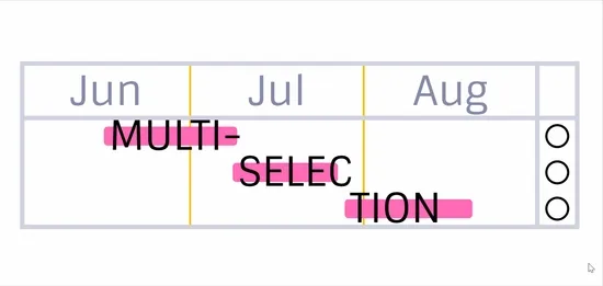
User Experience
NEW
Vizzlo finally supports multi-selection 🌈 now! Change or remove multiple annotations, bars, countries, …, tasks, anything really, at once.
NEW
We now offer a map of the United States of America!
Bug Fixes
Waterfall Chart
The placement of certain value labels (and the UI to manage them) has been improved. We fixed a bug where sometimes multiple columns would not collapse into one after you edited the spreadsheet.
User Experience
The sidebar will now better remember the state different collapsible panes were in as you walk around the UI.
Data-Sync
User Experience
NEW
Document updates from remote datasources can now be triggered directly from within Google Slides. No need to set up auto-sync anymore.
NEW
Add a level difference arrow to indicated changes from one position to another in basis points now.

Waterfall Chart
Bug Fixes
NEW
We keep on giving a lot of ❤️ to the Waterfall chart.
Add a level difference arrow to indicated changes from one position to another in basis points now.
Moreover, this release contains 6 bug fixes.
Annotations
NEW
You now have the option to toggle a footnote on, or off in all charts.
NEW
The box plot supports reference lines now. Learn more about this visualisation in our help center.
We fixed a bug that crashed this chart when you had added a Level difference arrow and suddenly deleted all data.
We fixed a bug for all Safari users. Solid connector lines are displayed as such when you edit your chart.
🎉 We have given the sum difference arrows a makeover.

New functionality includes:
- drag and drop
- vertical adjustment of the calculations
- improved positioning when multiple arrows are added
- streamlined user interface
With this release we also fixed 4 bugs in the chart related to the sum difference arrows.
Platform
NEW
More options at your disposal to customise numbers. New features include:
- 4 different option to display the sign of positive and negative numbers
- Switch position of the sign and a prefix
When you display data labels as percentages we made sure setting applies to the sum label too.
NEW
This chart supports level difference arrows now. Use this analysis feature to add an additional layer of information to your visualisation quickly.

Box plot
Data Viz
🎉 Vizzlo’s portfolio offers box plots now. Key features are 5 number summary statistics for each of your data columns, sorting by median, easy width and color adjustment, and a lot more to come.

We cleaned up the user interface and fixes some minor things about date formats.
Area Chart
Bar Chart
Bubble Chart
Dot Plot Chart
Grouped Bar Chart
Line Graph
Radar Chart
Range Plot
Slopegraph
Waterfall Chart
NEW
Most of our data visualisations now support SI prefixes, advanced number format options for axes and shown data labels.

Platform
User Experience
The usability when saving organization themes saw some improvements.
Data-Sync
Auto-sync will now work more reliably, if the original source returns empty data.
Radial Percentage
Data-Sync
Fix importing data in some cases.
NEW
You can now add sum labels to the chart.
Platform
User Experience
Yay! The sharing dialog will now show user names and avatars.
Platform
User Experience
The listing of available themes is improved, if you’re part of multiple organizations.
NEW
Segment labels can now take more space than the actual segments. We also updated the UI a bit.
You can now show legends, even if they only contain one entry.
Data Viz
Legend icons now scale according to the font size uses.
Bug Fixes
User Experience
We fixed a bunch of nasty text editor issues that affected Safari users.
Bug Fixes
Data Input
We fixed a crash when connecting to an empty data source.
We fixed updating presentations that contain Vizzlo charts which the updating user had never opened before.
Butterfly Chart
Bubble Chart
Grouped Bar Chart
Marimekko Chart
Pie Chart
Radial Bar Chart
Slopegraph
Stacked Bar Chart
Easier number formatting through some changes in the user interface. Showing and hiding values is possible in the same place as you format them.
We updated the default data.
Bug Fixes
- User reported an error message when they joined a team - we fixed that.
- Safari user don’t see the editor sidebar flickering anymore.
- There was a chance that your charts crash when you connected to an empty Google Sheet, that should not happen anymore.
We cleaned up the UI and put more focus on the most important features.
Team folders contain an activity stream now. We also made it a lot easier to set up your team from your documents dashboard.
Adding numbers and formatting those got a lot easier due to a change in the user interface.
We fixed a bug that did not show analysis lines when your bar chart already contained a growth rate.
NEW
There is now the option to hide all data labels, and we also streamlined the user interface.
Slight improvement to the user interface to make number formatting easier and consistent.
Line Graph
Bug Fixes
We fixed a bug that did not display your first data points when you switched between a continuous and a discrete horizontal axis.
Bar Chart
Bug Fixes
There was a chance that a scale break was not properly displayed on the vertical axis. We fixed that issue.
Data Input
While you import your data via a connection to an external data source, the option to overwrite column headers manually works as expected now and forever.
Bug Fixes
- User reported an error message when they joined a team - we fixed that.
- Safari user don’t see the editor sidebar flickering anymore.
- There was a chance that your charts crash when you connected to an empty Google Sheet, that should not happen anymore.
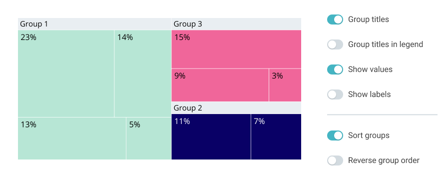
NEW
The chart features now sorting and reversing of groups.
We fixed a bug that made grouping slices to an “Other” category not possible when you migrated from another chart to a pie chart.
Admins of Vizzlo organizations don’t see all team folders in the dashboard anymore, but only those that you are part of.
You ended up with a “undefined” label in a task, when you selected the label input from the sidebar. We removed this behaviour.
‘question?’ and ‘question’ are now considered as the same word.
Bug Fixes
Loading folders…no more. This release fixes a bug reported by some of you that made it impossible to move documents and folders.- Input elements where not always selectable in the spreadsheet when you connected your charts to an external data source. That is fixed now too.
- We fixed a bug that caused a 403 error when you linked your documents to Google sheets at certain times.
Data Input
Bug Fixes
We fixed a bug that caused a 403 error when you linked your documents to Google sheets at certain times.
Fixes a bug that added an offset for horizontal charts with multiple top level nodes.
Fixed a bug that caused you to add team members twice when creating new teams.
Data Input
We revamped the user interface of the data sync feature. Learn everything you need to know about connecting your Vizzlo documents to external data sources in our help center.
Slide change to the default date format in this chart - this is now based on your locale.
Bug Fixes
We fixed a bug that erversed the first 2 characters in the spreadsheet when you typed too quickly.
🎉 The Time Series Graph now supports separate colors for positive and negative values. This features works for line, bar and area charts.
Bug Fixes
We fixed an issue with exporting custom fonts that contain special characters to PNG and PDF files.
Team members are able to create new document from team templates.
Platform
Bug Fixes
- We fixed a bug for Safari users that made the sidebar flicker in some charts.
- Folders with special characters in their name are visible again in your dashboard.
There is a new option for each selected category to overwrite its color.
Data Input
We added the option to prevent our servers from overwriting column header when you connect a chart to an external data source. Read how this will help you in our help center article.
Platform
We released the audit log for enterprise customers. This will give admins a chronological list of events that happened in their organization.
The first data label was not shown for line series - we have fixed that.
Bug Fixes
It appeared that the color input stopped working after 3 characters, not anymore. We fixed the issue.
Data Input
🎉 Connecting a chart to an external data source has become very powerful.
You can now bring any combination of columns into Vizzlo’s spreadsheet, and they don’t even have to start in the same row.
T; R:Y; I:T; Y;O;U;R;S;E:L;F
Learn more about how to connect a chart to an external data source.
Time Series Graph
Bug Fixes
We have fixed a bug that caused the first x-axis label not to be displayed.
Bug Fixes
User’s that signed up with their AppleID got back their avatar icon.
Points are no longer cut-off at the edge of the diagrams. It feels like a bug fix, but it reverses what was merely an early design decision.
Platform
If you log-in with your Google account, we will now use your avatar from there.
Mentioning your teammates in comments is easier now due to newly keyboard shortcuts.
Platform
Bullet lists will always be left-aligned when you use the rich text editor.
It is possible now to display up to 20 series with this chart.
We added the option to update charts only on selected slides. You can still update all charts altogether.
Bug Fixes
- You will see the correct dimension again when you change the document layout.
- Moving and renaming folders works as expected again.
Platform
- You can now insert soft line breaks using the rich-text editor
- keyboard shortcuts for bold ⌘+b (Mac) or ctrl+b (Windows), italic ⌘+i or ctrl+i, underline ⌘+u or ctrl+u formatting are supposed now too. To clear any formatting press ⌘+\ or ctrl+\
We added the team name when you navigate through folders.
Bubble Chart
Dot Plot Chart
Marimekko Chart
Grouped Bar Chart
Growth Bar Chart
Stacked Bar Chart
100% Stacked Area Chart
100% Stacked Bar Chart
We added an option to hide axis labels.
It is now possible to add an editable source in the footnote.
It was not possible to navigate into sub-folders of your team. We fixed that.
Axis settings are getting more flexible: we have added the option to hide axis labels.
Bug Fixes
We fixed a bug that made the user interface flicker in some charts under Safari.
Platform
Bug Fixes
Fix redirect after creating folders in your dashboard.
2020
Platform
Bug Fixes
👋 The welcome dialog will welcome you only once now. 👋
🎉 Scale breaks on the y-axis are now supported.
See our help center article on bar charts for all features, tips&tricks.
It is possible again to navigate into your Box, GDrive, Dropbox and Onedrive folders from our Google Slides add-on.
Platform
It is now possible to connect Vizzlo documents to private XLSX, CSV files and Google sheet. For the feature to work, just connect your Vizzlo to GDrive.
Google Slides Add-on
Bug Fixes
We fixed a bug that made the sidebar not show your documents in the Google slides add-on.
Platform
Searching for documents and folders in the dashboard gives correct results again.
We made a slight change in the user interface to make it easier to change the number format of the data labels.
Improvement to the number formatting and the code base to avoid update loops.
We added the option for admins to create teams from the dashboard.
We have improved the position of the first and last data point. They are displayed above the line. The option to show them before or after the end of the line is still available.
Bug Fixes
We fixed a bug that made a Gantt chart and a Project phase chart crash.
Project Phase Chart
Bug Fixes
A fix that brings back the option to add a phase in the horizontal mode of this chart.
👩🏾🤝👩🏼 Collaboration just got better. Access team folders now in our Google Slides add-on.
We fixed a bug in the radar chart. Html tags are not visible anymore in a legend when you used the rich-text-editor to style the legend text.
Teams
Platform
We keep improving account and user management for teams and enterprise customers. New settings were added to make the lives of admins easier.
Platform
🎨 We improved the creation of color palettes.
No matter how many categories or series your data contains, our algorithm will do the right thing. It will add as many colors as needed for your charts. These colors are created by interpolation from the color space defined by the color palette of the theme used.
Teams
Bug Fixes
Chart layouts and themes created for your team will show the correct organization name in the document editor again.
The waterfall chart supports Level Difference Arrows too.
We fixed a bug so that drag and drop works smoothly again when rearranging groups.
The initial date format displayed in your chart will match your locale now.
Tiny improvement to avoid confusion - no negative values are allowed anymore when change the number of icons.
The visibility of the analysis features like trend line, benchmark, and reference line was improved.
Time Series Graph
Bug Fixes
We fixed a bug were a newly added shade was almost invisible. 👻
🎉 We added support for level difference arrows.
A minor change to minor values. The position of these values was improved when they were placed at the top of a chart. Waterfall charts in PowerPoint presentations should especially benefit from this where margins are set to 0 by default.
NEW
We added Level difference arrows as a new analysis feature. Use it to highlight and compare values.
Drag and drop the arrow ends to calculate the sum, difference, growth rate, ratio, or add free text. Read more about level difference arrows in our Help center article on bar charts.
Platform
You can now sign-up with your apple ID
Milestones are now placed at 12pm.
Platform
🎉 Collaboration for team members just got to the next level. You can comment on team documents.
NEW
You can now slant the axis labels in the vertical mode of a bar chart!
NEW
The bar chart comes with three options now to change the color mode.
You can now
- set one color for all bars
- color positive and negative values differently, or
- use the colors from your theme palette.
Marimekko Chart
Bar Chart
Line Graph
Time Series Graph
Growth Bar Chart
100% Stacked Bar Chart
Stacked Area Chart
100% Stacked Area Chart
Triangle Bar Chart
You can now hide vertical and horizontal axis lines.
We streamlined the UI for the bar chart and the stacked bar chart.
You can now hide vertical and horizontal axis lines.
Platform
We have created a landing page for our timeline charts at vizzlo.com/graphs/timelines
You can now directly add Vizzlo charts stored in Google Drive, Box, Dropbox, and OneDrive from the sidebar of our Google Slides integration. 📊
NEW
Another chart waiting for you! Welcome the Marimekko chart to the Vizzlo family. 🎉
Features include:
- Vertical and horizontal chart layout.
- Add padding between your segments.
- Display your data by absolute or relative numbers.
- Sort your data separately for each category.
Create your own: vizzlo.com/create/marimekko-chart
Data Input
NEW
We added support to sync your documents with public CSV files from all over the web, and stored in your Box, Dropbox, Google Drive, or OneDrive account.
NEW
Please welcome the GE-McKinsey Matrix in our portfolio 🎉

Features include:
- Switch between a square matrix layout and a rectangular layout.
- Add inner padding between the cells.
- Show or hide a legend, row, column, or cell headers.
- Move axes lines from top to bottom or left to right.
NEW
More customization options for you. Change the color of any milestone now independently.
Platform
NEW
Folder can be renamed now! Right-click on any folder and start editing.
NEW
You can add a label to each segment now!
NEW
The UI of the Timeline received a facelift. We made it easier to
- position milestones on a timeline
- change the granularity of the timeline to daily, weekly, monthly, quarterly or yearly
- adjust the date format
Besides that, we added the option to display free text instead of dates!
Platform
NEW
Uploaded fonts are now accessible while editing a document.
NEW
One more chart that was completely revamped recently. Features include:
- Customizable document layout
- Set different colors for column headers, segment background and individual competitors
NEW
You can now filter a word cloud by the number of characters per word.
NEW
You can now switch between the options to make the area proportional to the values or the radius.
NEW
You can adjust the width of the bars when you added a projection to your chart
Time Series Graph
Bug Fixes
- Improved axis tick positions for very small ranges of the y-axis
- Labels and values are at correct positions when you add reference lines or a moving average
We set better defaults for the axis labels when you customize the range of the y-axis
We have improved the color contrast when you change the opacity.
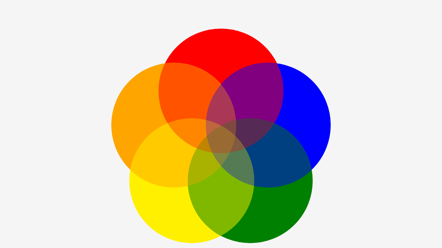
NEW
We added more customization options to the Sum / Difference arrows. Instead of calculations, it is now possible to show free text.
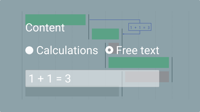
Platform
Waterfall Chart
NEW
More options to compare values across bars using Sum/Difference Arrows.
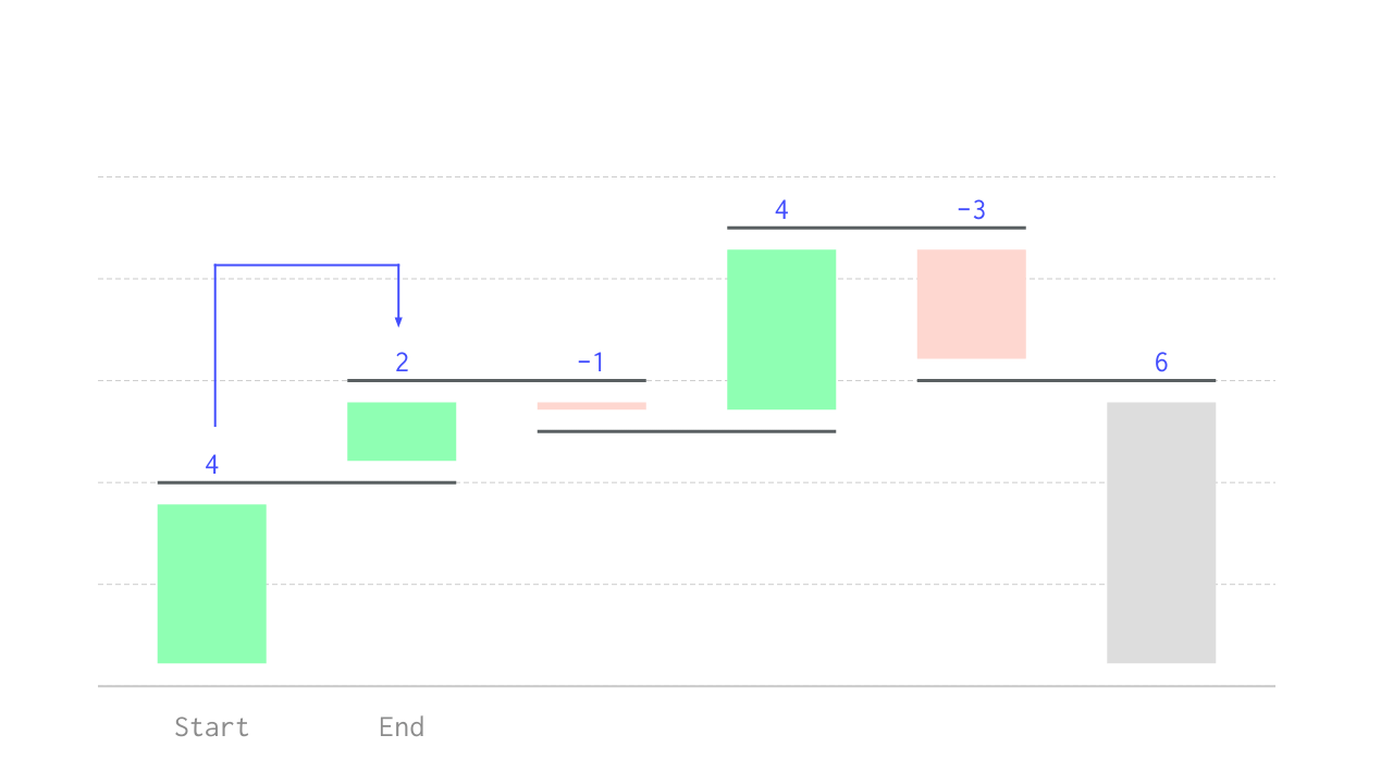
- Sum
- Differences
- Growth rate
- Ratios
NEW
We have completely revamped our slopegraph!
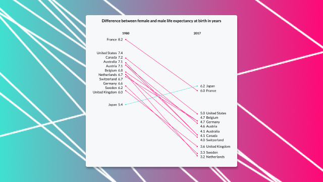
- Set colors differently for decreasing, increasing or equal values
- Adjust the line width for all lines or a single line
- Show/hide labels, values and legend
- Change the document layout and much more!
NEW
The label for Sum/Difference Arrows can be moved now.
NEW
We have added the option to change the color of all chevron headers simultaneously. The UI also received a facelift.
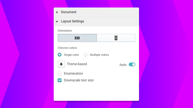
NEW
One more chart that got some ❤ recently.
It is now possible to
- change the document layout 👍
- change the color of the text 👍
- change the font size of the content easily 👍
- spin straw into gold 👎
Pictograph
Bug Fixes
Fractions will be shown correctly up to the nth decimal place.
NEW
Multiple bar series can be positioned in three different ways.
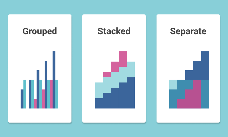
- Grouped — multiple series are arranged side-by-side
- Stacked — stack overlapping series on top of each another
- Separate — positions won’t be adjusted, series are displayed overlapping
NEW
You can sync your Vizzlo account to Box, Dropbox, Google Drive and OneDrive right from our desktop app (v1.3.6+).
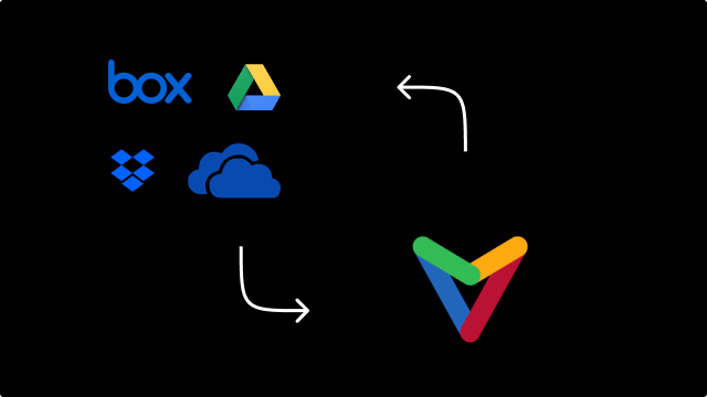
NEW
There is a new chart waiting for you in our portfolio! Use it to display the difference between two values.
You can adjust the size of the dots, switch between a horizontal and vertical chart and more. We added a more a sophisticated example to our gallery.
NEW
We added a few styling options to our Value Projection. Now you can:
- display values in absolute and percentage mode
- show the category labels above or below the chart (or hide them)
- change the color of the record labels
- change the font style of the category and record labels
- change the layout of the chart itself
NEW
We added the option to change the size of the dots.
Time Series Graph
Bug Fixes
We had introduced a bug with the last release. 🙄 Multiple bar series containing missing data are now displayed correctly again.
We also put some ❤ into this chart. It is now possible to adjust the chart’s layout to any dimension.
We put some ❤ into this chart. Adjust the chart’s layout and shape to your liking.
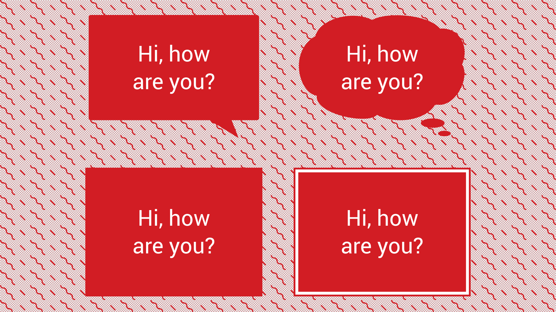
Platform
User Experience
We are continuously working to improve your user experience. An even fresher look for our website, and new icons welcome you. Also another Quick Start article was added on how to Customize a theme to help you give your work a unique look.
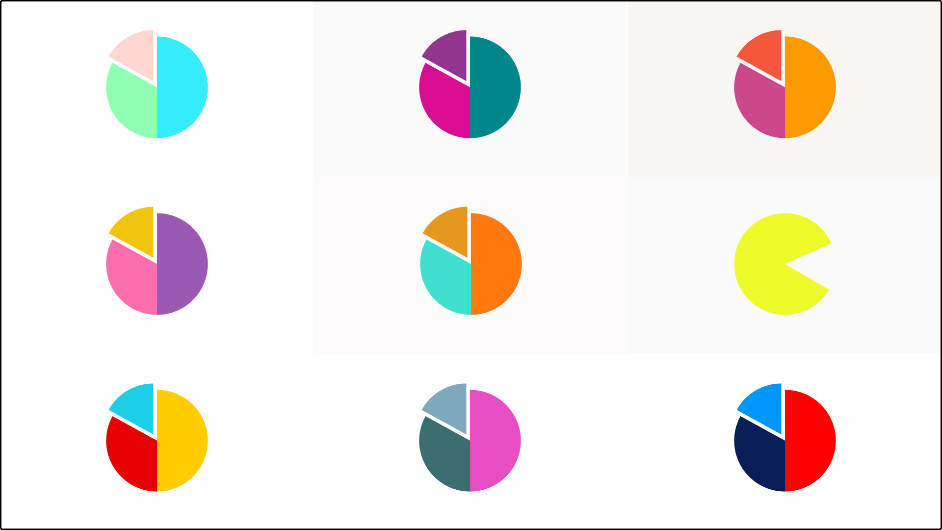
We did a few improvements to this chart regarding:
- The user interface was polished for a selected series
- By default the y axis starts at zero for bar charts and area charts
- Defaults y axis range was improved when a log scale is applied
Fixed. Also we fixed a bug that didn’t show difference shades correctly on Safari browser.
Platform
NEW
Theme selection is now much more illustrative. We will continue to work to make using Vizzlo as easy as possible.
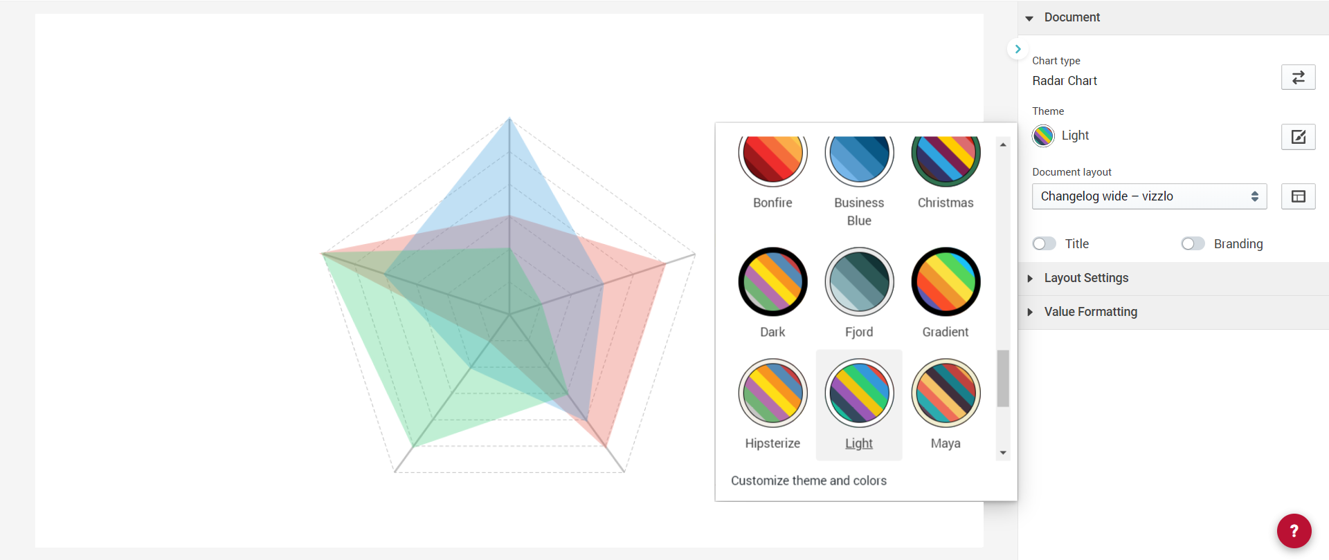
Multiple segments in the same activity are now connected through a ribbon
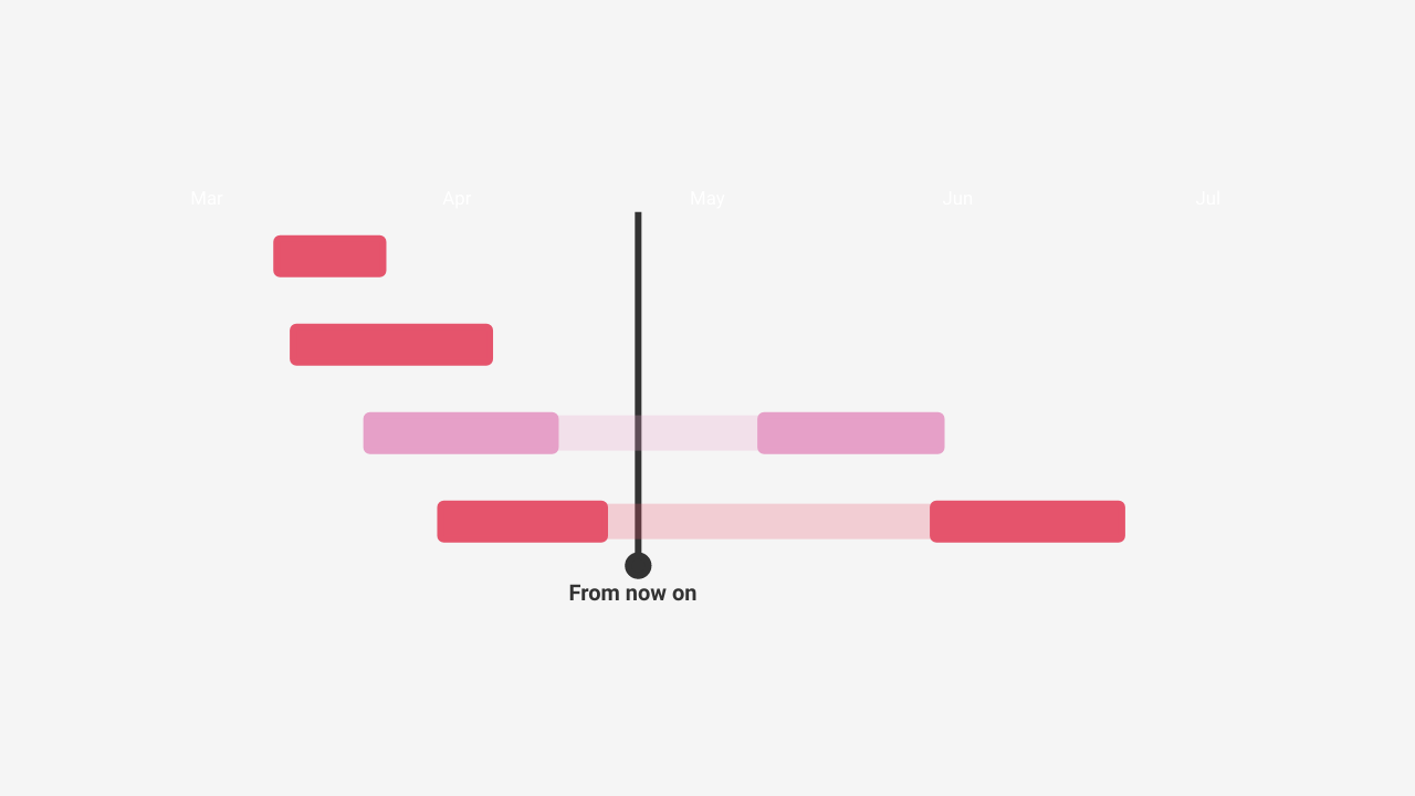
Platform
NEW
You can now log in with your Microsoft 365 account too.
Data Input
Number and date parsing just got better for Excel files. Drop it into the spreadsheet - decimal and thousand separator will be interpreted correctly as well as special formatting.
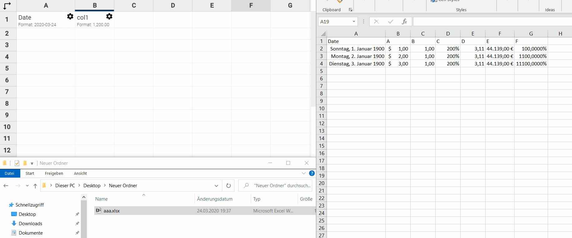
Platform
We re-designed our main landing page.
Go to vizzlo.com and see yourself (but you need to be logged out).
Annotations
Text annotations can now be easily resized. Simply use on of the drag handlers to adjust the text box to your needs.
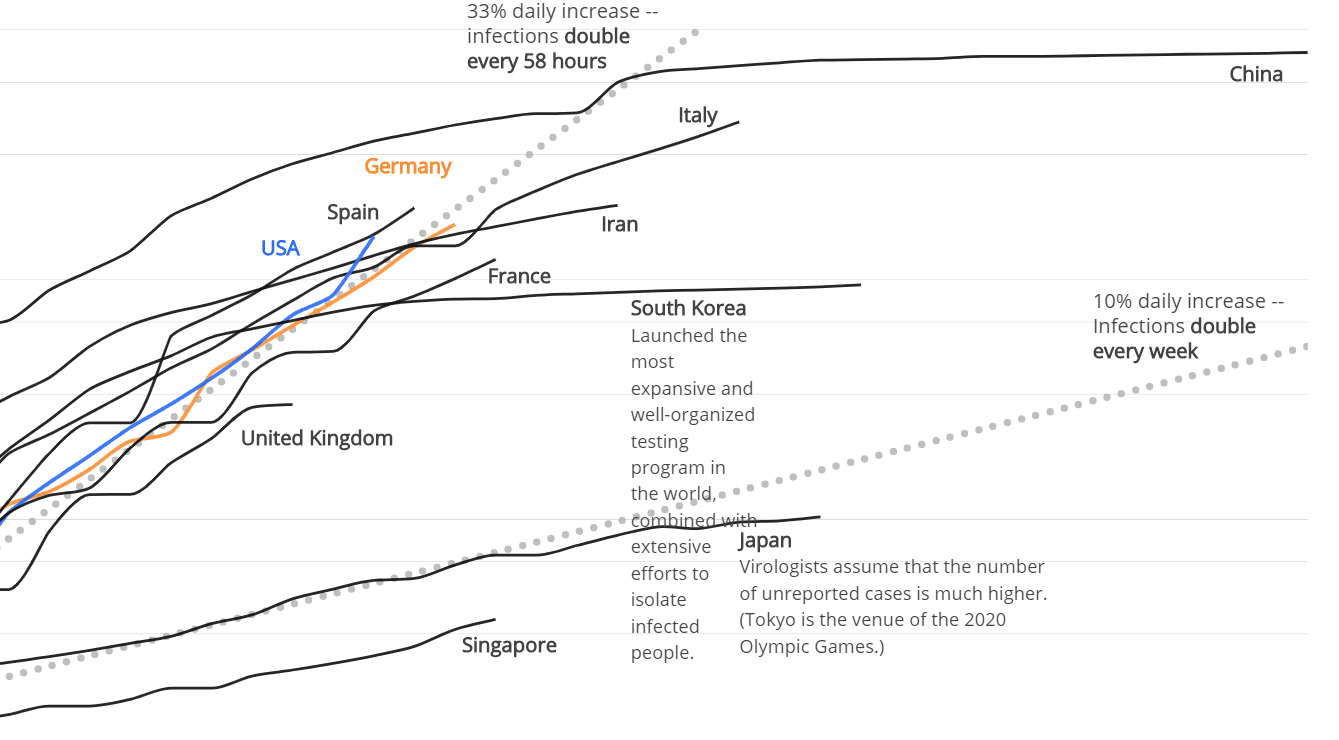
Bug Fixes
You can now reset your password again without any issues.
Platform
A new dashboard is welcoming you! We’ll keep you updated about new features, promotion, articles. Also you’ll see the document you recently worked on right away.
Welcome home. 🏡
We have added the possibility to show series as grouped bars.
Click on a series and under Series style chose Grouped bars
Dependencies use a improved routing and are at the correct position when you drag segments forth and back
Data Input
Date parsing was improved when the display format is Month Year and you input, e.g. 2 2020 or 4/2020
For the pir chart we improved the label positioning further so that multi-line labels don’t overlap.
Platform
User Experience
NEW
- From now on, new users will be welcomed by a small selection of examples: get ready to explore and start creating!
- While editing document, we improved the visibility of the selected elements
- The interactivity of the dashboard while scrolling has significantly improved🚀
We further improved the automated label positioning for the pie chart! Especially multi-line labels benefit from that and don’t overlap.
Data Viz
NEW
It’s now possible to change the text size character by character! Simply select text and use the rich text editor for the customization.
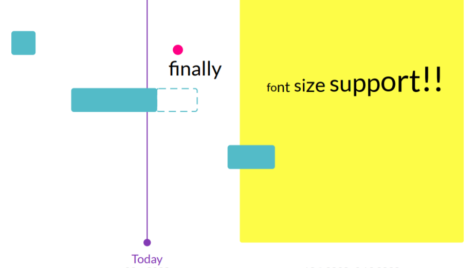
NEW
Click on the column header and resize your columns as needed. Visualizing your project flow just became easier.
Click on the lock icon to undo your changes.
Platform
User Experience
The sidebar of the visualization editor got a major overhaul!
Properties of the document and selected elements are grouped now. The settings are way easier to access than ever before. Additionally, we introduced a toolbar to quickly allow you to open the spreadsheet or add anotations or analysis series. 🤙
Annotations
NEW
Text annotations can be rotated now.
Input elements got a fresh new look too.
Adding a prefix to the center label is now possible.
Our Pie Chart and Donut Chart have now more beautiful and smarter connectors between slices and labels. To try them on your charts, check the box Align labels
Bug Fixes
Text input: rich text edits will be exported correctly
Waterfall Chart: Existing documents showing difference arrows don’t not crash anymore
We have spent time to improve performance & memory usage.
This results in:
- a decreased starting time of Vizzlo’s powerpoint add-in by a second, and it
- makes working with large presentations stabler - especially when working with multiple presentations or running PowerPoint for multiple days
Also we improved our preview images to look nicer and clearer
![]()
We increased the resolution of embedded Vizzlo graphics in your presentations! 😎
Bug Fixes
Polar Bar Chart: Existing documents will not immediately crash anymore
Organizational Chart: Supports multi-line titles now
Google slides add-on: Any Vizzlo graphic can be added to your presentation again, we introduced a bug with previous release - sorry
Platform
There is no “i” in team! We made it easier for you to create a Vizzlo organization. Make collaboration easier by sharing documents, custom themes, and templates. 👩🏽🤝👩🏼👨🏾🤝👨🏻
We have improved the interaction when reorganizing trees. Attaching a subtree to another position works easily.
Platform
The selection and editing of text input was improved a lot especially if you have many text elements. We have also laid the foundation to expand the use of the rich text editor.
Bug Fixes
Waterfall Chart: Exported images show correctly updated text when elements are moved.
Platform
User Experience
NEW
vizzlo.com/documents has a fresh, brand new look. ✨
NEW
You can now quickly group slices in one bigger “Other” slice to make your chart easier to read.

NEW
Now it’s possible to adjust the start and the end of your activities by simply dragging the handlers on each side
Bug Fixes
Organizational chart: intermediate roles are now positioned correctly when deleting other, unrelated roles.
Platform
Bug Fixes
Time Series Graph: The spreadsheet froze for this chart when there was a scale break used together with invalid data.
Timeline Chart: There was a chance you saw a full ISO date format in the sidebar. Should not have happened too often.
Organizational Chart: Boxes will now immediately update upon changing a position to be an intermediate role.
Platform
NEW
This changelog! 🎉
NEW
You can resize the width of the columns now! Simply drag it to the left and right to make your Gantt Chart even better.
Small UX improvements: Selecting (and deleting) a segment will no longer select (and delete) the whole activity anymore. 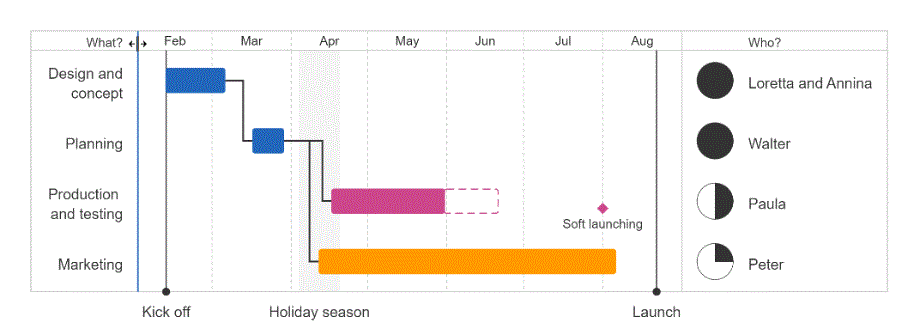
Milestones are now connected with a line when they get moved away from their position; also the performance of the chart has improved a lot
User Experience
Color picker: it became a lot easier to change the color of an element. Simply click on the color code an edit it!
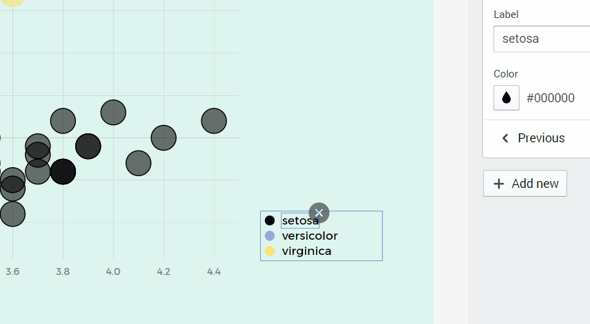
Bug Fixes
Organizational Chart: there was an update issue when you have changed one entry to be an intermediate role
Time Series Graph: The chart crashed when when you displayed your series as area that contained missing data
Annotations: the drag handler were a bit off when you rotated a line
Platform
Vizzlo's Desktop App
NEW
You can now browse your document history in our desktop app too! Go to File → Document history ... or press Strg/Cmd + Shift + Alt + H to browse your changes.
NEW
We have added an option to set the box height or box width for each row individually. That gives you a lot more freedom to tailor your chart according to your needs.
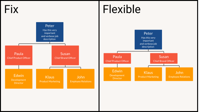
NEW
Milestones can now have their own color and shape. Simply click on any milestone and change their appearance in the sidebar.
Besides that we put some ❤ into this chart and improved its usability and performance a lot: dragging activities, adding milestones and segments feels much more smooth and less hectic now.
Platform
NEW
Document history! Browse versions, restore them or create a new document as a copy. None of your changes will be lost. Click on the chart title in the menu bar and then Document history ... or use the shortcut and press Strg/Cmd + Shift + Alt + H to open it.
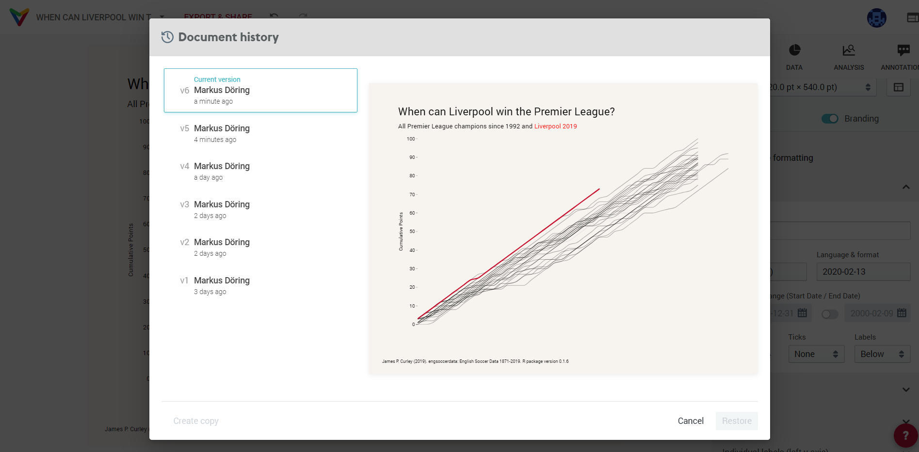
User Experience
Simple Gantt
NEW
You can drag and drop activities vertically now
Milestones can have their own date format independent of axis settings and activity settings.
We also improved the grid line positions and respective date labeling of the horizontal axis. You don’t need to worry about it and we take care of a good format here.
Fixed. The placement of date & description in some edge cases now works as expected.
Stacked Bar Chart
Bug Fixes
NEW
You can place category labels now directly to the last bar instead of having them in a legend.
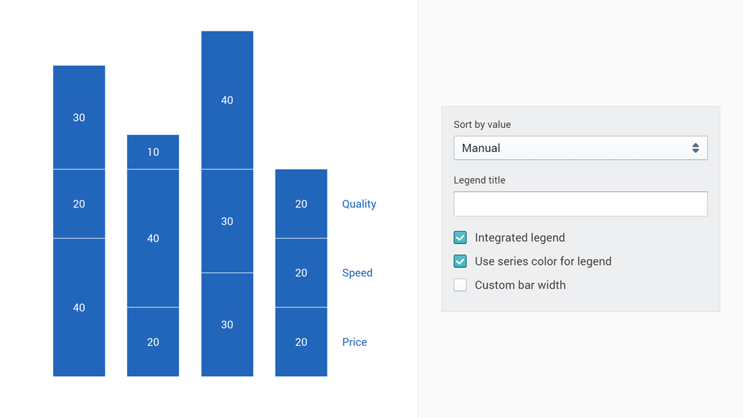
Fixed. The number format of sum labels was totally off when you displayed individual values as percentages too. That is now working.
Fixed. There was an updated error of axis labels after you reordered your bars. That is also working now.
We have added support for formatting the number in centered label. Now can be more precise than ever.
Bug Fixes
Data Input
Fixed. There were multiple crashes in our spreadsheet when parsing date data. This should work now without any issues (hopefully).
Bug Fixes
Pie Chart: There was a bug when value labels were aligned. You couldn’t change the category labels to be displayed in the legend.
Gantt Chart: you could see some weird behavior of the chart moving outside of the canvas when you placed a milestone outside of the date range. That is gone now.
Time Series Graph: it was not possible to hide the label of a shade but now everything is back to normal.
User Experience
Small UI improvements for our Waterfall Chart and Pie Chart such that it becomes easier now to switch between different display styles.
Bug Fixes
Gantt Chart: axis labels weren’t centered if your axis domain didn’t cover a whole year
Pie Chart: the tooltip position was off a bit for a selected wedge
Venn Diagram: better position of newly added circles that overlay each other
Time Series Graph: the chart crashed when you deleted data from spreadsheet that was used for an analysis feature
Date parsing of quarters didn’t work as expected in our spreadsheet
We improved the sorting for an even smarter chart. Bubbles will be rendered by their size: largest on bottom, smallest on top so you won’t miss any observation.
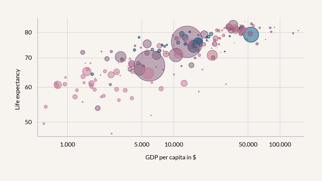
Bug Fixes
Small UI improvements and bug fixes for the Pictograph, Time Series Graph and Pie Chart.
NEW
In Analysis, you can now aggregate your observations by summing them over an interval.
2019
Data Input
NEW
Auto-syncing your charts to external data became a lot easier: There is now the possibility to browse your cloud connections for files by just a click.
NEW
You can now display bubbles even if these represent negative values in your data. 🧐
Performance improvements of the text rendering — resizing columns and writing text is a lot faster now. 🏃♀️
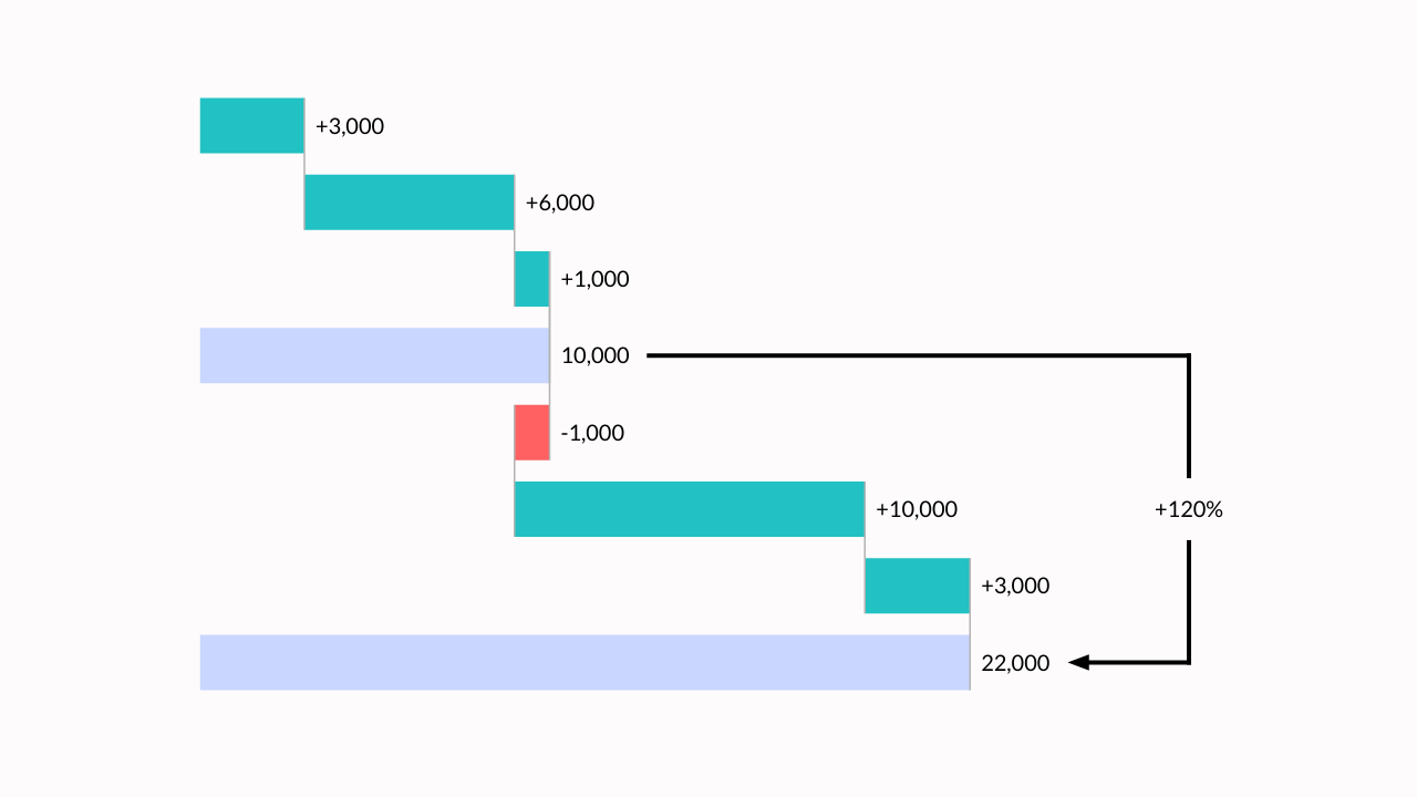
NEW
We added the possibility to set the minimum size and maximum size of all bubbles to your liking.
We have also added an option to customize the opacity and the border width.
It’s now possible to hide all labels by just one click.
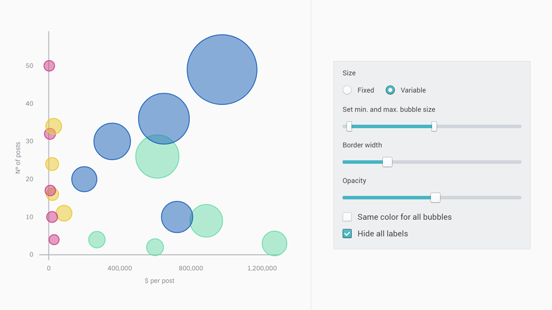
And generally, we improved the overall performance of the chart.🎈
Bug Fixes
Fixed some critical bugs in the Pie Chart, Time Series Graphs and Waterfall Chart. 👹
NEW
Create templates for your teams! As admin or brand manager of an organization simply create a document in the Templates folder in your documents dashboard.
Data Input
Bug Fixes
NEW
Data in the form of, say [$1, $2, $3] or [1%, 2%, 3%] will be parsed correctly now if you specify a prefix or suffix before data import
Fixed. Empty lines were displayed as <br> in spreadsheet
Fixed. Columns couldn’t be resized for some charts
Fixed. Content inside the spreadsheet wasn’t editable anymore after you used the auto-completion out of bounds
Bug Fixes
Waterfall Chart: for topmost entries of stacked bars a prefixed ’+’ was missing
Treemap: we mapped the wrong color code to ‘content color’ you set in the theme
Data Input
NEW
Sync your documents with external excel files and google sheets files! Go to Spreadsheet --> Connect and simply paste a public link to your data and schedule automated updates.
NEW
We have created templates for you! Select to display 2 to 5 circles arranged nicely.
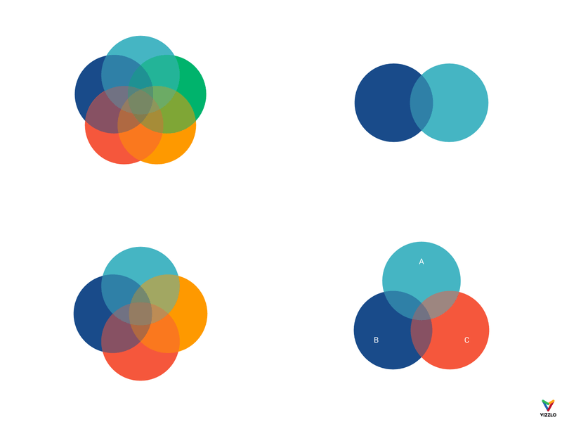
Rotate and slide the circles as you wish. Change their border width and opacity.