Chart Vizzard
Vizzlos KI-basierter Diagramm-GeneratorAre wages and the unemployment rate correlated?
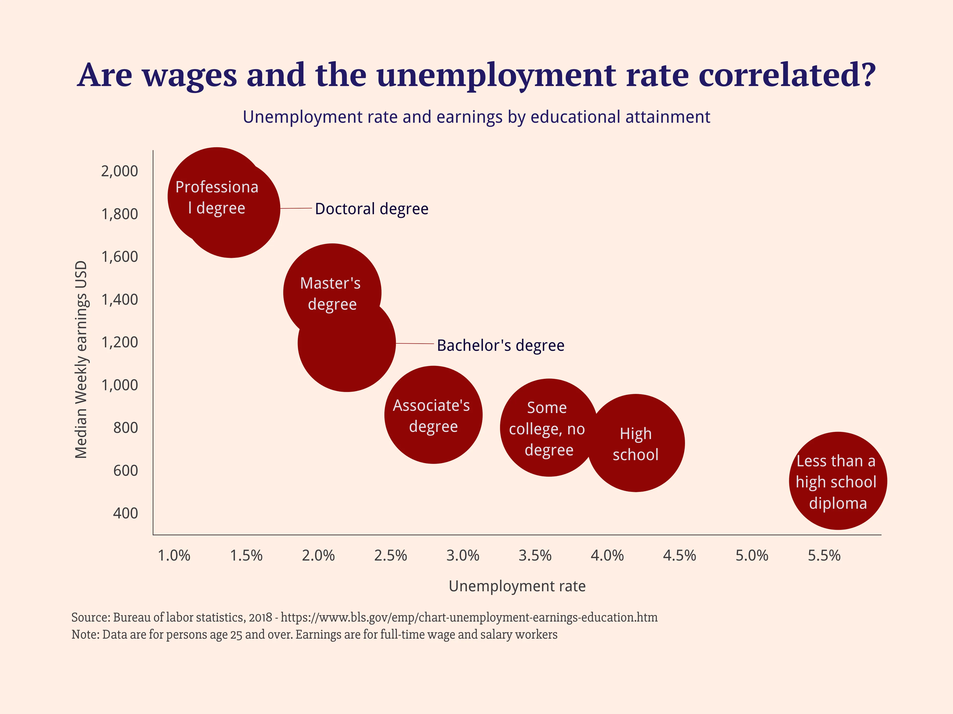
Today’s bubble chart gallery post shows how employment rate and weekly earnings change by educational attainment for workers ages 25 and older. As the chart shows, the more you learn the more you earn. Median weekly earnings in 2019 for those with the highest level of education such as a doctoral degree or professional degree were more than triple compared to the lowest level of education. In addition, the graph illustrates the unemployment rate by educational attainment. According to the chart, the more you learn the less the unemployment rate.
Dies ist ein Beispiel für Vizzlos "Blasendiagramm"
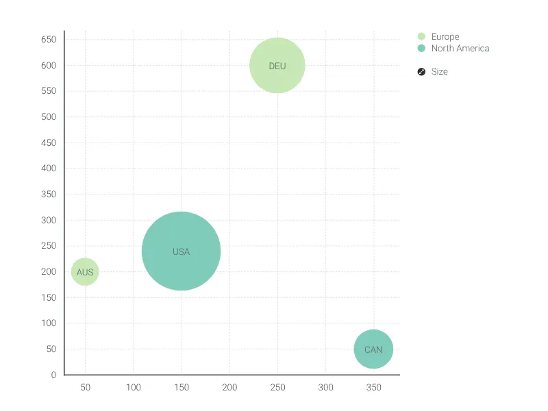
Ein multivariables Diagramm zur Visualisierung und zum Vergleich von bis zu vier Dimensionen Ihrer Daten.
Finanzen & Wirtschaft Vertrieb & Marketing Streudiagramme & Blasendiagramme