Chart Vizzard
Vizzlo's AI-based chart generatorBubble Chart
A multivariable graph for visualizing and comparing up to four dimension of your data.
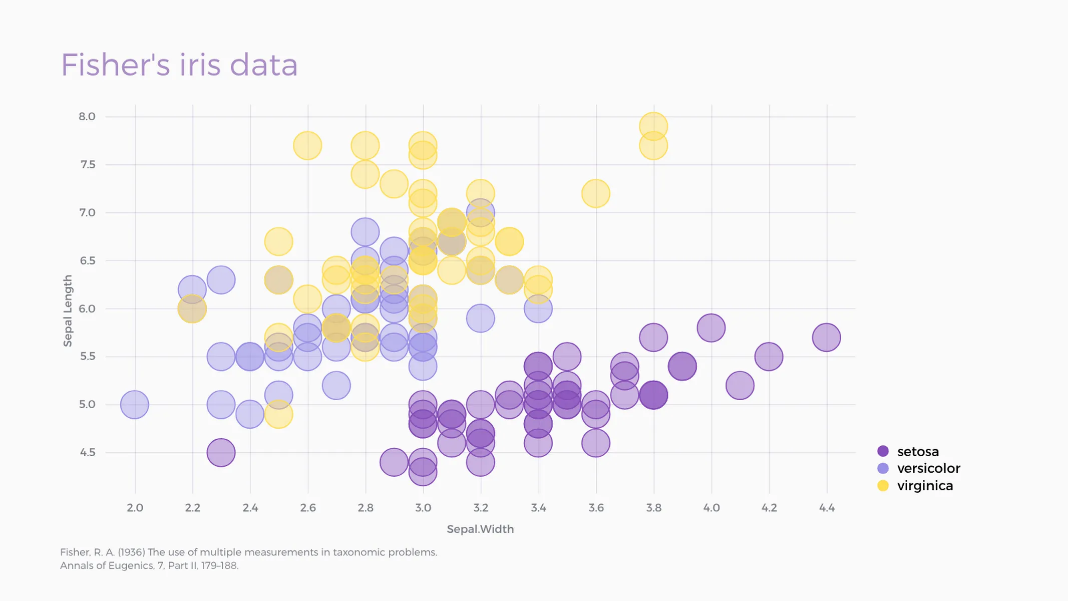
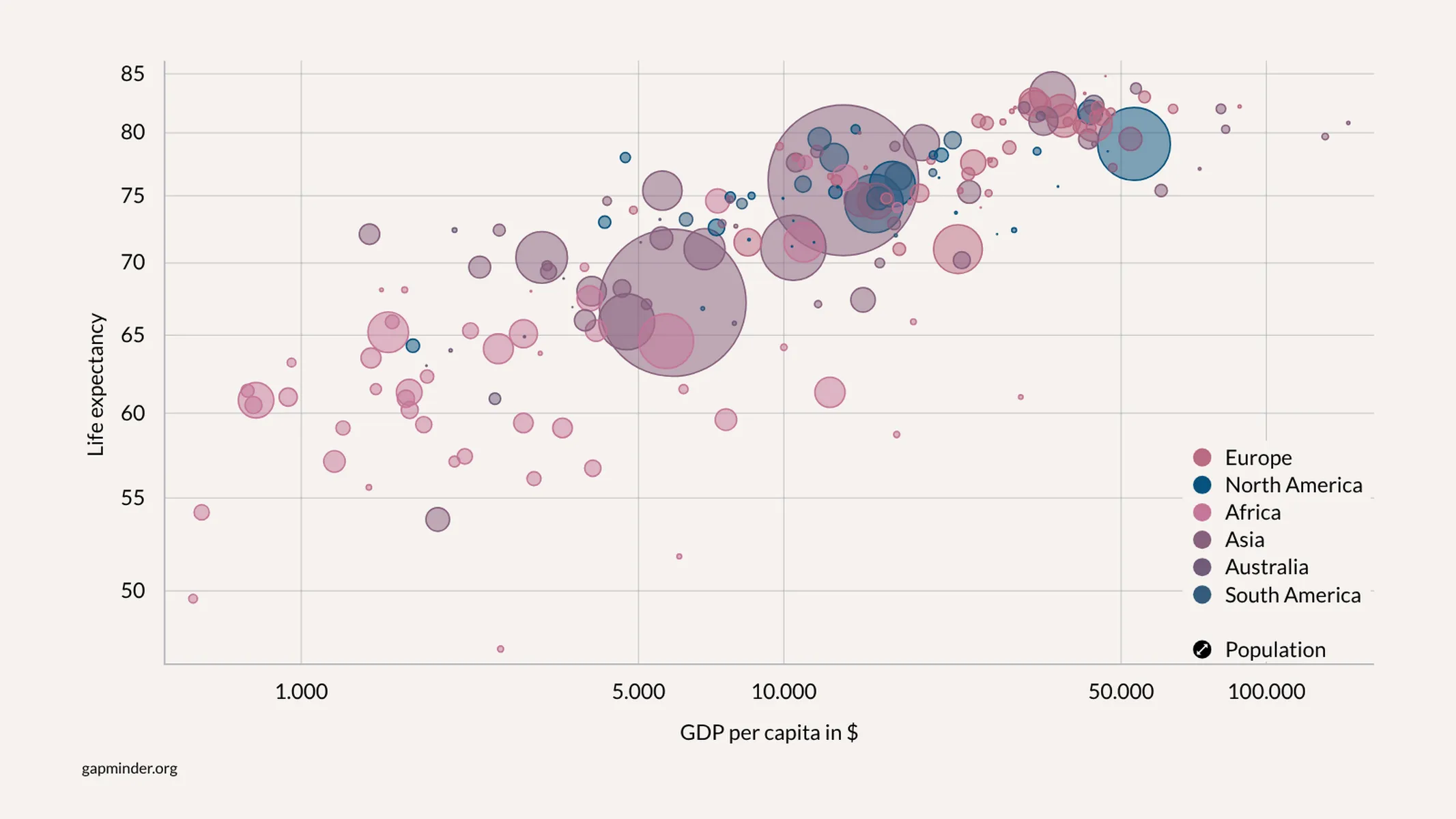
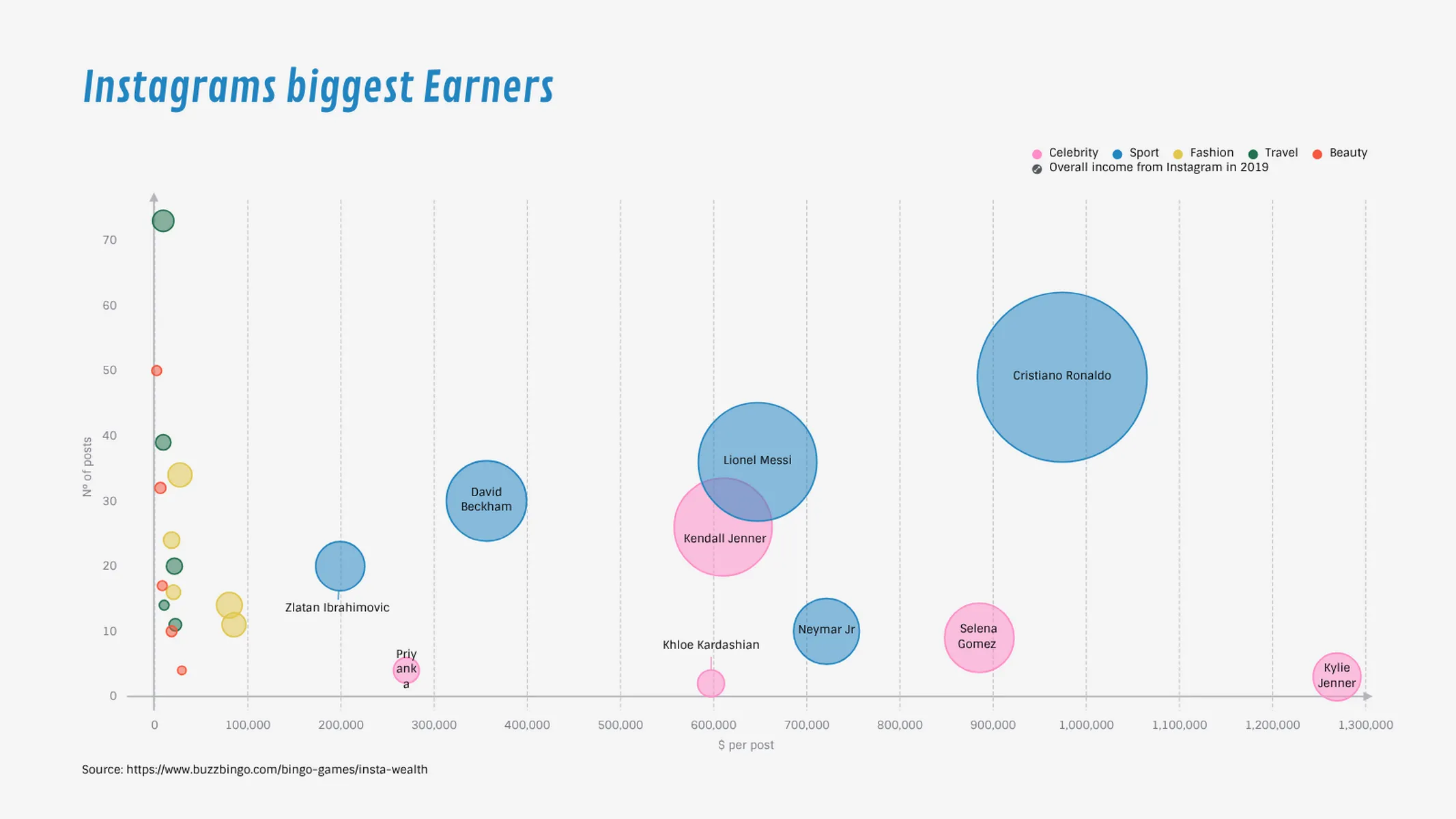
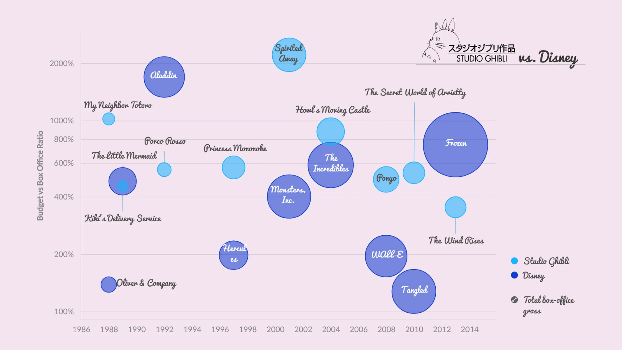
What is a bubble chart?
Many datasets contain two or more quantitative variables. You may be interested in how these variables relate to each other. To plot the relationship of just two such variables, usually you use a scatter plot. If you want to show more than two variables at once, you may opt for a multidimensional bubble chart.
How to make a bubble chart with Vizzlo?
Vizzlo’s bubble chart allows you to display up to four dimensions of your data:
- horizontal dimension
- vertical dimension
- bubble size, and
- bubble color.
Use the spreadsheet to enter your data with ease. Read our help center article on how to get your data into Vizzlo. If necessary, drag and drop the bubbles and their labels to reposition them manually. Explore the customization options in the sidebar:
- Adjust the size differences between the largest and the smallest bubbles with ease.
- To avoid overplotting, use transparency.
- Want a scatter plot instead? Set the size of the bubbles to be the same by one click.
- Color all your bubbles in the same way.
Bubble chart maker: key features
- Effectively map up to four variables at once
- Show up to two legends, one for size and one for color
- Show or hide data labels by one click
- Change the opacity
- Add a border stroke to your bubbles.
- Switch between linear scales and logarithmic scales
- Show or hide axis and grid lines
- Custom number formats and colors
- Adjustable minimum and maximum values for X and Y-axes
- Optional legend for categories/groups
Best uses for Bubble charts
- show the relationship between two quantitative variables
- use the size of the dots to represent a third quantitative variable
- make use of color to highlight a categorical variable
Ressources
Bubble Chart: What's new?
Fixed spreadsheet editing.
Drag and drop for bubbles now works properly again.
Added support for scale breaks.
Custom colors can now be configureds for individual records.
Custom formatting is now also enabled for values.
Bubble Chart Alternatives
Enhance your productivity
Create a Bubble Chart directly in the tools you love

Create a Bubble Chart in PowerPoint with
Vizzlo's add-in

Loved by professionals around the world


Visualizations your audience won’t forget
Convey abstract concepts and data with professionally designed
charts and graphics you can easily edit and customize.