Chart Vizzard
Vizzlos KI-basierter Diagramm-GeneratorHow do people spend their time?
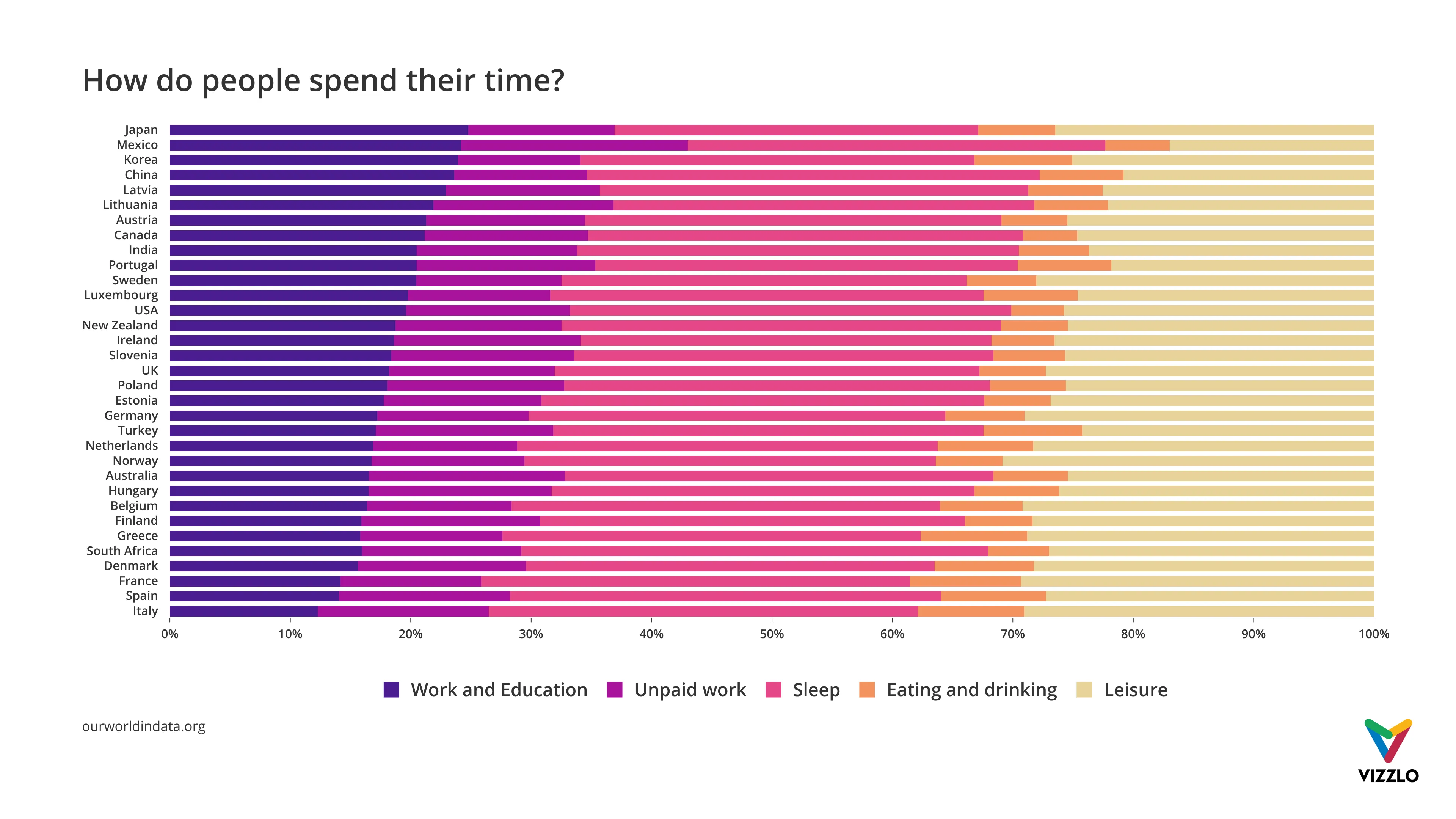
Each of us has 24hours to spend each day, that is 1440 minutes. This chart compares the average time allocated across various day-to-day activities, from paid work to leisurely activities.
There are some notable differences between the different countries. Some prioritize family time or household chores, while others cherish a good night’s sleep or seeing friends. People from wealthier countries can afford to work less. Take, for example, China and Mexico: in these countries, people spend, on an average day, almost twice as much time on paid work as people in Italy and France do.
Source: ourworldindata.org
The data for the 33 countries profiled come from the Organization for Economic Co-operation and Development (OECD)’s Time Use database, for ages 15 through 64 years old.
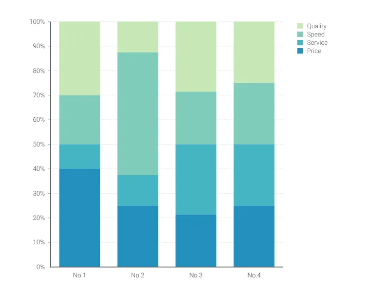
Dies ist ein Beispiel für Vizzlos "100% gestapeltes Balkendiagramm"
Erstellen Sie ein gestapeltes Balkendiagramm, das sich zu 100% aufaddiert.