Chart Vizzard
Vizzlo's AI-based chart generator100% Stacked Bar Chart
Create a stacked bar chart that adds up to 100%.
Features
- Multiple series
- Vertical and horizontal views
- Custom number formats and colors
- Custom axes and grid
- Optional labeling of individual values
- Adjustable min/max values for y-axis
What is a 100% stacked bar chart?
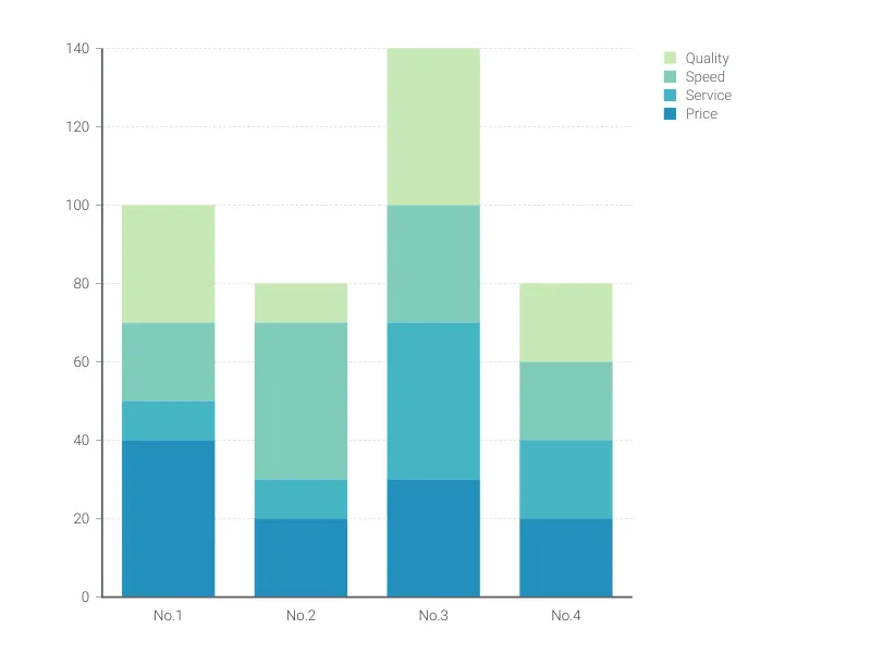
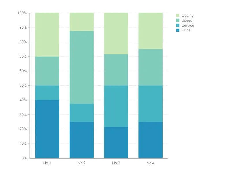
In a 100% stacked bar chart, the cumulative height of the columns/bars equals 100%, and the segments display the relative size/proportions of categories.
Unlike the conventionally stacked bar chart, the 100% stacked bars don’t have different heights and don’t represent any absolute values. Therefore, they are ideal for highlighting the part-to-whole relationship of multiple data series, allowing a comparison only of the composition of the various groups.
How to make a 100% stacked bar chart with Vizzlo?
Make a compelling 100% stacked bar online and export it to your presentations and reports.
- On the tab “DATA” of the sidebar, click on the button “CATEGORIES” to name them.
- Select a column on the chart to edit it using the active cards on the sidebar.
- Optionally, use Vizzlo’s spreadsheet to enter your data more efficiently. Make sure the number format matches your source (click on wheel icons), then just copy and paste the data.
- Finally, try the customization options of the tab “APPEARANCE.” to choose to plot the chart vertically or horizontally, disable the grid, etc.
Pro tip: If you want to emphasize the absolute difference between the groups, consider creating a conventionally stacked bar chart.
100% Stacked Bar Chart: What's new?
The styling of individual numerical value labels can now be modified—much in the same way you’ve been able to format the text labels before.
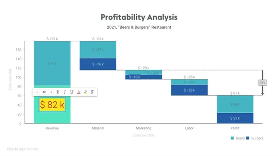
Axis titles can now be disabled.
Adding numbers and formatting those got a lot easier due to a change in the user interface.
We added an option to hide axis labels.
You can now hide vertical and horizontal axis lines.
100% Stacked Bar Chart Alternatives
Use Cases
Bar & Column chartsEnhance your productivity
Create a 100% Stacked Bar Chart directly in the tools you love
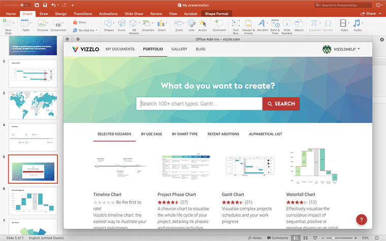
Create a 100% Stacked Bar Chart in PowerPoint with
Vizzlo's add-in
Loved by professionals around the world


Visualizations your audience won’t forget
Convey abstract concepts and data with professionally designed
charts and graphics you can easily edit and customize.
