Chart Vizzard
Vizzlos KI-basierter Diagramm-GeneratorWhat Does Healthcare Cost?
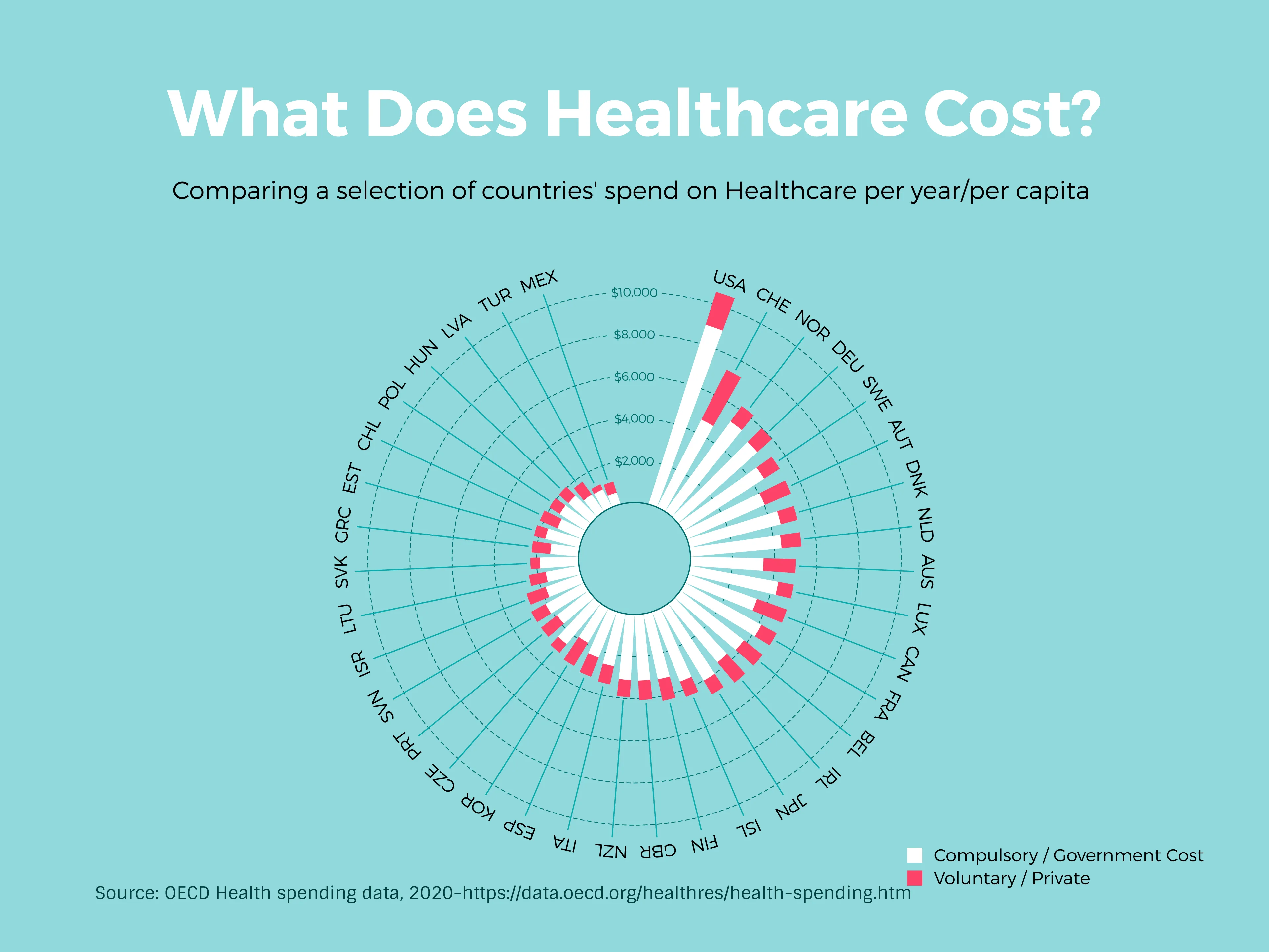
It’s clear to see from this Polar Chart that America’s healthcare costs are currently at an untenable rate, with the cost to the U.S. government close to double the next highest spend on healthcare per capita (Switzerland).
Perhaps unhelpfully, this situation can be read in two ways.
The first is that, with such high costs to the state already, schemes like Universal Medicare that raise government spending on health are an impossible expense–the aim should be to lower the price per capita rather than increase it.
However, another way of interpreting this information is to look at the costs incurred by other countries with just as advanced medical resources as America that already offer a universal healthcare-style plan. France and Italy both have systems with emergency and general practitioner services free at point of delivery, and top the 2020 Best Healthcare global ranking by the World Health Organization. Italy’s government healthcare cost is over 3.5 times less expensive than America’s per capita - proving you can offer both!
Dies ist ein Beispiel für Vizzlos "Polares Balkendiagramm"
Erstellen Sie schnell ein anspruchsvolles Polardiagramm mit gestapelten Balken – eine auffällige Alternative zu herkömmlichen Säulendiagrammen.