Chart Vizzard
Vizzlo's AI-based chart generatorAugust 30, 2019 • 4 min read
Data viz is not for everyone
Or so the new wave of high-paid data viz experts want you to think…

With the news of Salesforce’s acquisition of data-viz giant Tableau for a cool $15.7bn, you’d be forgiven for thinking of data visualization as an expensive, complicated and inaccessible field to the mere outsider. Tableau as a tool has a reputation for being hard to learn — with many equating the undertaking to that of learning a language, it’s often an intimidating option for those that simply need to better illustrate a monthly report. As Ashish Singh reflects on his data viz blog DoingData.com, the format isn’t highly integrated with the most used and most familiar data software, Microsoft Excel.
“Coming out of Excel’s cellular mindset was not easy for me,” said Singh in his article on learning Tableau, “I will have to unlearn [Excel] if I want to learn Tableau”
Author and evangelist of data visualization Nathan Yau recommends the average user forgo even these complex data viz tools and rely on coding themselves; even highly experienced visual communicators like Nolan Haims struggled with Yau’s bestseller ‘Visualize This’.

“It wasn’t long into the book before Nathan started talking code. Code, as in Python, PHP, Javascript, HTML and his favorite, an open source program simply called “R.”’, he writes, “…despite the fact that included in the book is a Flowing Data user survey showing that most (31%) of readers use Excel, Microsoft’s program is largely ignored after a perfunctory introduction”
For experts (or hobbyists and enthusiasts with a lot of spare time on their hands) the depth of this process offers many benefits, but it also makes the simple act of illustrating information strangely elitist. Perhaps data viz, like SEO and many other shrouded processes before it, is unnecessarily kept at an inaccessible level simply to protect the high wage brackets that experts can currently justify?
Often times the most beautiful visual solutions are the simplest to produce. Take this example of data visualization below from the Washington Post, in which participants of the Iowa State Fair were asked to circle the Democratic candidates they knew.
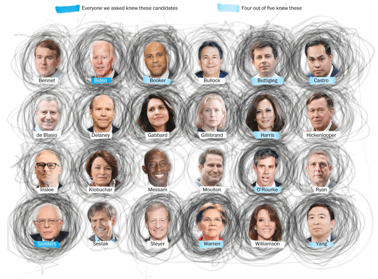
The visual impact is instant: you can see very clearly who has been circled furiously, with an additional color coded legend to give clearer groupings. The visual impact is arrestingly messy, and human, and tells a story; we feel the participants holding their pens to paper as real people, rather than solely numbers on a spreadsheet. And yet, this is all achieved without a decade of experience in coding, an MSc in computer science or even the most basic knowledge of Excel. Anyone can aggregate hand-drawn circles into one image — and that’s exactly what makes it so exciting.
It’s not particularly revolutionary to desire a more egalitarian tool to bring data visualization to the masses; if we think of any of the tech giants, the strive for intuitive user experience is key for all of them. So why do the only options seem to be: a) spend an excessive amount of time learning several new skill sets, or b) pay through the nose for someone else’s expertise?
The solution is to create more accessible tools.
We made Vizzlo for this purpose: to democratize data viz, and make it simple and effective for everyone. It’s fast, intuitive, yet still aesthetically-driven. Even your grandmother could make a beautiful and accurate data visualization with this tool! And to the relief of all users of the ever-popular Excel, all of your .xls spreadsheets can be directly imported to each and every Vizzard chart you create. If data viz is, in essence, all about communication, we are really proud to extend that simplicity in communication to the creation of data viz.