Chart Vizzard
Vizzlo's AI-based chart generatorOctober 1, 2019 • 4 min read
Is dataviz the new SEO buzzword?
It seems like we’re learning new buzzwords every month or so, but ‘dataviz’ has been in the air for a while now and with Google’s release, Salesforce’s acquisition of Tableau and companies like Vizzlo refining ever-more user-friendly tools, it looks like data visualization will surpass the ‘trend’ status and keep on growing.
Visual communication can improve any area of your business, cutting decision time and increasing the clarity of all of your data. In fact, we strongly believe that visualization is the single most important process to increase productivity. But what can the visualization process bring to another buzzword-turned-integral-process: SEO?
For starters, Search Engine Optimization is really all about analysis, and the backbone of analysis is data. The best SEO managers out there can read and interpret data at a glance, and get their argument across with more persuasion than any sales pitch. Sales ability and storytelling, while a brilliant added bonus, shouldn’t really be mandatory; excluding science-brains in lieu of convincing pitchers means we could be missing out on some exceptional analysts. Data visualization can handle all the communication (in fact, presentations using visuals have been found to be 43% more persuasive) so that SEO experts can focus on finding new and innovative optimization techniques.
You’ll already be familiar with dataviz for SEO. The Google Analytics dashboard gives you various graphs and charts to interpret your topline data instantly. It’s great information that can only go so far — as an SEO specialist, you need to follow data across your whole customer journey, of which GA can only track a portion.
Three Areas To Focus On:
1. Competitive analysis
For instance, you’ll already be paying attention to how your competitors are performing on social media, what their highest traffic content is, keywords they are targeting and so on. Visualizing this information can quickly show trends to replicate and gaps to exploit.
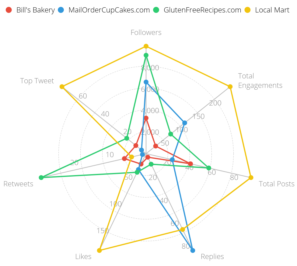
From this analysis we can see that, although GlutenFreeRecipes.com is posting a lot less than the rival with the highest volume (Local Mart) and receives many fewer likes, it’s recipe content is so shareable that it is very closely competing for follower number — so clearly this is a key way to increase Twitter reach! Having a high reply rate like MailOrderCupCakes.com doesn’t seem to boost follower number so much.
2. Backlink analysis
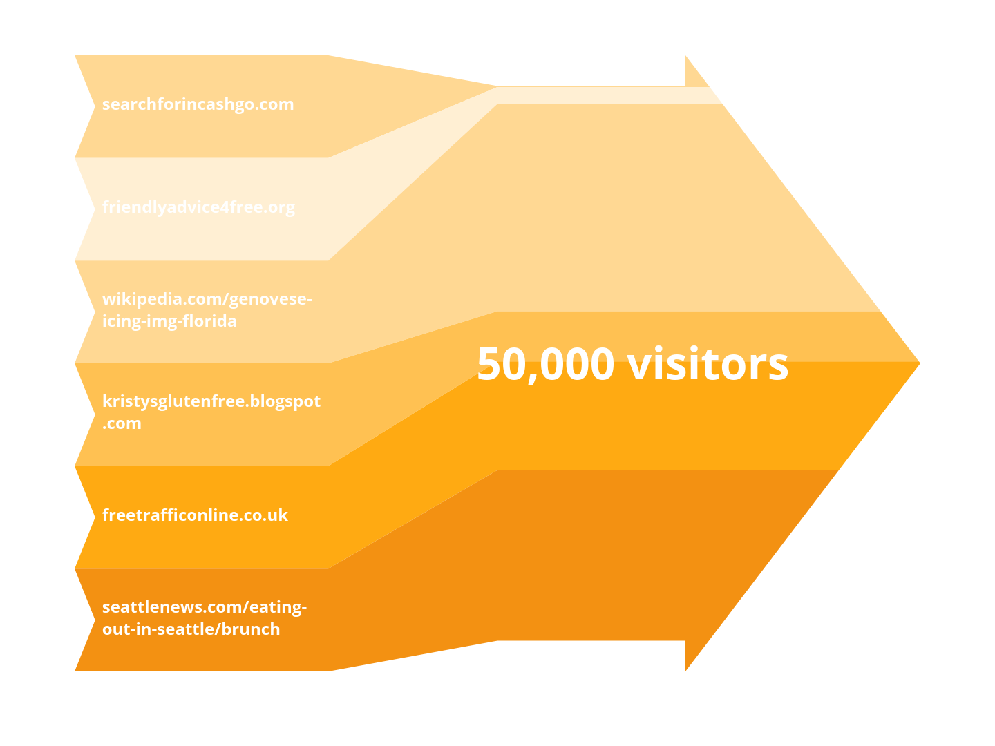
One of the greatest wins you can achieve from creating great original content is for it to be informative enough that other sites will cite you as a source. Analysing and then visualizing who your current backlinks are means you instantly know who to target (and who to delete) for future content. In the Sankey Arrow example here, we can quickly understand some valuable info. While freetrafficonline.co.uk may not be the most desirable source, it’s driving a significant amount of traffic — better to delete searchforincashgo.com and friendlyadvice4free.org first. And though the topic of this Wikipedia page is niche, the notoriety of the website gives great, valuable users, so regularly promoting Genovese icing will keep the quality of the link strong.
3. SEO Audit score vs Visitor
Visitors are going down, but your Webmaster says a drop in traffic is just a normal side-effect of the summer period. You’re not convinced — but is it worth the time spent discussing it further? With a graph you can make in 15 minutes, a much fuller picture becomes clear.
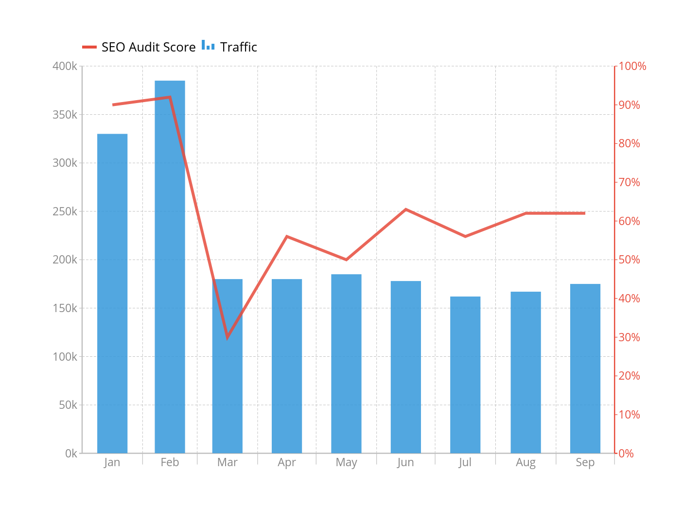
While July has been your lowest month for visitors so far this year, it’s very clear to see from this visualization that your traffic took a major hit in March in relation to an SEO issue. You know you’ve been producing a lot of blog content over the summer to try and combat this drop, and it has had some positive effect, but you’ll never achieve the same traffic numbers you had at the start of the year without isolating and fixing the problem. There turns out to be a technical bug that stops search engines from scanning your pages correctly — missing that would’ve been a catastrophe!
But does every company really need to have data visualization capabilities?
If you want to save time, increase productivity, improve cross-company communication, and clearly see the facts of your bottom line before you make big decisions, the answer is yes. Fortunately, expanding your dataviz production doesn’t need to mean hiring expensive experts or taking key employees away from their current task load in order to complete complex training.
The alternative is easy, accessible, user-friendly dataviz software that can save your company thousands in lost work-hours. Vizzlo was created to solve these problems in the founders’ own business lives, and once we realised how crucial this tool was becoming to our daily workload and our SEO analysis, it was time to share it with other professionals.