Chart Vizzard
Vizzlos KI-basierter Diagramm-GeneratorTop 6 Countries of Male Tennis Players in the Top 100, 1973–2021
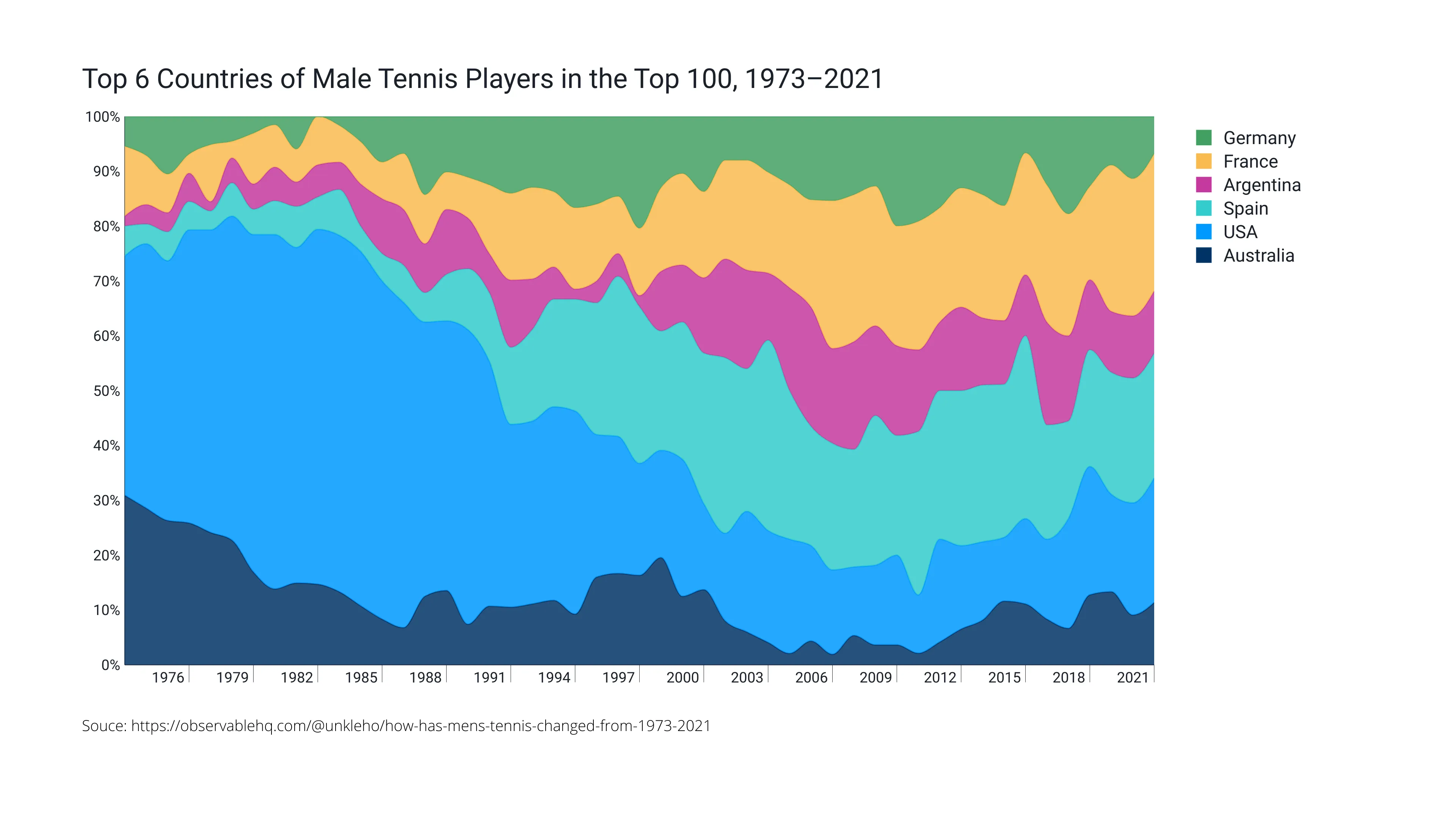
How has the composition of countries in the ATP men’s singles top 100 rankings changed over the past 49 years? That’s what we want to show with this chart. Once dominated by the USA and Australia, the rankings now show a more global sport, with a greater balance between major countries. European heavyweights such as France, Spain and Germany have grown a lot in recent years. The evolution of Argentina, representing South America, is also worth mentioning.
Source: https://observablehq.com/@unkleho/how-has-mens-tennis-changed-from-1973-2021
Dies ist ein Beispiel für Vizzlos "Zeitreihendiagramm"
Komplexes Zeitreihendiagramm zur Visualisierung detaillierter Finanzdaten.
Finanzen & Wirtschaft Balken- & Säulendiagramme Linien- & Flächendiagramme Zeitbasierte Diagramme