Chart Vizzard
Vizzlo's AI-based chart generatorTime Series Graph
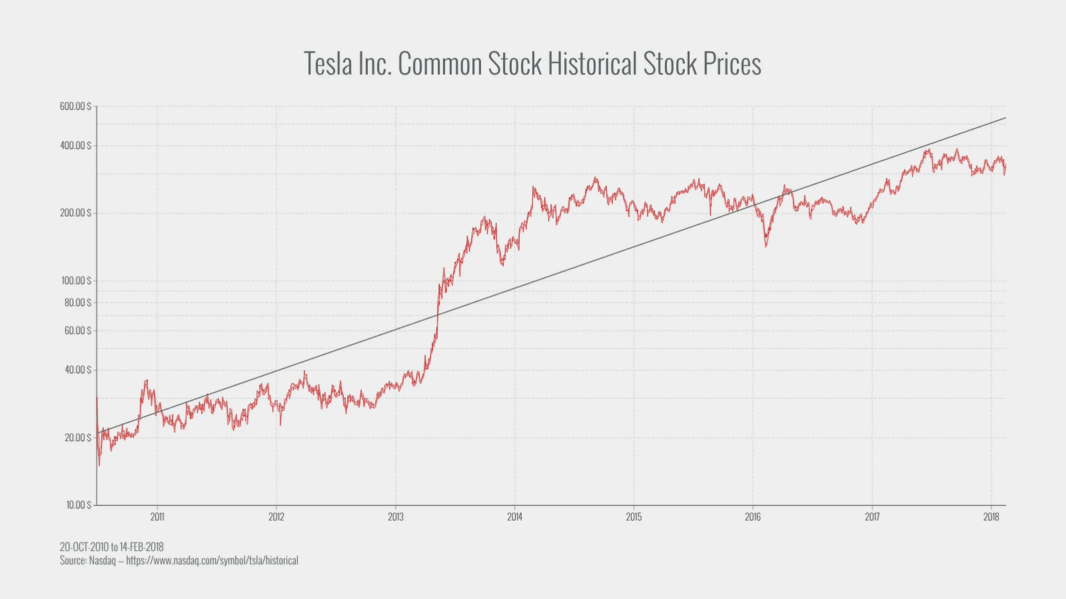
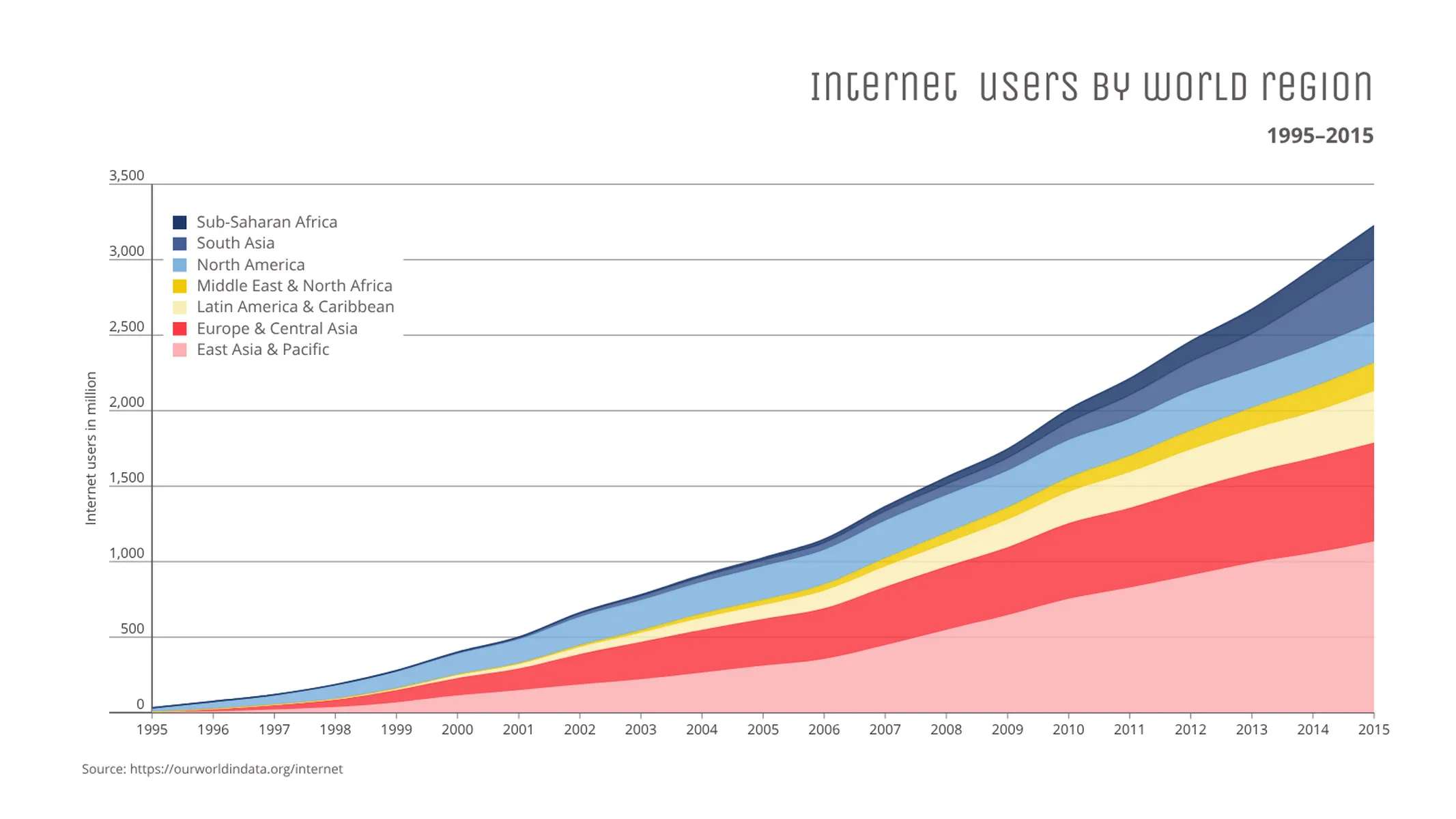
Complex time series graph to visualize detailed financial data.
What is a time series graph?
A time series graph, also called a times series chart or time series plot, is a graphic design that illustrates data points indexed in time order. A time series graph is one of the most commonly used data visualizations. The natural order of the horizontal time scale gives this graph its strength and efficiency.
A time series is a sequence taken at successive spaced points in time. Thus it is a sequence of discrete-time data. A time series plot is usually the step in a complex time series analysis or time series forecasting. In finance, a moving average is an indicator often used in technical analysis of stocks and other assets. There may be a seasonality. Does the time series show a trend? In general, the development of observations over time can be shown at a glance. How do multiple time series develop in relation to each other?
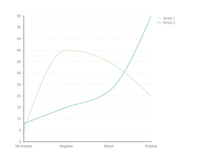
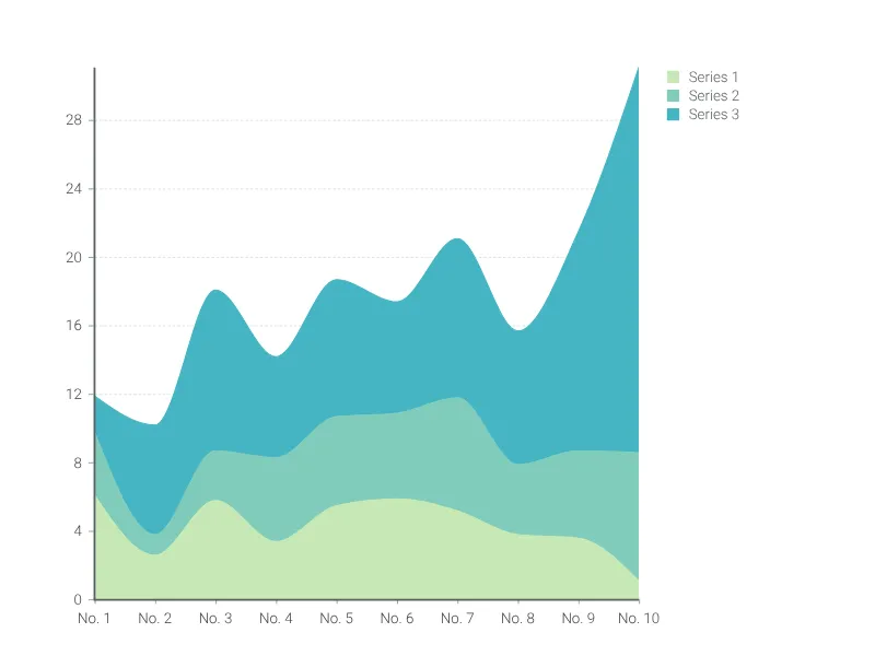
Under a time series graph, one usually imagines a line chart, i.e. observations are connected with a continuous line. The purpose of the line chart is to show relative change over time. However, it is not unusual in weather charts to show temperature and rainfall over a period of time in one chart, where a line is chosen for temperature and bars for rainfall. Another special case of the line chart is the area chart, where the area below a line is filled with a solid color to emphasize volume or quantity as well.
A brief history of the Time Series Graph
The oldest know visualization to show observations plotted over a time scale was reported in Howard Gray Funkhouser’s 1936 article, entitled A Note on A Tenth Century Graph, as Edward Tufte points out in his book The Visual Display of Qualitative Information. That graph from almost 1.000 years ago showed planetary movements. All but one of the 44 charts in William Playfair’s The Commercial and Political Atlas were time series graphs.
Best uses for the time series graph
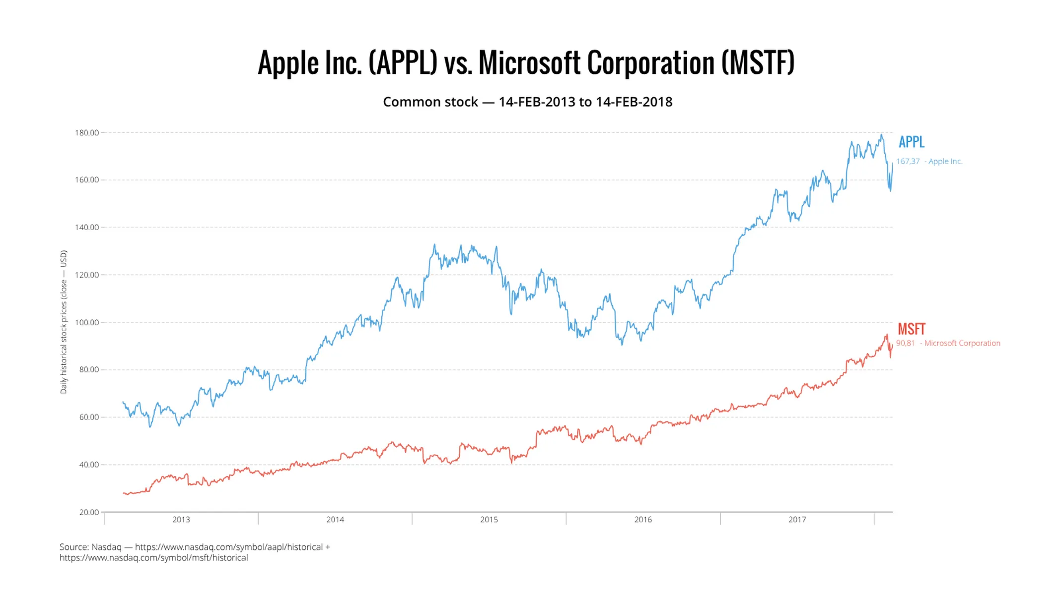
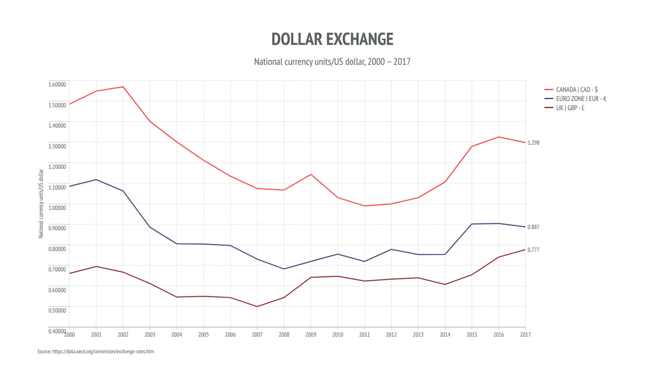
- Financial charts, such as exchange rates, stock prices, or any other asset.
- Weather data such as temperatures, rainfall, or even tides.
- Atmospheric distribution of the drivers of climate change: carbon dioxide (CO2), methane (CH4), and nitrous oxide (N2O).
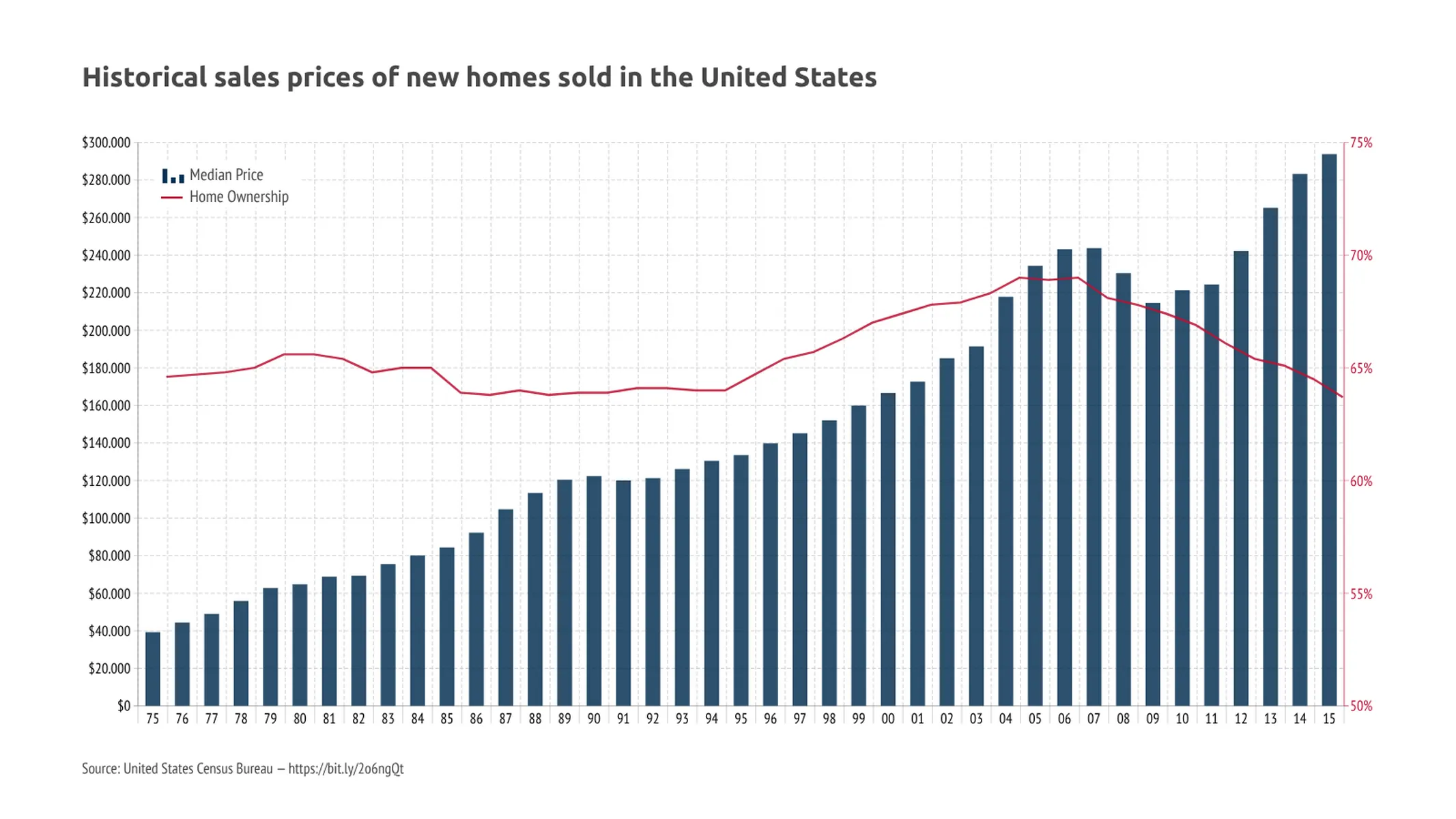
- Show how quantities, like sales, have changed over time across multiple related data series using bars or an area chart.
- Add a vertical, or horizontal shade to put the focus on certain parts of your data, like economic boost and bust cycles.
How to create a time series graph with Vizzlo?
- Use Vizzlo’s spreadsheet to enter your data as a Microsoft Excel file or as a CSV file quickly. Vizzlo’s spreadsheet supports more than 20 different date formats.
- Change each series to be shown as a line chart, bar chart, or area chart.
- The chart is fully interactive - just click on any series to change its properties like color, style, opacity, and width.
- Drag the legend to any position.
- Change the scale of the y-axis to be logarithmic or keep the linear scale.
- Click on the x-axis and y-axis to see customization options: set the axis range, define the scale and choose how to display axis tick marks and labels.
- Show or hide vertical, horizontal gridlines or click on Edit single gridlines to manually choose gridlines you want to display.
- Time series graph: pro tips
- Add a moving average that helps to smooth out the data to put the focus away from the noise onto the signal.
- Add shades to overlay, e.g. recession bands on a time series plot.
- Fill the space between lines to highlight the greater-than and less-than differences over time.
Time series graph maker: key features
- Show multiple series as lines, bars, or area charts.
- Interpolated the observations as straight lines or splines.
- Aggregate a series to a lower frequency or granularity.
- Add a moving average, a trendline, or a projection, growth rates, reference line, and a benchmark line.
- Fill area between two lines.
- Add points to the chart in various shapes.
- Adjust the opacity of your series, whether its a line, bar, or area.
- Plot the data on a linear scale or a logarithmic scale.
- Specify major gridlines separately for vertical gridlines and horizontal gridlines.
- Adjust the number format of the vertical axis.
- Adjust the date format of the horizontal axis.
- Click on the x-axis or y-axis to change the color, change the format of the axis label or hide the axes.
- Add an optional secondary y-axis.
- Adjust the axes ranges and axes breaks.
- Custom axis ticks position.
Resources
- How to create an Area chart
- How to create a Control chart
- How to create a Difference chart
- Line, area and time-series graphs. Choose the best visualization type for your data
Time Series Graph: What's new?
Series data points are now placed at interval center per default.
All data point settings are now shown by default.
Fixed date inputs for shades showing N/A.
Series that are part of a bar or area stack on one y-axis can now be moved swiftly and freely to the other y-axis. This means that the chart now adjusts to the new conditions while preserving all existing settings.
All series style settings are now available per selected series.
The chart space will now adjust when the axis labels are removed.
Time Series Graph Alternatives
Enhance your productivity
Create a Time Series Graph directly in the tools you love

Create a Time Series Graph in PowerPoint with
Vizzlo's add-in

Loved by professionals around the world


Visualizations your audience won’t forget
Convey abstract concepts and data with professionally designed
charts and graphics you can easily edit and customize.