VORSCHAU
Chart Vizzard
Vizzlos KI-basierter Diagramm-GeneratorApple - Device Sales by Year
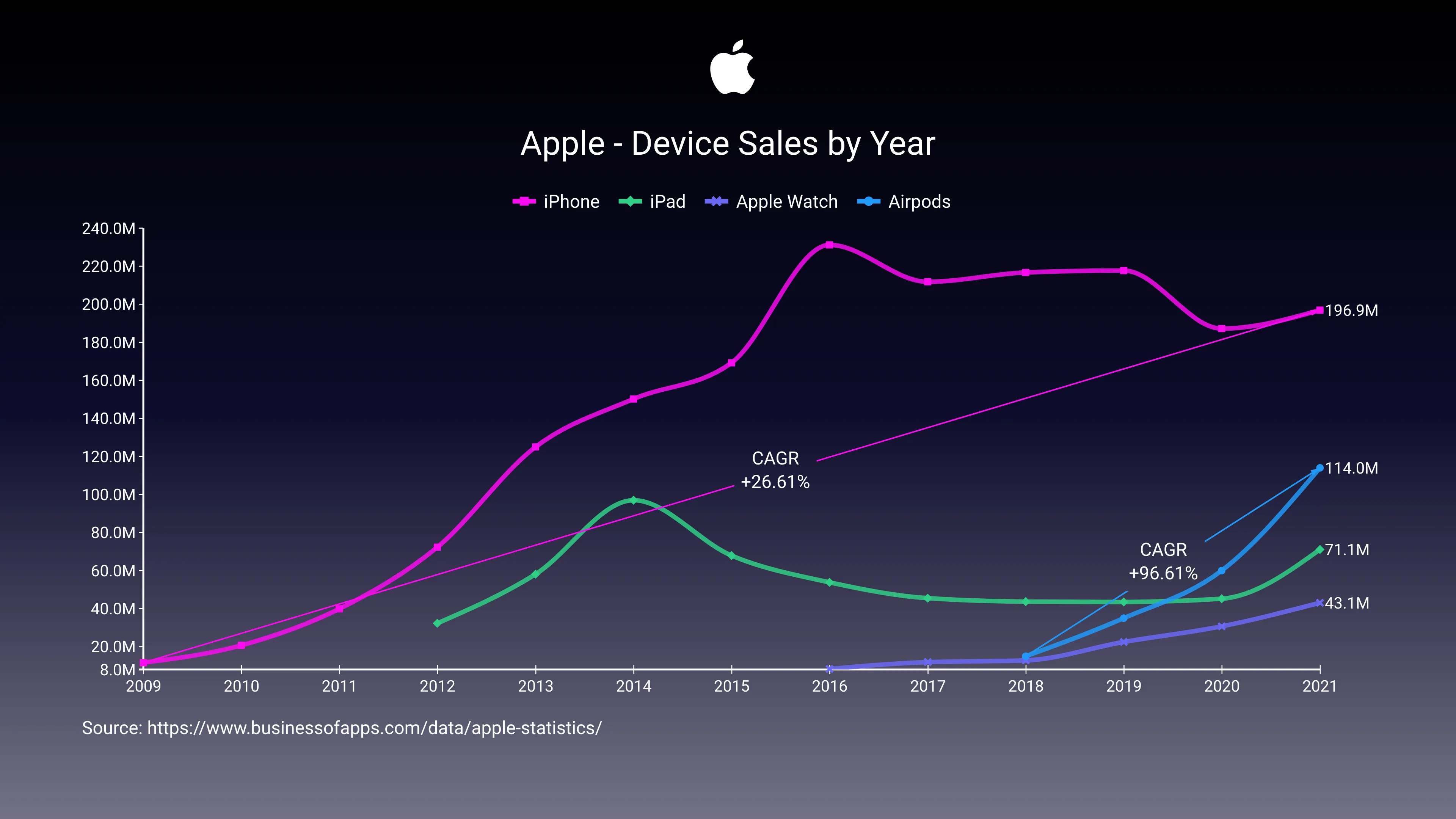
In recent weeks, some articles comparing the Airpods revenue with big-tech companies financial results have been successful on social media. But really how big are the Airpods? That’s what this chart tries to show.
Since they were launched, Airpods sales have practically doubled each year, at a pace very similar to what we’ve seen on the iPhone first years.
After the iPhone, Airpods are the most successful Apple product, far surpassing the Apple Watch and the iPad.
Dies ist ein Beispiel für Vizzlos "Zeitreihendiagramm"
Komplexes Zeitreihendiagramm zur Visualisierung detaillierter Finanzdaten.
Finanzen & Wirtschaft Balken- & Säulendiagramme Linien- & Flächendiagramme Zeitbasierte Diagramme