Chart Vizzard
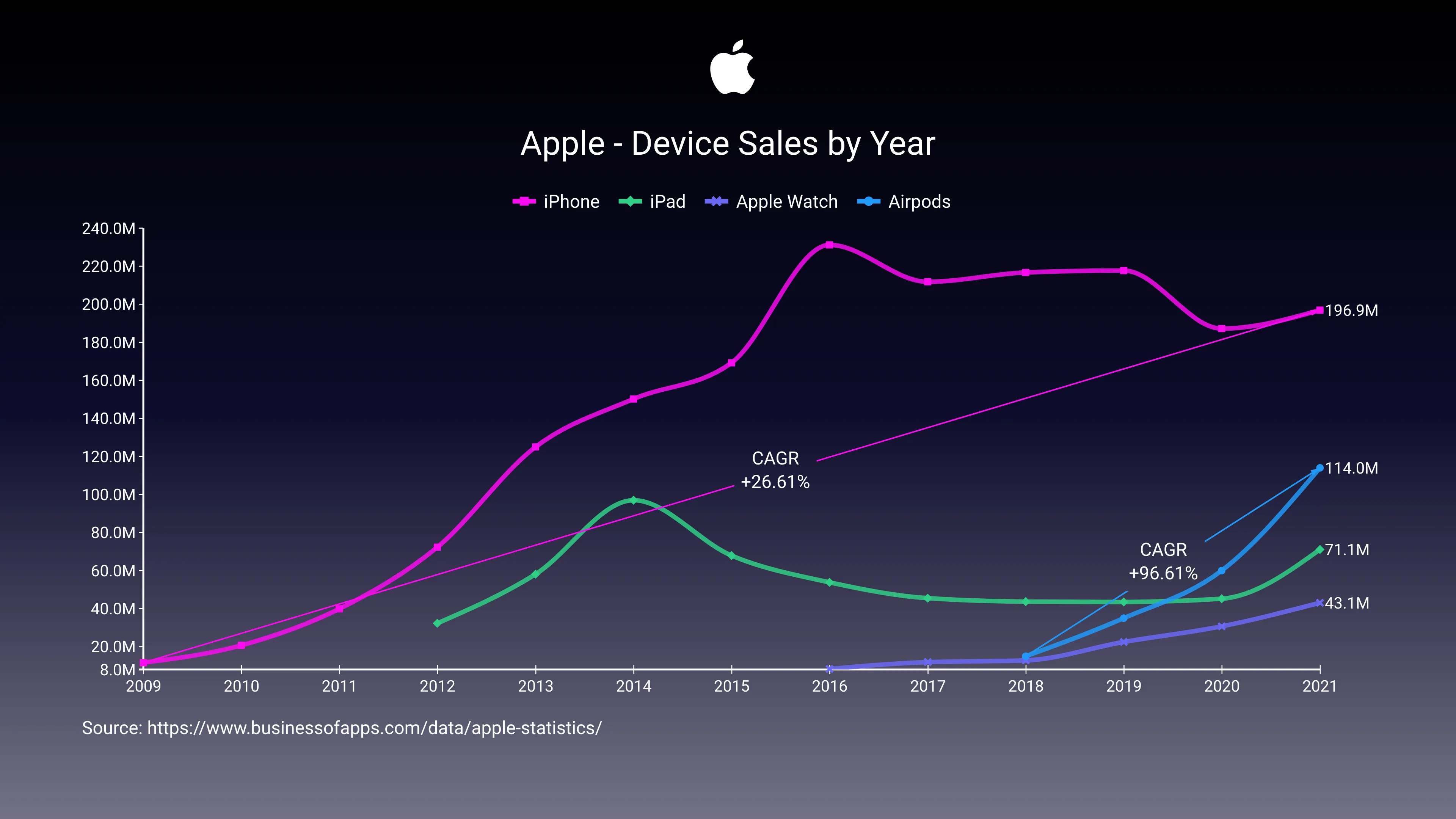
Vizzlo's AI-based chart generatorApple - Device Sales by Year

In recent weeks, some articles comparing the Airpods revenue with big-tech companies financial results have been successful on social media. But really how big are the Airpods? That’s what this chart tries to show.
Since they were launched, Airpods sales have practically doubled each year, at a pace very similar to what we’ve seen on the iPhone first years.
After the iPhone, Airpods are the most successful Apple product, far surpassing the Apple Watch and the iPad.

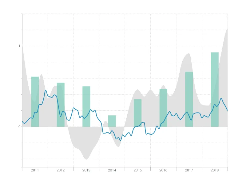
This is an example of Vizzlo's “Time Series Graph”
Complex time series graph to visualize detailed financial data.
Finance & Economics Bar & Column charts Line & Area charts Time-based charts