Chart Vizzard
Vizzlo's AI-based chart generatorCreate your Iceberg Chart in seconds
What's hidden below the surface of your project plan? Visualize it with an actual iceberg!
Create your chart in 3 simple steps
- Create new Iceberg Chart
- Add your data
- Export or share
Why Vizzlo?
- Create professional charts in seconds
- Fully customizable, no design skills needed
- Create directly in PowerPoint & Google Slides
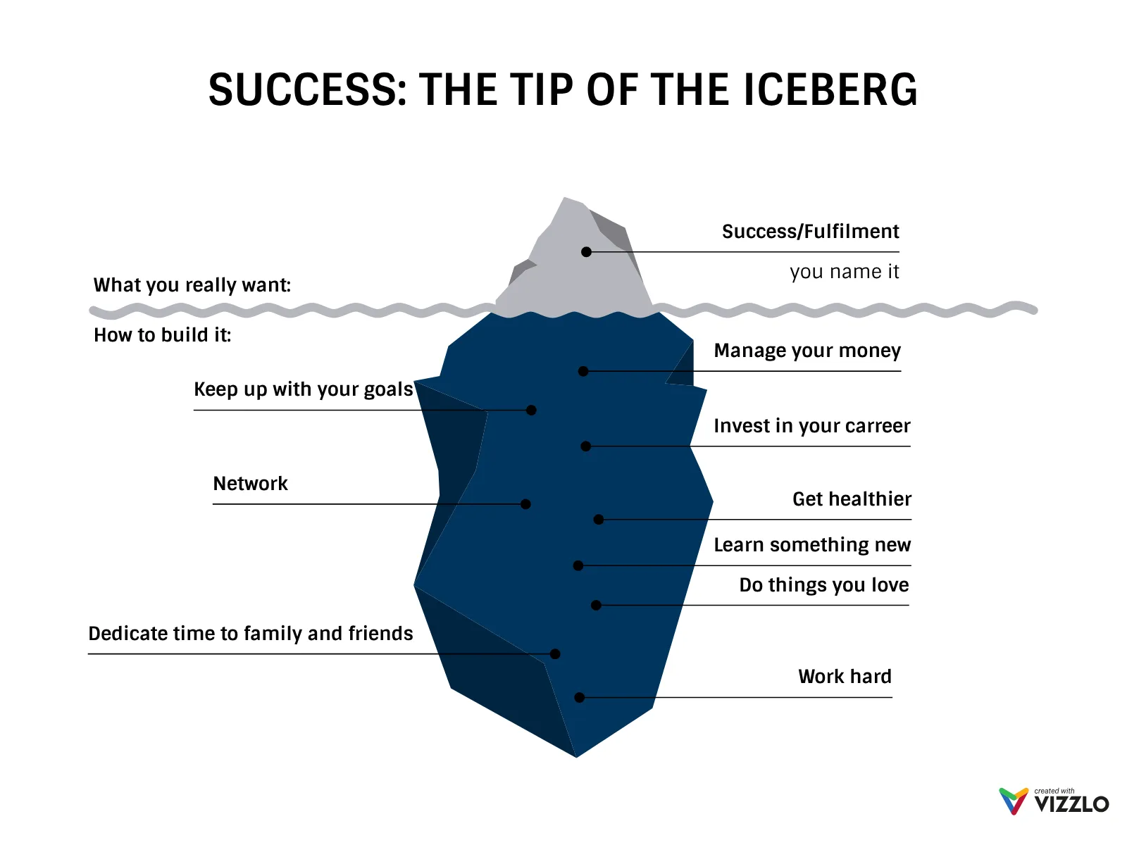
What is an iceberg chart?
The Iceberg Chart leverages the powerful metaphor of an iceberg to visualize the hidden versus visible aspects of any situation, project, or analysis. This compelling visualization helps audiences understand that what appears on the surface often represents only a fraction of the complete picture, with substantial elements remaining hidden beneath.
Key Features
- Above/below water metaphor: Clear visual distinction between visible and hidden elements
- Adjustable water level: Customize the proportion of visible vs. hidden content
- Precise positioning: Place text labels exactly where they belong above or below the waterline
- Color customization: Optional color coding for different types of information
- Dual labeling system: Separate section labels for “above” and “below” categories
Best Use Cases
- Project management: Show visible deliverables vs. underlying infrastructure work
- Risk analysis: Display obvious risks vs. hidden or systemic risks
- Cost analysis: Reveal upfront costs vs. hidden long-term expenses
- Problem solving: Distinguish symptoms from root causes
- Change management: Illustrate visible changes vs. cultural transformation needed
- Research presentation: Show preliminary findings vs. deeper investigation required
- Skills assessment: Display obvious competencies vs. foundational knowledge
Configuration Options
Tailor your iceberg visualization with precise controls:
- Water level positioning: Slider control to adjust the visible/hidden ratio (0-100%)
- Section labeling: Customize “Above” and “Below” labels to match your content
- Item positioning: Place each data point precisely above or below the waterline
- Color coding: Optional color assignment for categorizing different types of information
Visual Impact
The iceberg metaphor is universally understood and creates immediate impact:
- Intuitive understanding: Everyone knows most of an iceberg is underwater
- Proportional awareness: Visual representation of hidden vs. visible elements
- Depth suggestion: Implies complexity and layers beneath the surface
- Discovery motivation: Encourages audiences to investigate deeper
Strategic Applications
This visualization excels when you need to:
- Reveal complexity: Show that simple problems often have complex underlying factors
- Manage expectations: Help stakeholders understand hidden work or costs
- Encourage investigation: Motivate deeper analysis of underlying issues
- Prioritize resources: Highlight where attention is needed most
The Iceberg Chart transforms abstract concepts about hidden complexity into a concrete, memorable visual that audiences will reference long after your presentation ends.
Iceberg Chart: What's new?
Iceberg Chart Alternatives
Use Cases
Pictorial chartsEnhance your productivity
Create a Iceberg Chart directly in the tools you love

Create a Iceberg Chart in PowerPoint with
Vizzlo's add-in

Loved by professionals around the world


Visualizations your audience won’t forget
Convey abstract concepts and data with professionally designed
charts and graphics you can easily edit and customize.