Chart Vizzard
Vizzlo's AI-based chart generatorNew interface: the best Vizzlo experience yet!

This week we introduced an awesome update to Vizzlo’s user interface. Clear, organized and beautiful: now it’s even easier to create amazing charts and visual aids for your presentations.
These changes reflect Vizzlo’s mission: to simplify your life, making great design accessible, and the creation of visuals fast and effortless.
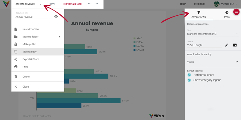
To make your experience more enjoyable, we’ve created a new concept for the menu and the sidebar of the document editor.

On the top, you’ll see a new menu bar with all document related commands can be found: save, export, print, share, etc.
And settings related to the appearance of the visualization (layout, colors, fonts, legends, etc.) and the data are now divided into different tabs in the sidebar.
This new approach presents the core functions and specific options of each vizzard in a clearer and more intuitive way. Vizzlo is now even simpler to use.
Feel invited to discover the new interface: we’re eager to hear your feedback.
Try it out! And tell us what you think. We’re happy to listen.