Chart Vizzard
Vizzlo's AI-based chart generatorWhat is a Venn Diagram
Venn Diagram Definition
A Venn diagram (also known as a set or logic diagram) can show the differences, similarities, and overlapping relationships between sets, i.e., groups of data. Its most common use is to describe the commonalities between opposing factions—for instance, in the Venn diagram example below, we can see the shared characteristics of plant and animal cells.
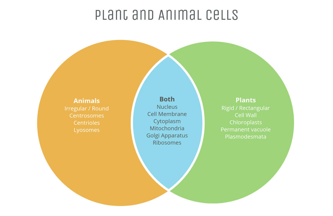
A data set is visualized as a constellation of fixed points within a closed circumference (usually circles, but sometimes ellipses, spheres or even triangles): visually describing one category that all of the included data has in common. For the example above, the circumference containing animal cell characteristics has the data points: irregular/round, centrosomes, centrioles, lysosomes, nucleus, cell membrane, cytoplasm, mitochondria, Golgi apparatus, and ribosomes. Only some of these data points/characteristics are shared by plant cells, visualized in the blue intersection.
Like the look of this Venn diagram example? Get started and create your own!
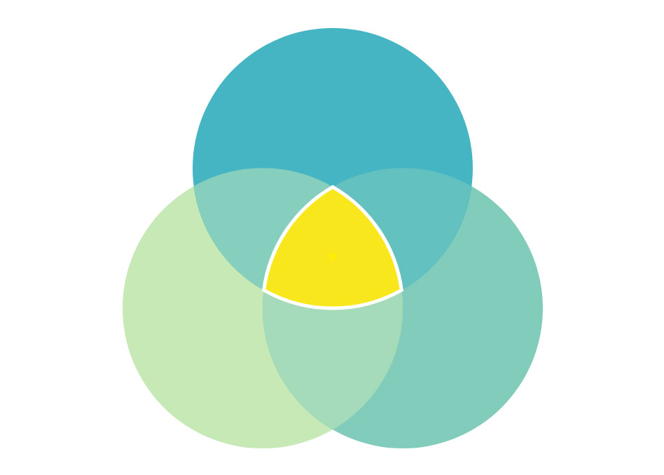
The main point of interest with Venn diagrams is this intersection—the data that falls amongst more than one category (in the example above, this is clarified with the label “both,” though it must be remembered that an intersection is not its own, separate data set). Venn diagrams can consist of multiple intersections and circle sets, but the most often used is the 3-circle or triple Venn diagram.
One particular factor in the triple Venn’s popularity is that it creates, at its centre, a curved triangle of perfect and constant width, known as the “Reuleaux triangle.” This shape has fascinated engineers, mathematicians, architects and graphic designers for both its mathematical possibilities and its visual beauty, and has been used by polymaths from German engineer Franz Reuleaux (for whom they are now named after) to produce kinetic machinery, to Leonardo Da Vinci for map projection.
Start designing your own charts and business graphics.
Try Vizzlo for freeDevelopment and History of the Venn Diagram
In some shape or another, Venn-style diagrams have been around since the Middle Ages. The abstract visual representation of the conjunctions and intersections of different sets is an incredibly old concept, as there is a profound human impulse to show what does and does not belong together. As with most logical mediums, it has grown and changed organically over the years, being refined, refocused and repurposed into the circle diagram we are so familiar with today.
The first mathematician directly linked to this style of diagrams is the German polymath and philosopher Gottfried Wilhelm Leibniz, circa late 1600s. Leibniz was, in essence, an early adopter of many data visualization concepts: he believed in symbolic representation of complex thoughts in order to not only communicate these ideas better but leave less room for human error, misinterpretation, and the disputes that ensue. For Leibniz, calculating and visualizing differences of opinion into formalized logic diagrams achieved this.
The Euler Diagram
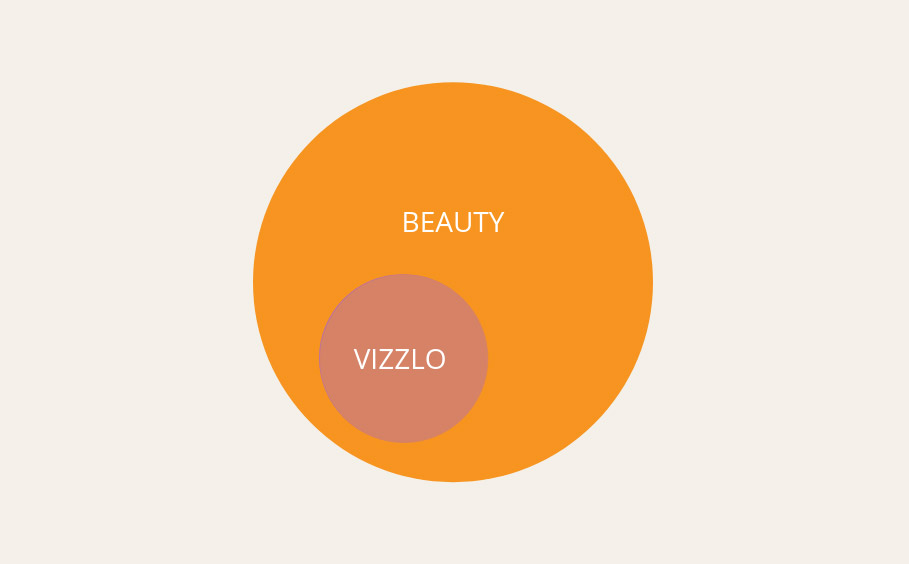
Roughly a hundred years later, the renowned Swiss mathematician Leonard Euler became widely renowned for using overlapping circles to represent logical conclusions (or syllogistic reasoning). These circles are used to depict the four categorical propositions of syllogism:
- The Universal Affirmative “All of Vizzlo’s graphs look beautiful”
- The Universal Negative “None of Vizzlo’s graphs are hard to produce”
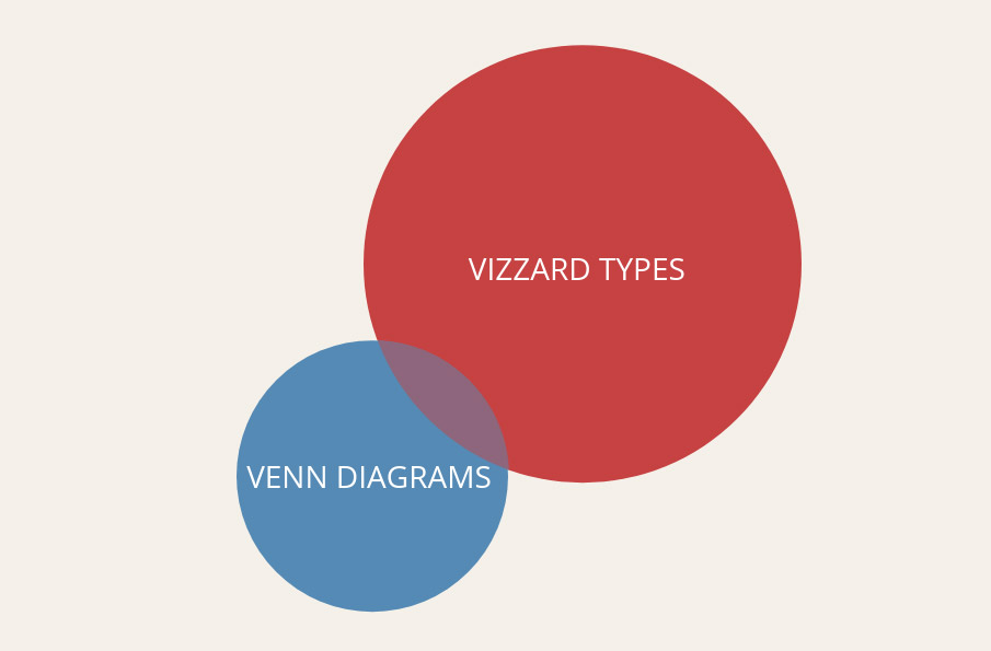
- The Particular Affirmative “Some of Vizzlo’s Vizzards include Venn diagrams”
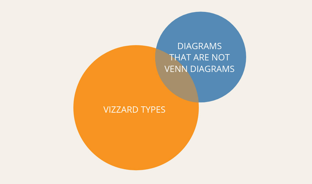
- The Particular Negative “Some of Vizzlo’s Vizzards are not Venn diagrams”
Sidenote: Did you know that, in line with logical semantics, the English language had four words for “yes” & “no” until the end of the 16th century?! The Universal Affirmative would have been spoken as “Yea,” the Universal Negative as “No,” the Particular Affirmative as “Yes” and the Particular Negative as “Nay.”
To be clear, it’s become common data viz practice to group both Euler and Venn diagrams under the more commonly known name “Venn diagram,” to help eliminate confusion—only in very technical mathematical situations would it be necessary to delineate between the two.
The Modern Venn Diagram
The Venn diagram we know today was developed by the English mathematician John Venn. In 1880 he published an article called “On the diagrammatic and mechanical representation of propositions and reasonings.” In it, Venn proposed to modify the Euler diagram to become a more comprehensive visualization for probability, by requiring all possibilities to be depicted. The name “Venn diagram,” however, was not coined by the American philosopher Clarence Irving until several years later in 1918.
Since then, the Venn diagram has been the center of extensive research from many other notable scientists, among them A.W.F. Edwards, Branko Grunbaum, and Henry John Stephen Smith. They have become an essential visualization for mathematical study, whether the traditional 3-circle diagram or more intricate versions including spheres and ellipses, for areas such as set theory, logic theory, rotational symmetry and the study of complex shapes and numbers such the tesseract.
What is NOT a Venn Diagram?
For such a straightforward diagram, the Venn has been mislabelled over the years. In fact, more often than not, we now refer almost exclusively to Euler diagrams when we discuss the “Venn.”
Venn diagrams are essentially a more specific type of Euler diagrams. Here is a handy Euler diagram visually describing that all Venn diagrams are Euler diagrams, but not all Euler diagrams are Venn diagrams:
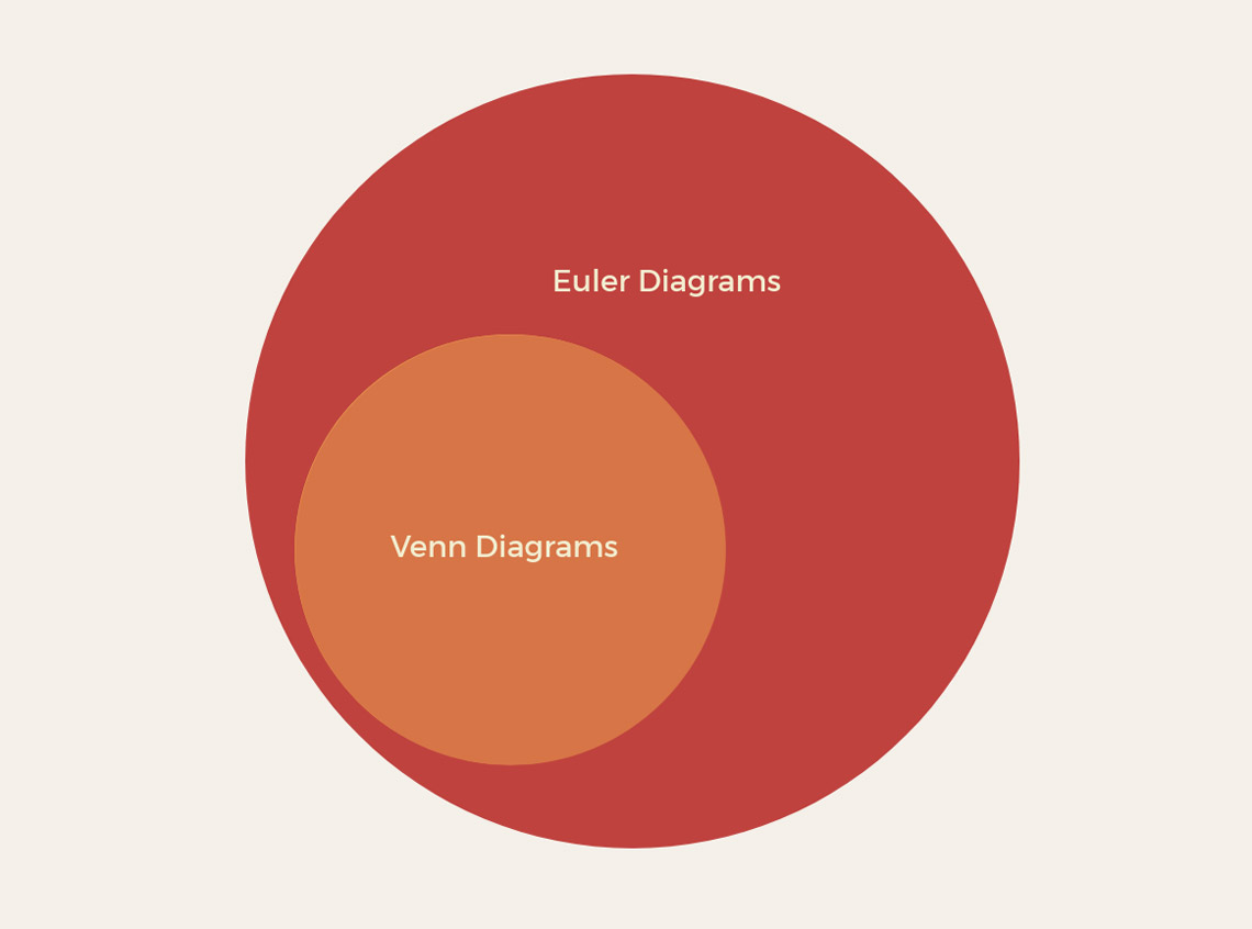
The golden rule of the Venn is that it always visualizes all possibilities, even if none of the data fits into these intersections, whereas an Euler diagram visualizes only the categories there is data for. If we were to force the diagram above to fit the parameters of a Venn diagram, we would have to imagine that some Venn diagrams exist that are not Euler diagrams. To put this into context, this is like stating that some animals are not penguins and therefore some penguins are not animals.
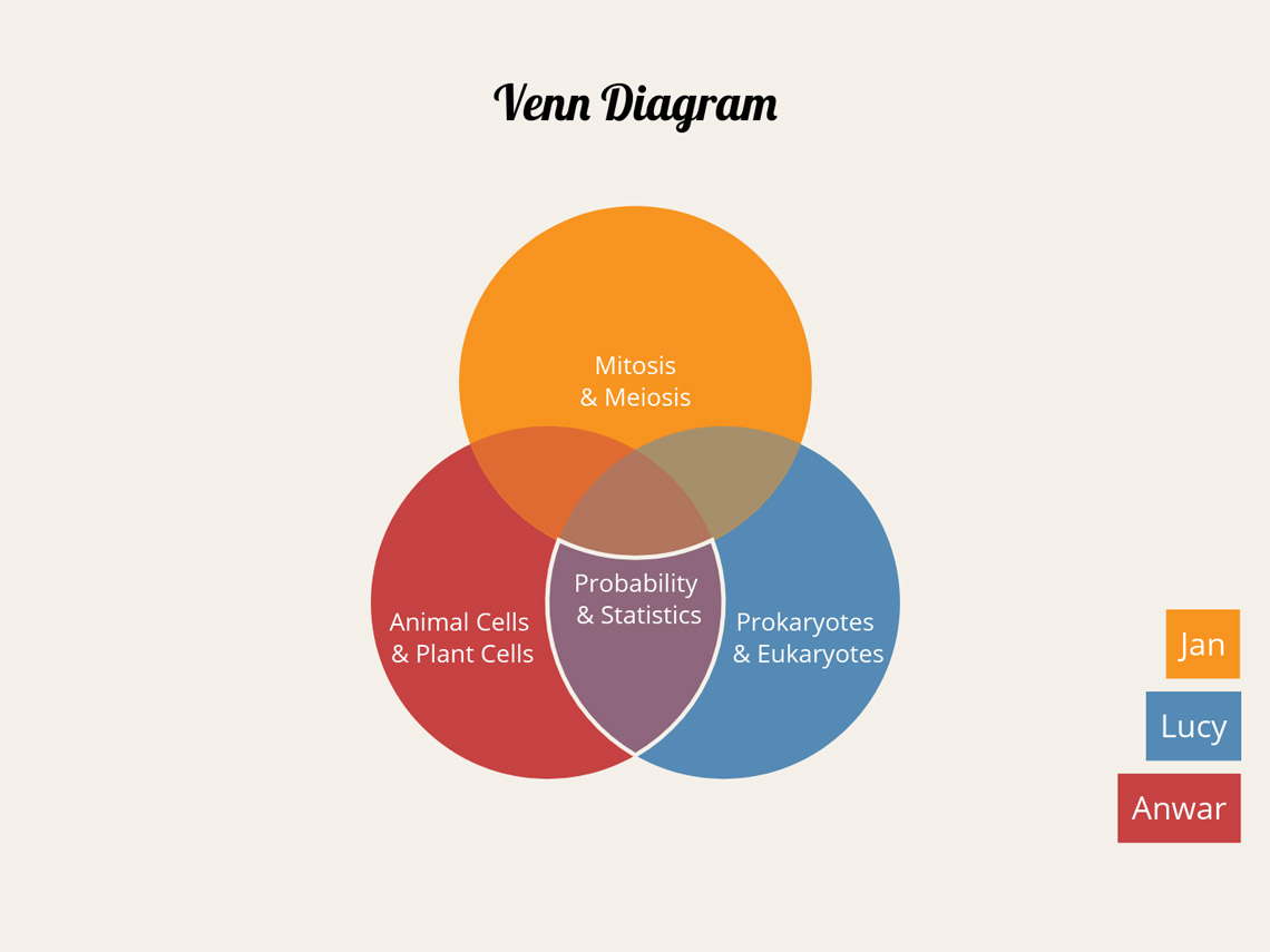
To show this difference in practice, let’s imagine that three friends are comparing their homework. Lucy produced two pieces of homework, one on “Prokaryotes & Eukaryotes” for Science and one on “Probability & Statistics” for Math. Anwar also produced his Math homework on “Probability & Statistics,” but chose the topic “Animal Cells & Plant Cells” for Science. Jans produced an excellent essay on “Mitosis & Meiosis” for Science, but completely forgot that his Math homework was due at all.
If the orange data set represents Jans, the pink data set represents Anwar, and the blue data set represents Lucy, we can organize this information in two different ways.
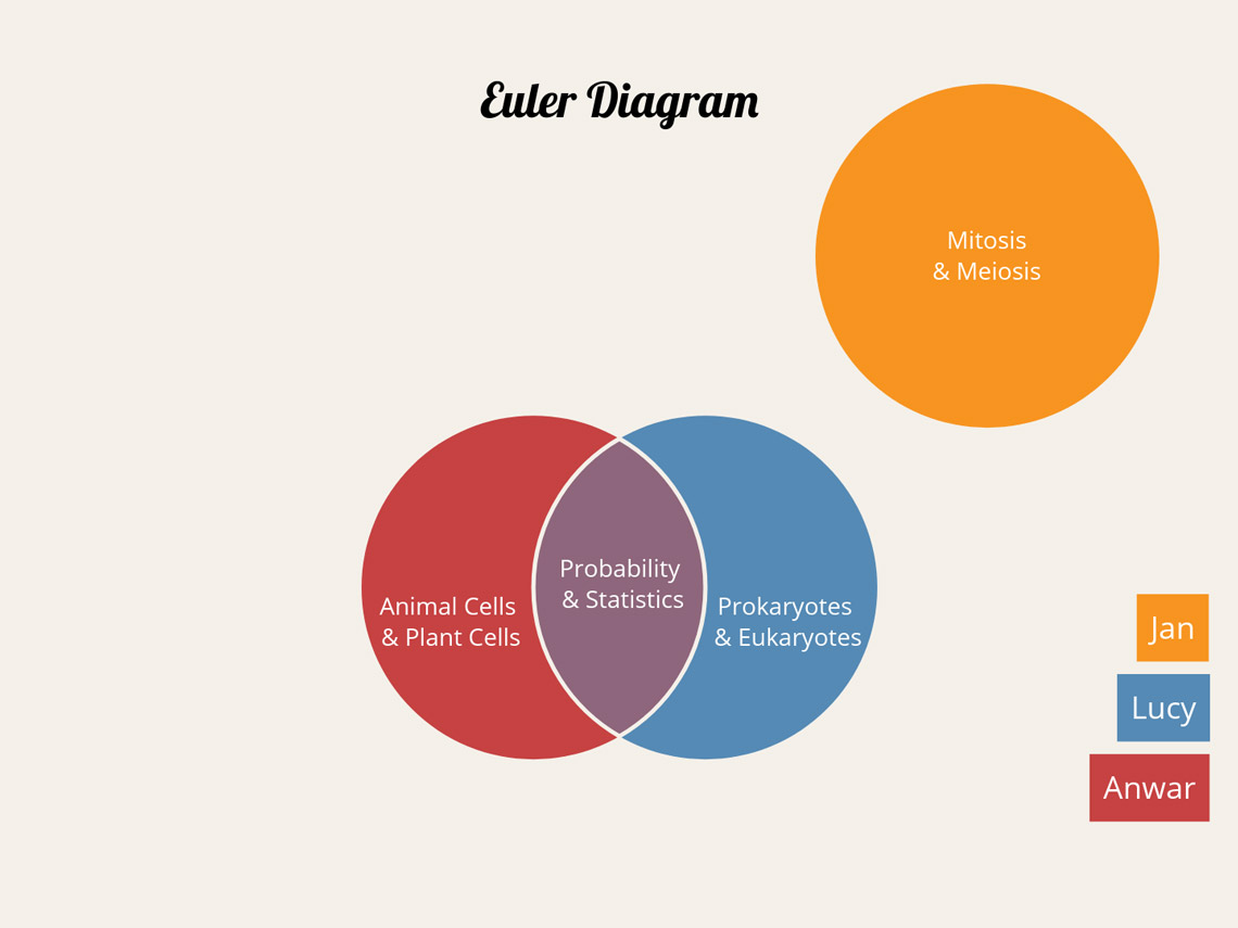
The Euler diagram shows just the possibilities we have factual data for already. We know that Anwar & Lucy both did their Math homework on “Probability & Statistics,” and so the intersection shows this. We know that Jans did not create any Math homework like Anwar and Lucy, and that they did not choose the same topic as him for Science, so Jans’ data set does not overlap with any other.
The Venn diagram shows the same information—the topics the three friends did individually, and the Math topic that Anwar and Lucy both chose. However, we also have intersections that are void of data but represent all other possibilities.
The orange intersection on the left represents the instance in which Jans, along with Anwar, remembers his Math homework as well as Science—but in this hypothetical outcome, Lucy forgets to complete work for Math. The green intersection on the right imagines the same fate for Anwar. The central intersection shows the possibility that all three friends remember to work on “Probability & Statistics” for Math, as well as their various topics for Science, and no one gets detention …
Ready to create your own Venn diagram? Here’s a little shortcut to the Vizzard page just for you.
To produce a Venn diagram, there must be both commonalities and differences between the two data sets. If all the information categorized is identical, your diagram would look like this:
Even with two data sets, if the information contained has no differences, the two curves would overlap entirely, creating just one circle.
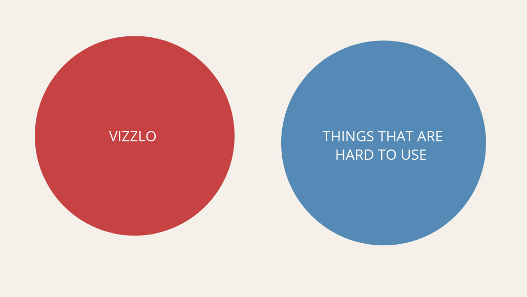
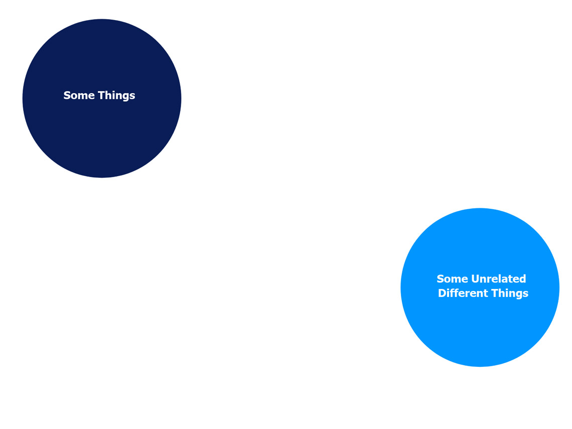
The opposite problem, two data sets with no commonalities, would also not create a Venn diagram (but a perfectly acceptable Euler diagram showing disjoint sets).
Surprisingly, something that looks as familiar as the example below is also not mathematically considered to be a Venn diagram.
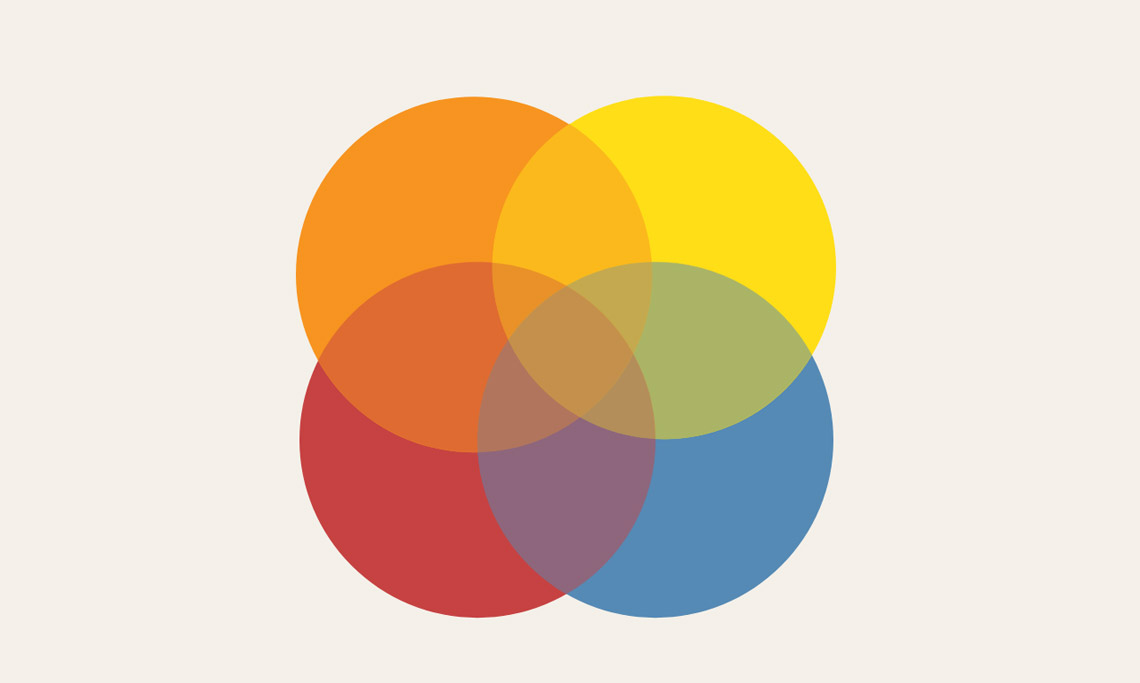
As previously explained, one of the key requirements of a Venn diagram is that it must show all possible logical outcomes. As there is no intersection in the example above in which only the yellow and the red, or only the blue and the orange, meet it cannot be considered a complete depiction of universal logic.
Summary
To summarise, a Venn diagram is:
- A type of Euler diagram
- A diagram with two or more data sets, depicted within circumferences
- Used to visualize the differences and shared commonalities between those data sets
- Used to work out all logical conclusions
- Incredibly fast to produce using Vizzlo’s Venn Diagram Vizzard
Vizzlo is super easy and you can try it for free.
Start designing your own charts and business graphics.
Try Vizzlo for free