Chart Vizzard
Vizzlo's AI-based chart generatorChanging Worlds: Global population in 1950 vs 2050

Part I of our Changing Worlds series.
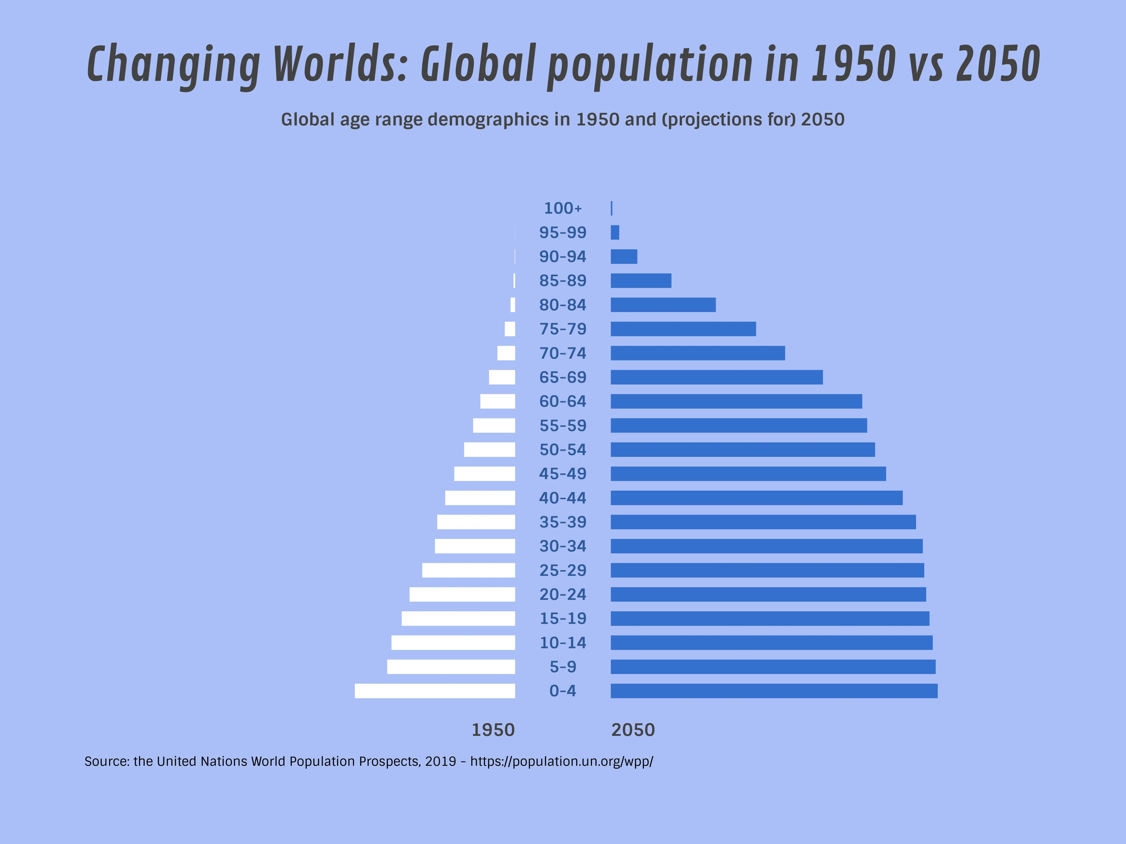
The change between the population in 1950 and the UN’s projections for 2050 are staggering, with a total increase of over 7 billion people - roughly quadruple the global population in 1950.
However, we can predict from this chart that this growth rate will slow significantly beyond 2050 as the proportion of those in their 20’s and 30’s (peak years for starting a family) are almost equal to the proportion of children–suggesting that most adults in 2050 will have only 1 or 2 children.
Compare this with the proportions in 1950 (particularly in the 0-4 age range, the beginning of the ‘baby boomer’ generation), where we see 50% more children than the 20-40 age range, and the causation for such a population increase becomes clear.

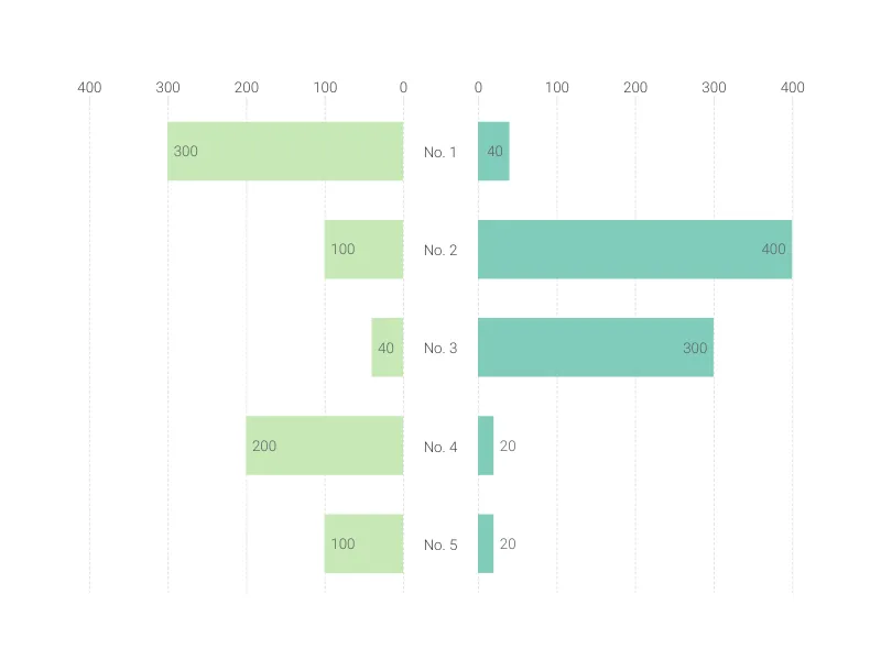
This is an example of Vizzlo's “Butterfly Chart”
Create a butterfly chart to compare two data sets side by side.