PREVIEW
Chart Vizzard
Vizzlo's AI-based chart generatorStar Wars - the force accounted

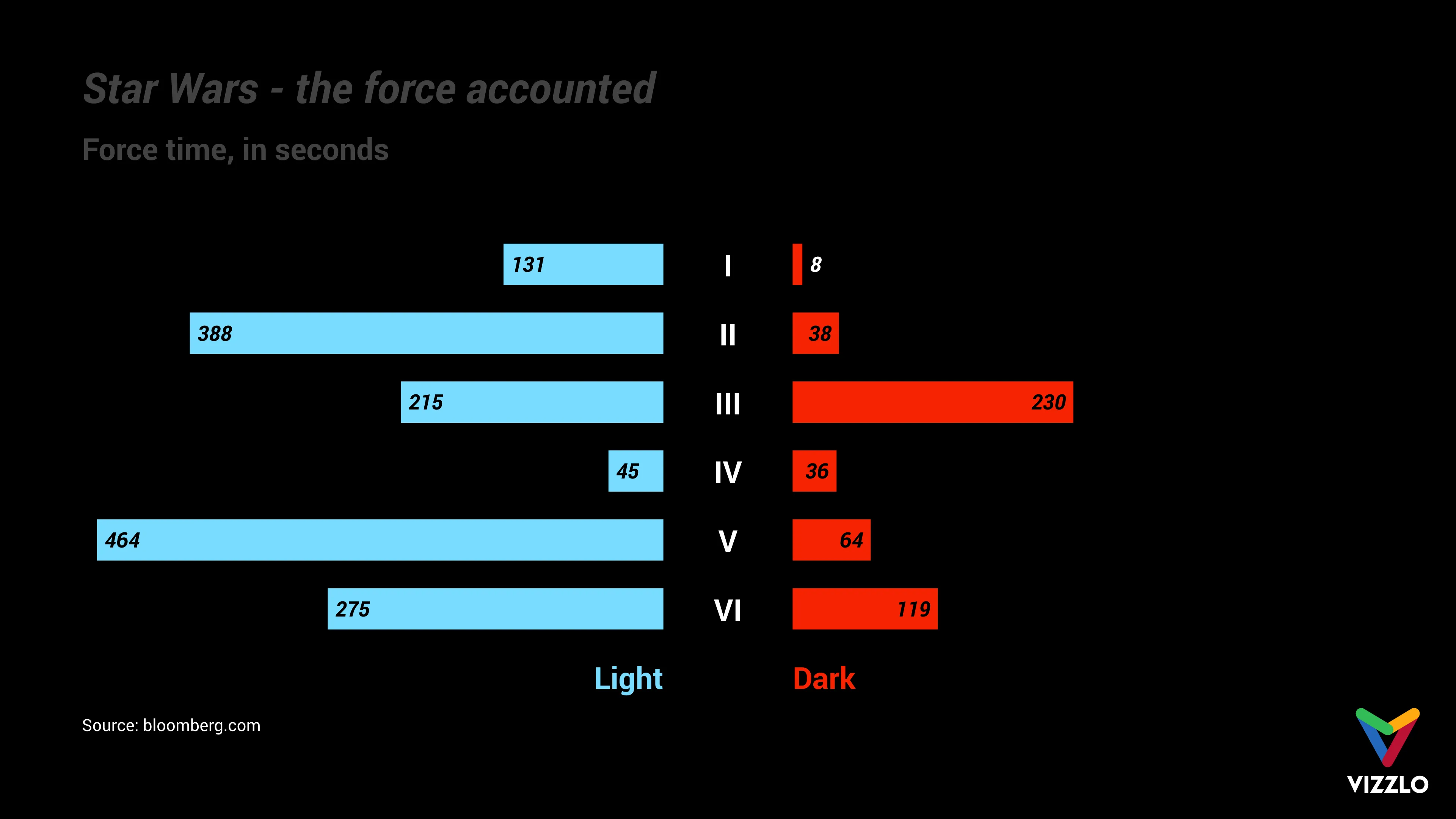
Star Wars Day, May 4th. This gallery post recreates a plot from this Bloomberg article: https://www.bloomberg.com/graphics/2015-star-wars-the-force-accounted/
The diagram shows the time, in seconds, that can be allocated to each side for the Force screen: light side vs. dark side.
The authors pointed out that only 4 percent of the 805-minute Star Wars film canon involves discernible Force use.
May the 4th be with you!

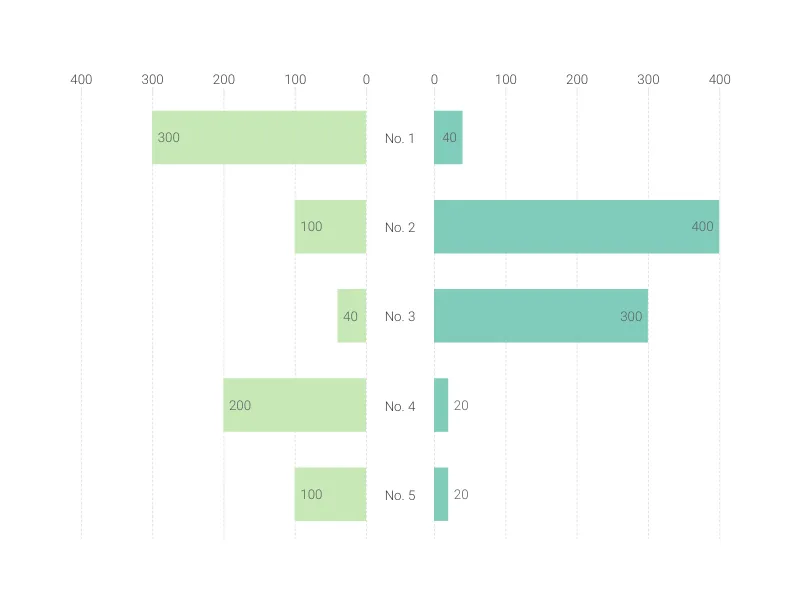
This is an example of Vizzlo's “Butterfly Chart”
Create a butterfly chart to compare two data sets side by side.