Chart Vizzard
Vizzlo's AI-based chart generatorA case for a Pie chart

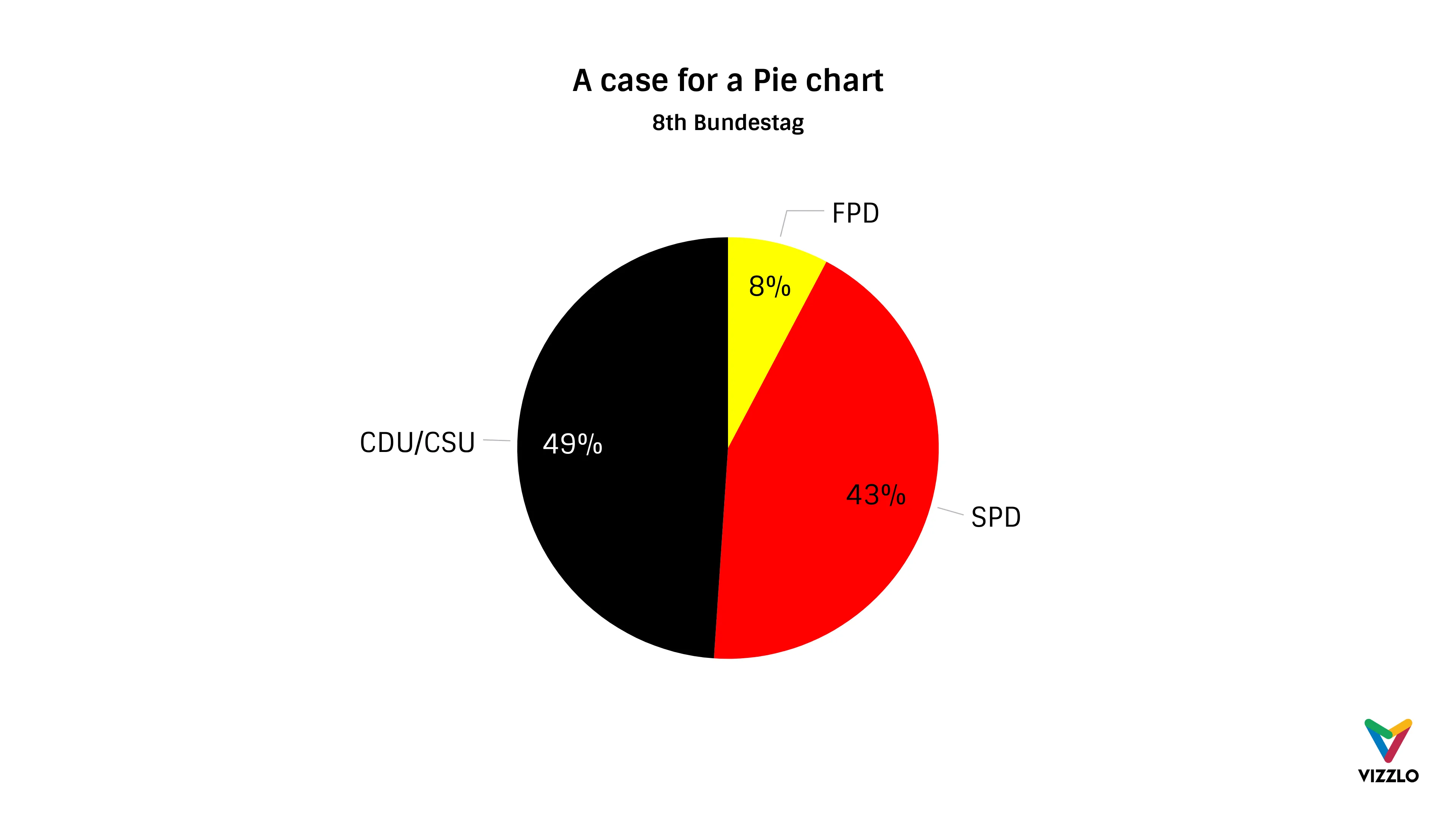
It is not often the case that a pie chart is the best type of graphical device to show proportions. Claus Wilke mentioned an example where a pie chart is just the right choice.
The author cites this example because the pie chart most clearly shows the distribution of seats in the German Parliament between the coalition of Social Democrats (SPD) and Liberals (FDP) versus the Conservative (CDU) faction. Even if the difference in the 8th Bundestag (1976-1980) was only 1%, the example shows this clearly. Because a pie chart encodes values as angles, and people are not good at comparing angles, Pie charts work best for values around 25%, 50%, or 75%.
Source: Claus O. Wilke, Fundamentals of Data Visualization

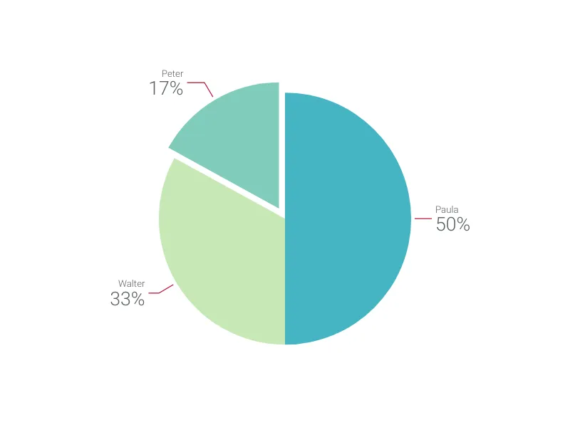
This is an example of Vizzlo's “Pie Chart”
Our free online chart maker helps you create pie charts in no time. Online, in PowerPoint or Google Slides.