Chart Vizzard
Vizzlo's AI-based chart generatorCreate your Pie Chart in seconds


Our free online chart maker helps you create pie charts in no time. Online, in PowerPoint or Google Slides.
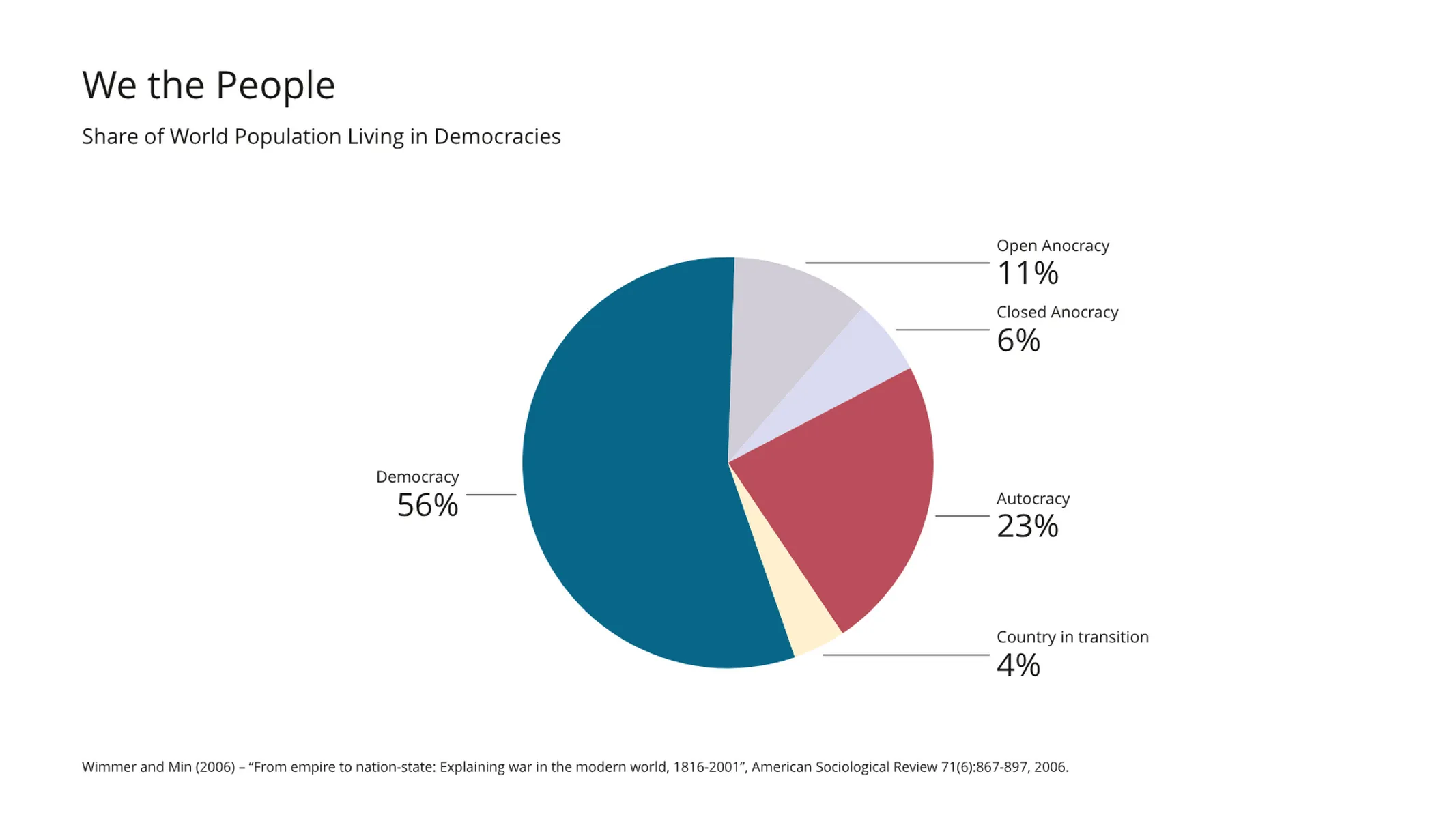
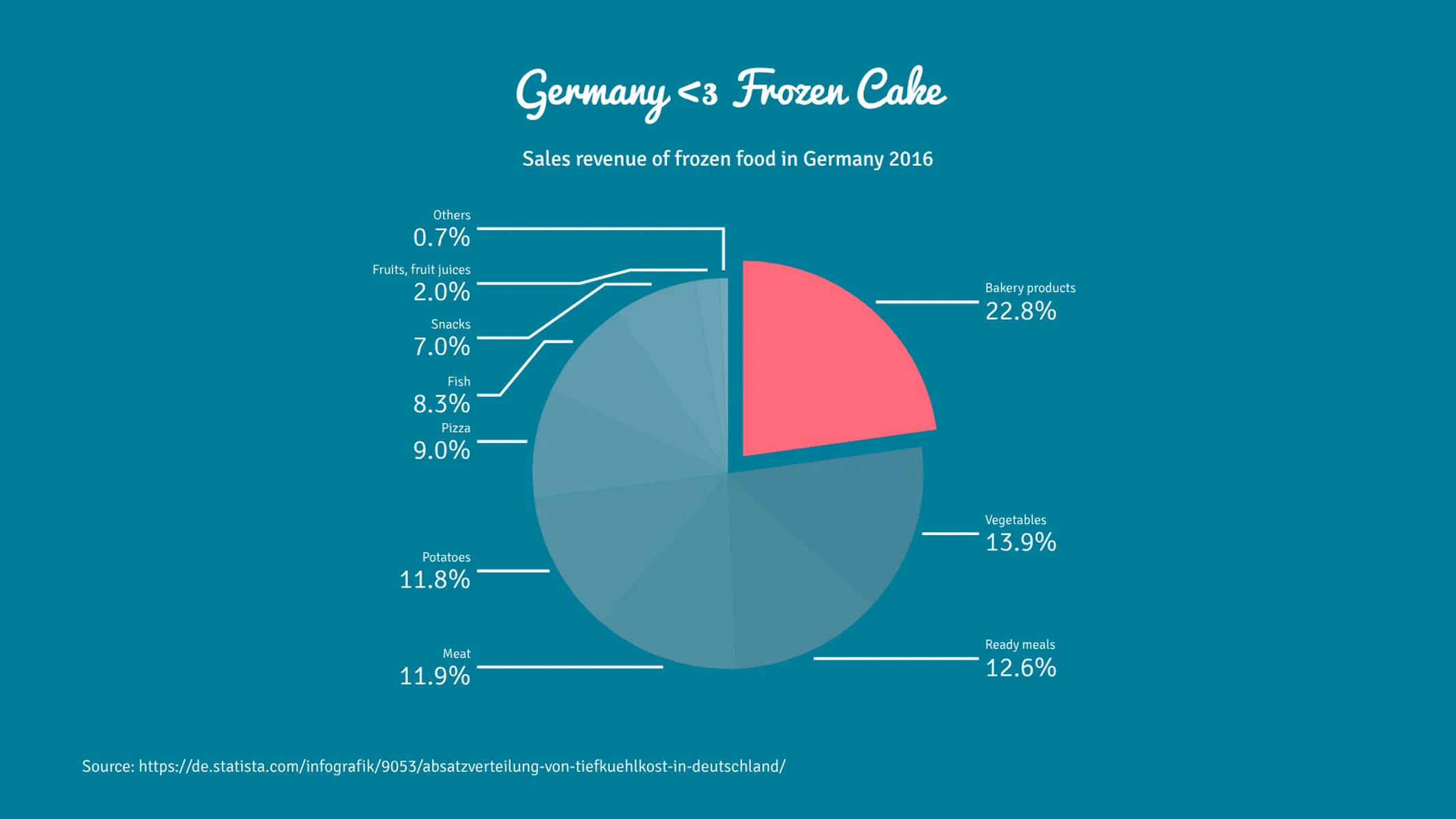
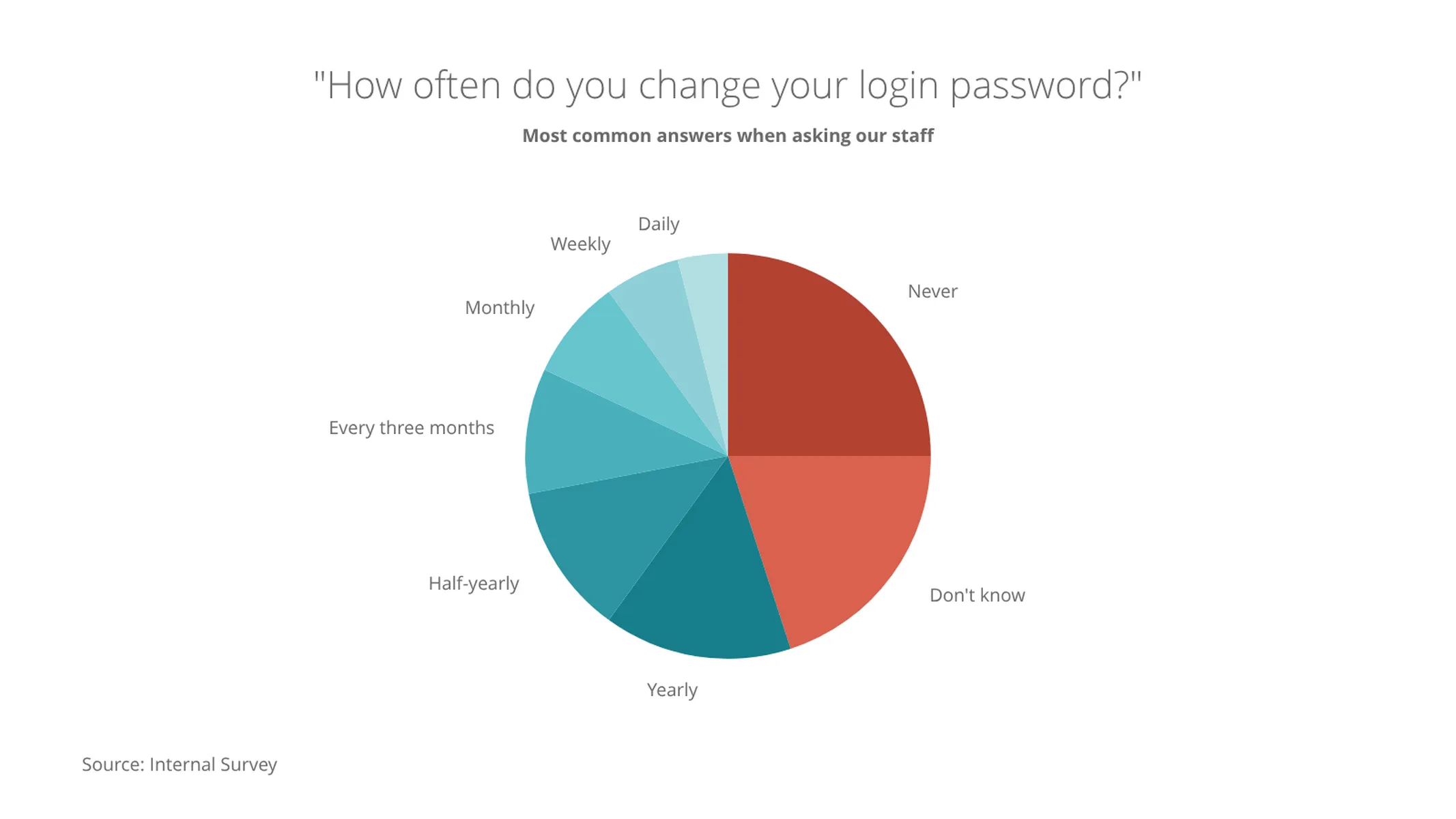
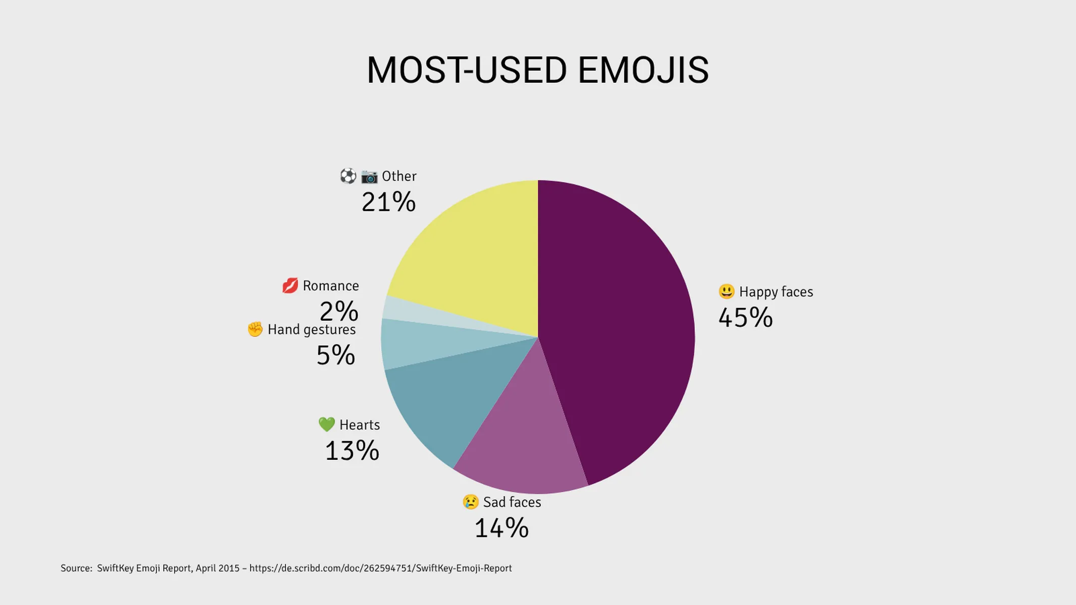
Create your chart in 3 simple steps
- Create new Pie Chart
- Add your data
- Export or share
Why Vizzlo?
- Create professional charts in seconds
- Fully customizable, no design skills needed
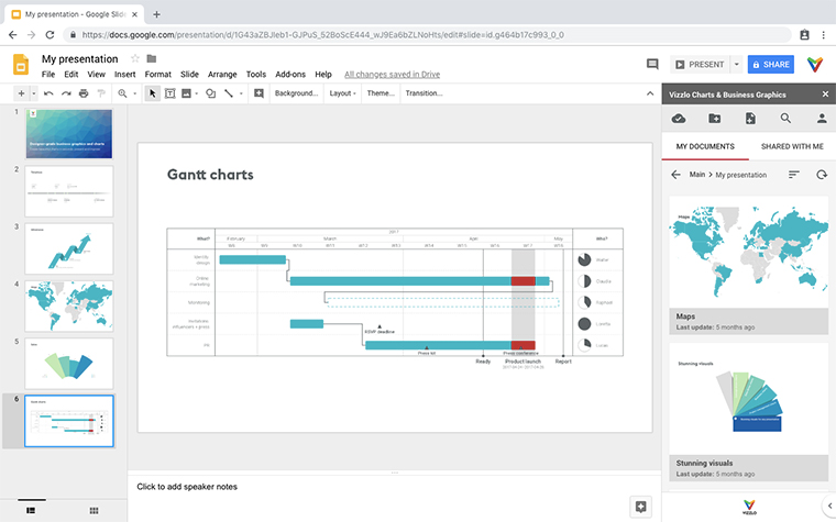
- Create directly in PowerPoint & Google Slides
What is a pie chart?
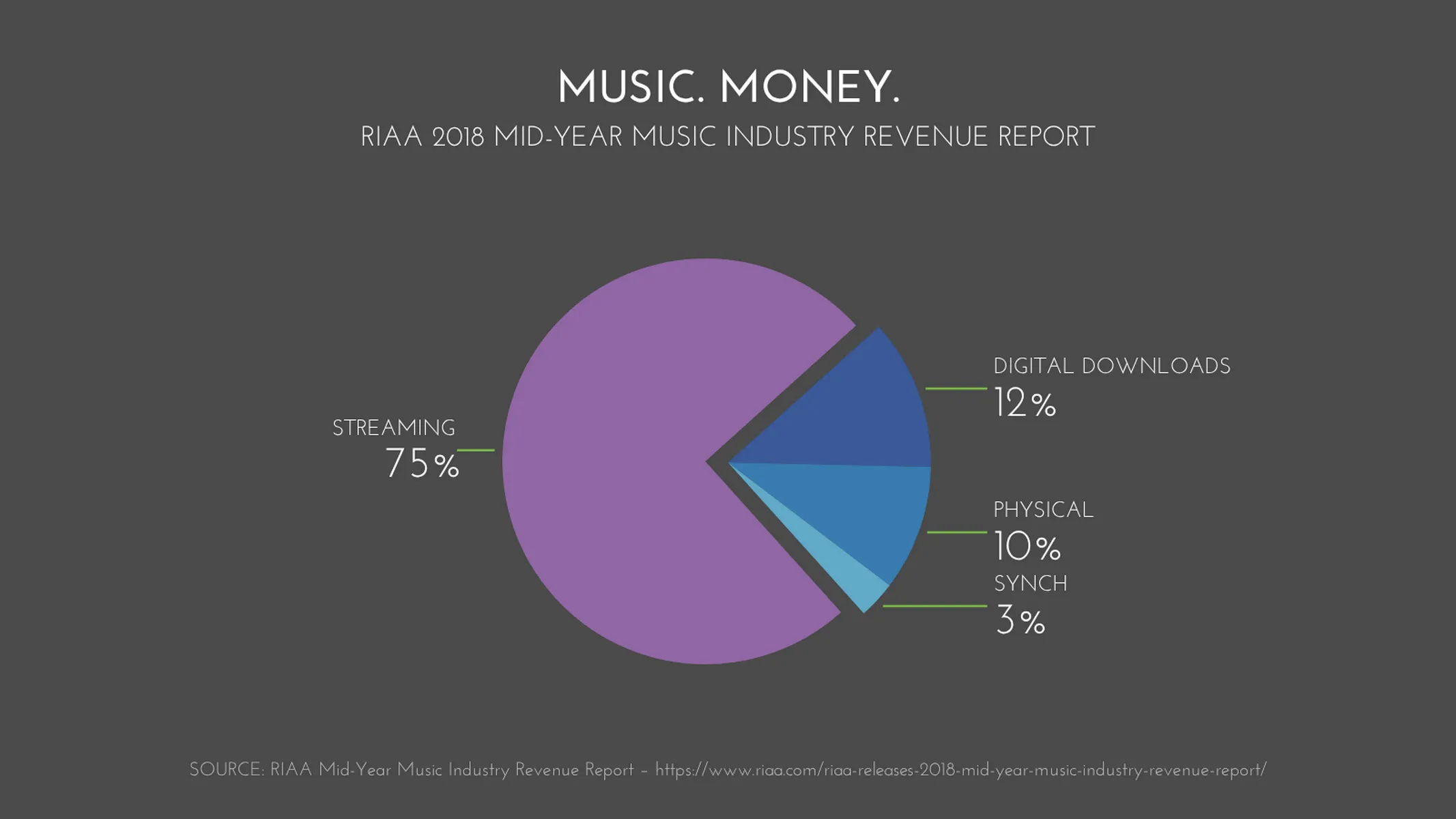
A pie chart (or circle chart) is a circular graphic whose total area represents 100%. It is used to visualize the proportions of different parts of a whole.
In a pie chart, each slice is proportional to the value it represents (this proportional relation is evident in many ways: through the slice’s angle, total area, as well as its arc length). The pie chart is widely used in newsrooms, business, and educational contexts to present the composition of demographic data, statistical numbers, market shares, etc., at a glance.
Best uses for the pie chart
- Showing the composition of demographic data, like the size of your market share in different geolocations
- Highlighting ‘stand out’ percentages, particularly in news, business or academic reports, and communicative information
- SEO website traffic analysis - where are your biggest sources of traffic online?
How to make a pie chart with Vizzlo?
This plugin is an intuitive online pie chart maker. Check the examples to get inspired and follow these easy steps to make a colorful pie chart in seconds:
- Click on the elements to select and edit them
- Use the “plus” buttons on the chart or the tab “DATA” to add new slices
- Alternatively, use the active cards in the sidebar or the spreadsheet to enter your data
- Select a slice and check the box “Highlighted” in the active cards to explode it (you can also right-click for this)
- Explore the options of the tab “APPEARANCE” to customize and optimize the display of labels, values, and lines
To get a full introduction on how to create a Pie Chart with Vizzlo check out our video tutorial:
Pie chart: pro tips
- As a pie chart is a proportional representation, it only works for values that add to 100% (otherwise, try a bar chart)
- If your chart has many sections that make it difficult to read, try grouping all data below the top 5 categories into one section titled ‘Other’
- If the labels for your sections are still overlapping even after re-grouping as above, try changing the “Layout settings” on the “APPEARANCE” tab (the check box “Labels as list” is particularly helpful)
- Always sort your chart sections by value: the largest share should be placed at 12o’clock, with the rest of the shares positioned clockwise in descending order (excluding the ‘Other’ section, which must always come last)
- For the design, sticking to gradients of one color and using a contrasting color to emphasise key data will make your chart easy to interpret–especially if you fade the ‘Other’ section to a pale grey to show that the other sections have greater significance
- 3D pies tend to distort our understanding of the proportions of shares (the depth of the chart creates the illusion of extra volume in some slices and not others)–so stick to 2D if you want to communicate accurately
- For a quick reference guide to the above, check out our Pie Chart Hacks infographic
Pie chart maker: key features
- Custom colors and number formats
- Custom connectors and labels
- Exploded segments
- Optional sorting by value
- Adjustable start angle
Resources
Our Data Viz Guide has a number of articles on pie charts, including:
Pie Chart: What's new?
Fixed selection frames for slices being displayed with an offset.
Fixed inner value label display for pie charts in 3D mode.
You now have the option to display both absolute and percentage values together.
Drag & drop for pie segments now works properly again.
Label lines in outside position now use the custom connector lines theme setting.
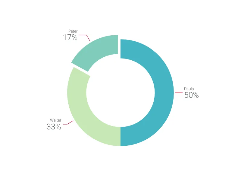
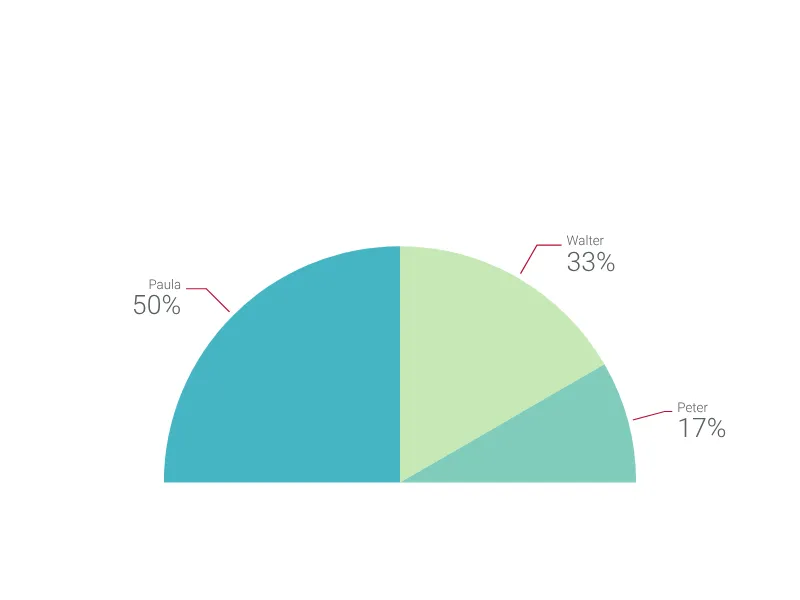
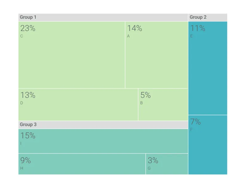
Pie Chart Alternatives
Use Cases
Circular chartsEnhance your productivity
Create a Pie Chart directly in the tools you love
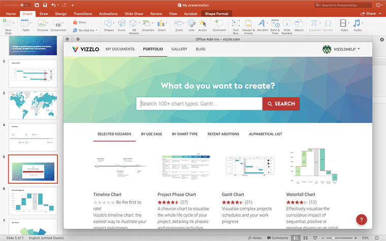
Create a Pie Chart in PowerPoint with
Vizzlo's add-in
Loved by professionals around the world







Visualizations your audience won’t forget
Convey abstract concepts and data with professionally designed
charts and graphics you can easily edit and customize.