Chart Vizzard
Vizzlo's AI-based chart generatorJune 13, 2017 • 4 min read
Line, area and time-series graphs
Choose the best visualization type for your data

When we decide to visualize quantitative data, we’re trying to make some aspects of these data evident. Therefore, before picking a chart type, we should ask ourselves some questions regarding our objectives. Contextual (e.g., about what you want to tell your audience) and specific questions (e.g., about the characteristics of your data sets and different chart types) are important to define a point of departure.
Some datasets can be explored in various ways. Therefore, there’s no such a thing as ONE right chart. However, some effective visualizations will help you clarify your questions and achieve your objectives.
Make your reports more powerful: use data visualization
Do you need to report the company’s results for the last quarter or present the website traffic and its different sources for the past twelve months? Because these are series of data points indexed chronologically (or just “time series”), a time series graph is your best option.
Are you analyzing how the performance evolves through sequential development stages or visualizing the distribution curve of your research data? A conventional line or area chart will help you to grasp the underlying patterns and trends of your data.
Regardless of your question, visualizing these data will not only help you in drawing up your analysis, but it will also make your observations and statements much easier for the public to understand.
What is the difference between a time series graph and a conventional line or area chart?
A time series graph is very similar to a line chart, but its horizontal axis (x-axis) is exclusively time-based. Hence, ideal to represent time series. While other line or area graphs allow you to plot your data along a value or category x-axis.
Lines vs. areas. When should you choose each of them?
At first glance, the line and area charts look very similar. They all work well to visualize single and multiple time series, i.e., to show changes and continuity along the horizontal axis. However, they are not interchangeable — they structure, organize, and present data differently, highlighting distinct aspects and thus providing different information.
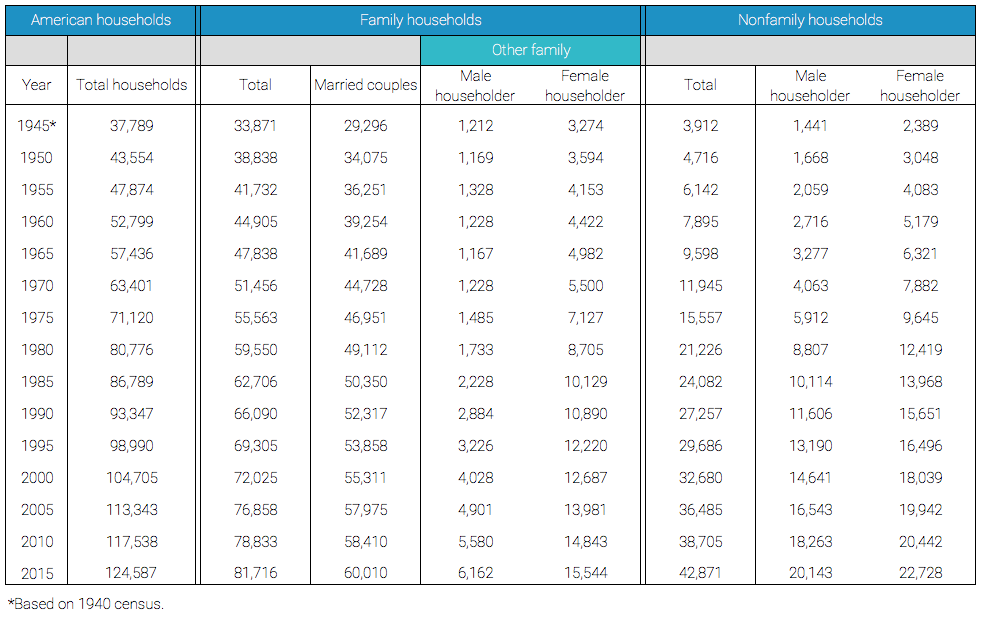
To explain when to employ lines or areas, we’ve chosen some data about American households over decades from multiple demographic groups (Table 1).
The first chart is a standard graph using only lines that shows how the numbers of different types of households evolved from 1945 through 2015.
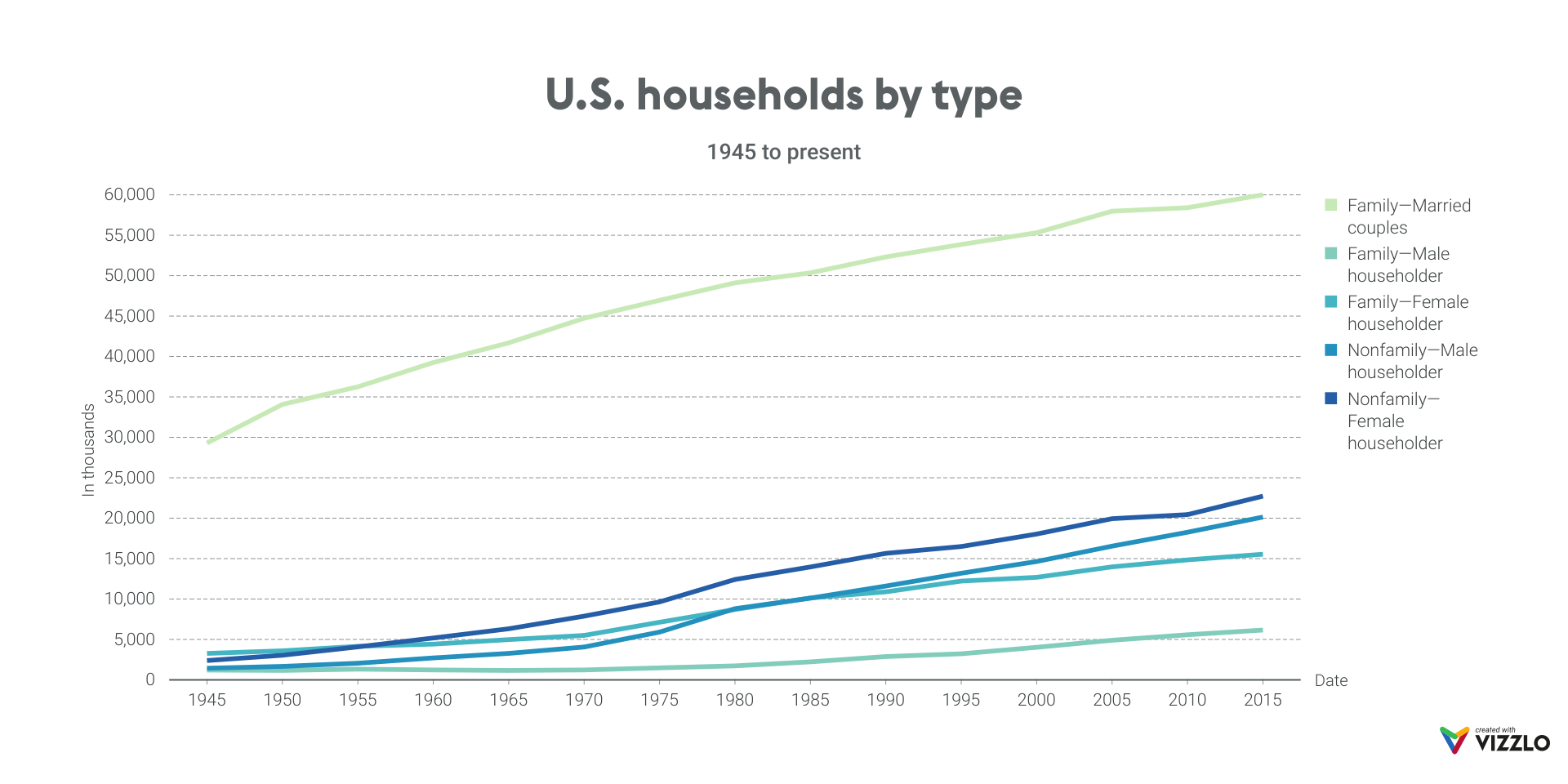
This is a good visualization to compare the demographic groups. From this chart, for example, we can see that male- and female-led nonfamily households grew faster than the lone-parent families and that married families are still the most common household type in the United States. This chart supports multiple similar comparisons among the demographic groups and time segments. However, it does not allow us to identify the total number of households quickly or to trace the evolution of their relative proportions.
If the objective is to show how the absolute number of households changed over time and to demonstrate how it is composed of different demographic groups, then we should choose the stacked area chart.
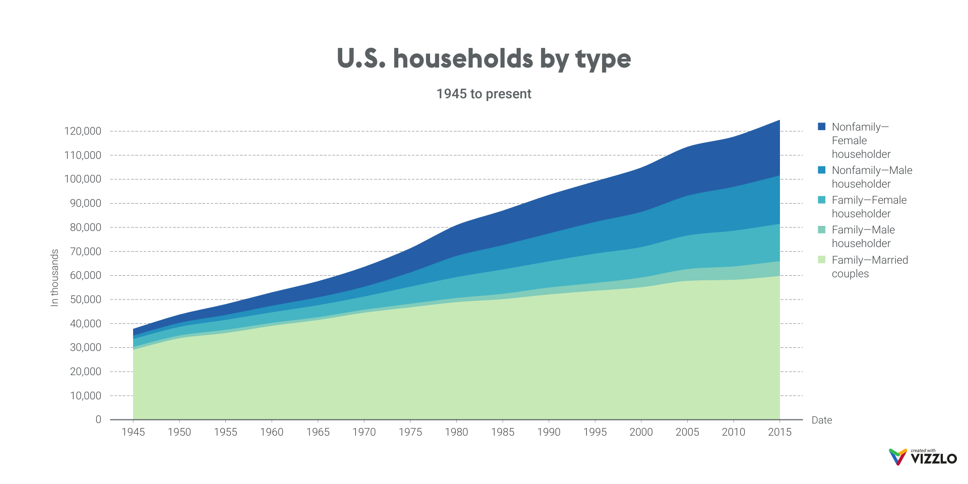
Nevertheless, in contrast to the standard line chart, it is difficult here for the reader to interpret and compare the absolute numbers of each segment. Because they are stacked, the corresponding values on the y-axis are cumulative.
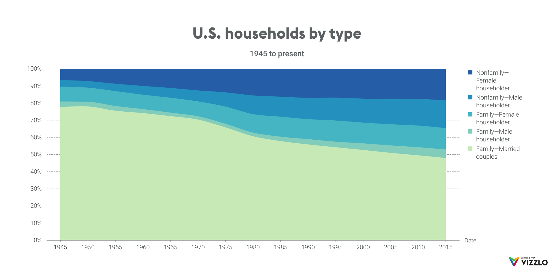
If we would like to demonstrate if or when the married families stopped being the majority household type in the United States, then we would look at part-to-whole relationships, i.e., percentages and relative differences.
For this purpose, the 100% stacked area chart can be very helpful. In the example below, the full area corresponds to 100%, and we can readily recognize that, while the percentages of all other demographic groups proportionally increase, the light green area corresponding to married families decreases gradually to under 50%.
Vizzlo’s area charts are colorful, dynamic, and catchy. Moreover, they are very simple to create! Use them to make your reports and presentations more compelling. Try them out!
If you would like to learn more about how to choose the right chart for your data, check our help center, and stay tuned for our blog updates.