Chart Vizzard
Vizzlo's AI-based chart generatorStacked Area Chart
Easily visualize changes of cumulative data series using the stacked area chart.
What is a stacked area chart?
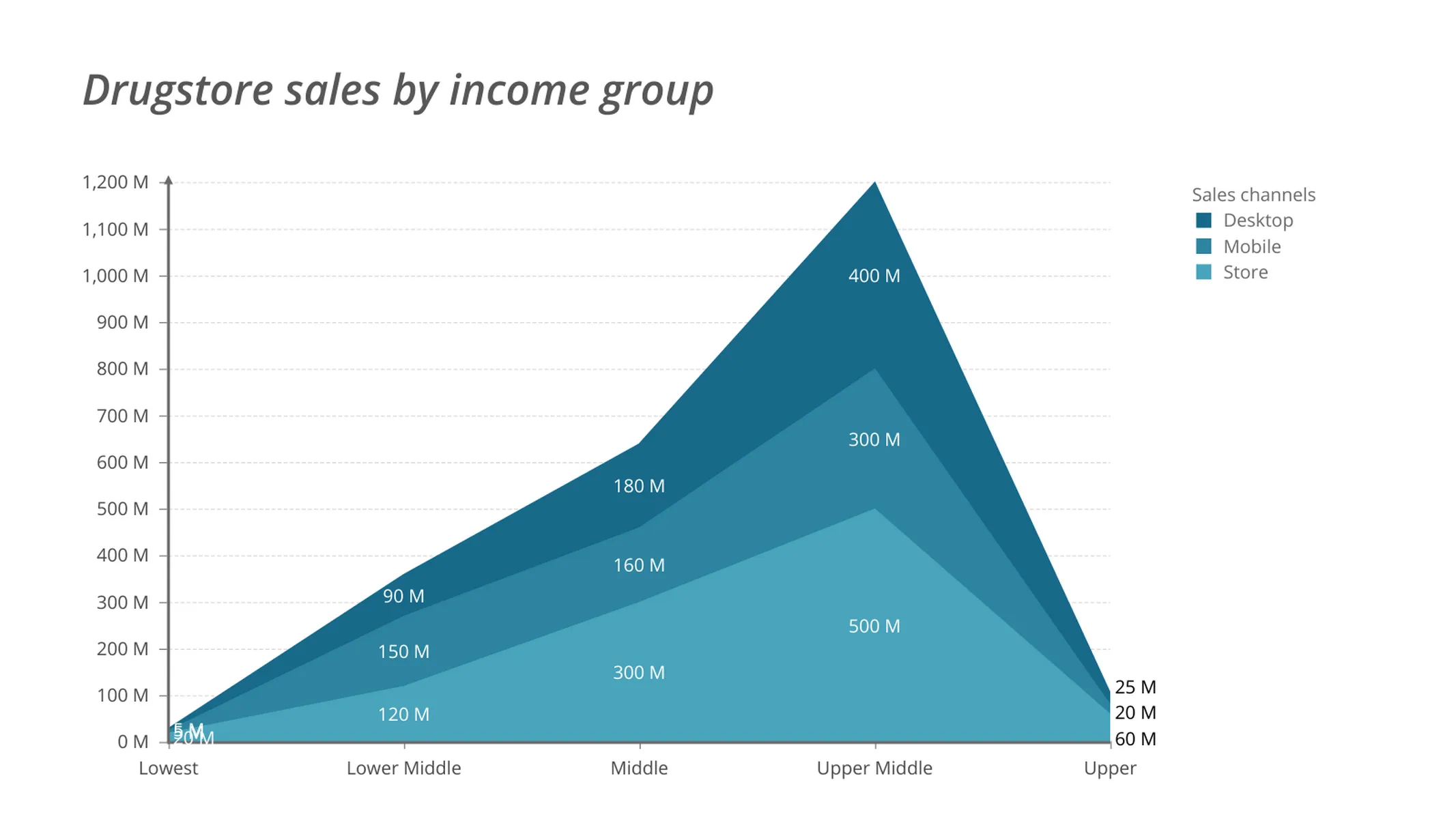
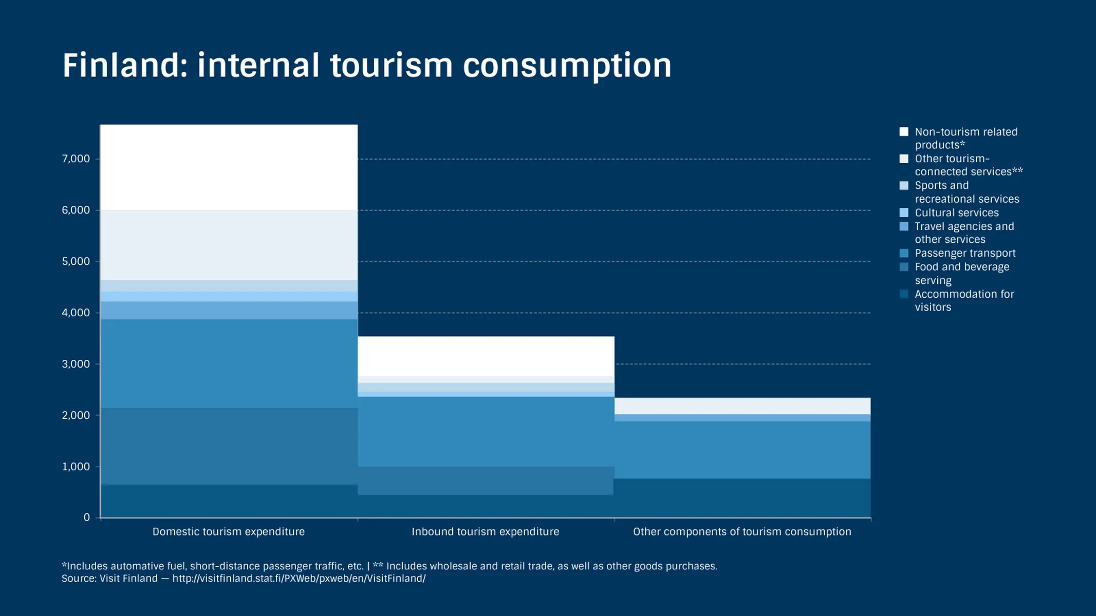
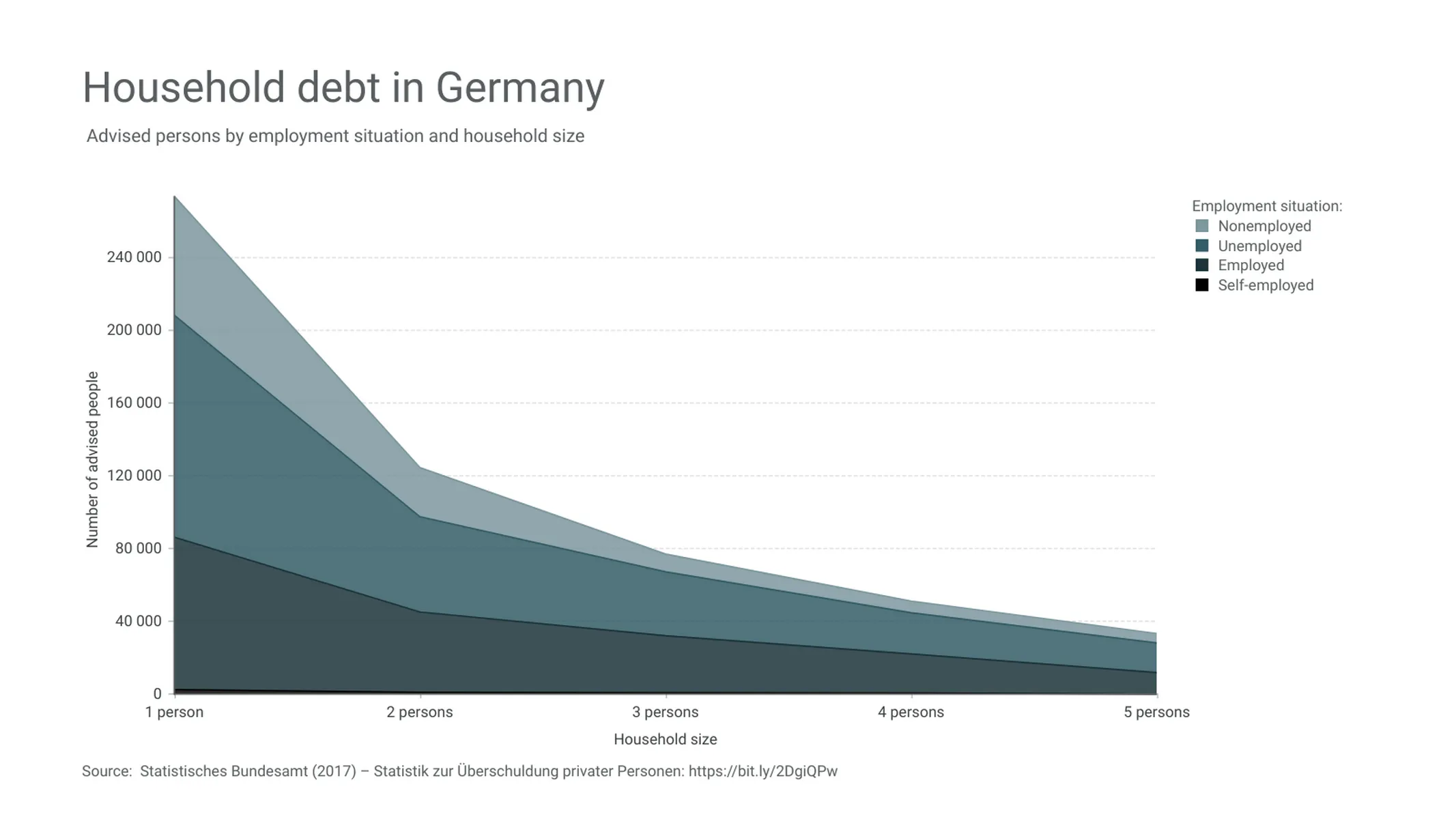
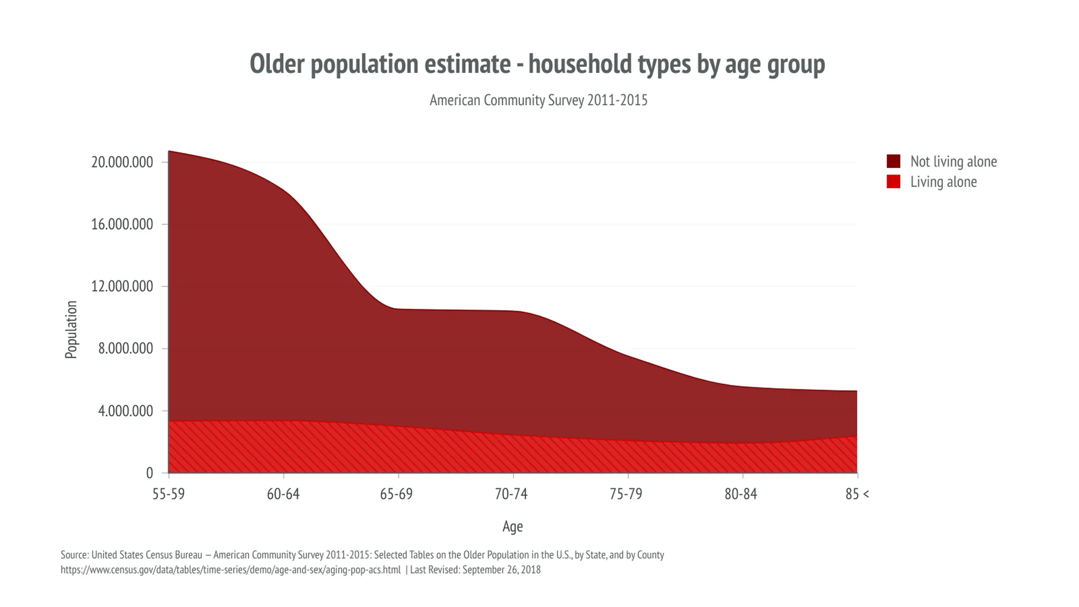
Stacked area charts represent the cumulative change of multiple series. In these graphs, the areas corresponding to each category are plotted on the top of each other.
A stacked area chart is ideal for displaying how different data series cumulatively evolve over a category or value x-axis, i.e., for revealing overall trends. Besides, it also helps to visualize how part-to-whole relationships develop, making evident how the series contribute to the cumulative total at different points.
How to make a stacked area chart with Vizzlo?
Create a stacked area chart online to present your data:
- On the tab “DATA” of the sidebar, click on the button “SERIES” to name your categories.
- Click on “EDIT DATA IN SPREADSHEET” to import or copy and paste your data. Make sure to match the number formatting with your source—click on the “wheel” icons to see the setting options.
- Explore the customization options in the tab “APPEARANCE” to choose/customize a theme and set up layout preferences.
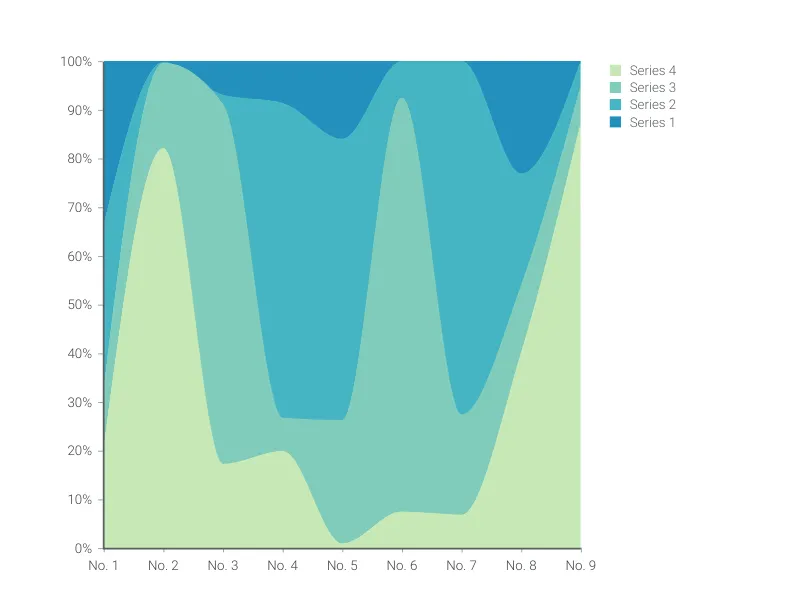
Pro tip: If you would like to figure out trends for each series or compare them, choose the line graph. Check the 100% stacked area chart, if observing the composition is your only objective, that is to say, if the cumulative/total values are not relevant to support your arguments. Use the time series graph to visualize your series over time.
Stacked area chart maker: key features
- Multiple series
- Straight line segments, smoothly interpolated curves or steps
- Custom x-axis: values (number) or categories (text)
- Adjustable axes and ranges
- Custom number formats
- Optional labeling of individual values
- Optional labeling of closing/end values
- Adjustable transparency
- Custom colors and fonts
- Custom gridlines
Resources
Stacked Area Chart: What's new?
You can now easily switch between regular stacked and 100% stacked mode.
These chart types now all support adding custom formatting to individual value labels.
Axis titles can now be disabled.
Added support for reference lines!
Adding numbers and formatting those got a lot easier due to a change in the user interface.
Stacked Area Chart Alternatives
Enhance your productivity
Create a Stacked Area Chart directly in the tools you love
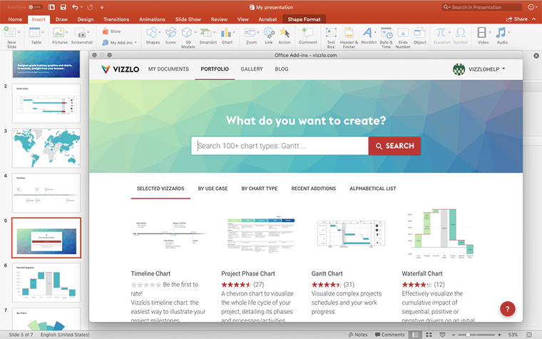
Create a Stacked Area Chart in PowerPoint with
Vizzlo's add-in
Loved by professionals around the world


Visualizations your audience won’t forget
Convey abstract concepts and data with professionally designed
charts and graphics you can easily edit and customize.
