Chart Vizzard
Vizzlo's AI-based chart generatorBox plot
Compactly display the distribution of a continuous variable.
What is a box plot?
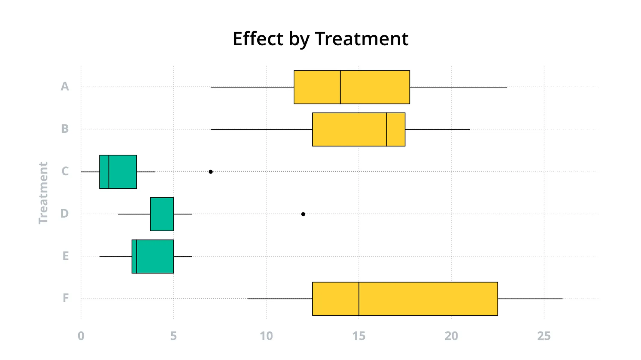
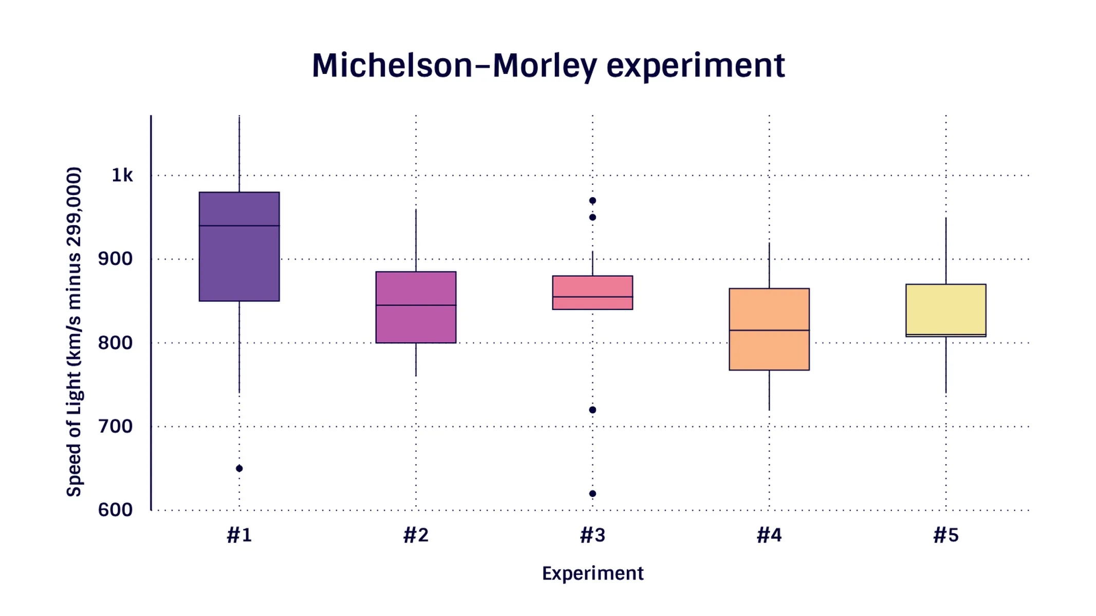
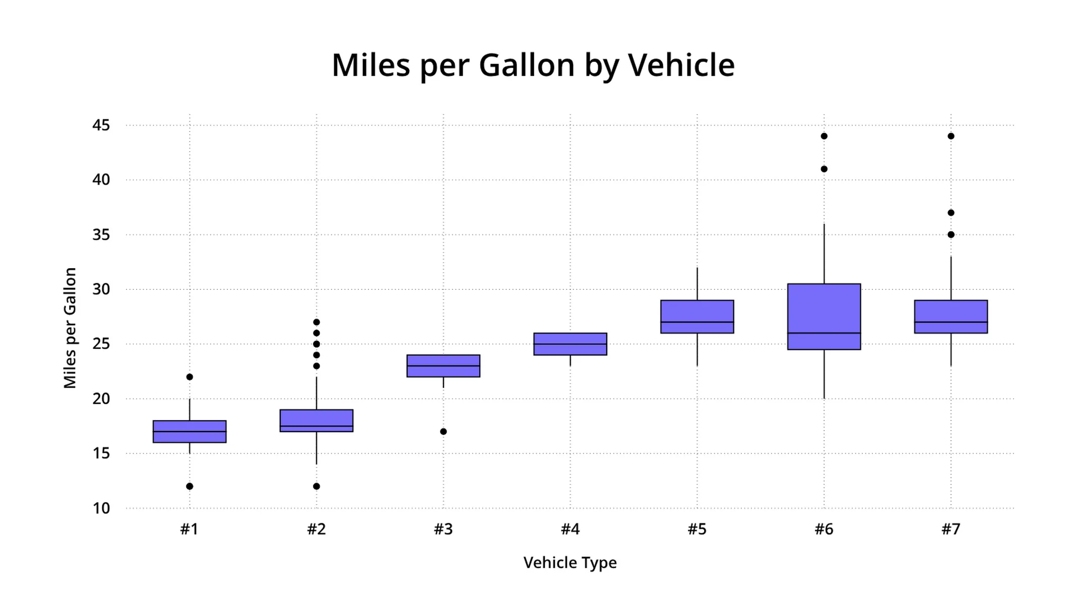
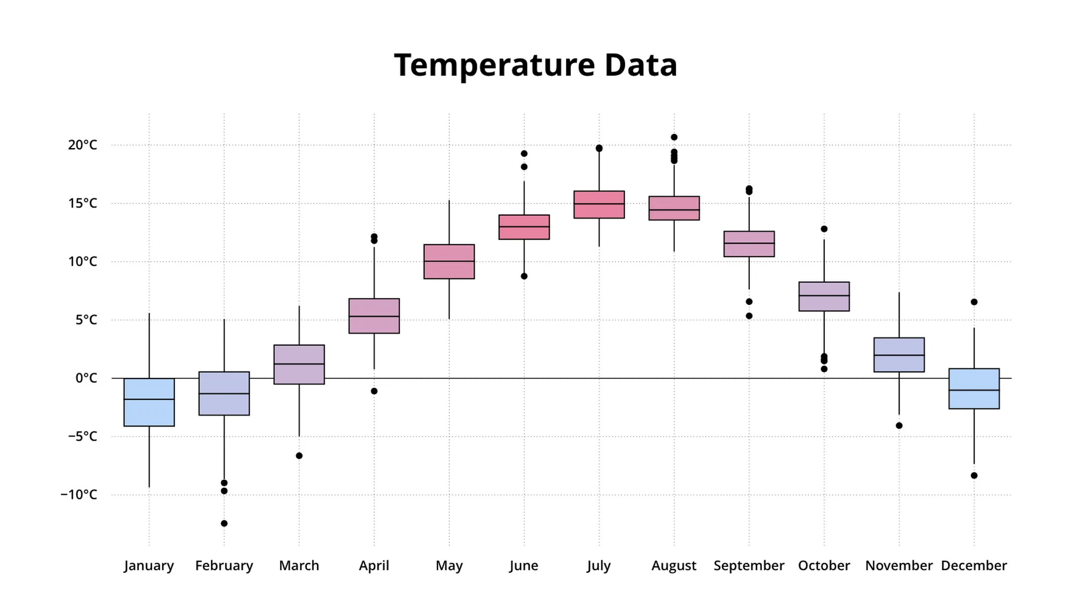
A box plot is a way to visualize the distribution of a continuous variable. A box plot, also box-and-whisker plot - displays a robust five-number summary of your data and all ‘outlying’ data points. The five summary statistics are the lower whisker, the first quartile, the median, the third quartile, and the extreme of the upper and lower whisker. A box is drawn from the first quartile to the third quartile. A vertical line goes through the box at the median of the data. Box plots also show lines extending from the box indicating variability outside the first and third quartiles. These lines are called whiskers, hence the name box-and-whisker plot.
How do you make a box plot online?
- Go to https://vizzlo.com/create/box-plot and click the “Create box plot chart” button
- Enter your data in the spreadsheet
- Customize your box plot and use it in your Google Slides or Powerpoint presentation
What does a box plot tell you?
A box plot can be used to see the skewness of your data. Is the data evenly distributed around the median, or are more data points above or below it? When the median is in the middle of the box, and both whiskers have about the same length, then the distribution is said to be symmetric.
How are the summary statistics calculated in a box plot?
- Lower whisker: Smallest value greater than or equal to Q1 - 1.5 * IQR
- First quartile (Q1): 25% of the data is smaller than this value
- Median: The ‘middle’ value of your data
- Third quartile (Q3): 25% of the data is larger than this value
- Upper whisker: Largest value less than or equal to Q3 + 1.5 * IQR
- Interquartile range (IQR) : The difference between Q3 and Q1
- Outliers: Values smaller than lower whisker, or greater than upper whisker
Reference: A Modern Introduction to Probability and Statistics (2005), Dekking et. al
Box plot maker: key features
- The box plot compactly displays the distribution of a continuous variable
- Sort boxes by their medians
- Adjust the width and colors of the boxes easily
- Add reference lines to show additional summary statistics for all your data
Box plot: What's new?
You can now show the min, max & mean values for boxes.
Using the spreadsheet now works properly again.
Axis titles can now be disabled.
The box plot supports reference lines now. Learn more about this visualisation in our help center.
🎉 Vizzlo’s portfolio offers box plots now. Key features are 5 number summary statistics for each of your data columns, sorting by median, easy width and color adjustment, and a lot more to come.

Enhance your productivity
Create a Box plot directly in the tools you love

Create a Box plot in PowerPoint with
Vizzlo's add-in

Loved by professionals around the world


Visualizations your audience won’t forget
Convey abstract concepts and data with professionally designed
charts and graphics you can easily edit and customize.