Chart Vizzard
Vizzlo's AI-based chart generatorHamburger Chart
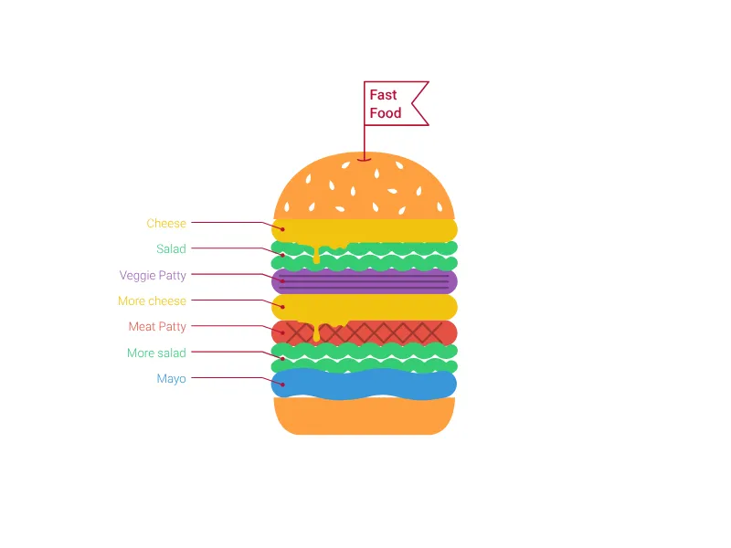
Visualize your technology stack using delicious layers of a hamburger or sandwich.
What is a hamburger chart?
The Hamburger Chart offers a deliciously creative way to visualize layered systems, technology stacks, or hierarchical structures using the familiar metaphor of a hamburger or sandwich. This playful yet professional visualization makes complex layered architectures more approachable and memorable.
Key Features
- Layered visualization: Stack up to 9 different layers to represent system components
- Ingredient variety: Choose from different visual elements (patty, cheese, mayo, veggie patty, salad)
- Custom labeling: Each layer includes descriptive text for clear identification
- Flag customization: Add a custom title flag to brand your technology stack
- Visual appeal: Engaging food metaphor makes technical concepts more accessible
Best Use Cases
- Technology stack documentation: Show application layers from database to user interface
- Architecture diagrams: Represent system tiers and their relationships
- Process layers: Visualize sequential steps or hierarchical procedures
- Product composition: Break down complex products into component parts
- Organizational hierarchy: Show management or operational layers
- Software architecture: Display microservices, middleware, and infrastructure layers
Configuration Options
Build your perfect hamburger chart with flexible options:
- Flag title: Customize the banner text that appears above your hamburger
- Layer ingredients: Select from various visual components for each layer
- Layer labels: Add descriptive text to explain each component’s purpose
Creative Applications
The hamburger metaphor works particularly well because:
- Familiarity: Everyone understands how hamburger layers work together
- Visual hierarchy: Clear top-to-bottom structure shows system organization
- Component relationships: Layers naturally stack and interact with adjacent components
- Memorable presentation: Food metaphors are more engaging than traditional diagrams
Design Considerations
- Layer order matters: Arrange ingredients logically from bottom to top
- Visual balance: Mix different ingredient types for optimal visual appeal
- Content clarity: Use descriptive labels that clearly explain each layer’s purpose
This visualization transforms potentially dry technical documentation into an engaging, memorable presentation that audiences will remember long after your presentation ends.
Hamburger Chart: What's new?
Hamburger Chart Alternatives
Use Cases
Pictorial chartsEnhance your productivity
Create a Hamburger Chart directly in the tools you love

Create a Hamburger Chart in PowerPoint with
Vizzlo's add-in

Loved by professionals around the world


Visualizations your audience won’t forget
Convey abstract concepts and data with professionally designed
charts and graphics you can easily edit and customize.