Chart Vizzard
Vizzlo's AI-based chart generatorSet of Scales Chart
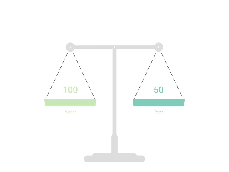
This scale will be ideal for showing your balanced or disbalanced values.
What is a set of scales chart?
The Set of Scales Chart uses the classic balance scale metaphor to visualize comparisons between two competing values, options, or forces. This powerful visualization immediately communicates balance, imbalance, trade-offs, and relative weights, making it perfect for decision-making scenarios and comparative analysis presentations.
Key Features
- Balance metaphor: Classic scales design instantly communicates comparative relationships
- Two-value comparison: Direct visual comparison between competing elements
- Adjustable tilt: Rotation angle control shows degree of imbalance or preference
- Dual labeling: Clear identification of both competing elements
- Visual weight: Immediate understanding of which element carries more “weight”
- Minimal configuration: Focus on the essential comparison without distracting elements
Best Use Cases
- Decision analysis: Weighing pros and cons of different options
- Resource allocation: Comparing investment in different areas or projects
- Performance comparison: Showing relative strengths between competitors or alternatives
- Risk assessment: Balancing potential risks against potential rewards
- Budget decisions: Comparing costs versus benefits
- Priority setting: Visualizing competing demands for attention or resources
- Trade-off analysis: Demonstrating what must be sacrificed for gains elsewhere
Configuration Options
Fine-tune your balance visualization with precise controls:
- Rotation angle: Slider control (50-130 degrees) to adjust the degree of tilt
- Element labeling: Clear identification text for both sides of the scale
- Value specification: Quantitative values that determine the visual balance
Visual Impact
The scales metaphor provides immediate understanding:
- Universal recognition: Everyone understands how balance scales work
- Immediate clarity: Tilt direction shows which element “wins” the comparison
- Proportional representation: Degree of tilt indicates strength of preference
- Decision framework: Visual tool for evaluating competing options
Balance Interpretation
Scale positions communicate different states:
- Perfectly balanced: Equal weight suggests equivalence or difficult choice
- Slight tilt: Modest preference or minor advantage
- Strong tilt: Clear winner or significant imbalance
- Extreme tilt: Overwhelming preference or major disparity
Professional Applications
This visualization excels in scenarios requiring:
- Executive decision support: Clear visual framework for leadership choices
- Stakeholder communication: Immediate understanding of competing priorities
- Strategic planning: Balancing different strategic options or investments
- Change management: Weighing benefits of change against risks or costs
Psychological Advantages
The scales metaphor taps into deep psychological understanding:
- Justice associations: Scales suggest fair, considered evaluation
- Measurement credibility: Implies careful weighing of evidence
- Decision clarity: Provides framework for resolving difficult choices
- Visual persuasion: Powerful tool for demonstrating preferred options
The Set of Scales Chart transforms abstract comparisons into concrete, visual representations that facilitate better understanding and more confident decision-making in complex choice scenarios.
Set of Scales Chart: What's new?
Set of Scales Chart Alternatives
Use Cases
Pictorial chartsEnhance your productivity
Create a Set of Scales Chart directly in the tools you love

Create a Set of Scales Chart in PowerPoint with
Vizzlo's add-in

Loved by professionals around the world


Visualizations your audience won’t forget
Convey abstract concepts and data with professionally designed
charts and graphics you can easily edit and customize.