Chart Vizzard
Vizzlo's AI-based chart generatorHow to make a Gantt chart in Excel for Microsoft 365
In this Gantt chart Excel for Microsoft 365 step-by-step tutorial we will show you how to make professional Gantt charts using Microsoft Excel and PowerPoint.
We have created a preformatted Gantt chart template in Excel for you. It provides a simple, straightforward way to add your project information, task, dates, and notes into the spreadsheet. All that information will automatically appear in the Gantt chart.
Click here to download the Gantt chart template for Excel. Follow the below steps to create a unique Gantt chart for your project from scratch.
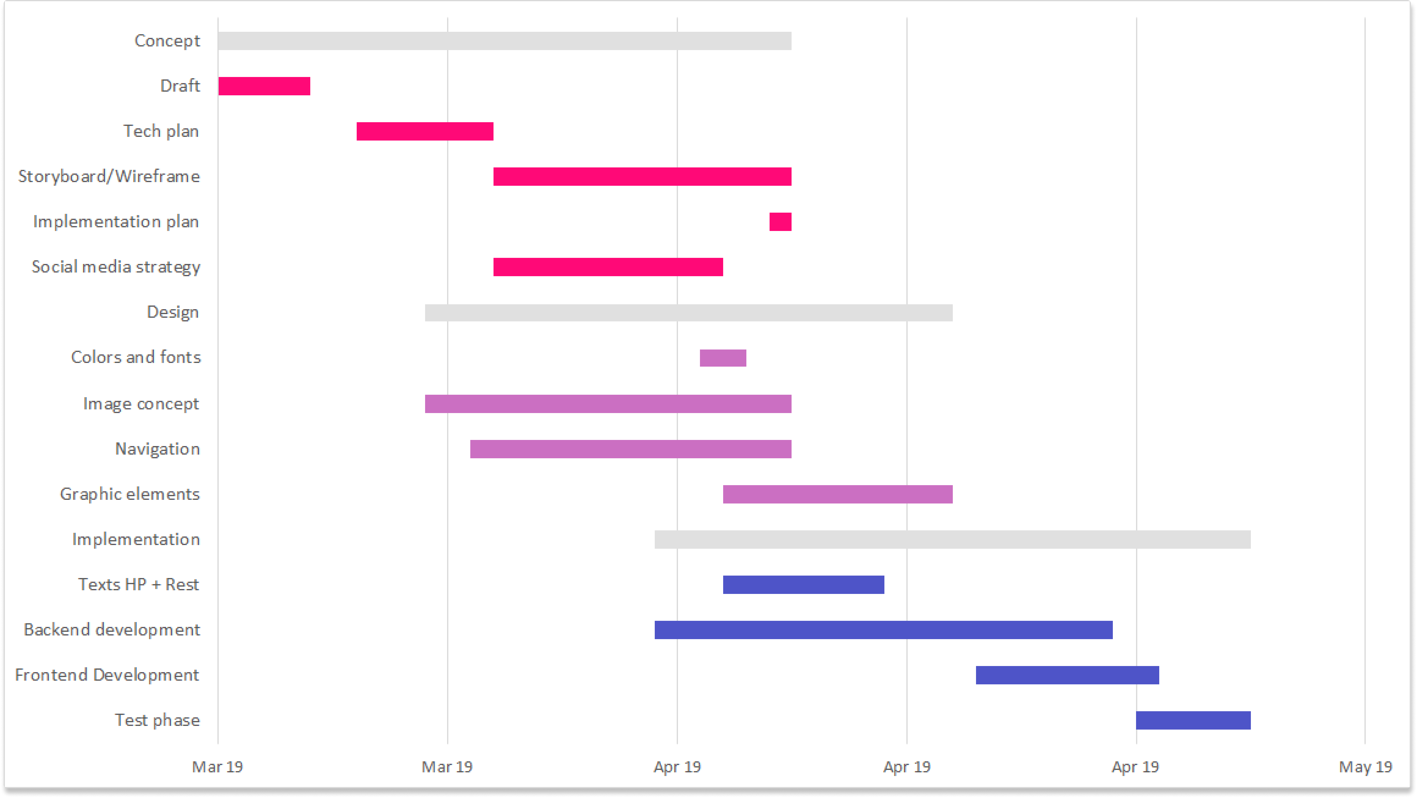
What is a Gantt chart?
A Gantt chart is a timeline of your project. Project management requires knowledge, and skills on project activities to meet the project requirements. When it comes to managing projects, you need tools to make them manageable. Professionals use Gantt charts to visualize how highly complex tasks can be broken down into smaller processes.
Microsoft Excel does not have a built-in Gantt chart template as an option. We will show you how to create a Gantt chart in Excel using the stacked bar chart and a bit of styling and formatting.
Using Vizzlo’s Gantt chart template can save you a lot of time. All you need to do is create an account and you are ready to start! You will be able to add milestones, dependencies, adjust tasks and activities using drag and drop simplicity, high-quality download, and you can connect your Gantt chart with a public Google Sheets or Microsoft Excel file directly. This will save you even more time if you update your data frequently. Besides, Vizzlo’s native PowerPoint add-in and Google Slides add-on make it easy to seamlessly integrate into your favorite presentation tool.
Start creating your own gantt chart.
Try Vizzlo for freeHow to make a Gantt chart in Excel
Would you like to learn how we created this Gantt chart from scratch in Microsoft Excel? Follow the instructions below to create a Gantt chart in Excel.
- Create a project table in the Excel worksheet
- Insert a Stacked Bar chart
- Formatting the Gantt Chart and its data
- Change the properties of your tasks
Create a project table in the Excel worksheet
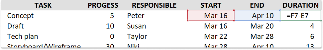
The first step to your Gantt chart in Excel is the data. Enter your project table and list each task is a separate row. Structure your project plan by including the Task, Progress, Start date, End date, and Duration to complete the tasks.
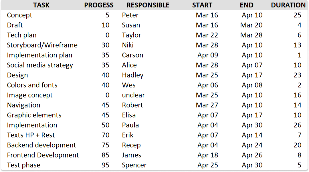
The two columns we will need to create the Gantt chart are Start and Duration. Note that you can use Excels formula to create the Duration column: Duration = End Date - Start Date
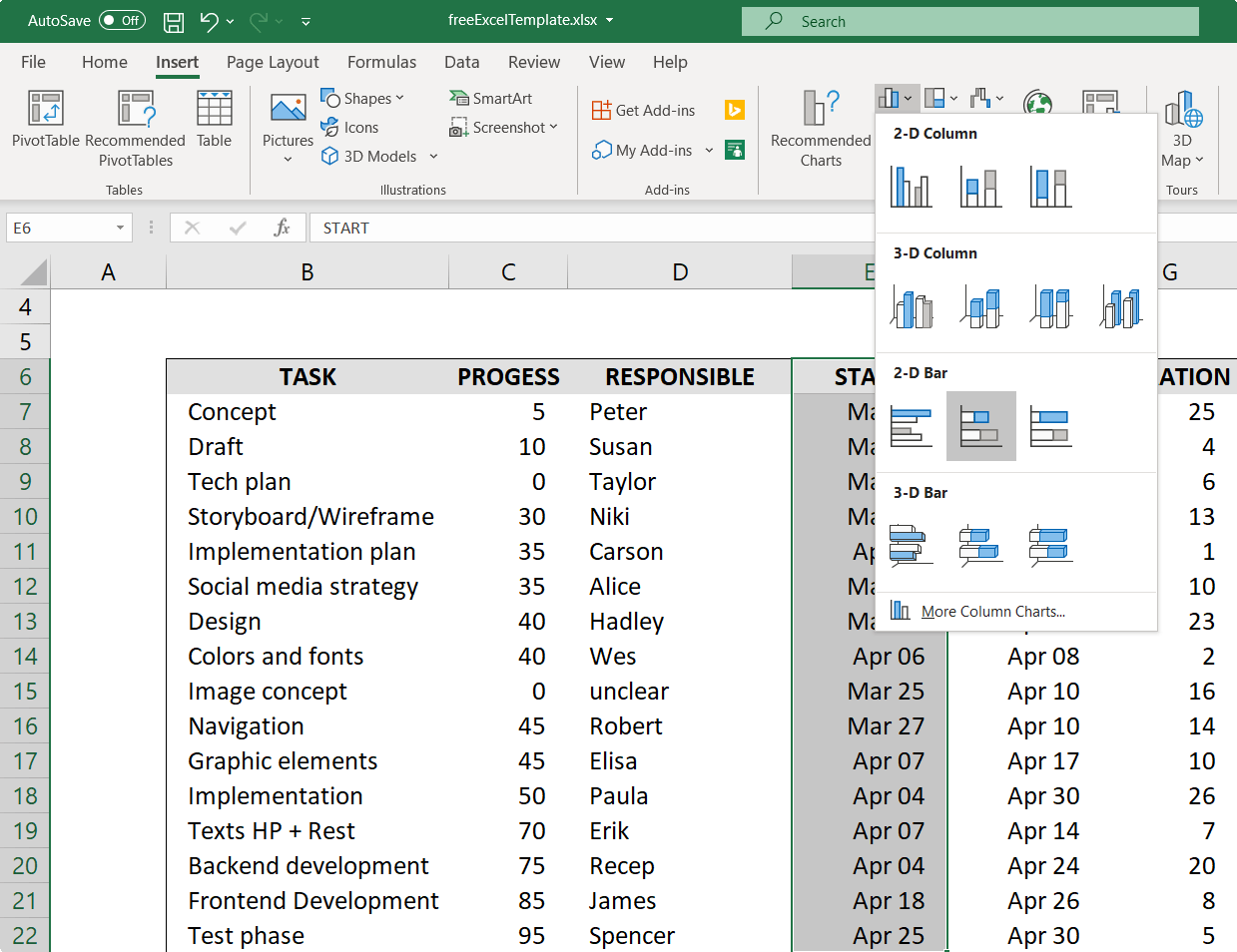
Insert a Stacked Bar chart
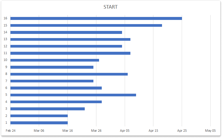
Select the values of the column Start including the column header. Select the values of the column Start _including the column header. Switch to the _Insert tab → under the Charts group and click Bar. Under the 2-D Bar section, click Stacked Bar.
When you clicked on Stacked Bar chart, you should see this result:
Formatting the Stacked Bar chart and its data
You need to add a second series to your chart to make it look like a Stacked Bar chart. This is when we need to add the Duration column to your existing chart. To so, right-click anywhere on the chart, in the menu that will then open choose the option Select Data…
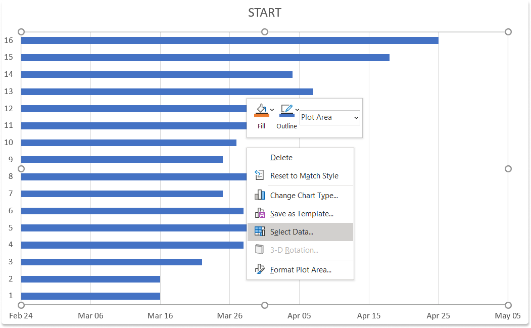
… this will open a dialog called Selected Data Source. To add a second series besides the already selected Start series click on the Add button.
The Edit Series dialog opens and you see two input elements:
- Series name
- Series values
To add a series name click in the column header, i.e. click on the cell that says Duration. Alternatively, you can type “Duration” or any other name in this field.
Remove the content from the Series values input element and then select on the first cell in the Duration that contains a value and drag the mouse down to the last value.
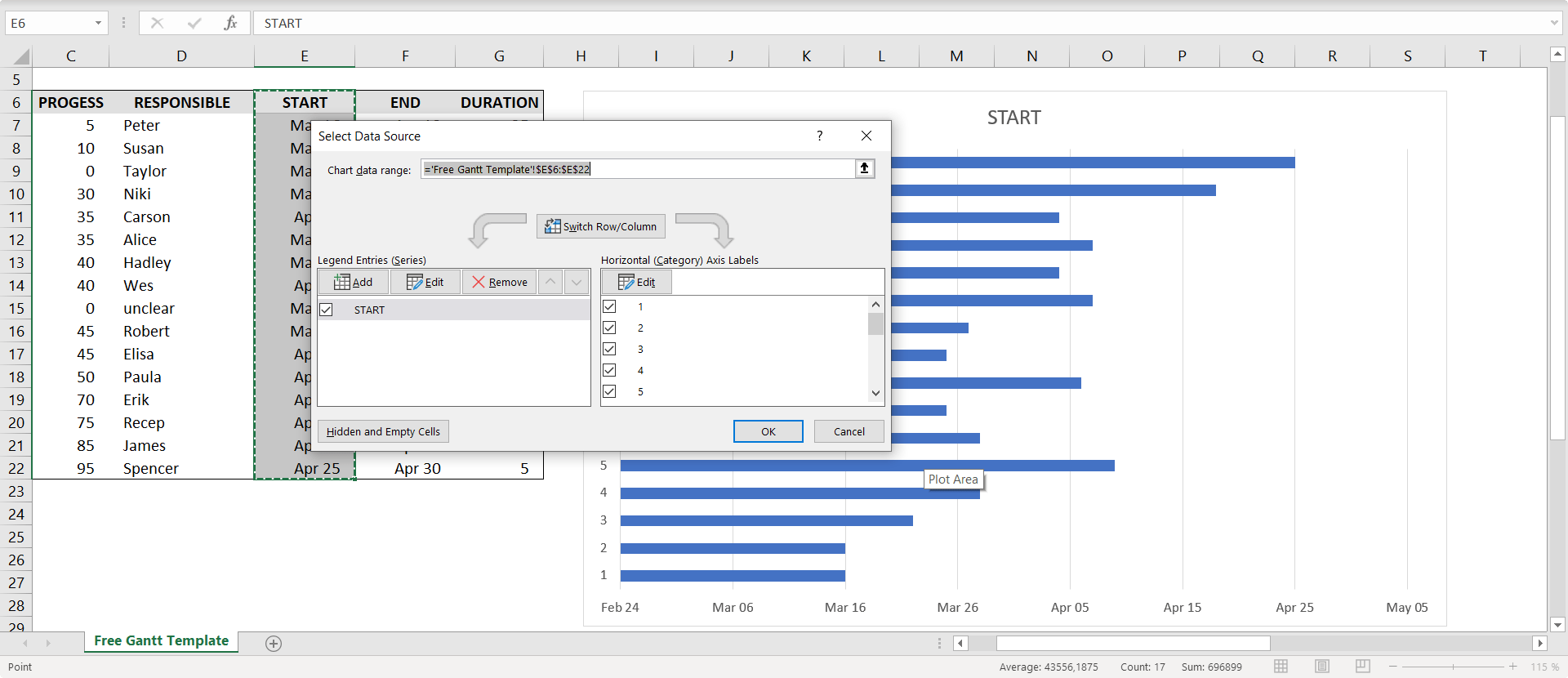
Click Ok to close the menu and this will bring you back to the Selected Data Source dialog. The chart that you will get as result will look like this:
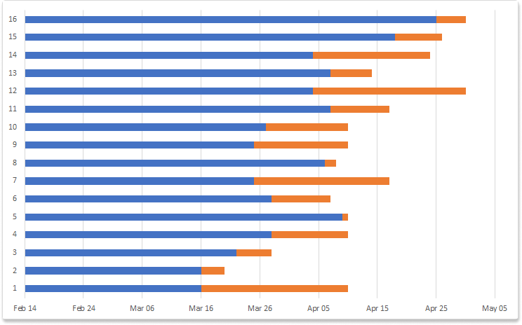
Turn a Stacked Bar chart into a Gantt chart
To make a stacked column chart look like a Gantt chart, we have to make one of the two series ‘disappear’. In the end one series will be looking like the floating tasks that make the typical look of a Gantt chart. The goal is to hide the blue bars so that only the orange parts are visible. Technically we need to keep the blue bars as a zero baseline. So let’s make them transparent.

Now the next steps are:
- change the labels of the y-axis
- reverse the y-axis
- adjust the x-axis range
- flip the x-axis
Change the labels of the y-axis
We are going to use the values from the Task column of our data table as labels of the y-axis. To change that:
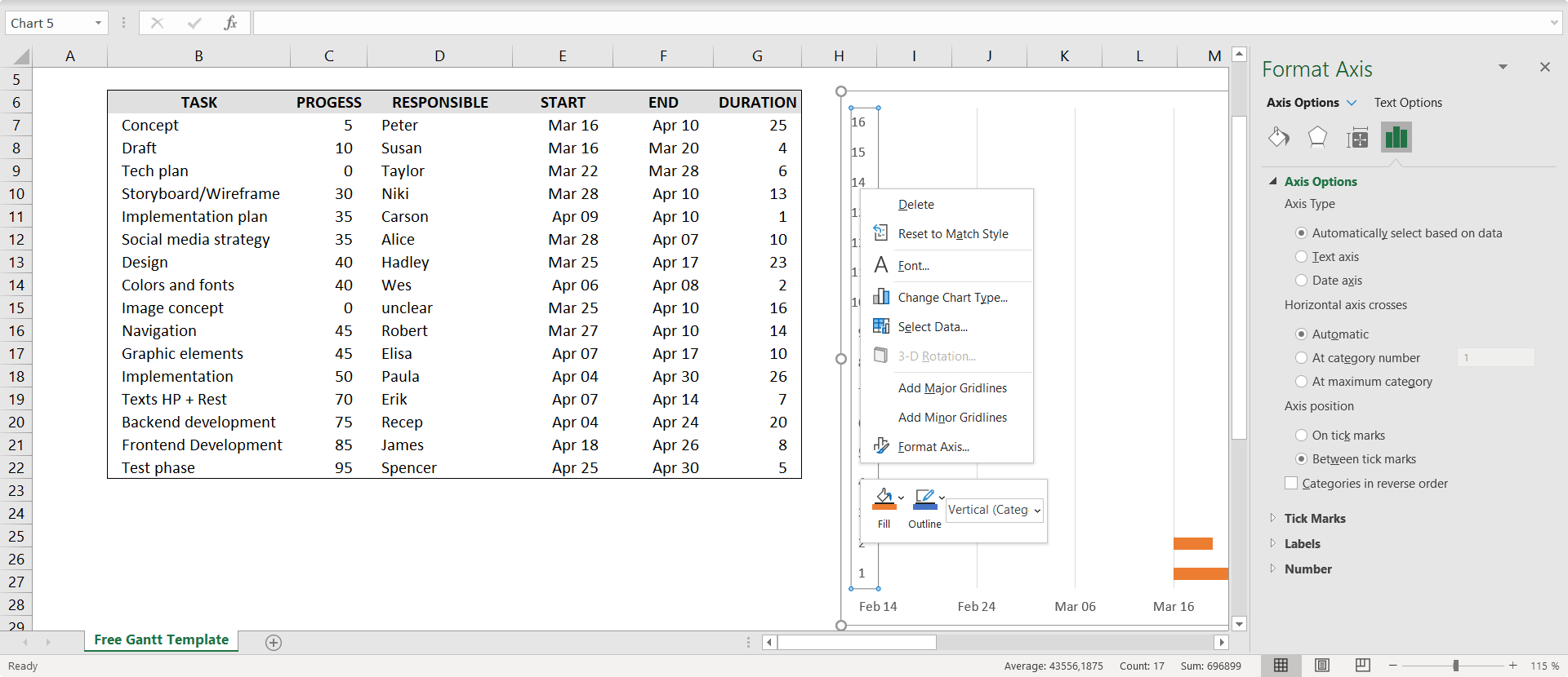
- Right-click on the y-axis
- In the dialog that opened click Select Data…
- On the bottom right of the Select Data Source dialog under Horizontal (Category) Axis Labels click the Edit button
- Select the values of the Task column
- Press Ok
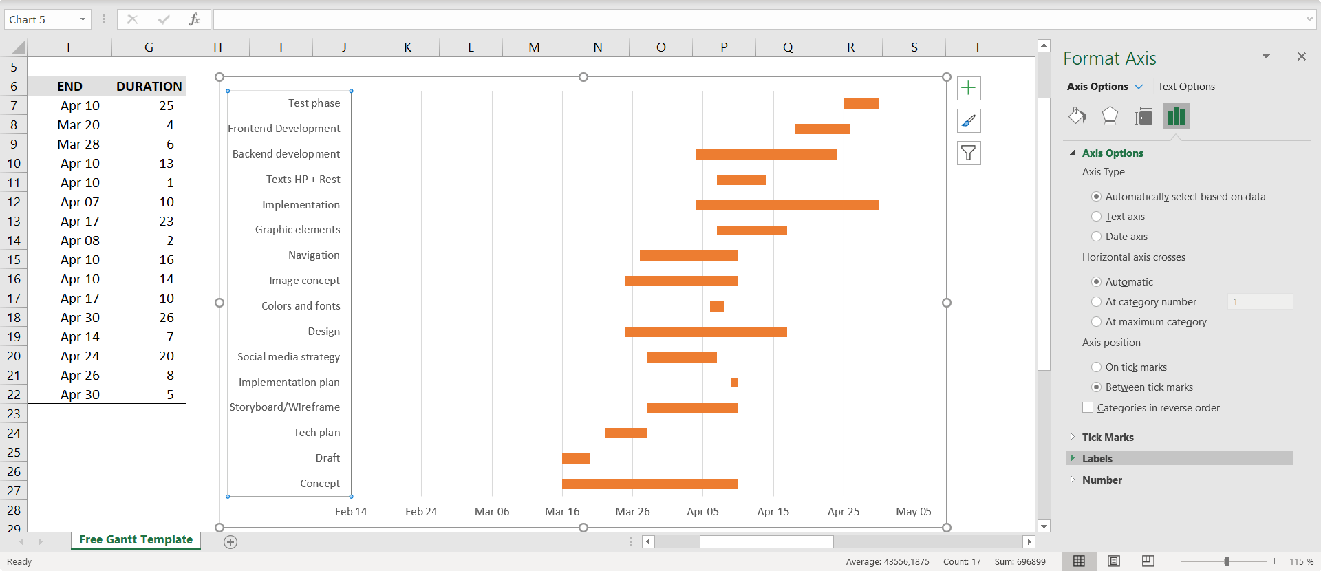
Reverse the y-axis
Select the y-axis to open the Format Axis dialog. Under the section Axis Options click the checkbox at the bottom called Categories in reverse order.
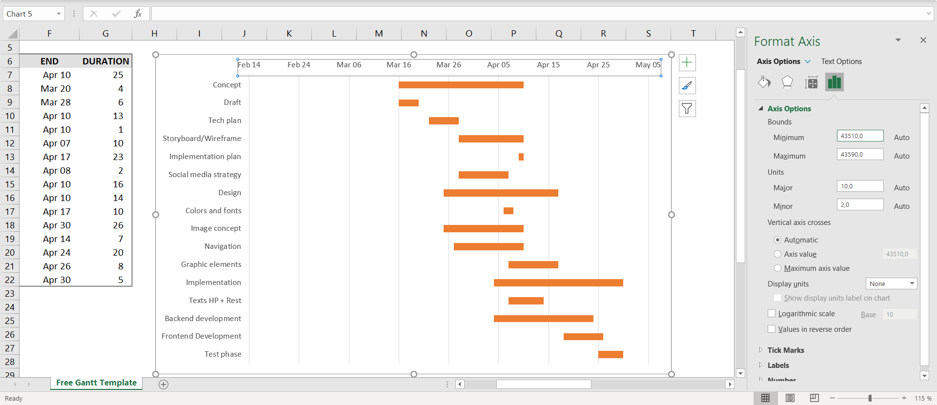
Adjust the x-axis range
You have noticed that the x-axis range does not start at the first day of the first task. We can change the axis range easily. Maybe the tricky est part is to know how Microsoft Excel handles date values.
Excel stores dates as sequential serial numbers so that they can be used in calculations. By default, January 1, 1900 is serial number 1, and March 16, 2019 is serial number 43540 because it is 43,540 days after January 1, 1900. You can see that when you select a cell and change the format from Date to, e.g. General. We will use the 43540 as the minimum of the axis range.
To change the axis range you need to select the axis first. Then in the sidebar you can change axis properties. Under Axis Options there is a number input in which you need to enter 43540. Voilà.
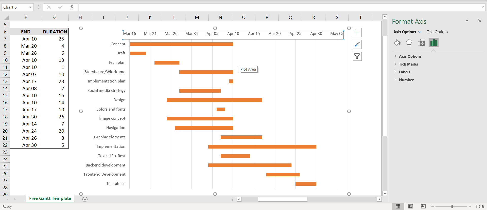
Flip the x-axis
Because we reverse the y-axis before, the x-axis labels are now shown on top of the chart. We can change that with a few clicks too.
How to make a Gantt chart in PowerPoint
Microsoft PowerPoint is generally a better choice for making Gantt charts for your presentations and reports. Vizzlo offers a PowerPoint add-in that makes and updates Gantt charts by importing or pasting from Excel.
The benefits of using Vizzlo are:
— Import your data as Excel file, a .CSV file, or connect to Google Sheets
— You can schedule automated updates of your charts
The next steps will show you how to turn the Excel table you created above into a PowerPoint Gantt chart using Vizzlo.