Chart Vizzard
Vizzlo's AI-based chart generatorWhat Is A Timeline?
The definition of a timeline is a chart or graph that visually depicts a series of events that happen over a period of time. But what is the purpose of a timeline? They can help contextualize a story, a process, or any other kind of event by setting clear points, in chronological order, along a horizontal or vertical line.
So what does timeline mean for the average Joe? Timelines have the ability to give the viewer a quick yet refreshingly holistic view on a sequence of past or future events. They can improve information retention and encourage organization. When showing time on a specific scale on an axis, timelines can be used to visualize the lapses in time between events, the duration of events, and also the simultaneity and overlap of events.
Covering thousands of years or a matter of minutes, timelines have a huge plethora of uses, summarizing the development of ancient civilizations or simply structuring the day to day schedule.
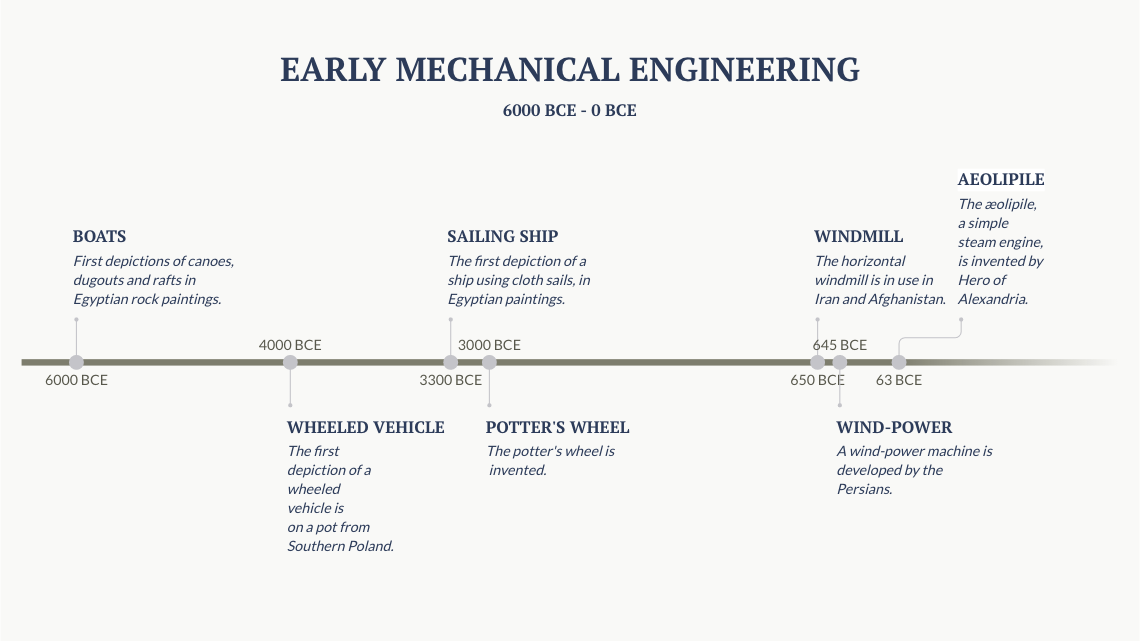
Starting with the well known, here is an example of one of the simplest of timelines. Aptly showing a “Line” representing a period of “Time” from 6000 BCE to 0 BCE. It charts the early human achievements of mechanical engineering. This was made using our Timeline Chart template.
If you want to create your own Timeline, you can start doing so right here
It depicts a span of 6000 years with each significant event marked suitably within the timeline. We see a lengthy 2000 year period between the invention of the boat and the eventual addition of sails.
Timeline Examples: What are the Different Kinds of Timelines?
Whether to summarize historical events, outline legal cases or enhance your project management, there are many forms of timeline which can be of help. They boil down to 3 main categories; Standard Timeline Chart, Gantt Chart and Time Series Graph. All can be nipped and tucked with various visual styles to enhance your data.
Gantt Chart
A Gantt chart is a fantastic organizational tool and most commonly used for project management. It will feature variously sized bars spread across a timeline, each bar representing the start date, duration and end date of an activity. Once studying the chart, you will be able to see the whole sum of the projects within its time frame. Where do activities overlap? How long will the whole project take? Remember our Gantt charts can be easily updated if your running off schedule or god forbid ahead of time! Here is an example of a Gantt Chart in the form of a housing refurbishment schedule.
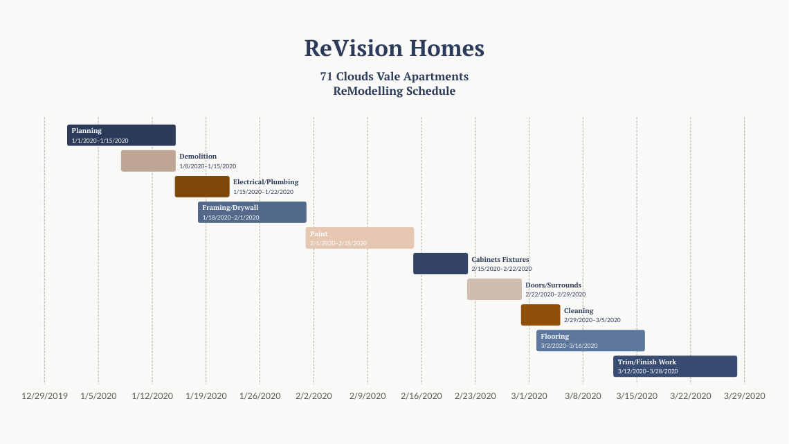
You can see from this example that the total planned time to remodel Clouds Vale Apartments would be approximately 4 months. You can also see that at various times there are overlapping tasks such as the ‘Planning’ and ‘Demolition’ Stages. Further notes and recommendations could be added to this graph to give more detail.
Tip! You can create a Gantt Chart in seconds with Vizzlo
Standard Timeline Chart
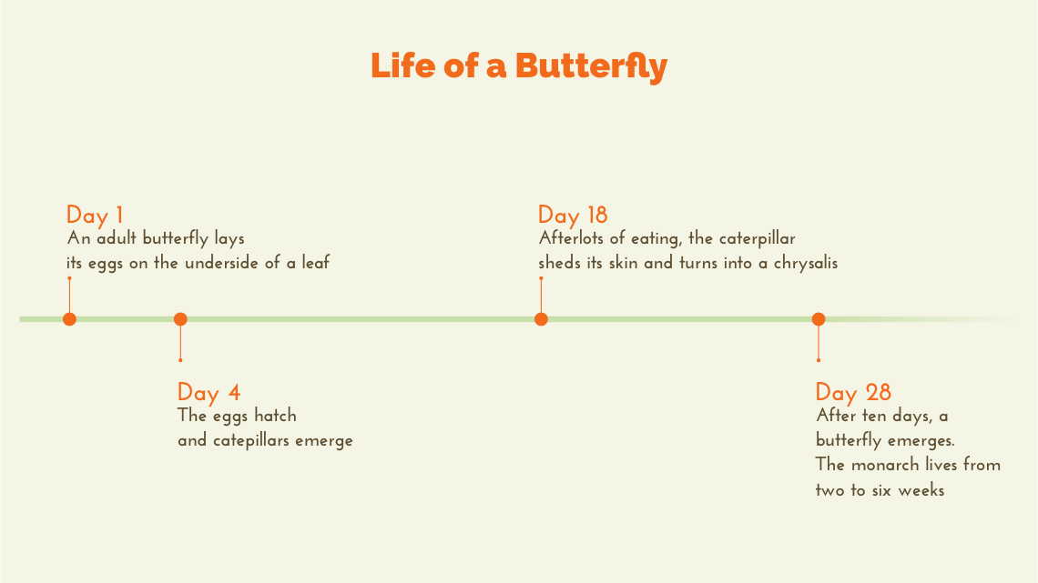
What’s a timeline without a nice simple one!? Rather than bars graphically showing event lengths like in a Gantt Chart, a standard timeline chart shows pinpointed single events with accompanying text and/or imagery. These are classically found in History Classrooms and Museums but actually have a wind range of uses. Here is the timeline of the short but beautiful life of a Monarch Butterfly.
You too can create a Timeline in seconds with Vizzlo—it has its very own graph maker!
Time Series Graph
A time series graph uses an X and Y axis to illustrate a quantity/measurement change throughout time. In most cases the horizontal axis (X) of the chart is used to mark increments in time and the vertical axis (Y) pinpoints values of the variable which is being measured. When the values are connected in chronological order by a line, it creates a series of peaks and troughs. These peaks and troughs can tell a story of progression or decline and are useful in visualizing data to create reports and forecasts. They are quite often created from financial and scientific data. A time series chart can be thought of as a series of snapshots that have been
taken at regular intervals. Below we see a graph that illustrates the change in global surface temperature relative to 1880-2018 average temperatures taken from NASA.
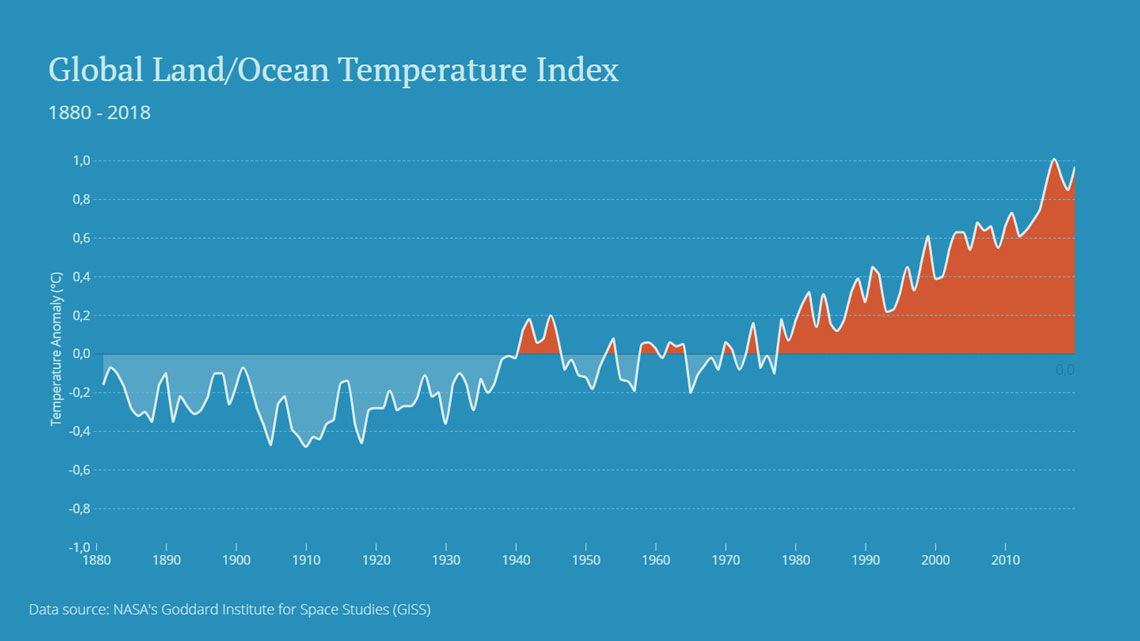
We can see that from 1980 to 2018 temperatures have risen considerably and look to rise even further. Using the smoothing function for the line creates a clearer sense of rise and fall when dealing with averages.
Guess what? Vizzlo has a super-powerful (but easy to use) Time Series Graph creator !
Development and History of the Timeline
Ironically, there is no timeline for the history of the timeline. But some would argue that it could have been the first graph to have been invented. Its ability to summarize the human story into moments of achievement, failure and abstention is clear and powerful. In the Year 2000, many “Millennium Timelines” were printed and presented as free pullouts in newspapers and magazines, stating their own timeline meaning and version of key events up until that millennial year.
Let’s recap! What is the definition of timeline?
- It is a visual representation of events that happen over a period of time.
- It can be used to summarize historical events, outline legal cases or enhance your project management.
- It can improve information retention and/or encourage organization and timekeeping.
- It’s Incredibly fast to produce using Vizzlo’s Timeline Maker.