PREVIEW
Chart Vizzard
Vizzlo's AI-based chart generatorNobel Prizes by Gender over Time

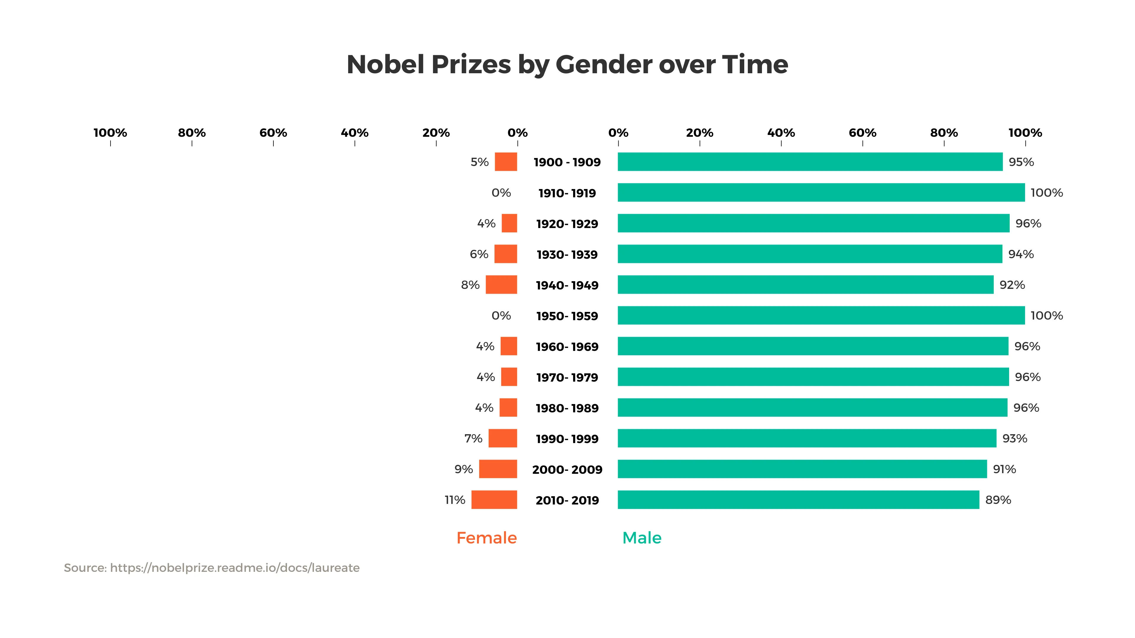
This visualization demonstrates the gender distribution in Nobel Prize winners since 1900, grouped by decade.
We use a butterfly chart here to compare the data to highlight the gender disparity. As one can see, there has been only a handful of female Nobel Prize winners until today. At least the relative share has increased somewhat in recent decades.
Source: nobelprize.org

This is an example of Vizzlo's “Butterfly Chart”
Create a butterfly chart to compare two data sets side by side.