Chart Vizzard
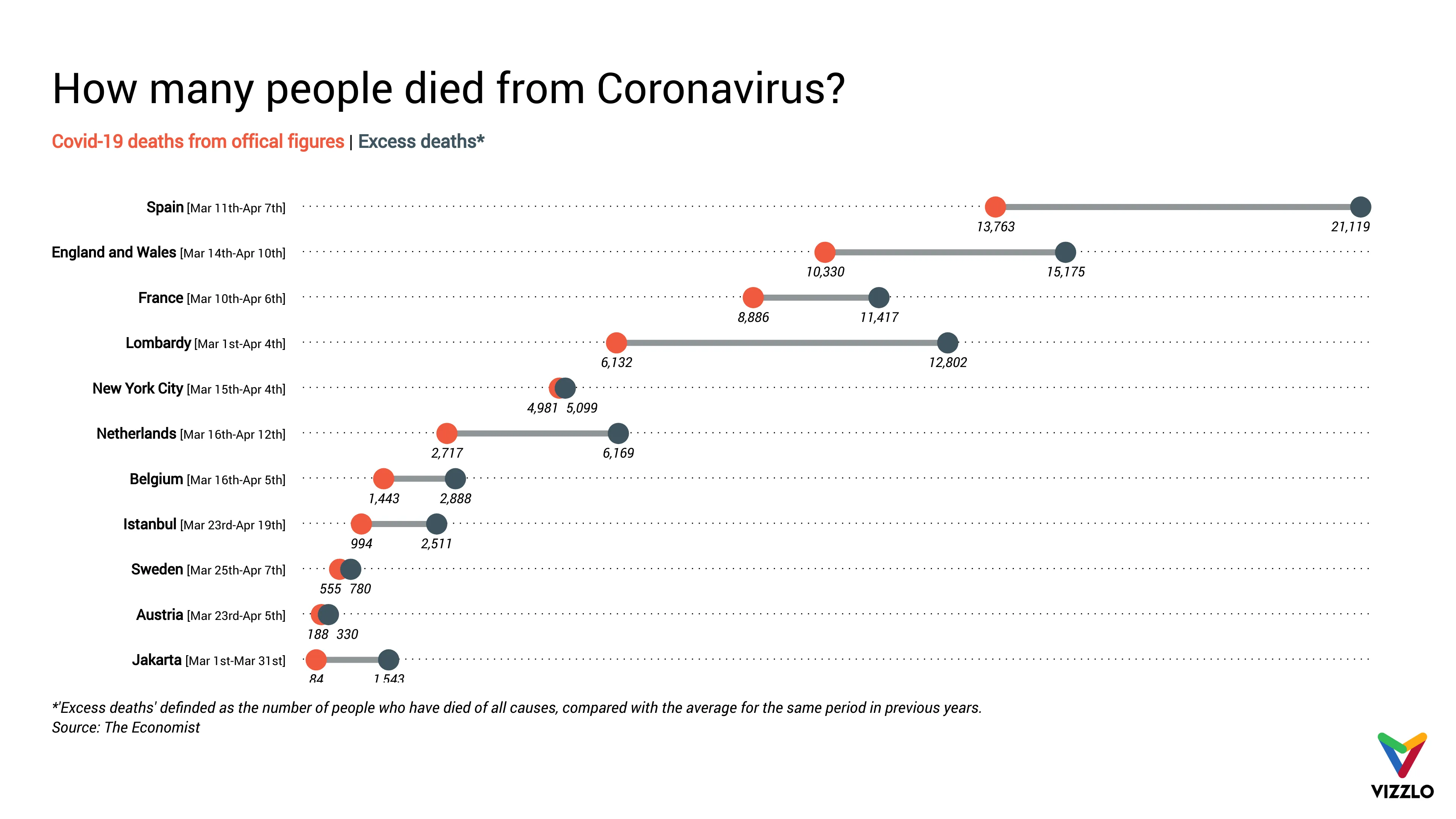
Vizzlo's AI-based chart generatorHow many people died from Coronavirus?

Covid-19 has spread to nearly every country in the world. Countries worldwide had instituted a full or partial lockdown, affecting billions of people - public life has come to a standstill almost everywhere.
According to official figures, more than 2.8 million people worldwide have become infected with the virus and the number of deaths will soon exceed 200,000, including more than 50,000 in the USA alone (as of 24 April). Nevertheless, experts suspect that the number of unreported cases is much higher. Estimates, however, turn out to be difficult.
The Economist has therefore compared the figures for deaths from COVID-19 with the official statistics on deaths in general. In many countries and regions, the absolute number of deaths in 2020 is above the long-term average over the same period and region. The journalists call these differences “excess deaths” - the results of their evaluation have been made available to everyone.
Source: The Economist, Tracking covid-19 excess deaths across countries, https://www.economist.com/graphic-detail/2020/04/16/tracking-covid-19-excess-deaths-across-countries

This is an example of Vizzlo's “Dot Plot Chart”
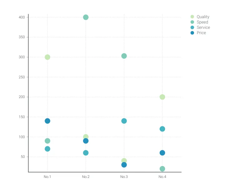
The dot plot chart is a visually appealing alternative to the bar chart for single or multiple categories of data.