Chart Vizzard
Vizzlo's AI-based chart generatorDot Plot Chart
The dot plot chart is a visually appealing alternative to the bar chart for single or multiple categories of data.


What is a dot plot chart?
A dot plot is a type of graph in which dots are used to mark the coordinates of categories and their respective values.
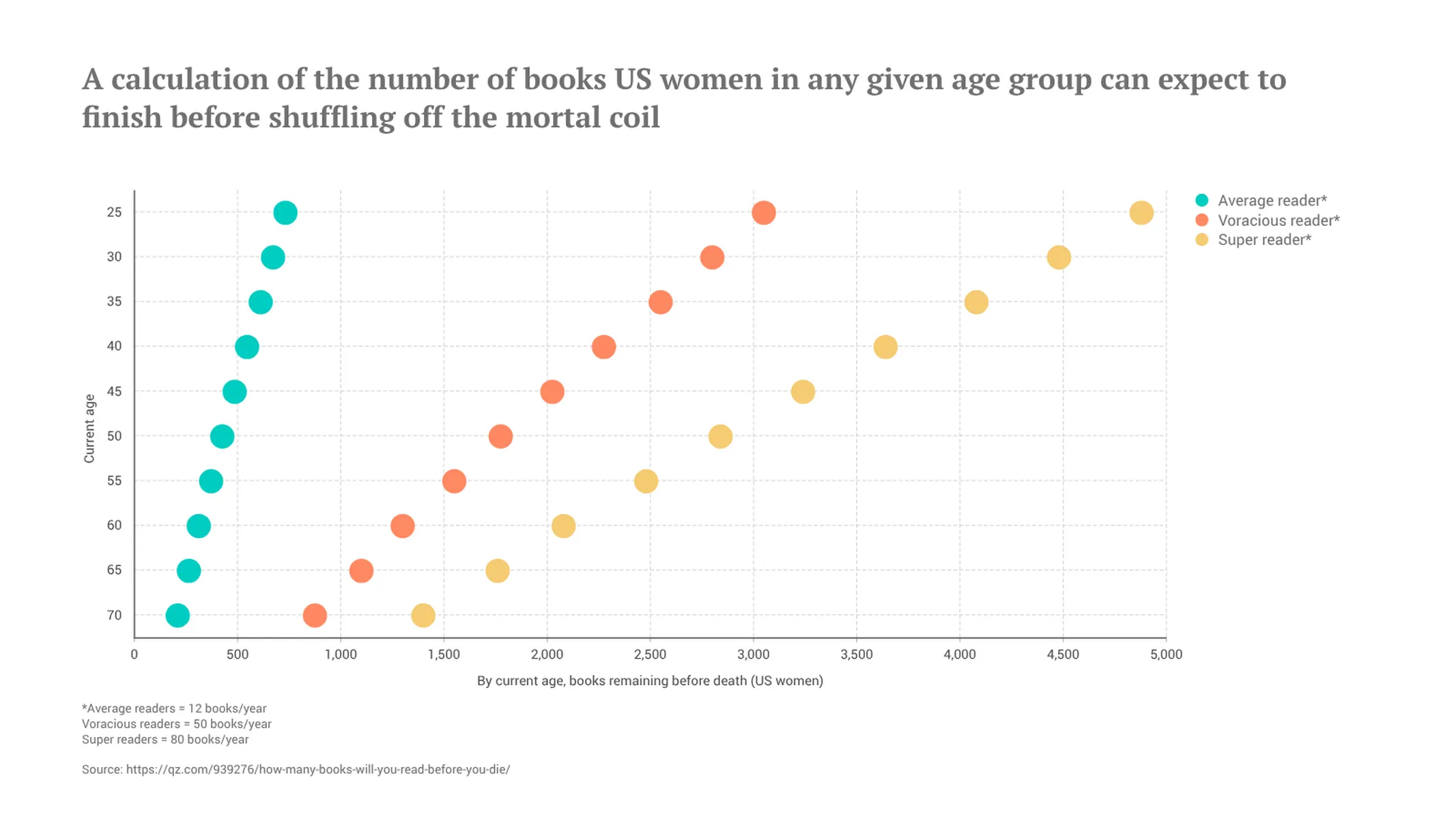
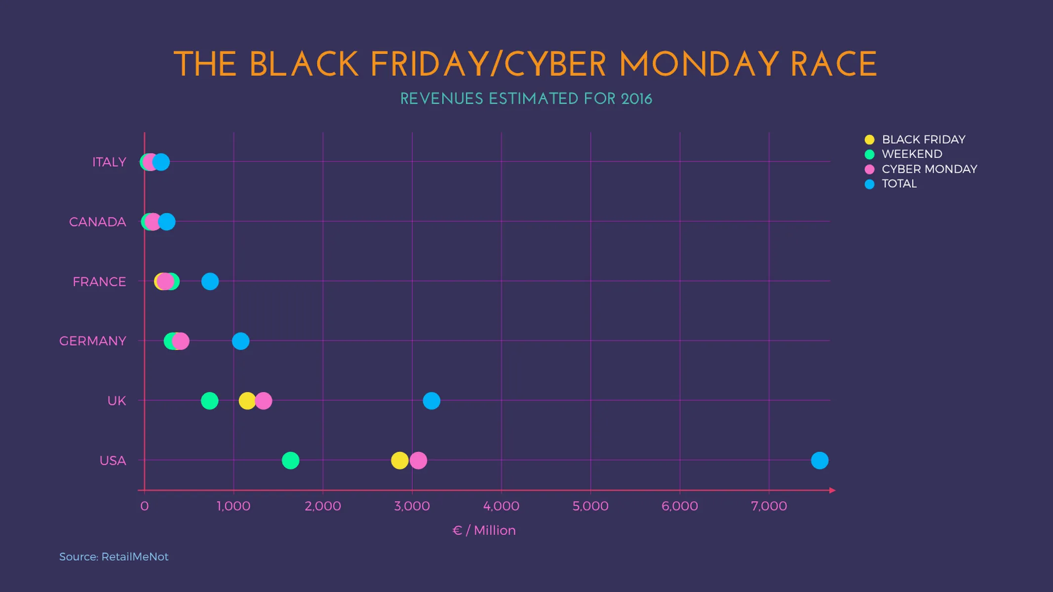
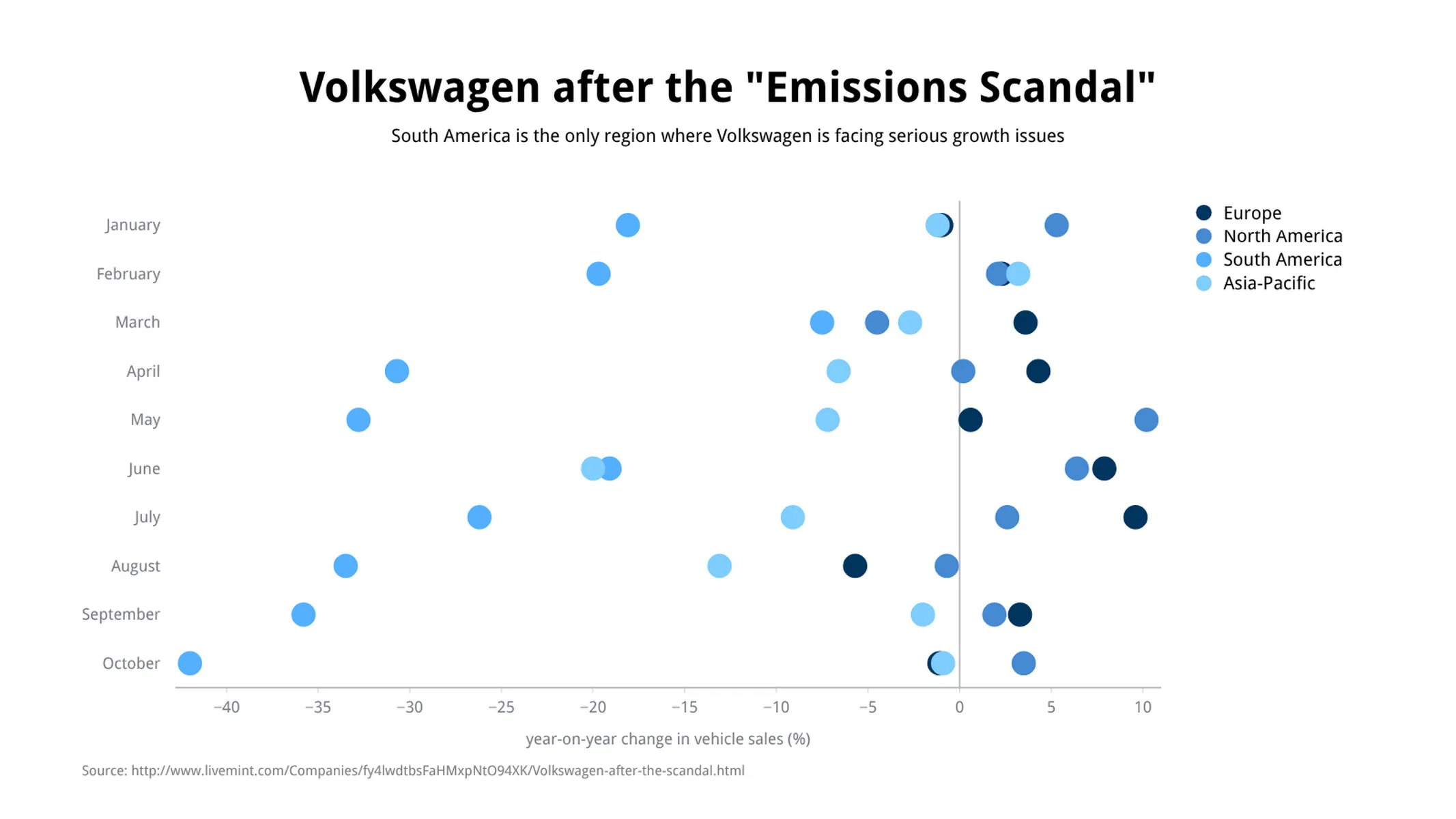
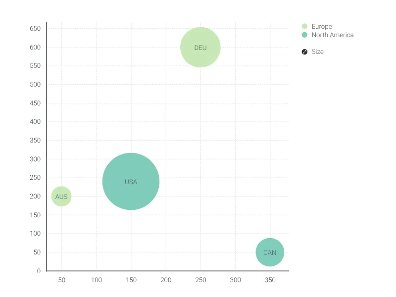
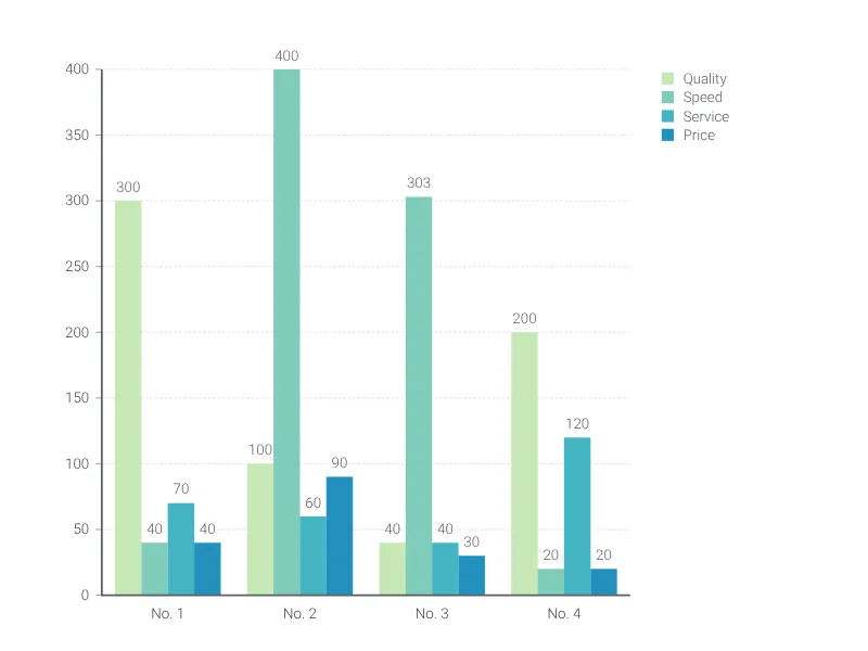
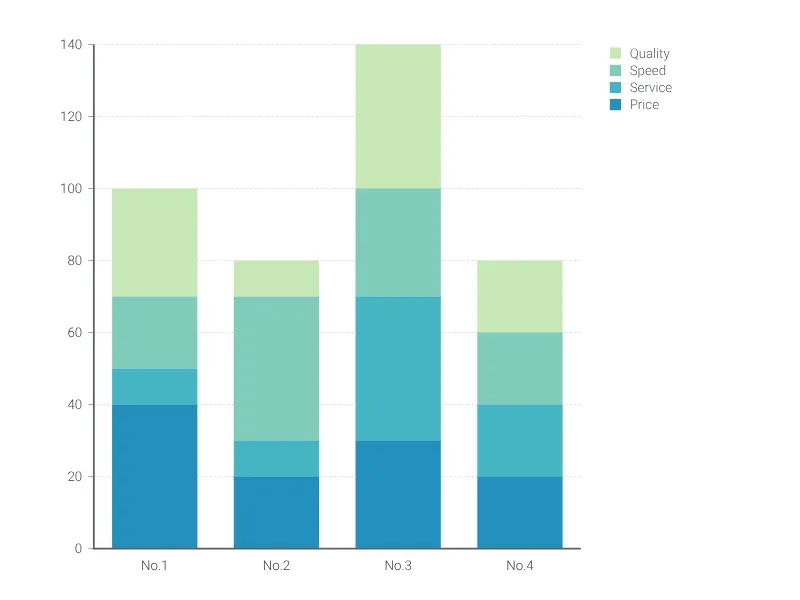
Like a bar graph, a dot plot chart has one category axis and one value axis. One of the axes displays the elements/groups of your comparison, the other shows the range of values of your variable. Dots of subsets are assigned with different colors, making them easily distinguishable. Dot plots are used to visualize the distribution of data points in time series or to compare a data set (with one or more categories) over a single variable, e.g., the revenues and profits from different product lines.
Best uses for the dot plot chart
- Data sets with multiple variables
- Continuous, quantitative and univariate data
- Highlighting outliers
- Currency comparisons
- Movie ratings
- Sports visualizations
- In fact, dot plot charts are extremely versatile, and will work for almost any topic you could think of!
How to make a dot plot chart with Vizzlo?
Make a dot plot online and export it to your presentations and reports. Check out the examples to get inspired, and follow these easy steps:
- On the “DATA” tab of the sidebar, click on the button “CATEGORIES” to name your groups and define their colors
- Use Vizzlo’s spreadsheet to enter your data with ease. Click on the wheel icons to match the number formatting with your source, then import or copy and paste your data
- Explore the customization options of the “APPEARANCE” tab to refine the look of your chart
Dot plot chart: pro tips
- Dot plots enable a clean and easy-to-read visualization of your data
- They can be a helpful alternative to a cluttered bar chart (as readers don’t need to compare the length of bars, but only the position of the dot along the value axis)
- For a dot plot chart, the “start-at-zero” rule for the value axis is not a must
Dot plot chart maker: key features
- Multiple series
- Vertical and horizontal views
- Custom number formats and colors
- Custom axes and grid
- Adjustable min/max values for y-axis
Resources
Dot Plot Chart: What's new?
Added support for scale breaks.
Custom colors can now be configureds for individual records.
Custom formatting is now also enabled for values.
An issue with axis range auto scaling for vertical charts was fixed.
All the charts that support symbols now have the same settings and styles available.
Dot Plot Chart Alternatives
Enhance your productivity
Create a Dot Plot Chart directly in the tools you love

Create a Dot Plot Chart in PowerPoint with
Vizzlo's add-in

Loved by professionals around the world


Visualizations your audience won’t forget
Convey abstract concepts and data with professionally designed
charts and graphics you can easily edit and customize.