Chart Vizzard
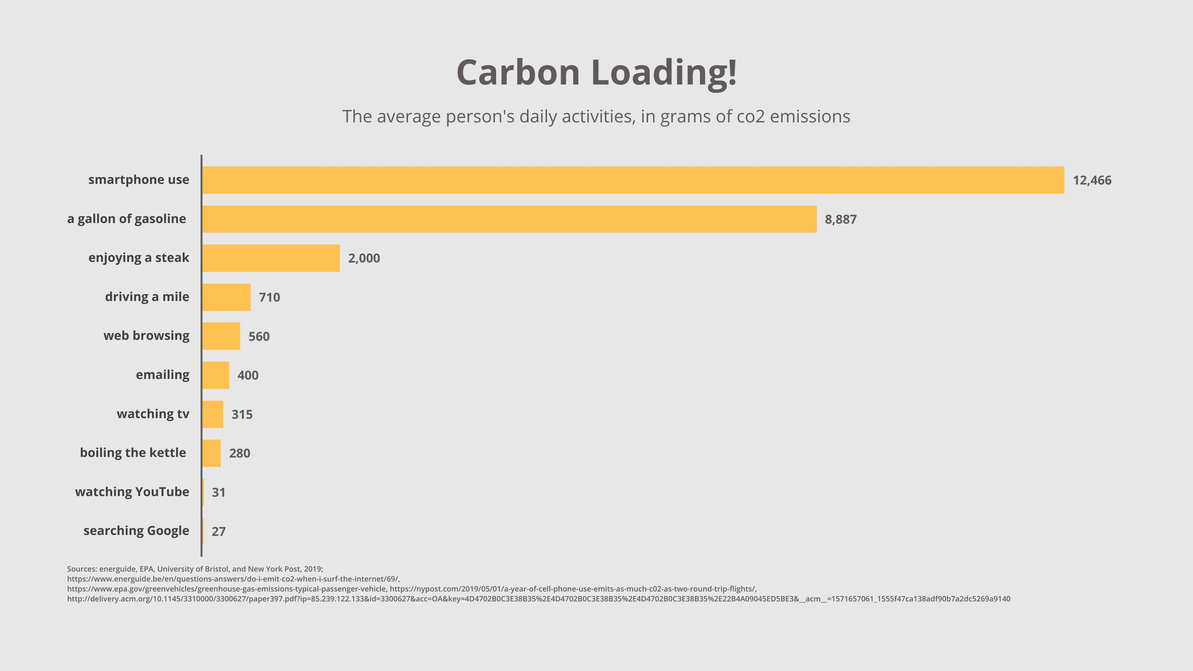
Vizzlo's AI-based chart generatorCarbon Loading!

Though Vizzlo has been steadily compiling data on climate change and carbon emissions for a while now, this week I stumbled upon a fact that shocked me: that in 2016, watching YouTube resulted in the equivalent of 11.13m tons of carbon dioxide emissions - similar to the total yearly amount of greenhouse gases emitted by a city the size of Frankfurt or Glasgow (thanks to the Fast Company and University of Bristol for this info). When you consider that in 2016 YouTube had roughly a billion users, that makes each viewer’s personal carbon footprint pretty low, but it got me considering other daily activities and how they might stack up to more widely considered unsustainable activities. For example, did you know that using your phone each year (for an average of 3.25 hours per day) creates the same carbon footprint as 10 flights from New York to San Francisco?!

This is an example of Vizzlo's “Horizontal Bar Chart”
A horizontal variant of the classic column chart.