Chart Vizzard
Vizzlo's AI-based chart generatorHorizontal Bar Chart
A horizontal variant of the classic column chart.
What is a horizontal bar chart?
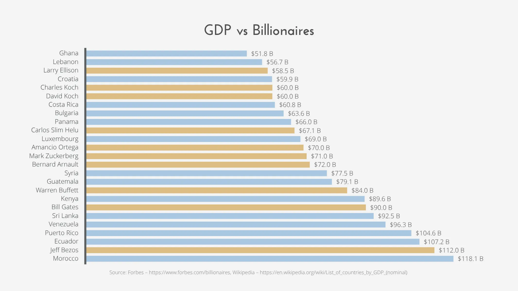
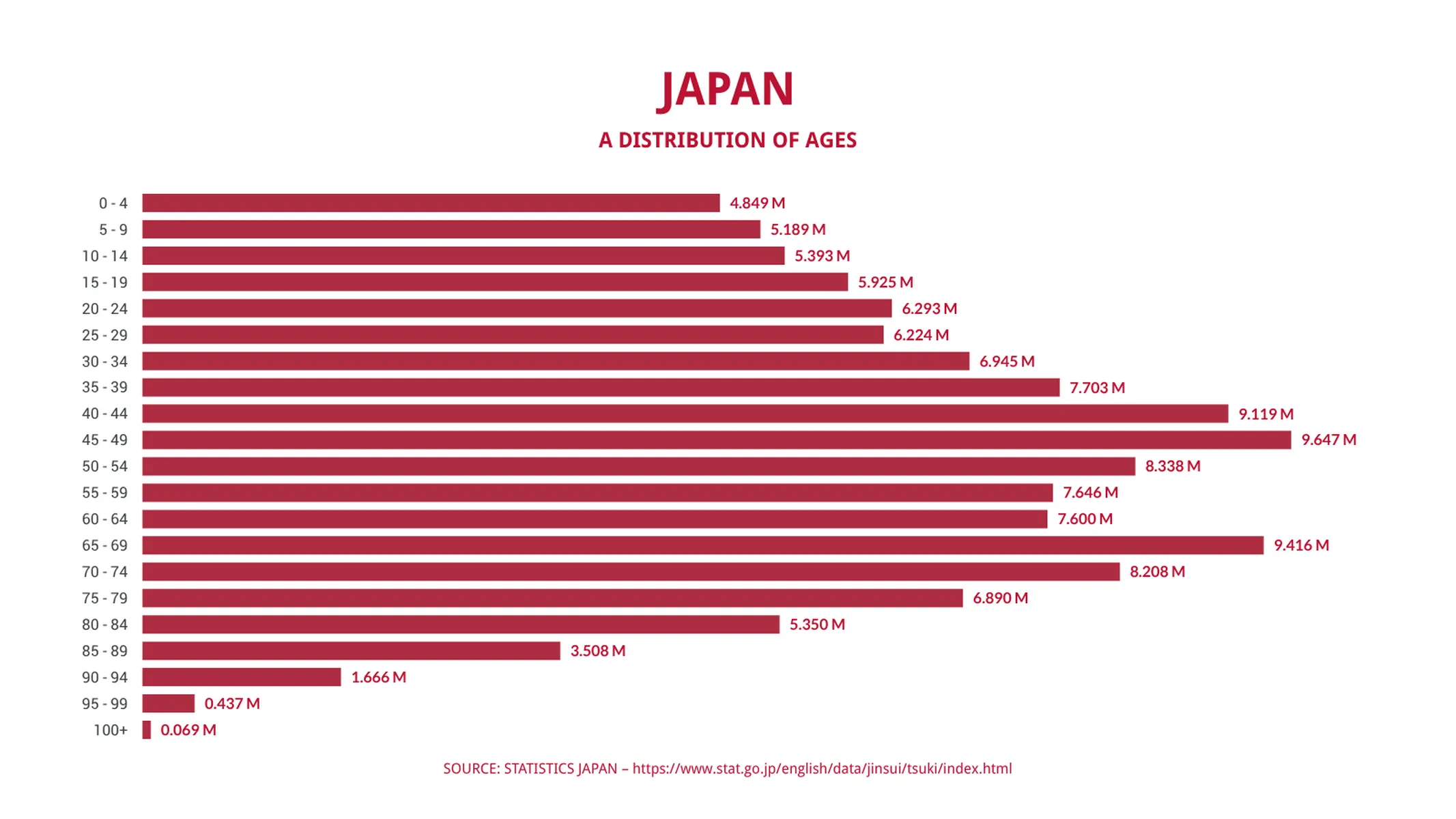
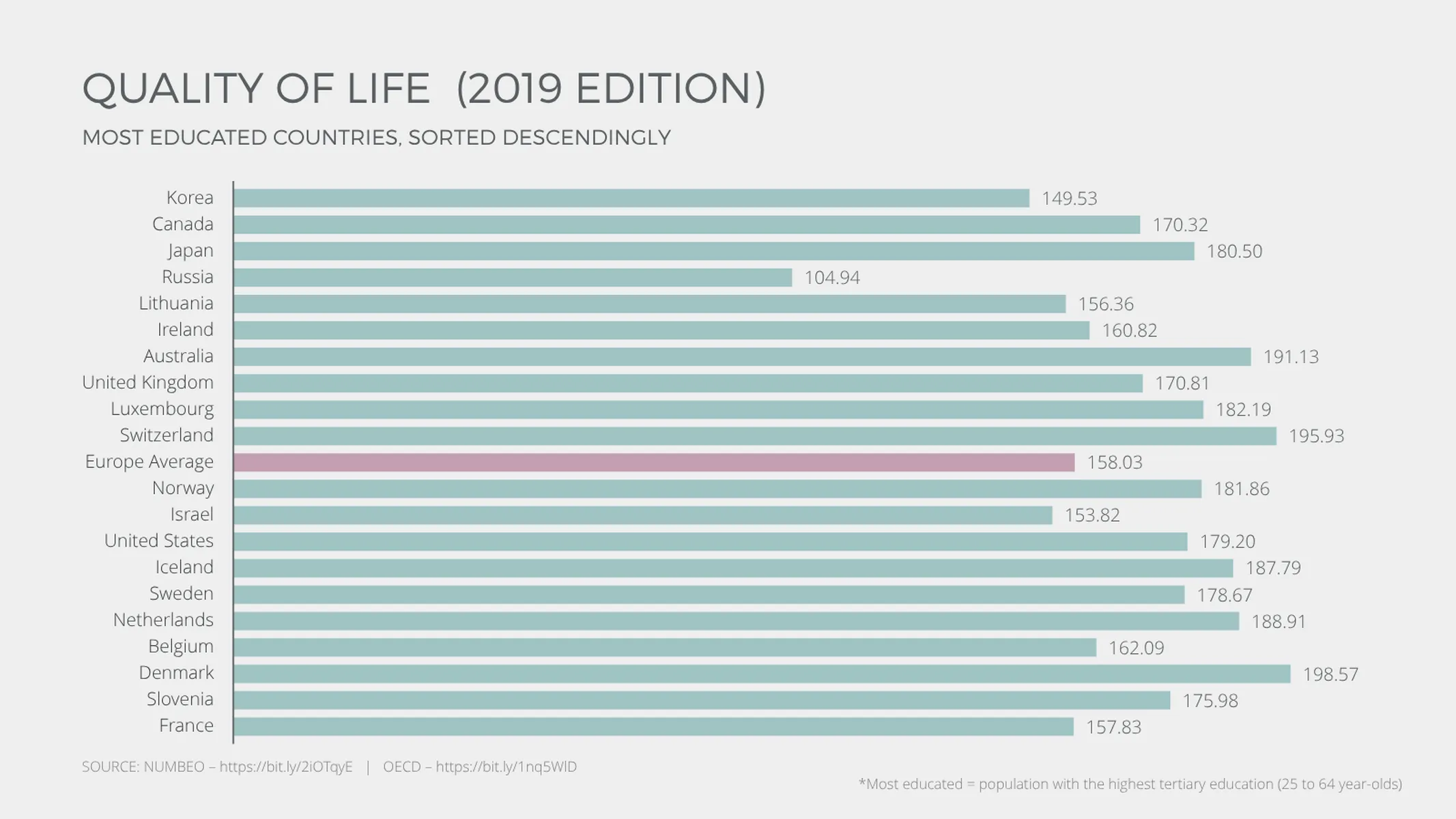
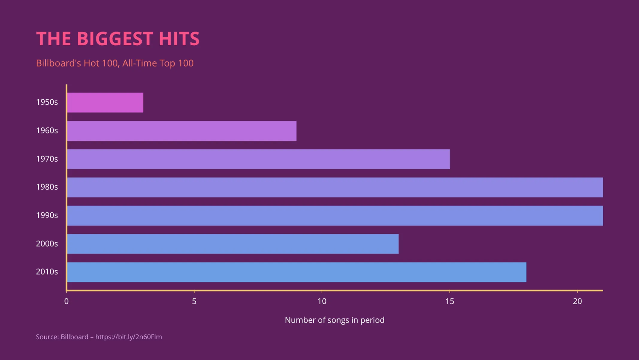
A horizontal bar chart is a slight variation on the column chart or vertical bar chart, with the primary difference being the inverted positions of the x-axis and y-axis. In the horizontal bar chart, the length of the bars are proportional to their values. The horizontal rendition of the bar chart is a more viable option for when larger quantities of data are involved since the positioning of the labels along the vertical axis offers better readability.
When to use a horizontal bar chart vs. a vertical bar chart?
Create a horizontal bar chart to display a data set that is nominal/categorical—i.e., qualitative categories. Examples of nominal data include: favorite food, city of residence, blood type, political party, etc. As mentioned earlier, horizontal bar charts are also ideal for larger data sets or those with longer labels.
How to make a horizontal bar chart with Vizzlo?
Follow these easy steps to create a great-looking horizontal bar chart:
- Click on the columns to start editing. Adjust the size of each bar using the handles.
- Click on the category labels to edit them, or use the respective cards in the sidebar.
- Alternatively, on the “DATA” tab click “EDIT DATA IN SPREADSHEET”, and copy and paste your data. Excel and CSV files can also be imported by drag and drop or with the click of a button.
- Explore the customization options using the “APPEARANCE” tab. Choose from additional display preferences to refine the look and feel of your new chart.
Horizontal bar chart maker: key features
- Horizontal and vertical views
- Custom number formats and colors
- Custom bar width
- Custom axes and grid
- Optional labeling of individual values
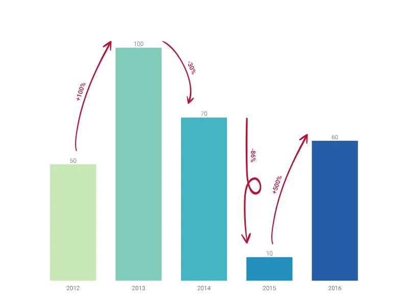
- Analysis lines: growth rates (CAGR), reference lines, trendlines, and benchmarks
- Optional sorting by value
- Adjustable min/max values for y-axis
Horizontal Bar Chart: What's new?
Fixed a bug that could cause the sidebar to malfunction when an analysis feature was selected.
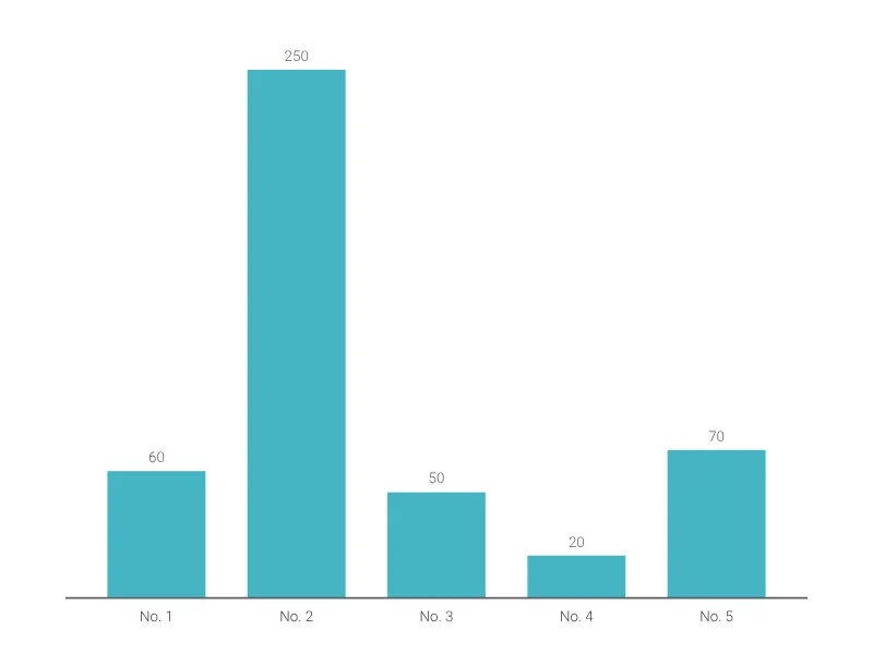
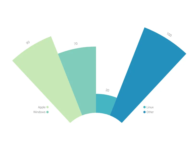
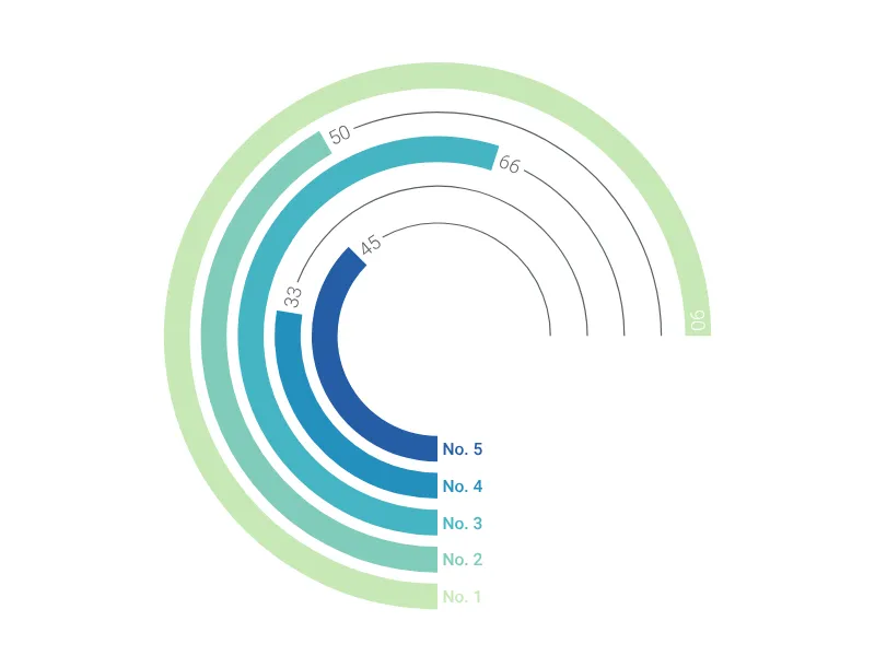
Horizontal Bar Chart Alternatives
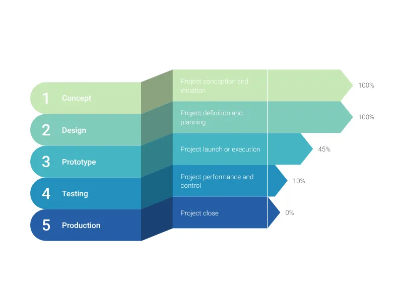
Use Cases
Bar & Column chartsEnhance your productivity
Create a Horizontal Bar Chart directly in the tools you love

Create a Horizontal Bar Chart in PowerPoint with
Vizzlo's add-in

Loved by professionals around the world


Visualizations your audience won’t forget
Convey abstract concepts and data with professionally designed
charts and graphics you can easily edit and customize.