Chart Vizzard
Vizzlo's AI-based chart generatorGlobal Life Expectancy: 1800-2020

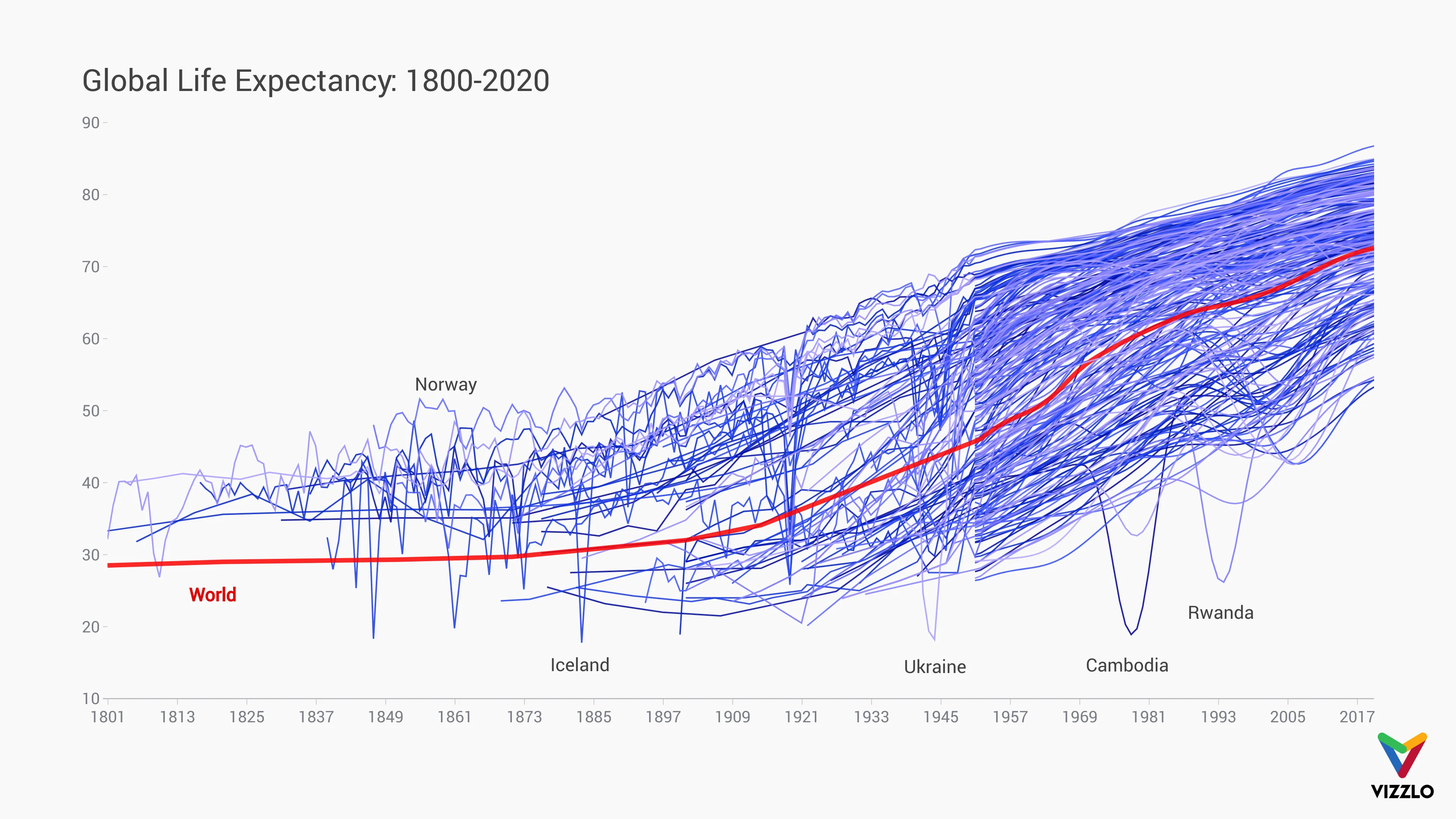
Our biggest data set yet, we show you 220 years of life expectancy in 244 countries across the globe.
The general trend for life expectancy has sharply increased in the last century, with advancements in medical science, technology and more social mobility.
Some anomalies have been highlighted in the chart.
Norway’s peaks of greater health and longer life in the mid to late 19th Century can be explained by the country’s early adoption of smallpox vaccines - saving the lives of many at a time when millions were suffering from smallpox throughout Europe.
Iceland’s low population account for its unsteady life expectancy, as fewer deaths result in a greater effect on the average age. The deepest dip recorded on this graph, in 1880, coincides with a sharp decrease in the temperature–causing many Icelanders to emigrate, and a general loss of life quality. At this time the life expectancy was just 18 years old.
Russia saw a strong decline in life expectancy during the reign of Tsar Nicholas II from 1894-1917. Civil unrest and protests saw many people die, either from overcrowding as in the Khodynka Tragedy or by governmental control and suppression. Military defeats and economic depression added to the death toll for the Russian people.
Ukraine’s pivotal role in World War II had a great impact on the country. The army that Ukraine sent to join the Allied forces was more than double that of Britain’s, and the country’s total loss of life (10 million Ukrainians) was only exceeded by Russia–a country with more than 5x the population to begin with.
1979 and 1980 saw the Cambodian humanitarian crisis at its worst. The horrors of the Cambodian civil war, Khmer Rouge regime, and subsequent Vietnamese invasion saw millions of Cambodians starved and murdered and hundreds of thousands escape to Thailand to avoid famine and violence.
The Rwandan Genocide in 1994 wiped out 70% of its Tutsi population (a Great Lakes region ethnic group) - up to 1 million dead.

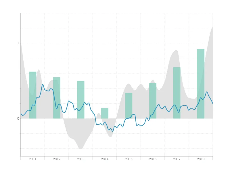
This is an example of Vizzlo's “Time Series Graph”
Complex time series graph to visualize detailed financial data.
Finance & Economics Bar & Column charts Line & Area charts Time-based charts