PREVIEW
Chart Vizzard
Vizzlo's AI-based chart generatorU.S. passenger air travel

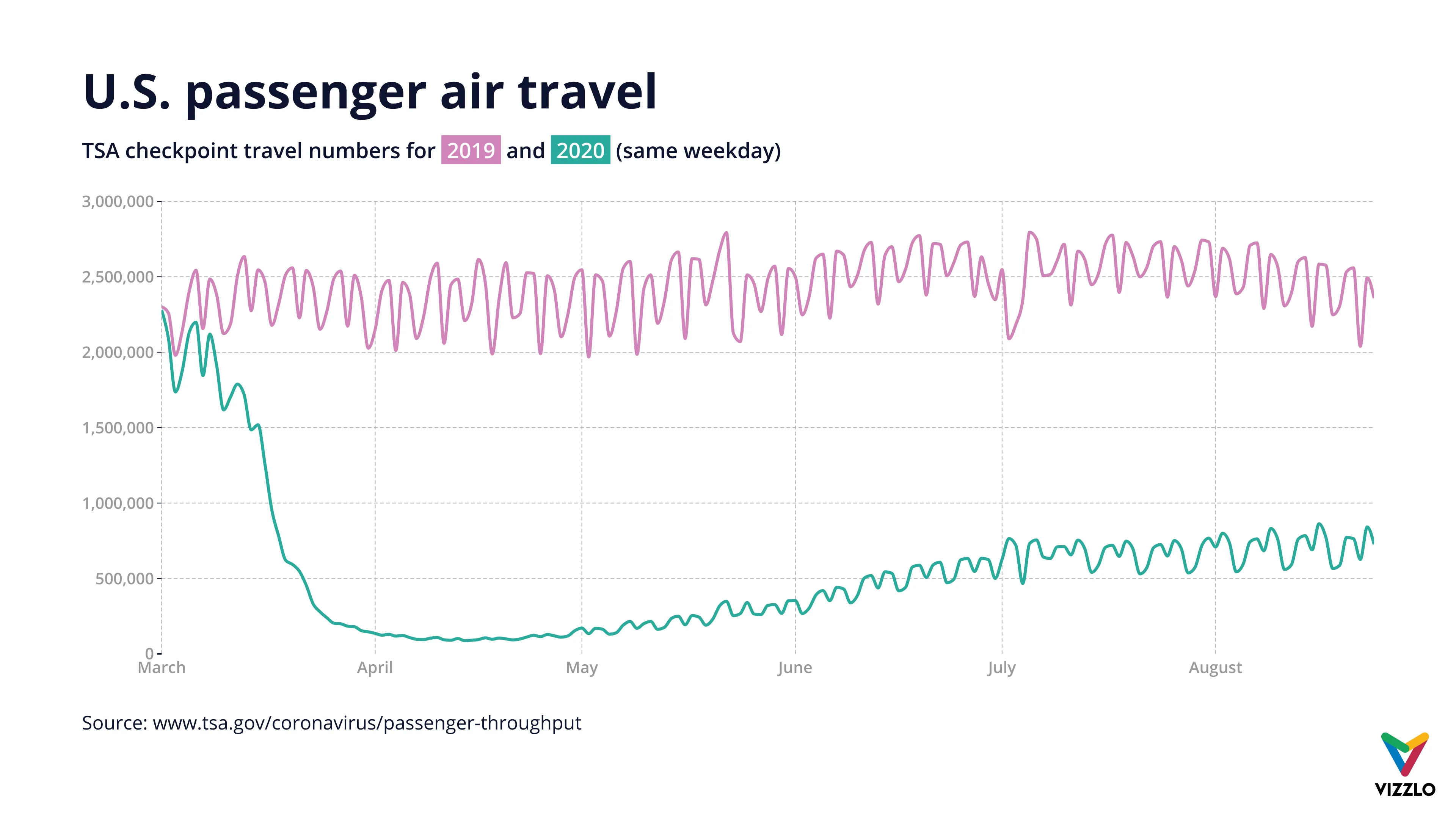
The corona virus still significantly affects air traffic in the USA and worldwide. The graph compares the number of air passengers in the USA in 2020 with the number of passengers in the previous year between March and July. The data is provided by the Transportation Security Administration. Overall, the number of departures has recently fallen by roughly 80 percent.
Source: www.tsa.gov

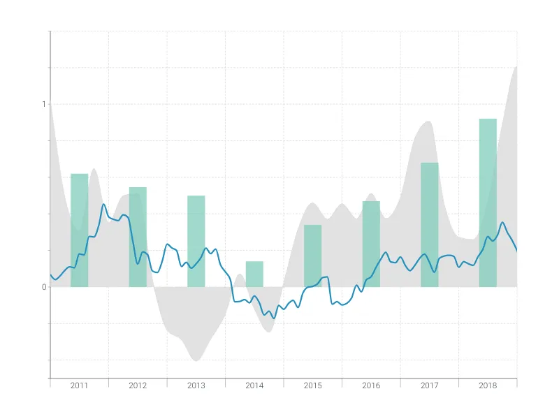
This is an example of Vizzlo's “Time Series Graph”
Complex time series graph to visualize detailed financial data.
Finance & Economics Bar & Column charts Line & Area charts Time-based charts