Chart Vizzard
Vizzlo's AI-based chart generatorCreate your Multiple Pies Chart in seconds
Place up to six pie charts on a single page. A modern alternative to a bar chart.

Create your chart in 3 simple steps
- Create new Multiple Pies Chart
- Add your data
- Export or share
Why Vizzlo?
- Create professional charts in seconds
- Fully customizable, no design skills needed
- Create directly in PowerPoint & Google Slides
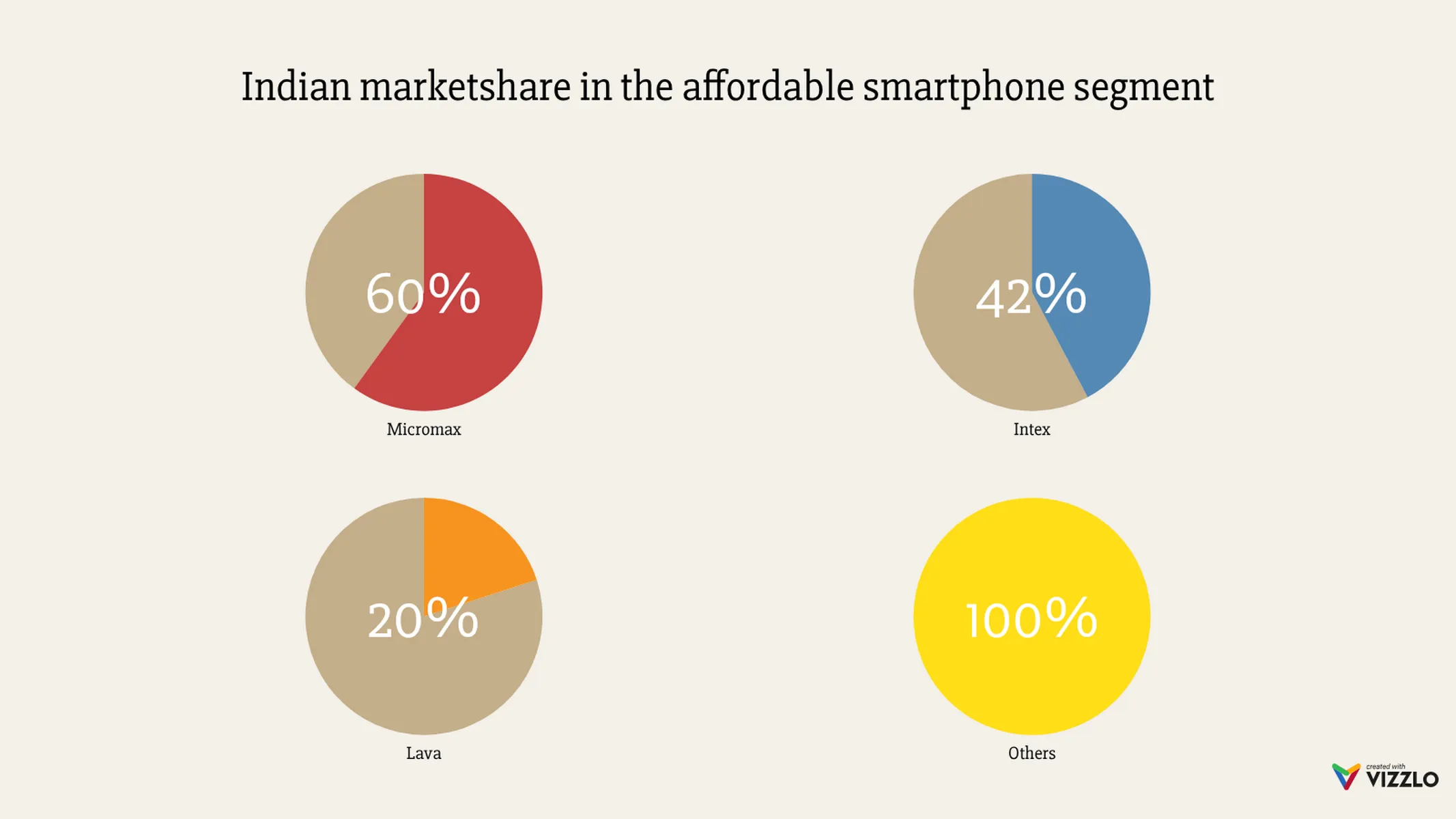
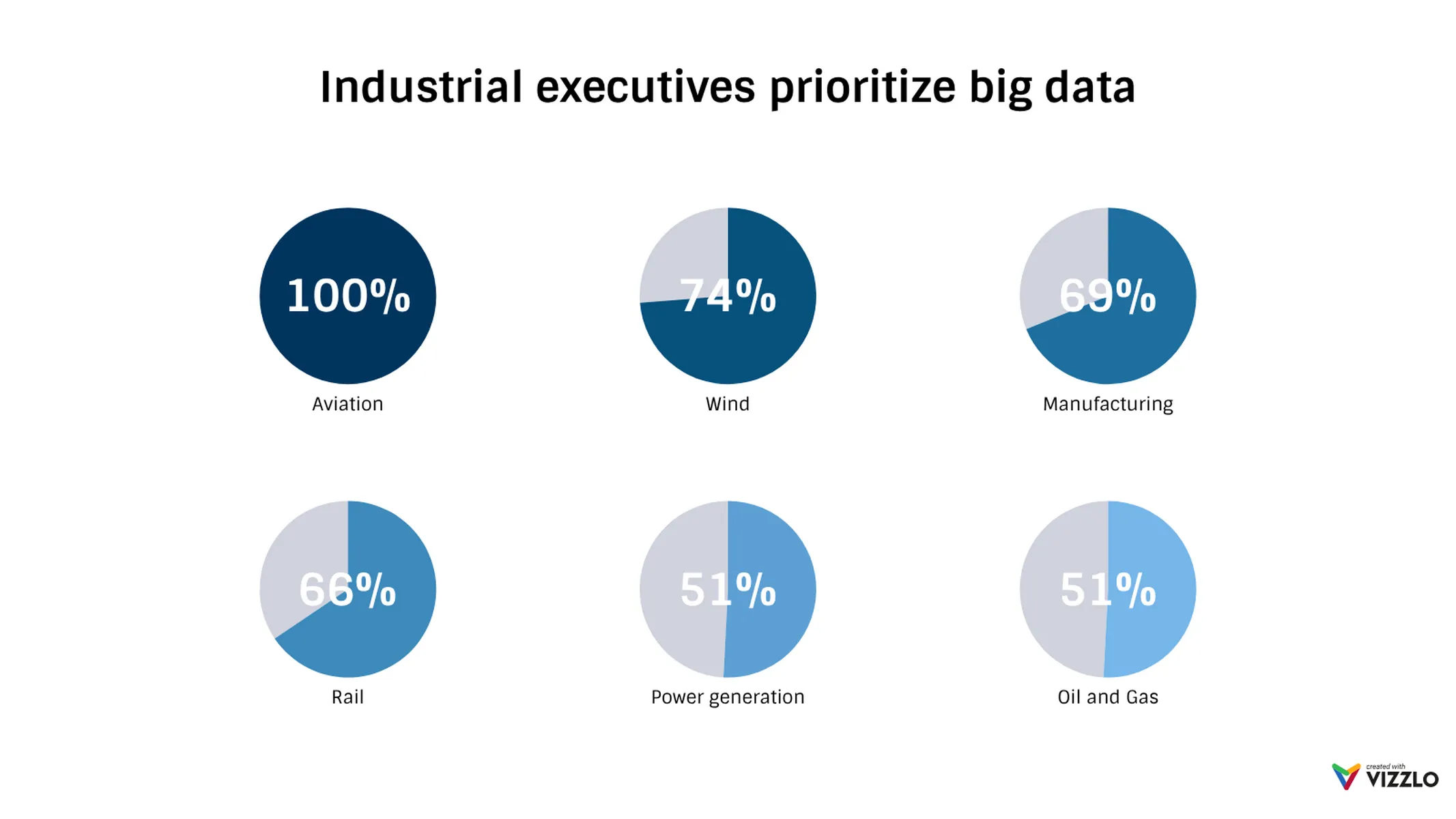
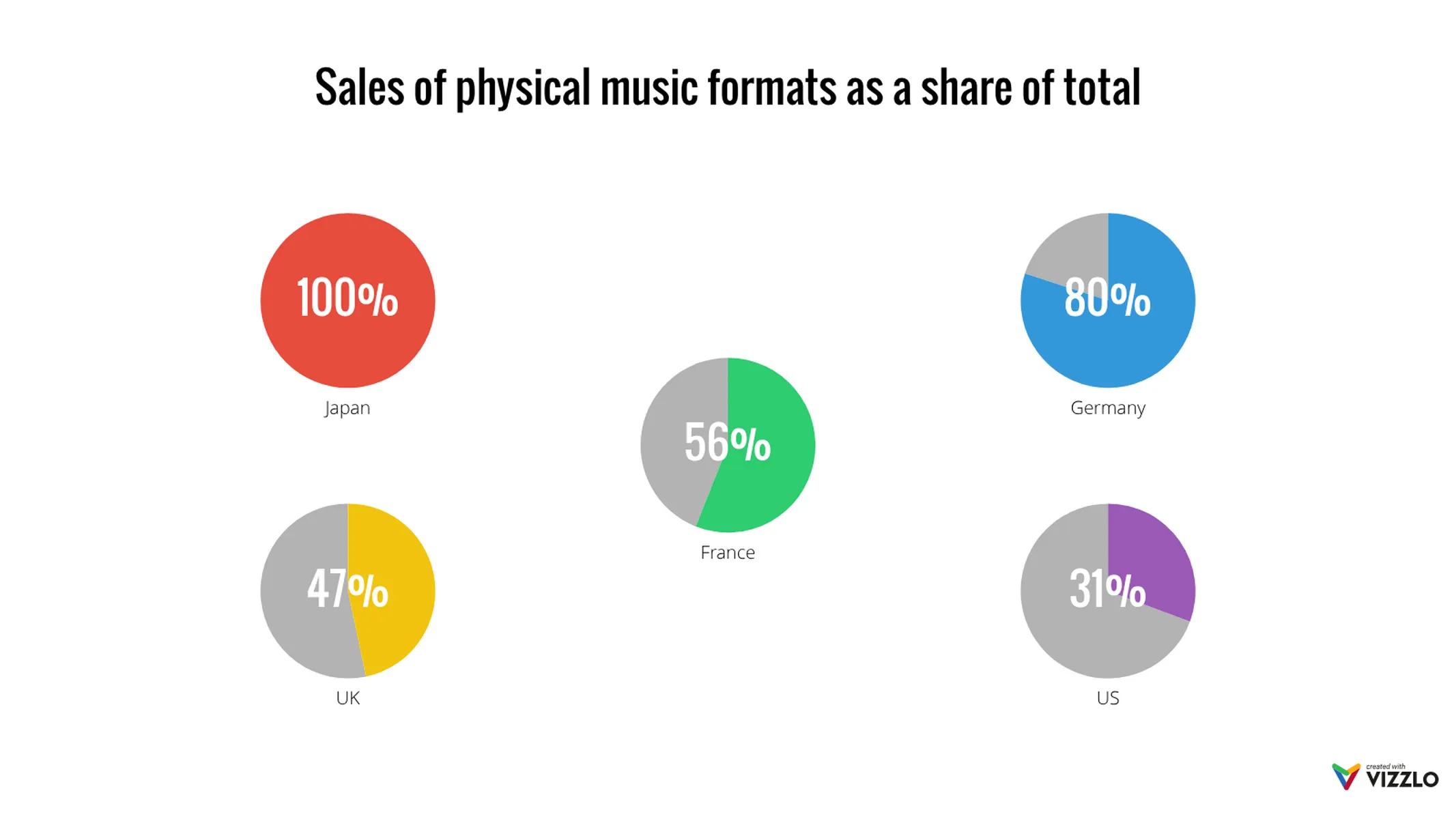
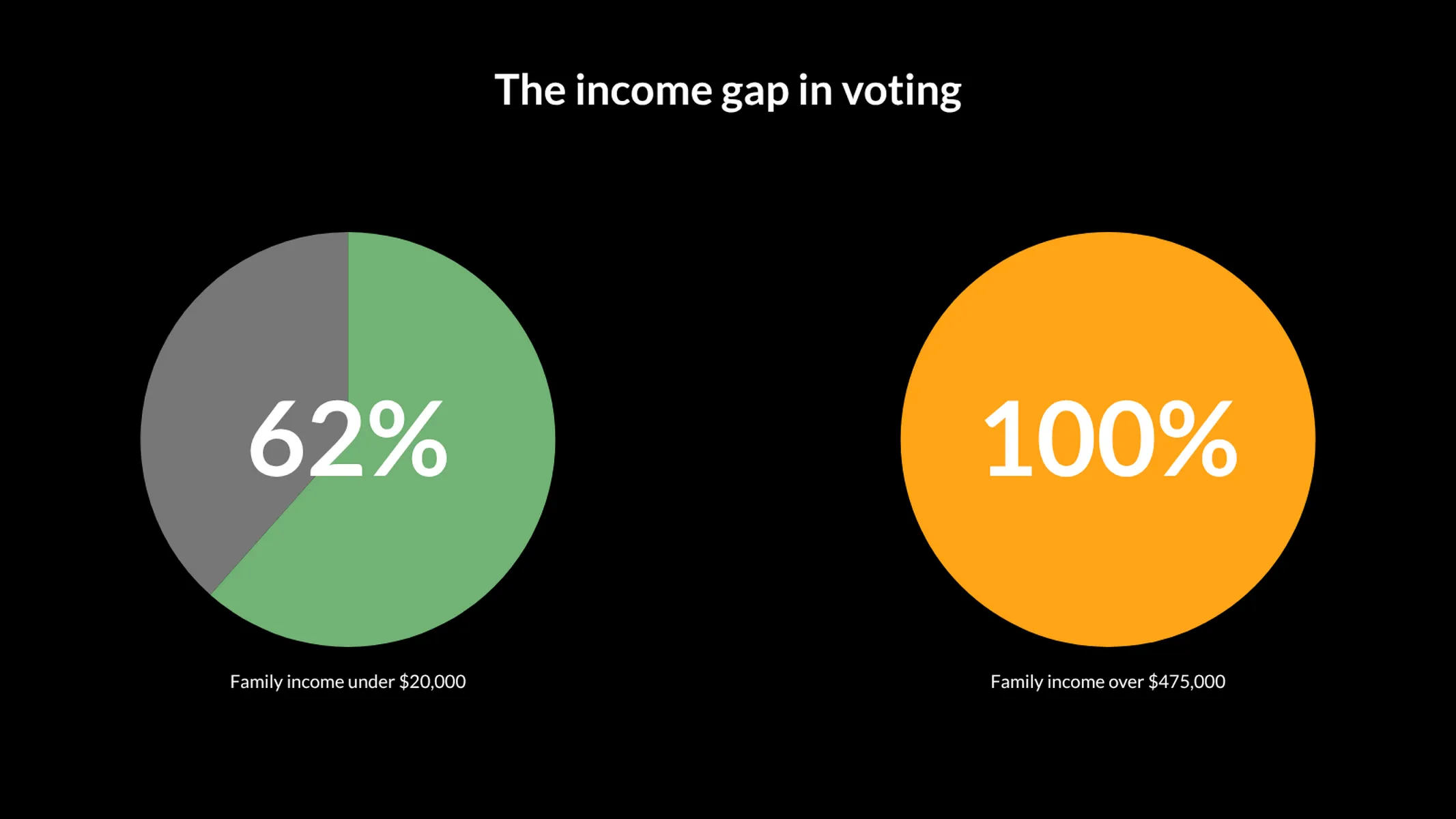
What is the multiple pies chart?
The multiple pies chart is a visualization in which multiple pies are plotted together, side by side.
While a single pie chart is used to visualize the part-to-whole relationship within one group, the multiple pies are mostly used to visualize and compare data of a category across different groups. For example, if you want to illustrate the market shares of a brand in diverse markets, the multiple pies are the right visualization choice for you.
You can also use the multiple pies chart to highlight sections/illustrate the breakdown of a traditional circle chart (making the differences more explicit). Or to present key facts/data about your topic.
How to make a multiple pies chart with Vizzlo?
Plot up to six pie charts side by side using this intuitive vizzard. Follow these easy steps:
- Click on the elements to select and directly edit them.
- Alternatively, use the active cards or the spreadsheet to enter your data.
- Use the “x” or ”+” buttons on the chart to delete or add a new pie.
- Explore the options of the tab “APPEARANCE” to customize your pie charts: you can sort them by size, custom the number format, hide percentage labels, and choose to use just one color for all of them.
Multiple pies chart maker: key features
- Custom colors and numbers
- Optional sorting by value
- Add up to six pies
Multiple Pies Chart: What's new?
These chart types now all support adding custom formatting to individual value labels.
Multiple Pies Chart Alternatives
Enhance your productivity
Create a Multiple Pies Chart directly in the tools you love

Create a Multiple Pies Chart in PowerPoint with
Vizzlo's add-in

Loved by professionals around the world


Visualizations your audience won’t forget
Convey abstract concepts and data with professionally designed
charts and graphics you can easily edit and customize.