Chart Vizzard
Vizzlo's AI-based chart generatorBar Chart
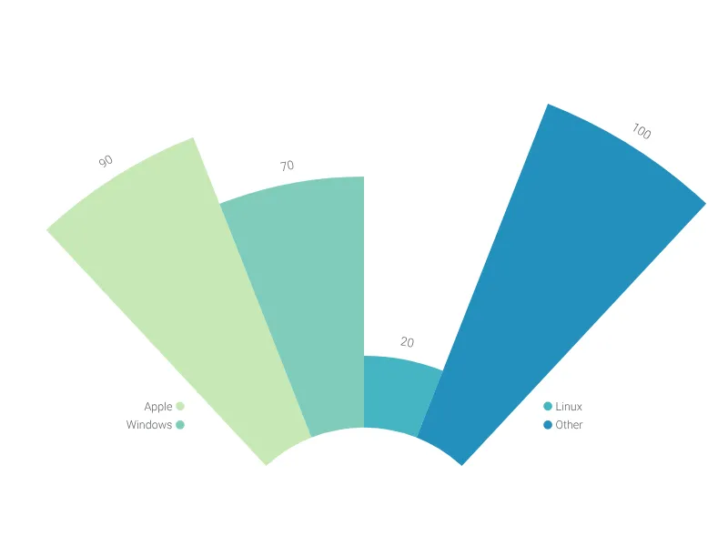
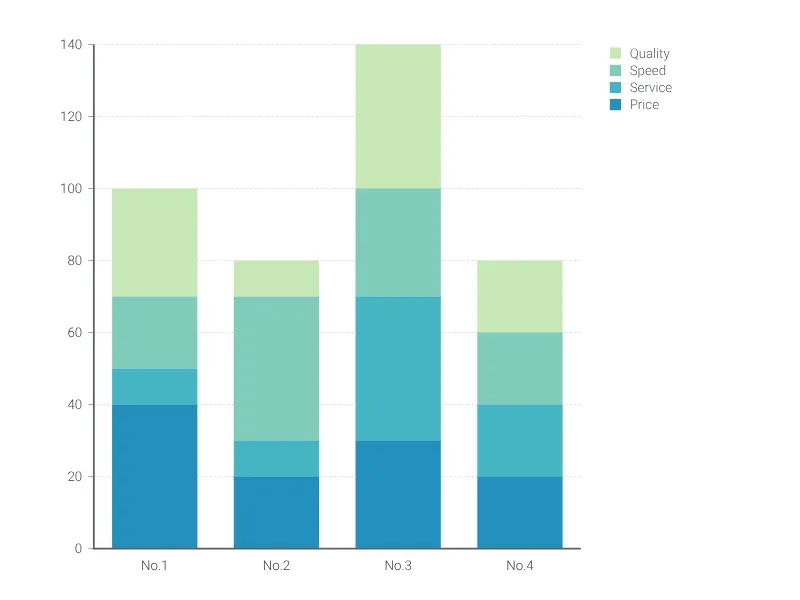
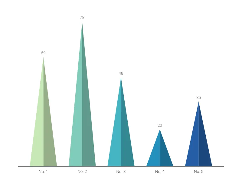
Visualize amounts with respect to one categorical variable


What is a bar graph?
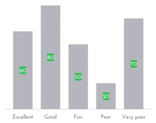
A bar chart is a common graphical display when you want to show quantitative values for a set of categories. The bars represent a set of numerical data points. The length of the bars is proportional to the numerical values associated with each category. The bars can be placed either vertically or horizontally. It is best practice to make the bars start at zero. Otherwise, you run the risk that your chart misleads people.
This type of chart is also known as a bar chart, bar plot, or column chart.
A brief history of the bar chart
The first known bar chart was part of Wiliam Playfair’s The Commercial and Political Atlas, from 1796. The author, a Scottish political economist and a pioneer in data visualization and graphic design, compared year-to-year data of different branches of trade.
How to make a bar chart with Vizzlo
- Enter your data either open the “Spreadsheet” in the menu bar and copy&paste your data into the corresponding fields or upload as XSLX or CSV file
- change the data of the default entries - just click on any bar and use the input elements in the sidebar
- Add additional bars by clicking the “plus” buttons on each side of a bar. Alternatively, click on “+ Add bar” in the menu bar
- Explore additional customization options the sidebar
- Click on Analysis to add a shade or a projection line
Bar graph pro tips
- Bar charts should generally include a zero baseline.
- If the labels to identify the bars take up too much horizontal space, swap the x and y-axis.
- Always sort your bars if the categorical variable has no natural order.
Bar graph: use case
- Almost anything!
- Sales volume of different brands
- Total number of people living in different cities
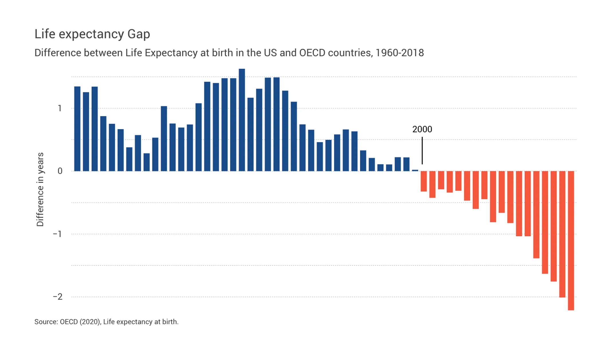
- The difference in life expectancy between countries or regions
Bar chart: key features
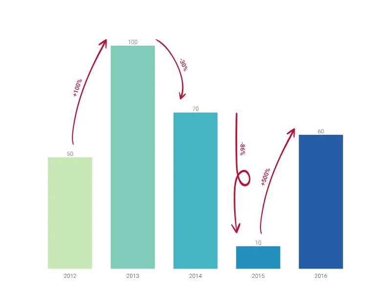
- Take advantage of our advanced Analysis functions to visualize growth, trends, projections and benchmarks
- Vertical and horizontal views
- Sorting bars ascending or descending
- Change bar colors
- Adjust bar width
- Customize axes lines and grid lines
- Adjustable minimum and maximum range for y-axis
- Analysis lines: growth rates (CAGR), reference lines, trend lines, and benchmarks
- Show values and change their number format
Resources
- Step-by-step tutorial
- Vizzlo’s Data Viz Guide includes:
Bar Chart: What's new?
Values can now be displayed inside the bars of bar charts.
Top arrows now respect sum value positioning again.
It is now possible to seamlessly switch between grouped and stacked series—no need to convert into a different chart type anymore.
A single click on a bar now selects the series and shows the series settings in the sidebar. Individual bar colors can be set by using a right-click on a bar and choosing the option “Change individual bar color” in the context menu.
Adding individual growth rates now works properly again.
Bar Chart Alternatives
Use Cases
Bar & Column chartsEnhance your productivity
Create a Bar Chart directly in the tools you love

Create a Bar Chart in PowerPoint with
Vizzlo's add-in

Loved by professionals around the world


Visualizations your audience won’t forget
Convey abstract concepts and data with professionally designed
charts and graphics you can easily edit and customize.