Chart Vizzard
Vizzlo's AI-based chart generatorCreate your Nightingale's Rose Chart in seconds
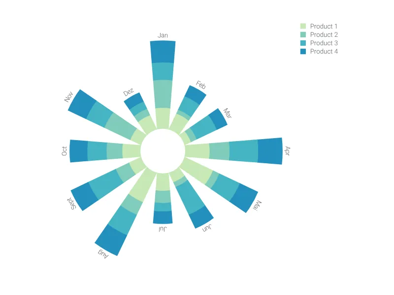
Create a sophisticated Nightingale's Rose chart to compare periodic data or various categories across different groups.
Create your chart in 3 simple steps
- Create new Nightingale's Rose Chart
- Add your data
- Export or share
Why Vizzlo?
- Create professional charts in seconds
- Fully customizable, no design skills needed
- Create directly in PowerPoint & Google Slides
What is the Nightingale’s Rose chart?
Also referred to as “polar area chart” or “coxcomb chart,” the Nightingale’s Rose chart is a circular graph that combines elements of a radar chart and a column graph.
In this graph, the proportional areas are plotted in a polar coordinate system, divided into equal segments (with the same angle). Differences between categories and groups are made visually evident through the filled areas of these segments.
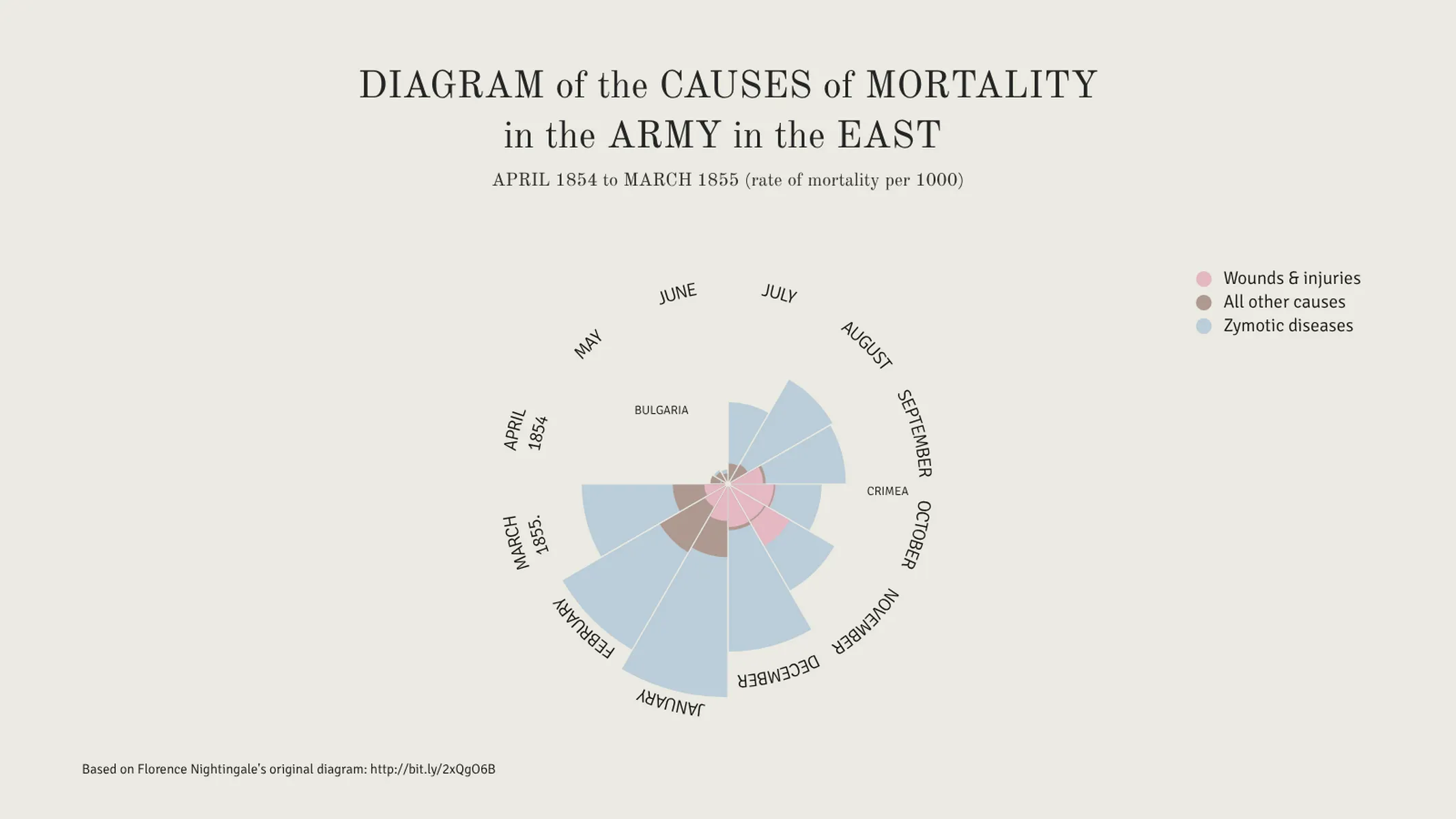
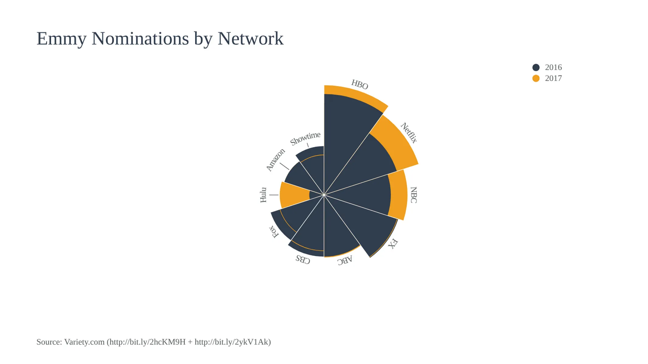
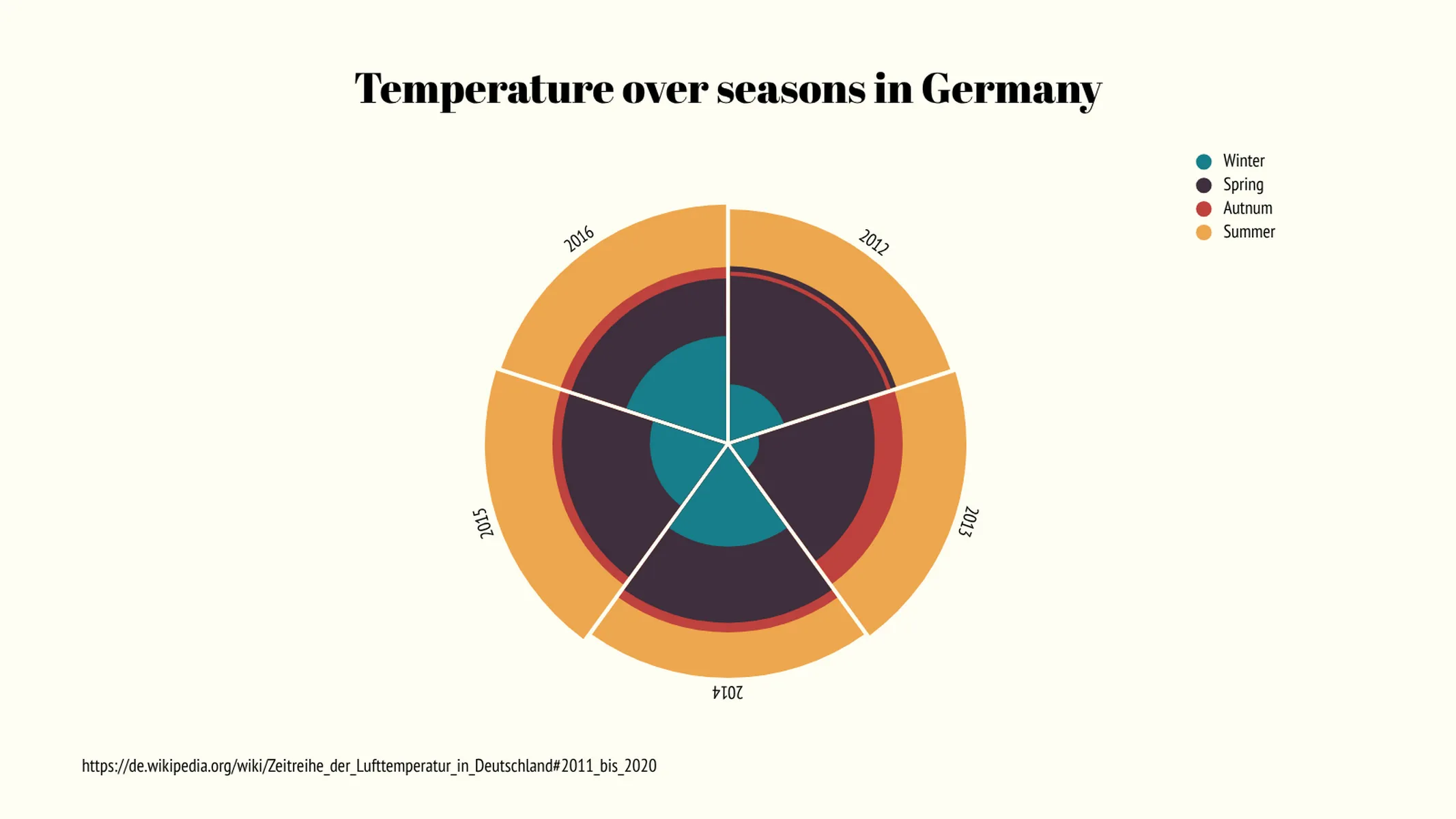
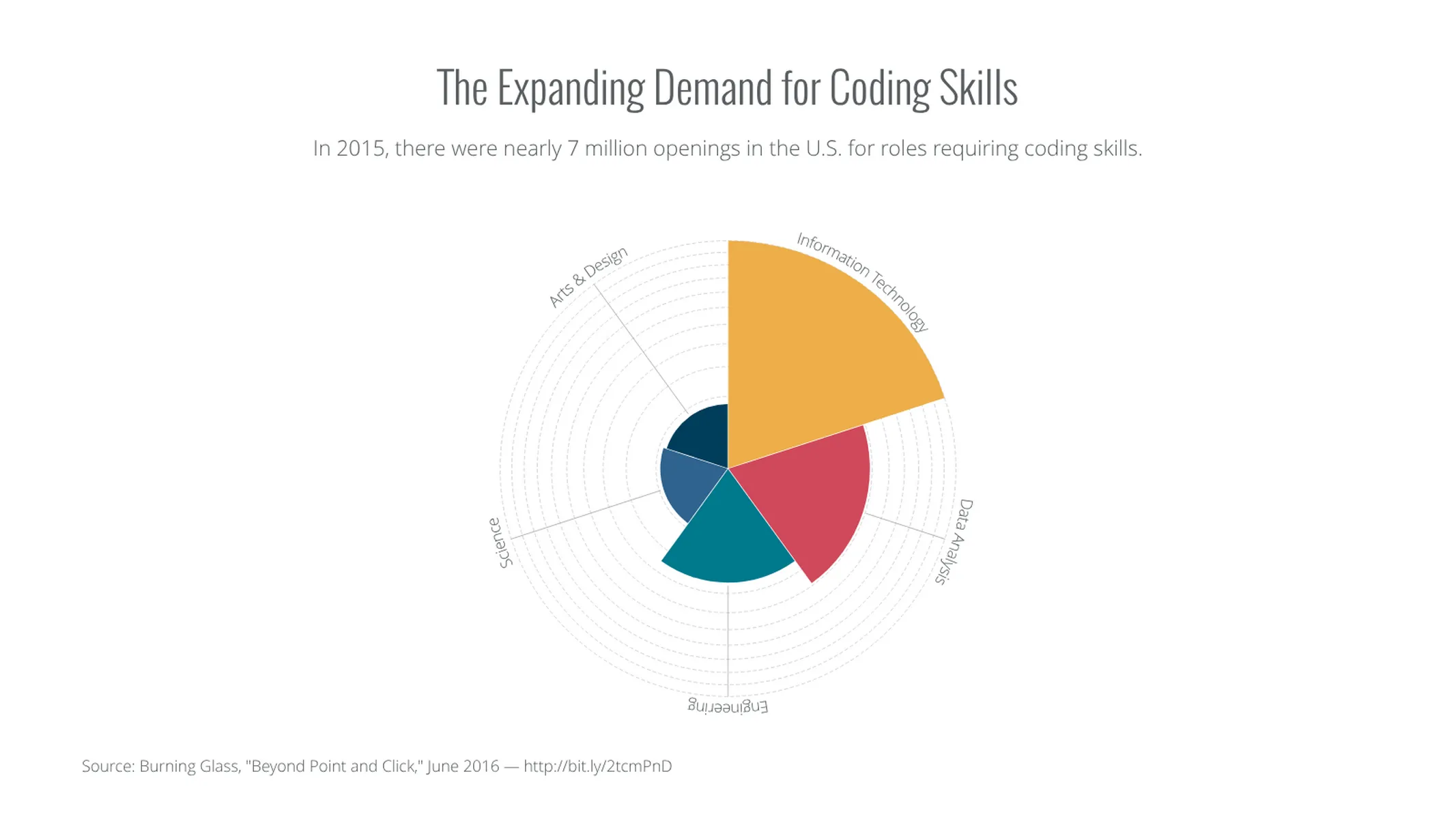
The invention of this diagram is attributed to Florence Nightingale—a British nurse and social reformer, who in 1858 developed this chart type to represent the causes of death of British soldiers during the Crimean War graphically. Her rose chart is especially appropriate (but not only) to visualize seasonal/periodic data. Check the examples to get inspired!
Curiosity: Meteorologists use this graph as a tool to visualize the distribution of wind speed and direction on a location. This meteorological chart is called “wind rose” and uses the compass rose as a reference to display the principal winds (cardinal and ordinal directions).
How to make a Nightingale’s Rose chart with Vizzlo?
Follow these easy steps to create your Nightingale’s Rose chart online:
- On the tab “DATA” of the sidebar, click on the button “CATEGORIES” to name them
- Then select a segment on the chart to edit it using the active cards on the sidebar. Alternatively, you can copy and paste your data directly into Vizzlo’s spreadsheet
- Try the options of the “APPEARANCE” tab to customize the look of the chart
Nightingale’s Rose chart maker: key features
- Multiple series
- Custom lines, grid and colors
- Adjustable start angle
Nightingale's Rose Chart: What's new?
You can now switch between the options to make the area proportional to the values or the radius.
Nightingale's Rose Chart Alternatives
Enhance your productivity
Create a Nightingale's Rose Chart directly in the tools you love

Create a Nightingale's Rose Chart in PowerPoint with
Vizzlo's add-in

Loved by professionals around the world


Visualizations your audience won’t forget
Convey abstract concepts and data with professionally designed
charts and graphics you can easily edit and customize.