Chart Vizzard
Vizzlo's AI-based chart generatorRadar Chart
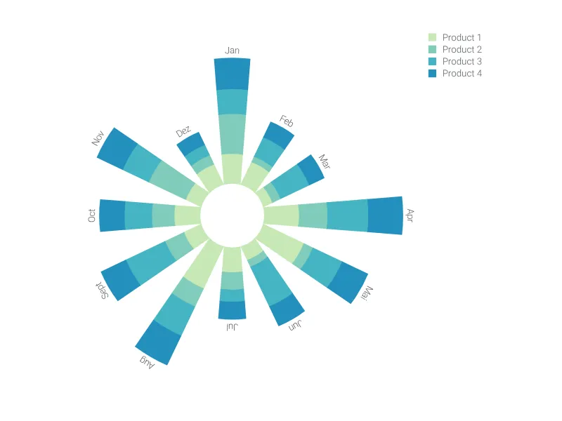
Easily compare multiple variables in a compelling graph with several polar axes.

What is a radar chart?
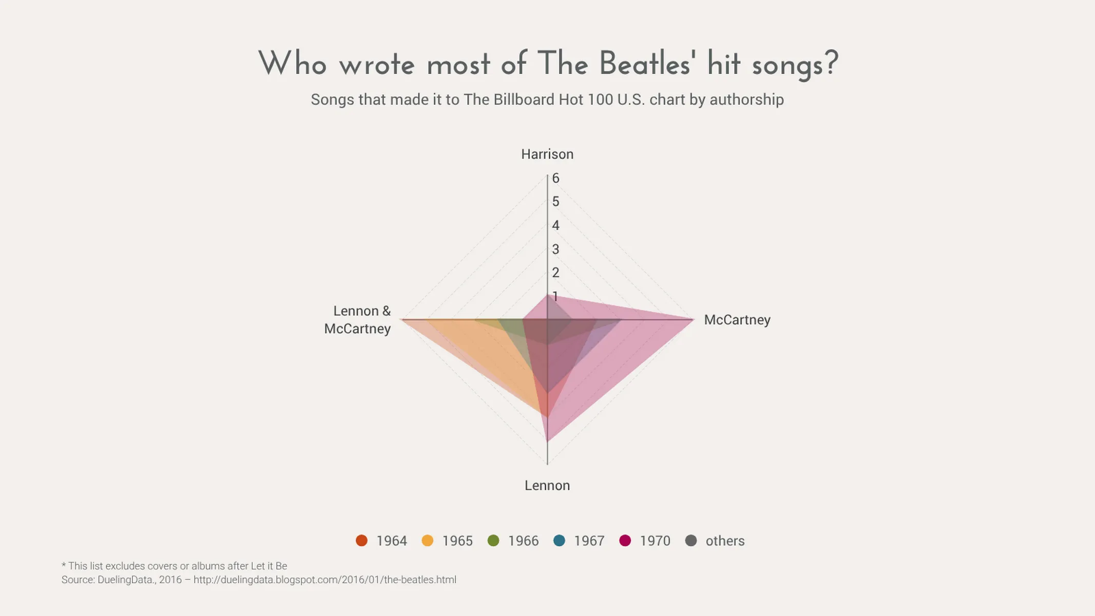
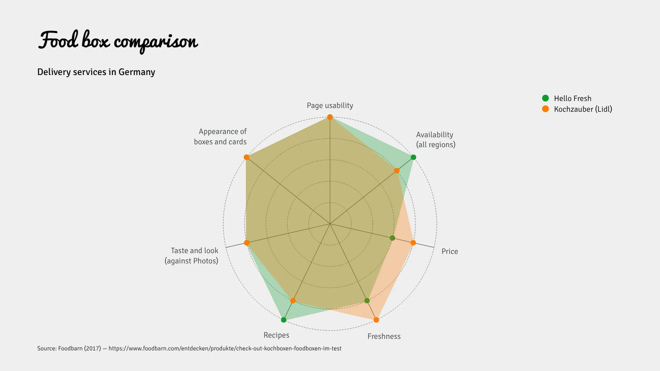
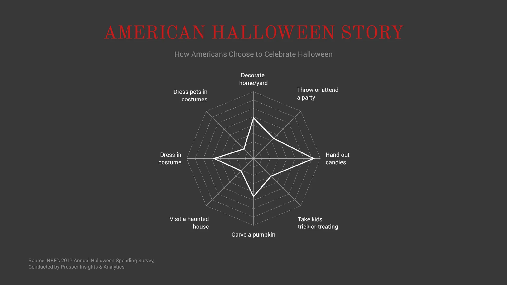
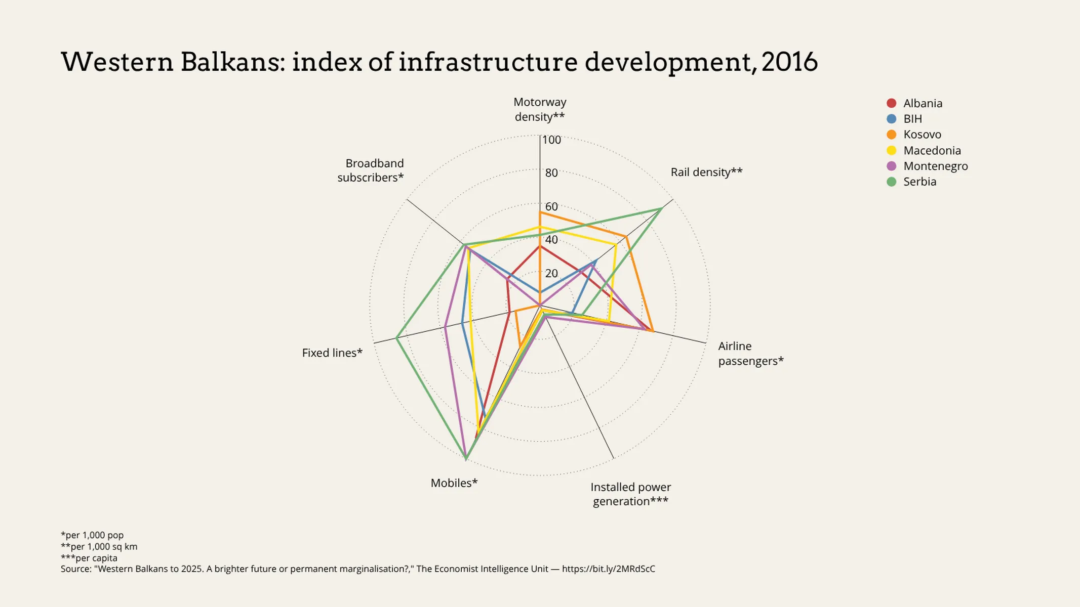
The radar chart—also known as a Spider Chart, Web Chart, Polar Chart and Star Plots (among other names)—is used to compare one or multiple categories (e.g. competitors, products, etc.) across different variables (e.g. quality indices, performance metrics, etc.).
The distance/radius of each point to the center is proportional to the maximum magnitude of the variable (or its highest record). A radar chart is ideal to reveal similarities and differences (outliers) between your categories. It’s especially effective to visualize cyclic data and the positioning of one or two categories across the different variables.
Best uses for the radar chart
- Representing data with multiple variables
- Showing commonality (or outliers) within a data set
- Data with clear differences (as the angular volume is more difficult to process than a simple bar)
- Showing placement on scaled variables (for example, from light to dark)
How to create a radar chart with Vizzlo?
This plugin is a fast and beautiful alternative to Excel. Create a compelling radar chart in seconds:
- On the “APPEARANCE” tab, click on “Edit polar axes” to define your variables
- Then, click on any line to start editing it on its active card
- Alternatively, copy and paste/or import your data into Vizzlo’s spreadsheet
- Explore the “LAYOUT SETTINGS” options of the “APPEARANCE” tab to customize the display of the grid, choose to fill areas, and show or hide tick marks and data markers
- Choose a Vizzlo theme or customize one with your preferred font-color combination
Radar chart: pro tips
- Before pasting your data into Vizzlo’s spreadsheet, make sure the number formats match your data source
- Click on the “Wheel” icons in the spreadsheet columns to see the number formatting options
Radar chart maker: key features
- Up to twelve variables (spokes/polar axes)
- Up to eight categories
- Custom colors
- View dataset as lines or filled areas
- Option to integrate a legend
- Adjustable min/max values for the polar axes
Resources
- The Data Visualisation Catalogue has a great page expanding on Radar Charts
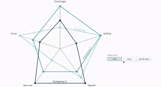
Radar Chart: What's new?
It is now possible to use custom settings for opacity and for the Category Styles with Line, Area or Line and Area
 .
.
All the charts that support symbols now have the same settings and styles available.
We solved a bug affecting the creation/deletion of new series from the spreadsheet.
Most of our data visualisations now support SI prefixes, advanced number format options for axes and shown data labels.

We fixed a bug in the radar chart. Html tags are not visible anymore in a legend when you used the rich-text-editor to style the legend text.
Radar Chart Alternatives
Enhance your productivity
Create a Radar Chart directly in the tools you love

Create a Radar Chart in PowerPoint with
Vizzlo's add-in

Loved by professionals around the world


Visualizations your audience won’t forget
Convey abstract concepts and data with professionally designed
charts and graphics you can easily edit and customize.