Chart Vizzard
Vizzlo's AI-based chart generatorDonut Chart
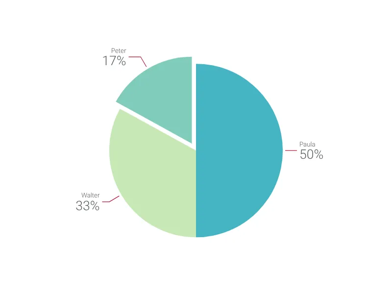
Slenderize your simple pie chart with this donut chart and highlight your favorite pieces.
What is a donut chart?
A donut chart (or doughnut chart) is a circular graphic whose total ring area corresponds to 100%. Just like a pie chart, each of its slices represents a proportional relationship of parts to a whole.
Because of its resemblance to the well-known pie chart, your audience will understand a donut chart effortlessly. Indeed, the donut chart is even easier to read: since its center is empty, it is not necessary to compare the angles and the sizes of the whole ‘slices,’ shifting the focus only to the arcs’ length.
Best uses for the donut chart
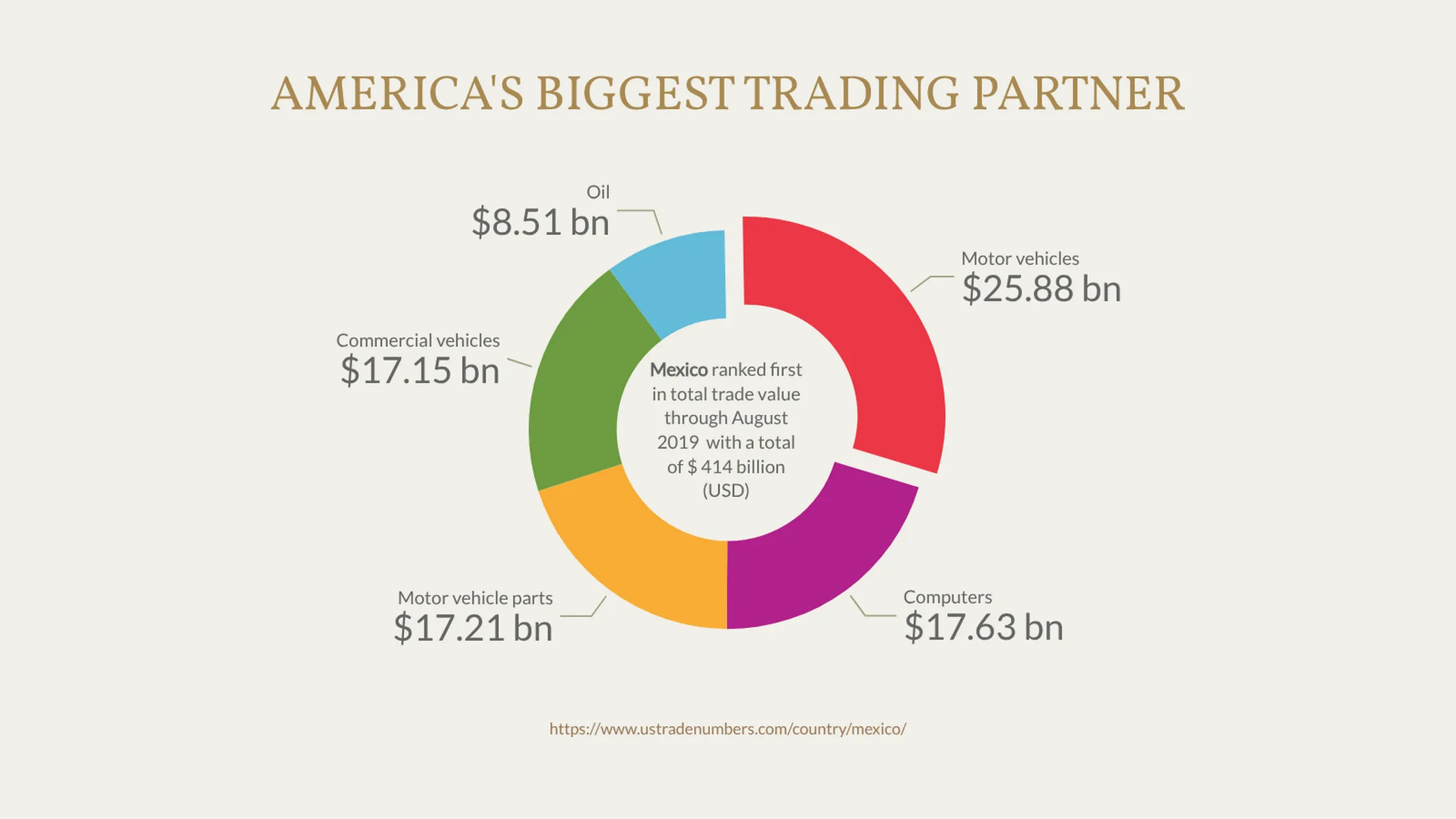
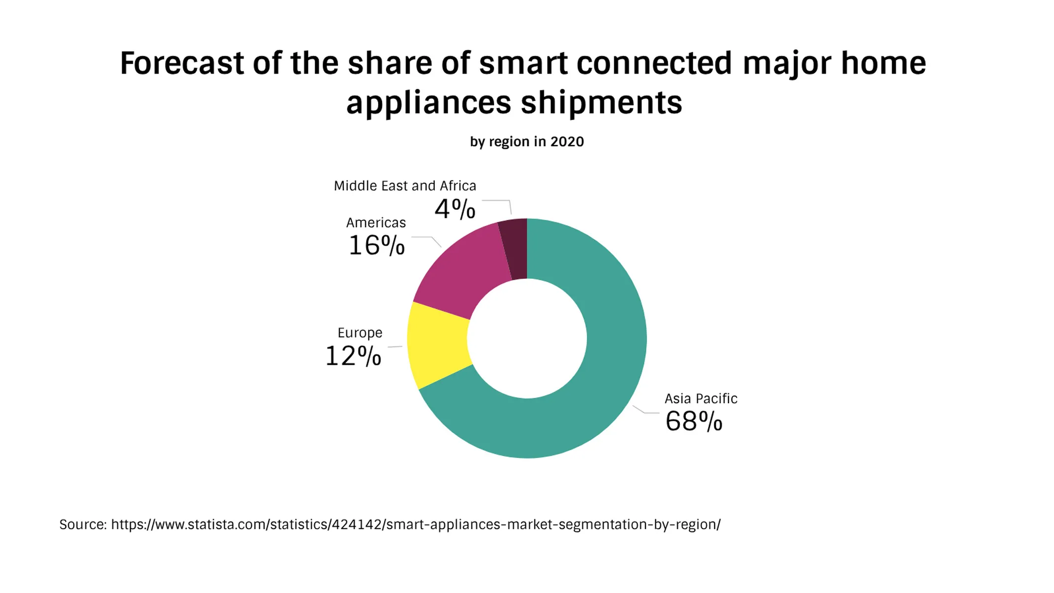
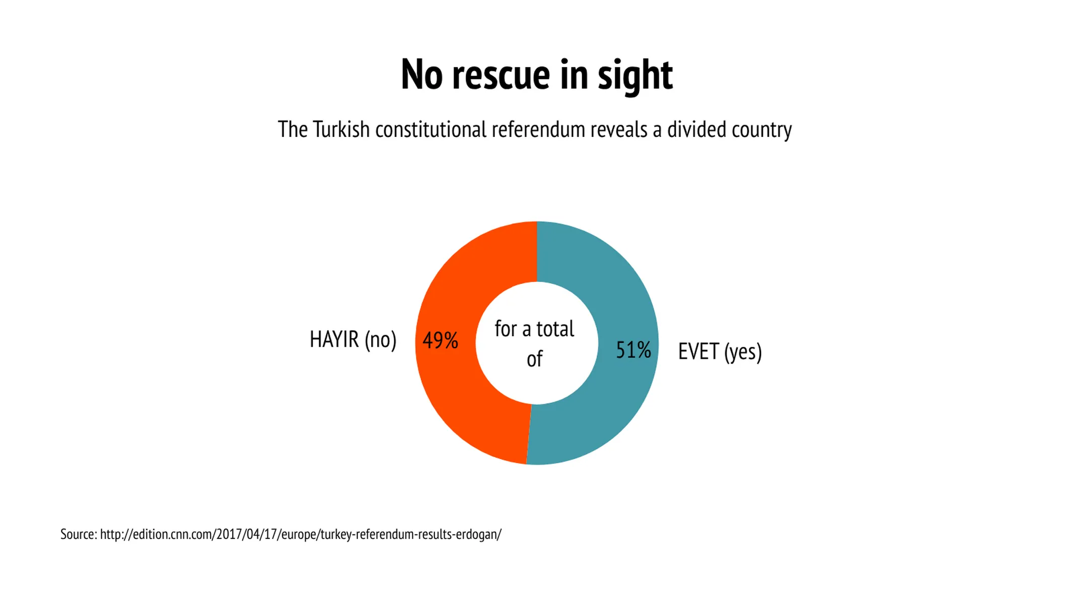
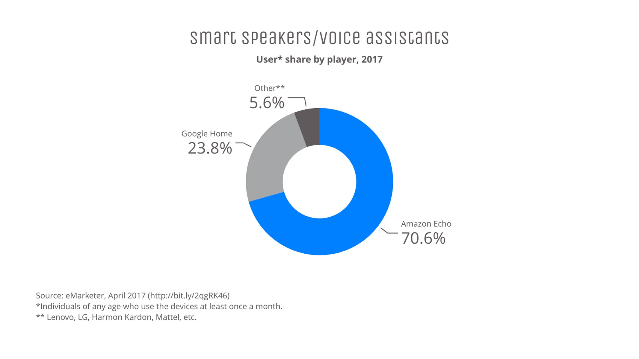
- Representing percentages of a whole
- Showing proportional demographics of your customers
- Data that is more difficult to process in Pie
How to make a donut chart with Vizzlo?
Make a great-looking donut chart to visualize your data, create better presentations and reports.
- Click on any element to select and edit it. If you wish, use the active cards in the sidebar as a support
- To add new slices, click on the “plus” buttons on the chart or the tab “DATA.”
- Alternatively, add a larger amount of data at once using the spreadsheet. Click on “EDIT DATA IN SPREADSHEET” in the tab “DATA” of the sidebar to copy and paste your data into it
- Select a slice and check the box “Highlighted” in the active cards to explode it (you can also right-click to choose this option)
- Test the settings of the tab “APPEARANCE” to customize and optimize how your labels, values, and lines are displayed
Donut chart: pro tips
- Check the donut chart examples to see potential customization options and get inspired
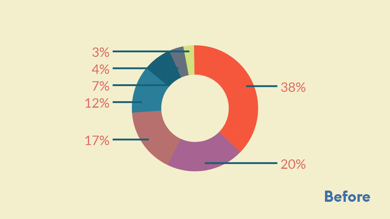
- Overlapping labels? Select ‘label as list’ on the Appearance tab to arrange them automatically (or follow the rules from our Pie Chart Hacks)
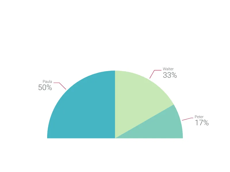
- Switch your donut chart to ‘pie’ format in just one click on the Appearance tab
- Use your white space - add explanatory text, or perhaps the total value, to the centre of the donut hole
- Labels and values can be quick-selected to show Inside the chart sections, Outside or in a separate Legend for customizable legibility
Donut chart maker: key features
- Custom colors and number formats
- Custom connectors and labels
- Exploded segments
- Optional sorting by value
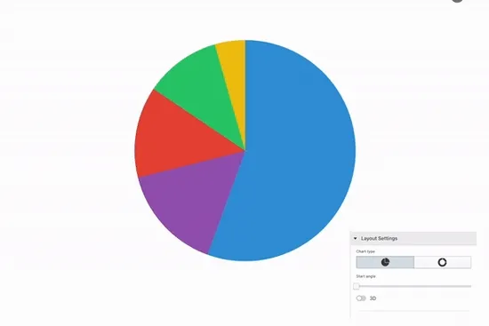
- Adjustable start angle
- Customizable ring width
Donut Chart: What's new?
Our first charts with 3D support are here: the Pie Chart and the Donut Chart !
The styling of individual numerical value labels can now be modified—much in the same way you’ve been able to format the text labels before.
We further improved the automated label positioning for the pie chart! Especially multi-line labels benefit from that and don’t overlap.
For the pir chart we improved the label positioning further so that multi-line labels don’t overlap.
Our Pie Chart and Donut Chart have now more beautiful and smarter connectors between slices and labels. To try them on your charts, check the box Align labels
Donut Chart Alternatives
Use Cases
Circular chartsEnhance your productivity
Create a Donut Chart directly in the tools you love

Create a Donut Chart in PowerPoint with
Vizzlo's add-in

Loved by professionals around the world


Visualizations your audience won’t forget
Convey abstract concepts and data with professionally designed
charts and graphics you can easily edit and customize.