Chart Vizzard
Vizzlo's AI-based chart generatorHow to Make a Pie Chart (That Even Data Viz Nerds Won’t Hate)
To Begin: Why Are Pie Charts Such a Hot-Button Topic?
Pie charts can be fun and informative, but they are not always super easy to read. If you search Google for information on pie charts, the chances are you’ll have come across one of the following kinds of articles:
- “Pie Charts: Bad by Definition"
- "Why are pie charts terrible?"
- "The hate of pie charts harms good data visualization”
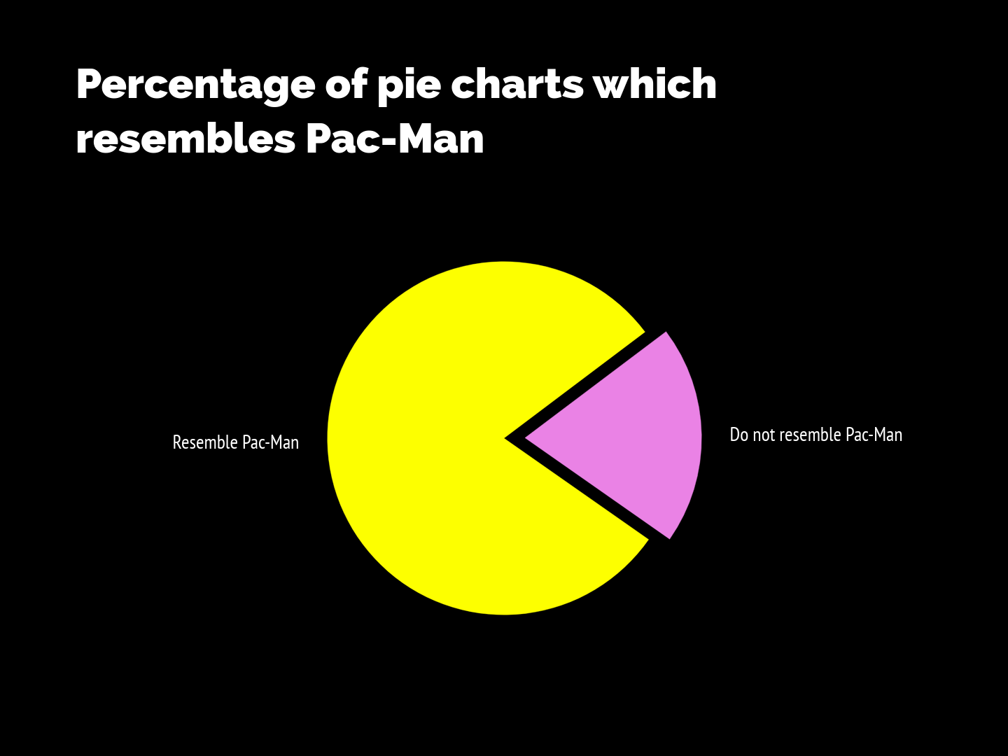
You may not have realized a simple circular graph could evoke such strong emotions, but why the controversy on the classic pie?
Born in 1801, pie charts have been highly criticized, compared to, improved, praised and sought after for over 200 years.
Many arguments have been shot in both directions, but the fact is that they continue to be around and it doesn’t look like they are going anywhere. So we might as well take a closer look at them and learn how to use them correctly.
The truth is they are not your default go-to-chart; what they are is colorful simplicity. Pie charts exemplify the part-to-whole relationship in a friendly form, and we need to respect their function.
Research has shown that the human brain can compare length easier than angle, and therefore some people argue that we should save the pies for dessert. When reading a pie chart, we have to notice the inner angles each slice forms, the area they occupy and the length of its outer-arcs, to judge proportions.
Depending on these factors and on how the pie chart is positioned, we try to decide which slice is bigger and well; there is simply too much room for error. So, step one, before the how-to guide starts, is to think about what you need to convey and whether a pie chart generator is the most effective way to do it.
Start designing your own pie chart.
Try Vizzlo for freeGolden Rule: The Data is Key
You may be sick of hearing us say this by now, but we cannot emphasize this point enough! Like with every visualization really, you must first understand the information you possess and the message you are trying to convey.
Pie charts are not comparison charts—they show composition, and you shouldn’t base your research findings or important business strategies on comparing proportions. Proportions might be a good starting argument to make a point, but do you really want to make them the center of attention? This will only make sense in rare cases.
That is why, before deciding to use a pie chart, you have to make sure your data requires one. If your data fulfills the following criteria, a pie chart might just be the right choice for you:
- Your data makes up meaningful categories
- You have different non-overlapping categories
- You have no negative values
- Your categories will add up to a 100% sample
- You will show six (or preferably fewer) categories
If your data meets these characteristics, then my friend you’ve earned yourself a pie!
Like the look of this Pie Chart example? Get started with your own version .
Use Cases: Who Wants Pie?
Pie charts work best when the data that you need to show is in categorical order. In such cases a pie chart serves as a much better form of representation than the usual bar graphs, because they can depict proportional representation in a very intuitive way. If this seems a bit too theoretical to be useful, let’s find some context with these professional pie chart examples.
Pie Charts for Presentations: (Motivation) To Persuade*
- How big is the market share in various different geolocations?
- Where could you gain more efficiency—is there a standout percentage of productivity being lost in one area, that you could easily address?
*Show investors, clients and budget-gatekeepers exactly how much your argument relates to the business as a whole
Pie Charts for Reports: (Motivation) To Illustrate*
- Where are your customers finding your business? (Particularly useful for website traffic analysis)
- Which different sections of your company contribute to the acquisition and retaining of a customer, and what is the proportion of your area?
*For everyone who has had the sneaking suspicion that their boss never actually reads their reports, make the key figures stand out as with pie charts
Pie Charts for Decision Makers: (Motivation) To Compare*
- How do the percentages of different metrics (for example, percent of new vs. repeat customers) compare year-on-year?
- Which demographic group purchased more products in the last quarter compared to others?
*Making decisions quicker = shorter meetings for everyone. Win win!
Start designing your own pie chart. It takes just a few seconds.
Try Vizzlo for freeData Viz in Practice: Pie Chart Creator
Just a reminder! Check this really concise video tutorial on our pie chart Vizzard page.
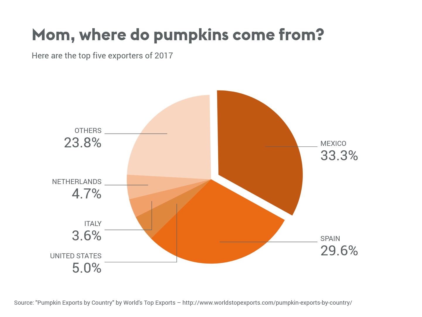
You made it through the all the pie chart theory! Congratulations, you are now ready to actually make a real, live pie chart. Maybe first it’s time to call your mom and tell her the good news?
You can start from scratch or use Excel if you want to, but Vizzlo’s pie chart generatormakes starting the process really easy.
The first thing we will choose is the single category that your data set is based on. This will most likely be the basis of your title, too.
Add in your circle, then carve it up into different proportional slices for the different percentages. It’s really important that the size of each slice is precise and exact to the percentage of the circle that you are representing, otherwise your visual could be extremely misleading and inaccurate. If you’re using Vizzlo, you can just upload your data set and the tool will calculate it for you with 100% accuracy.
Labels are crucial to get right to make your visualization easy to decode. Make sure they are easily visible, and if any labels overlap ensure that you reorganize the information so that all is clear. Don’t worry if you’re not sure—Vizzlo will give you a little prompt if anything overlaps.
This is your basic pie chart, but it may not be polished enough to persuade or impress just yet.
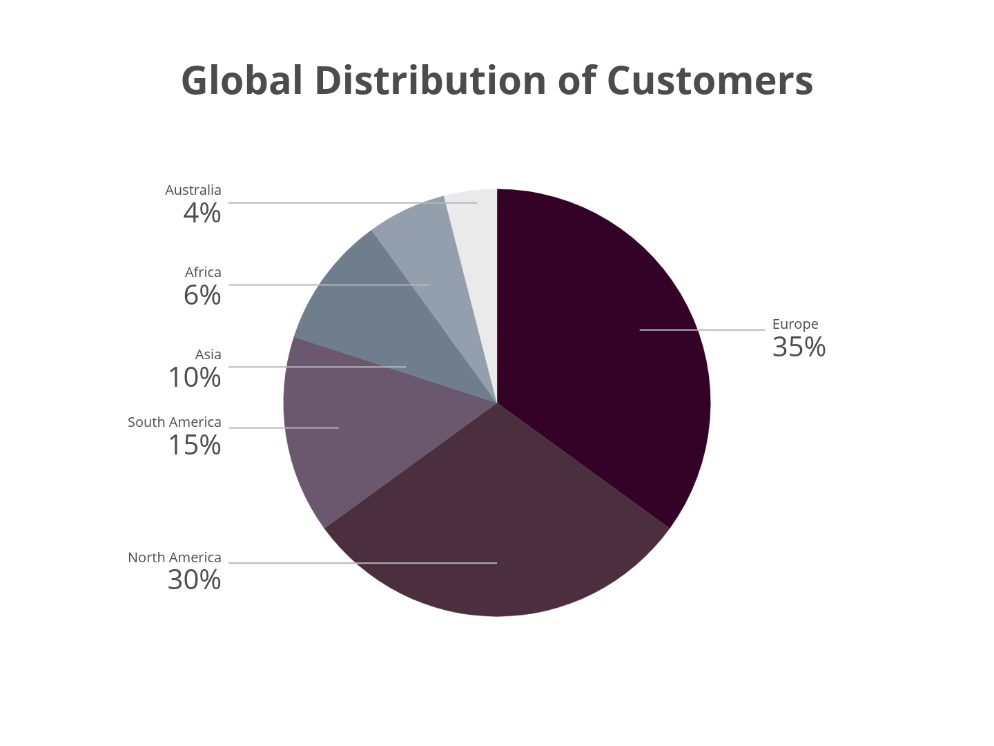
Design is crucial not only to give a pleasing look, but to make the information easier to digest. Visual cues like brand colors help to reinforce your information. You can upload your corporate colors to Vizzlo and save this theme to use on any chart—or you can choose from one of the preset themes to take advantage of the Vizzlo team’s designer-grade graphics and color theory.
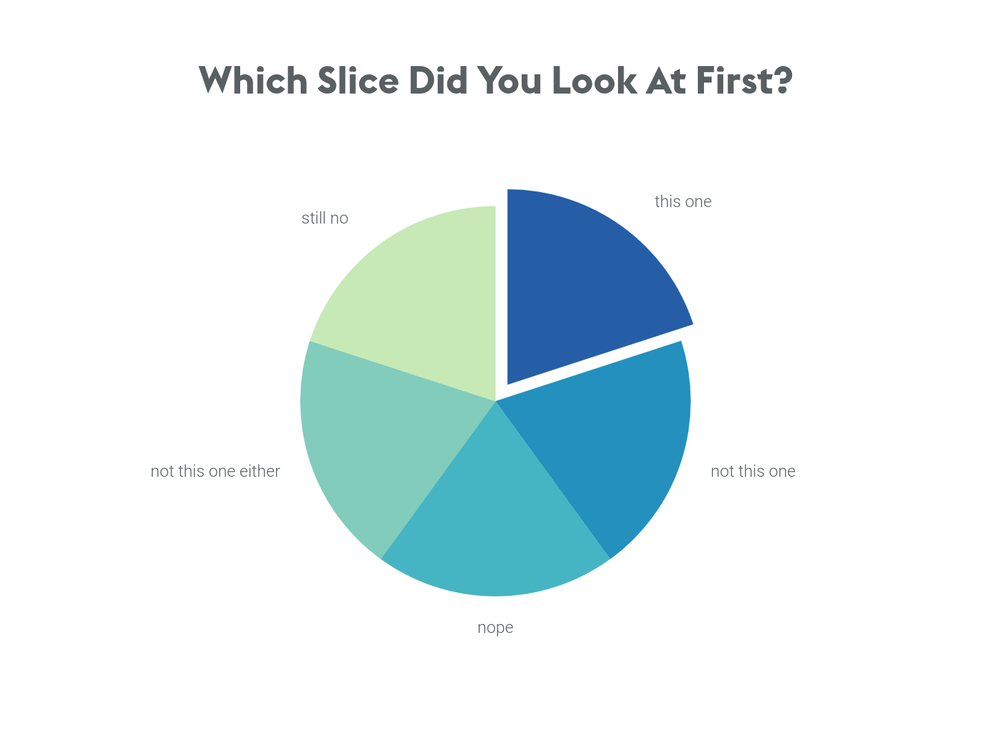
Exploding slices (a slice slightly removed from the rest of the pie) helps to emphasize a certain section—so that you can make sure your accomplishments, or any other crucial information, gets noticed first.
If you’re using Vizzlo, all formatting and customization is intuitive—it’s as easy as clicking on anything to edit it.
After inputting your data and formatting the chart, you are ready to share the work. Vizzlo has the option to download it in different formats, or you can decide to share it with viewing or editing rights. And, of course, every chart you make on Vizzlo is printable.
If you need any pointers on looks, color schemes or the like, check out Vizzlo’s examples gallery for different pie charts examples with all kinds of color schemes and styles.
And that’s all it takes to create a beautiful, quick and professional-looking pie chart!