Chart Vizzard
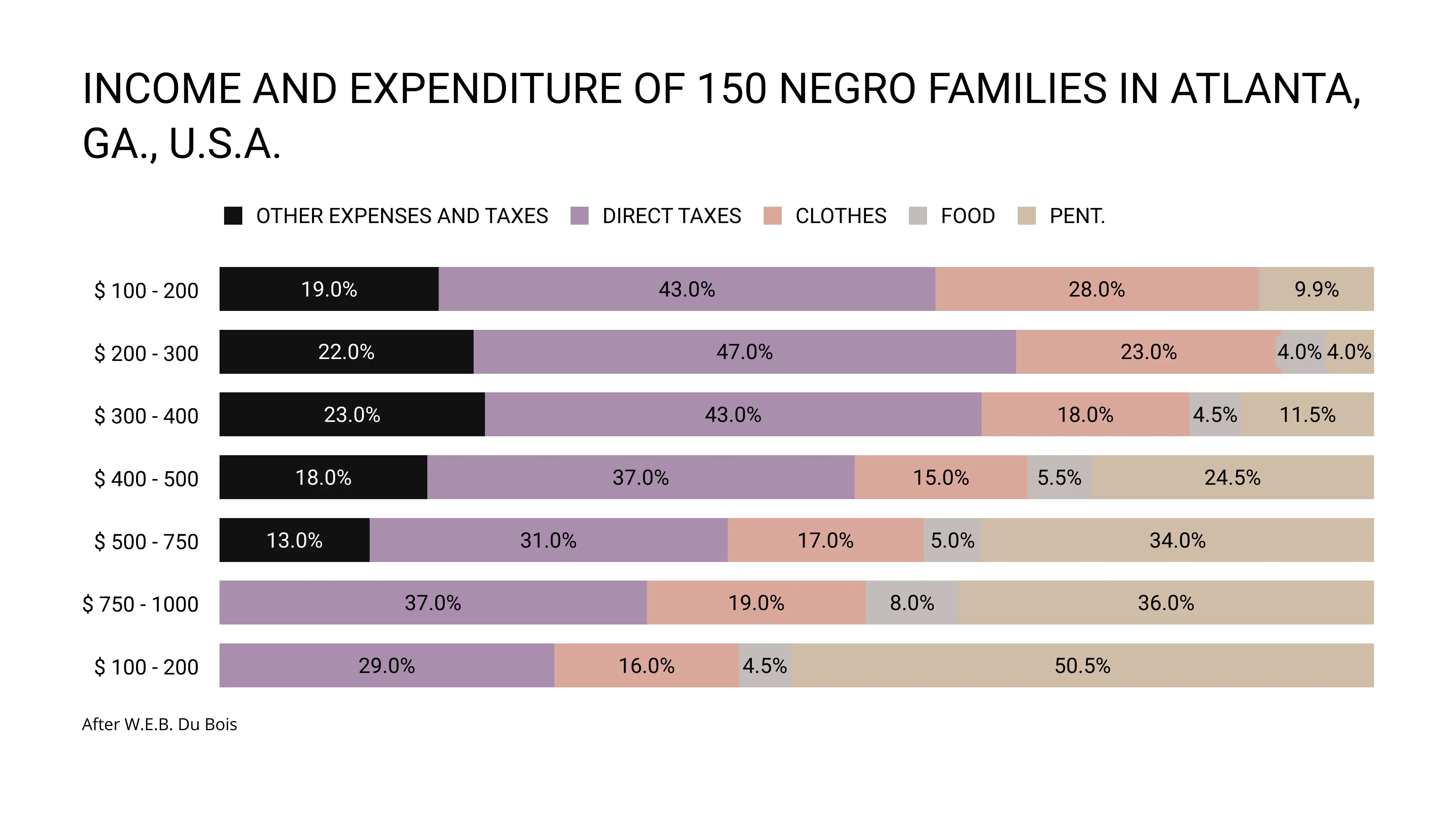
Vizzlo's AI-based chart generatorINCOME AND EXPENDITURE OF 150 NEGRO FAMILIES IN ATLANTA, GA., U.S.A

In 1900 creative artists from nations around the world assembled at the Exposition Universelle in Paris to showcase their achievements. One of the exhibits was dedicated to the progress made by African Americans since Emancipation.
This Exposition des Nègres d’Amérique featured an eclectic set of objects, images, and texts and among them approximately sixty data visualizations, that were contributed by W.E.B. Du Bois. It was “an attempt to give, in a systematic and compact a form as possible, the history and present condition of a large group of human beings”, as Du Bois has put it himself.
The first set of infographics, that Du Bois and his team created, used Georgia’s diverse and growing black population as a case study to demonstrate the progress made by African Americans since the Civil War. A second set was more national and global in scope. It included renderings of national employment and educational statistics, the distribution of black populations across the United States, a comparison of literacy rates in the United States relative to other countries, and other striking visualizations.
Further reading: W. Battle-Baptiste & B. Rusert (Eds.), W.E.B. Du Bois’s Data Portaits. Visualizing Black America

This is an example of Vizzlo's “100% Stacked Bar Chart”
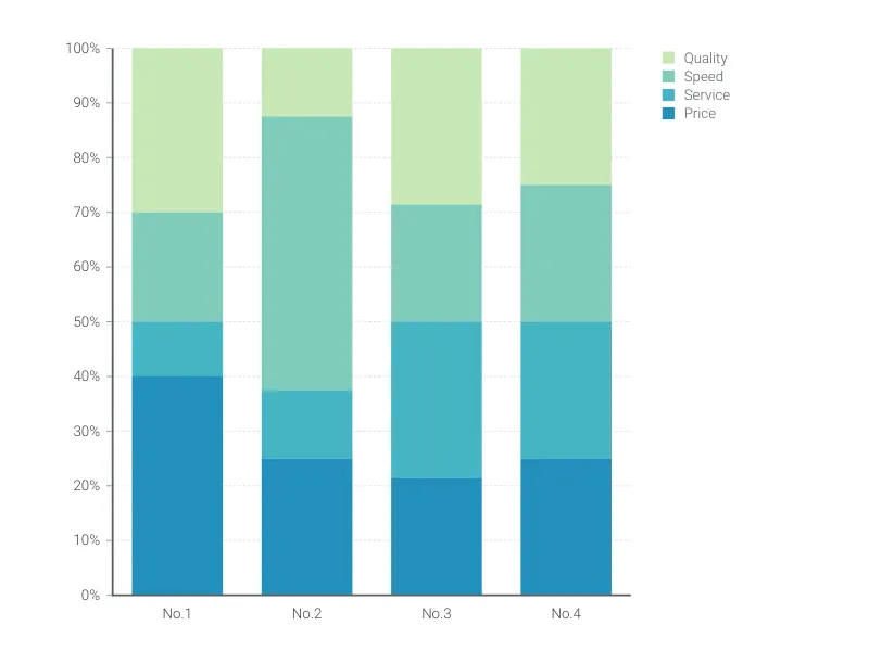
Create a stacked bar chart that adds up to 100%.