Chart Vizzard
Vizzlo's AI-based chart generator2018 California Wildfires

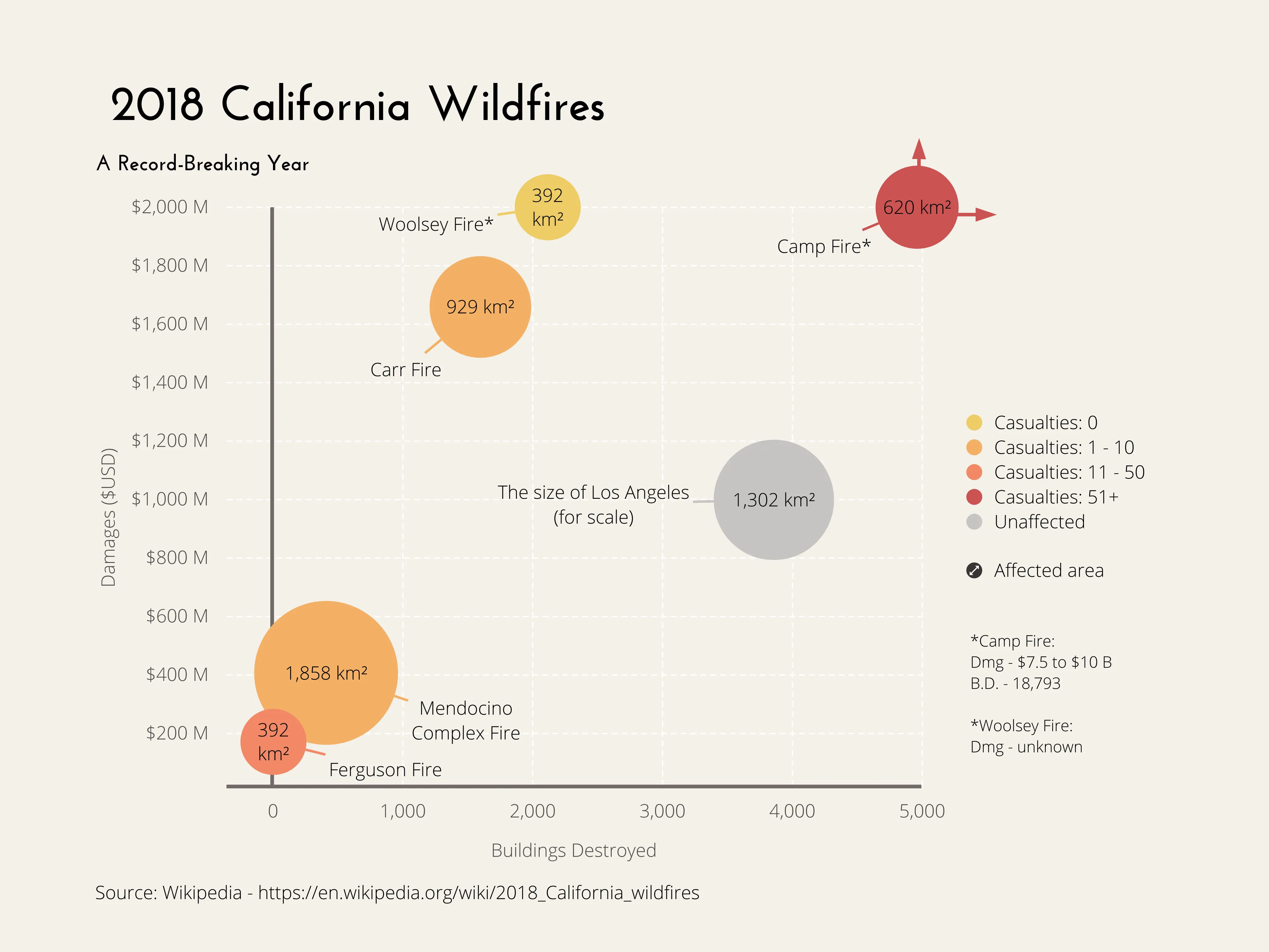
2018 has proved to be a particularly rough year for the state of California as this has gone on to be one of the worst in recorded history. Not only has the state seen the largest amount of burned acreage recorded in a season – but the Mendociono Complex Fire, which was active from the end of July to the middle of September, has become California’s largest wildfire on record. The fires are estimated to have caused more than USD 2.975 billion in damages so far. So why has this wildfire season been particularly bad? Many experts cite climate change as a very likely possibility, with increases in the average temperature and longer periods of drought providing ideal wildfire conditions. This bubble chart compares five of 2018’s largest wildfires, the area the city of Los Angeles occupies has been included to put things in perspective.

This is an example of Vizzlo's “Bubble Chart”
A multivariable graph for visualizing and comparing up to four dimension of your data.
Finance & Economics Sales & Marketing Scatter plots & Bubble charts