Chart Vizzard
Vizzlo's AI-based chart generatorPlug in, drop out: which energy source will kill you first?

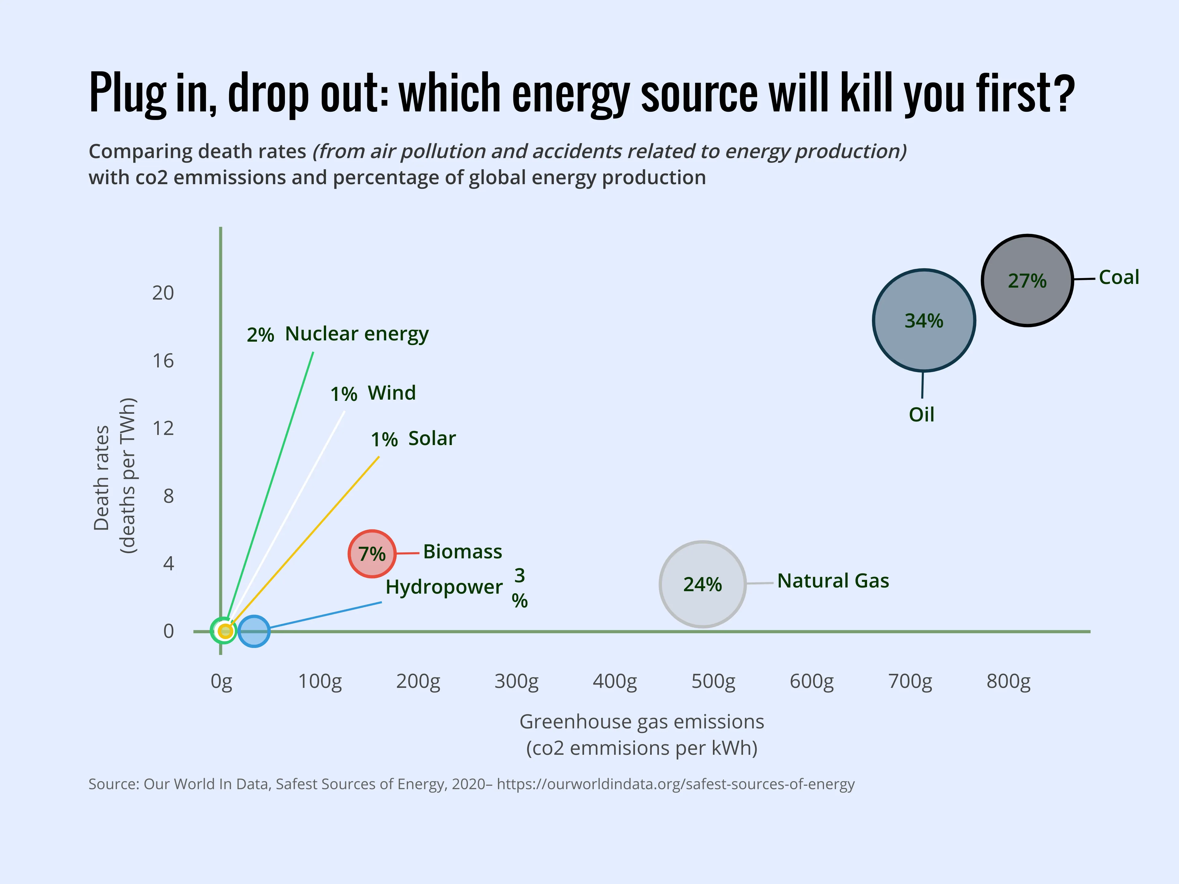
The correlation between what’s safe for the planet and what’s safe for us as human beings is, in fact, pretty strong.
Of course, it doesn’t take a genius to work out the relationship between co2 emissions and deaths caused by air pollution–but in this chart we also take into account the fatality rate involved in the production of each energy source.
Surprisingly, Nuclear Energy–always associated as dangerous to humans in production–has not only one of the lower rates of harm, but also a very low co2 generation.
With more than half of the world’s energy sourced from Coal and Oil, it’s clear from the graph that these two energy sources are causing multiple times more harm to both the environment and humanity. Let’s hope to see a reduction in the reliance on these fossil fuels in the future.

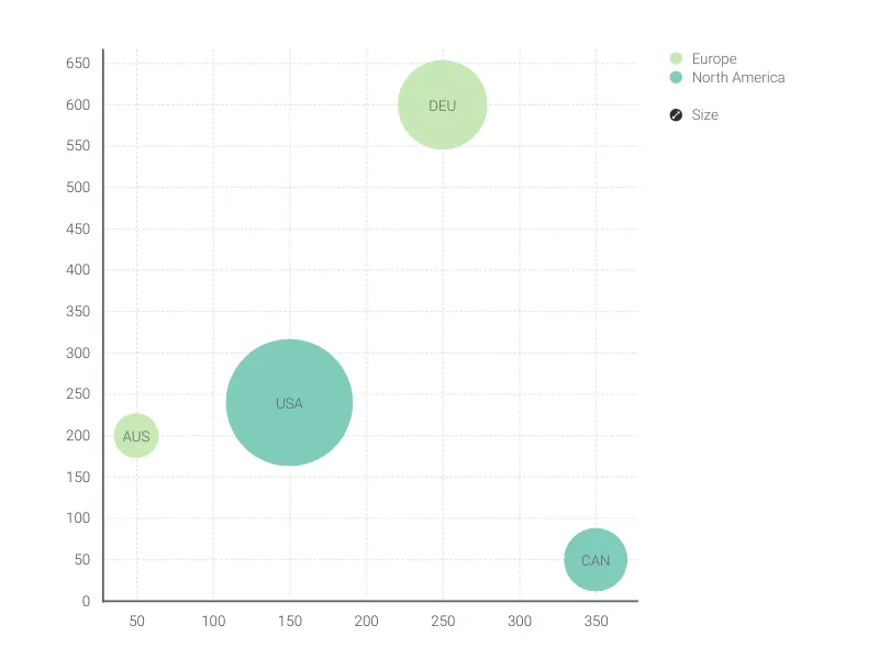
This is an example of Vizzlo's “Bubble Chart”
A multivariable graph for visualizing and comparing up to four dimension of your data.
Finance & Economics Sales & Marketing Scatter plots & Bubble charts