Chart Vizzard
Vizzlo's AI-based chart generatorAmerica's growing debt

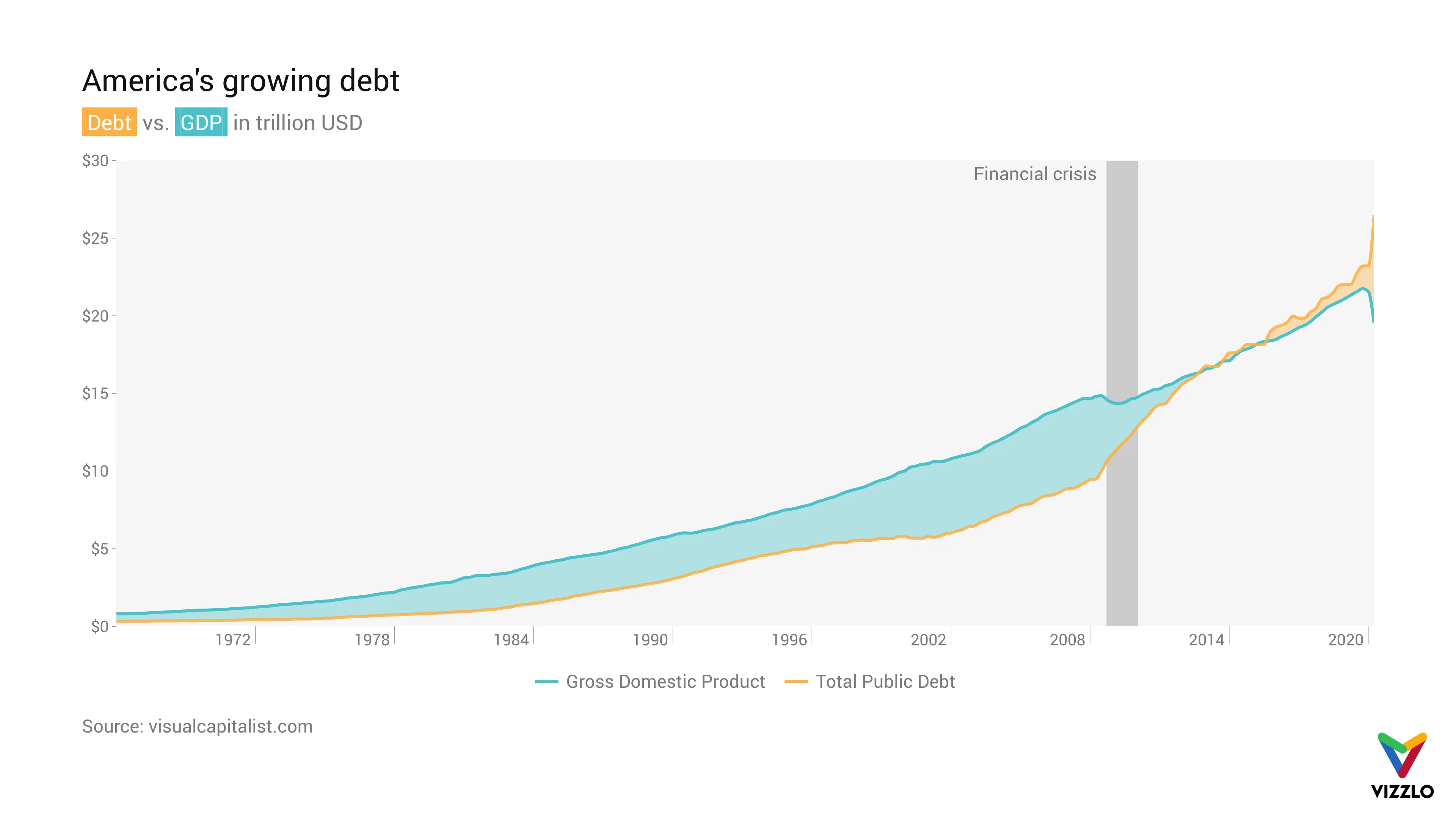
On top of this came the sharpest rise in unemployment, a slump in GDP and a sharp increase in public debt, as our chart shows.
US debt was relatively moderate at an average of 60% of GDP between 1994 and 2007. It took a drastic turn during the global financial crisis as the public debt increased to 95% of GDP by 2012.
Since then, US debt has risen even more sharply, relative to GDP. In April 2020, when the COVID-19 pandemic was in full swing, it reached a record level of 122% of GDP.
Source: visualcapitalist.com
Data: Federal Reserve, U.S. Treasury

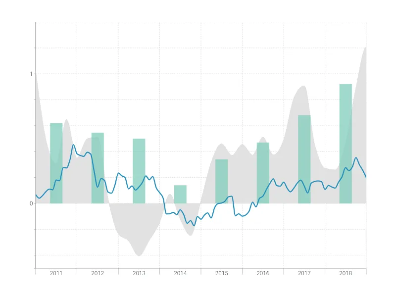
This is an example of Vizzlo's “Time Series Graph”
Complex time series graph to visualize detailed financial data.
Finance & Economics Bar & Column charts Line & Area charts Time-based charts